Omnipresent

Media by Synthex
Media by Synthex
Omnipresent makes it easy for companies to hire remote talent and employees anywhere worldwide, providing them access to home comforts such as local healthcare and social contributions while working for a global team.
Creative Lead — Brand Design, Visual Design, Webflow Development, Creative Direction
Linda Wang, Head of Marketing
Emma Cheung, Brand Manager
Jason Roach, Webflow Developer
Mathew Kerber, Visual Designer
The global pandemic kicked off a flywheel of remote adoption, leading companies to open their talent pool globally. Omnipresent seizes this opportunity by providing high-end solutions for companies to employ people anywhere in the world.
By the beginning of 2021, the company closed its Series A funding round only five months after a seed round. The global employment space was exploding, and remote-first companies experienced a remarkable hyper-growth. Ramping up their digital presence, a new brand and website was needed to keep moving forward.

When the opportunity came up on my radar, the marketing leadership had prepared a challenge to test the designer's skills they were hiring for. It was straightforward but a good reference on the brand possibilities back then.
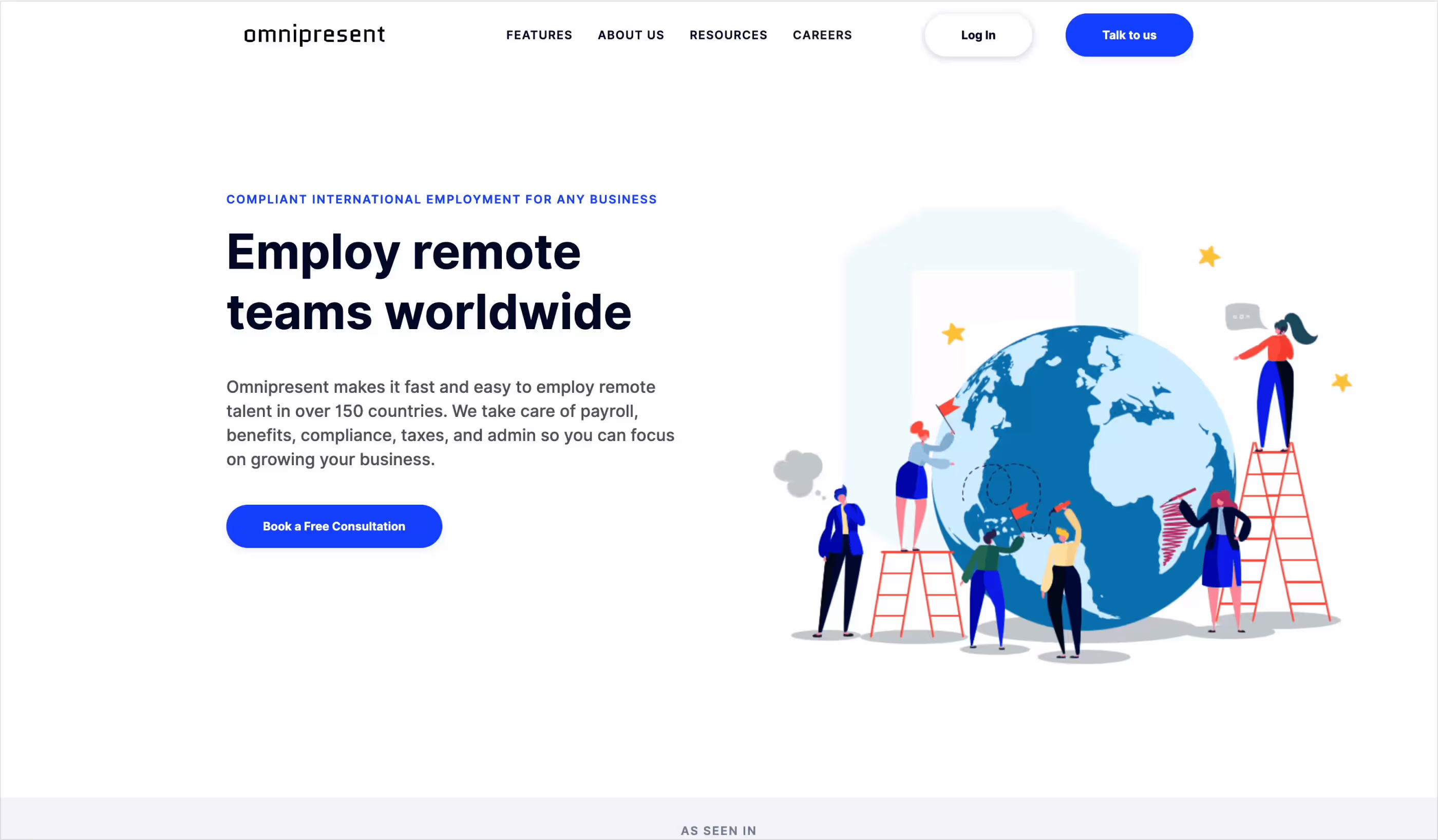
Based on their current digital presence, the ask was to create a high-converting landing page that could be targeted with paid ads. No copy or anything else was provided. The only requirement was to complete this homework within a few hours.
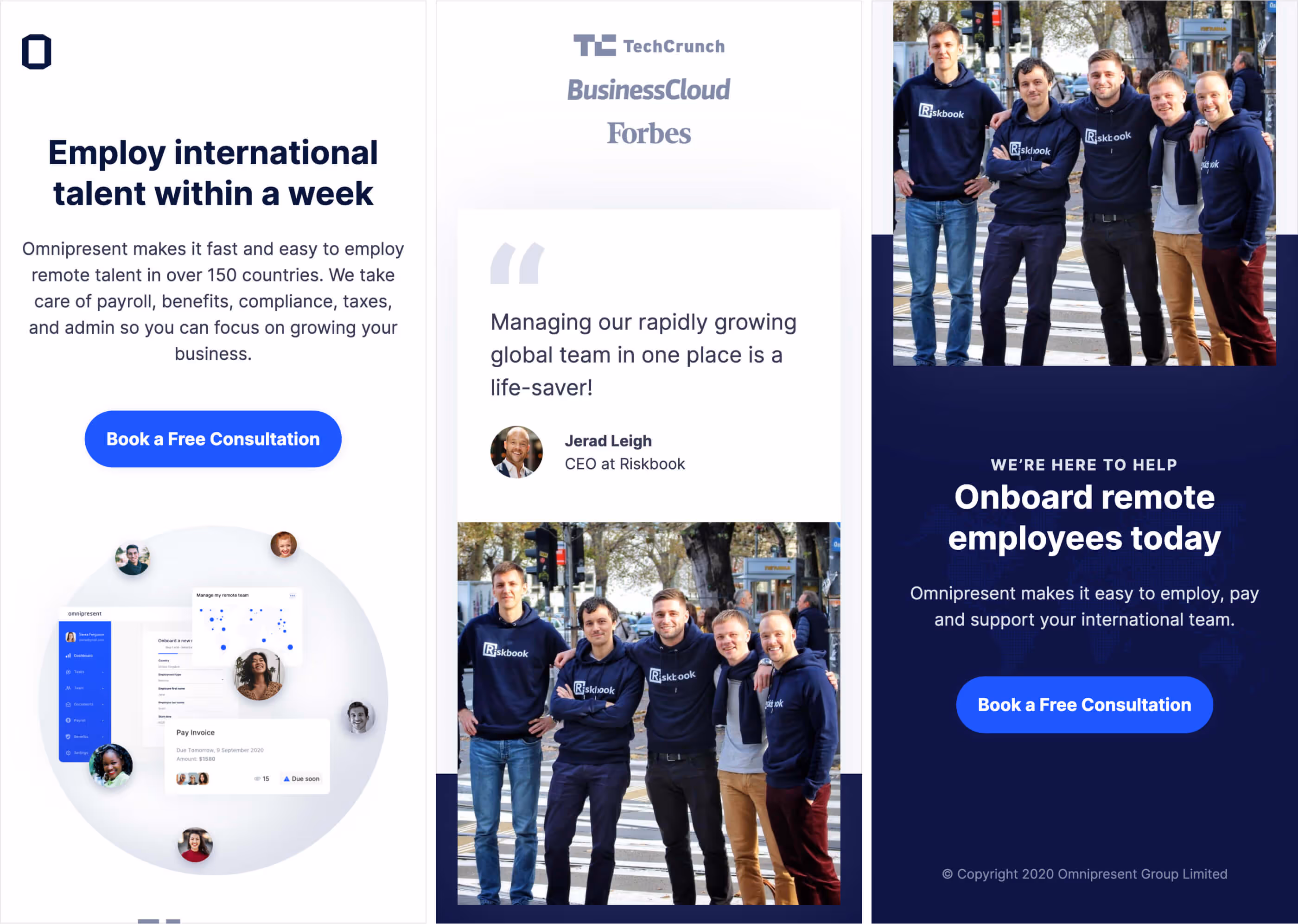
To fulfill the challenge, we made many assumptions, but we focused on the speed of delivery for the value proposition. This dictated how the headings and claims would be written and what design decisions we could make. We needed to show social proof, so we included some trust logos above the fold and an extensive testimonial below. The imagery used was around teams and the product itself.
We also had an outro to wrap up with the call-to-action about booking a free consultation. There is no form in line with this landing page by design; this creates less friction and makes it more likely to convert. The action is to schedule a meeting and provide contact details, which are big asks.
On day one of joining Omnipresent, I discovered we'd undergo a rebranding and complete website rebuild. The progress so far has focused on the brand identity and developed styling for collateral, but it needs more consistency. The team behind the rebrand before my involvement included an agency and the company's only in-house designer, who unfortunately had to leave a few weeks after I joined. David dos Santos planned the rebranding direction masterfully and set us up for success before handing it off.
The mark forming the new logo reflects Omnipresent's core: supporting a global approach to hiring talent.
The geometric shapes and their interplay with the white space reflect the focused, clear-cut, seamless service.
Omnipresent helps clients hire the best talent wherever they are. It makes this possible by providing seamless service so clients can focus on building their business globally and becoming omnipresent.
The logo combines the mark and name. The fact that the whole name is all lowercase and black reflects their quietly strong and supportive presence for the clients.
The logo is constructed using circles and straight lines. It's inspired by a perfect letter 'O' and a globe. The arcs create an outer circle with a prominent and even aperture to symbolize being open-ended and dynamic. The intersection and selective subtraction of the quarters that make the arcs create an internal circle, focusing on simplicity at the core and their ability to adapt to the client's specific needs.
The clear space around the logo is equal to any of the arcs from the mark. These arcs are each one a quarter of what makes a partial outer circle. This visual cue also applies to the spacing between the mark and the typeface.
Alternatively, the logotype is used when detached from the mark and as a stand-alone placement.
The company builds trust and equity in the Omnipresent brand through a simplified architecture focused on consistency and efficiency. Two styles are used to build lockups for sub-brands, products, teams, events, and campaigns.
The stacked logo is an alternative to maximizing the covered real estate on vertically oriented containers, usually for large-scale use. It should be avoided at small sizes or where horizontal whitespace is more prominent, as it can become illegible. The primary logo is based on a 13:4 aspect ratio, while the stacked version is based on a 5:3 aspect ratio.
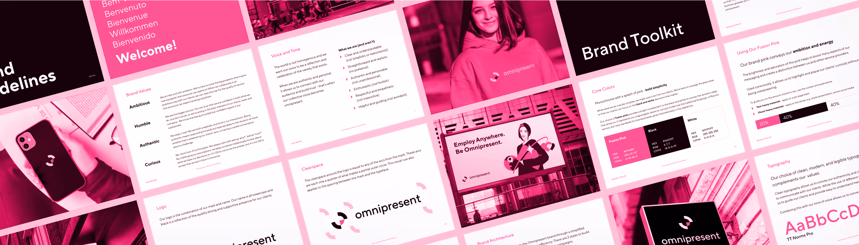
Monochrome with a splash of pink - bold simplicity.
While Omnipresent's work may be complex, the brand ensures it isn't for the clients. The team is here to manage the gray areas so the clients can focus on the black-and-white decisions that matter.
Fusion pink complements black and white to convey the dynamic edge that drives the brand. It represents the unapologetic desire to modernize the traditional Employer of Record service and raise standards for how businesses grow internationally in this digital era.
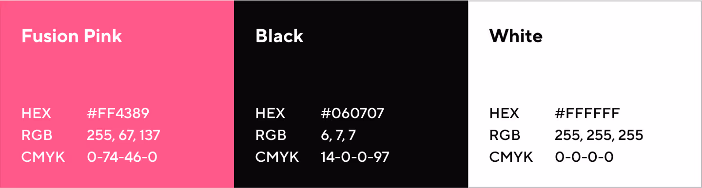
The brand pink conveys their ambition and energy.
This pink's brightness and saturation help boost many aspects of the messaging and create a distinction between Omnipresent and other service providers.
When used consciously, they can highlight and pique the clients' curiosity without being overpowered.

To guide on the amount of pink to use, the context and scale below are helpful:
Clean, modern, and legible typography complements Omnipresent's values.
Clean typography conveys the authenticity and clarity they aim to communicate with the clients. Using different sizes and weights allows them to guide the clients and provide easy-to-understand messages.
Combining this with the tone of voice allows the brand to convey a 'less is more' approach.
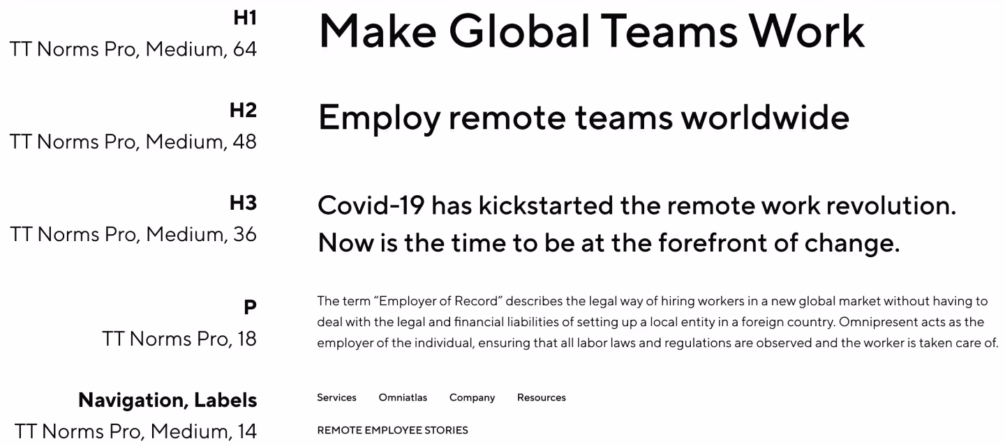
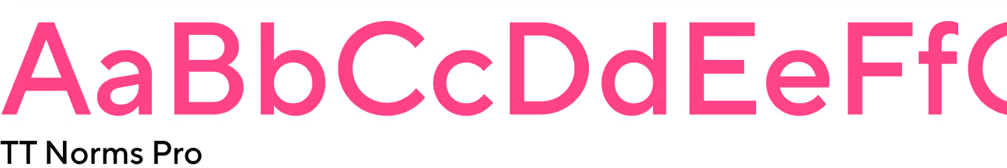
TT Norms Pro is the brand typeface for centrally produced marketing materials.
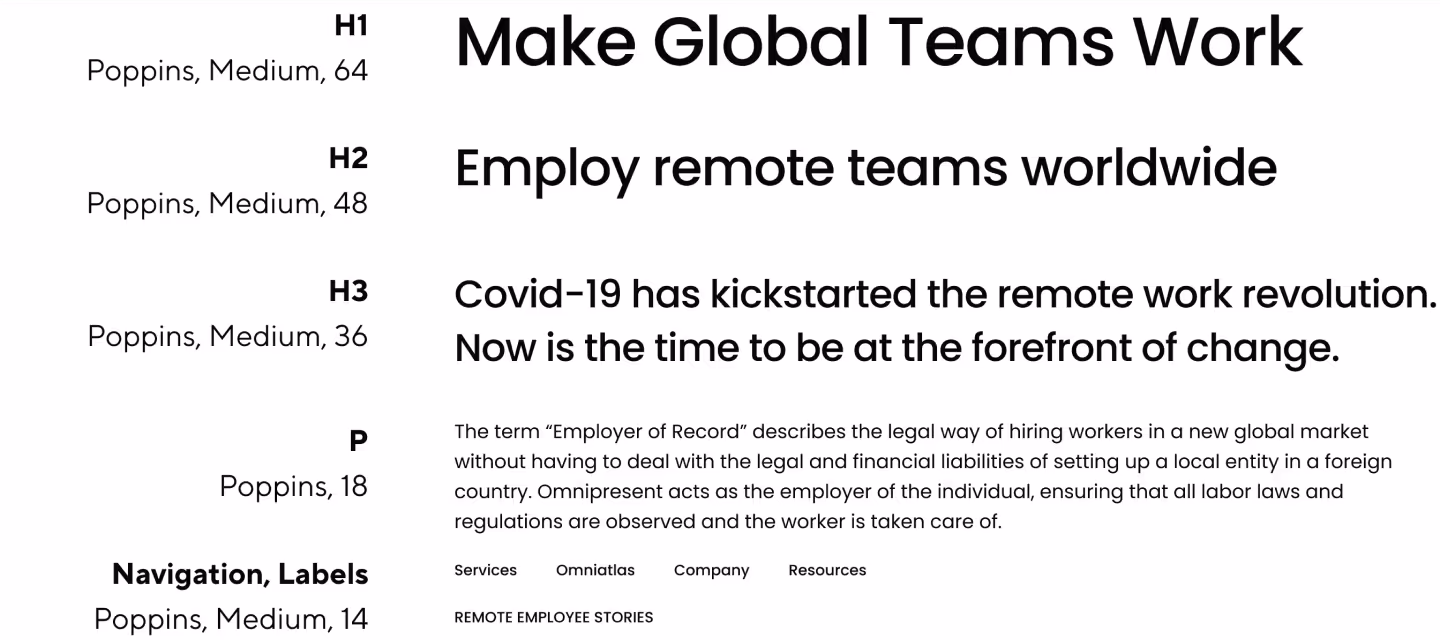
Considering accessibility, Poppins is a free font selected for company-wide use. It conveys the brand while giving teams the autonomy to edit self-managed materials.
The iconography style is minimal, with a focus on silhouettes.
Icons provide a medium to quickly communicate through symbolism, providing conceptual clarity and visual interest.

The iconography style is inspired by the mark and uses brand colors. Bold outlines and silhouettes combine to create icons with depth and dynamism while maintaining clarity.
The illustrations follow a clean, vibrant, and realistic style. Compositions focus on using negative space and perspective to create relatable silhouettes. This combination provides the brand with a unique approach to sharing stories.

The photography is natural, unstaged, and diverse, reflecting Omnipresent's values of authenticity and inspiring empathy. They should feel light, energetic, and warm to contrast with the bold colors and be the main visual focus on a page.
After defining all the aspects of the identity, we outline the new brand assets and how to use them to create consistent and cohesive branded materials. We compile them into one document that will serve as a practical guide about the essential elements of the Omnipresent's evolving identity. Thanks to Emma Cheung for refining the guidelines' content.

Brand guidelines help ensure your brand is communicated correctly internally and presented consistently to the audience. Yet, in the end, guidelines are just that—a guide. The document should be used with best judgment as a reference point.
The new brand identity is used across all visualizations, and for the first time, we start imagining how it looks in real life when implemented by making mockups.
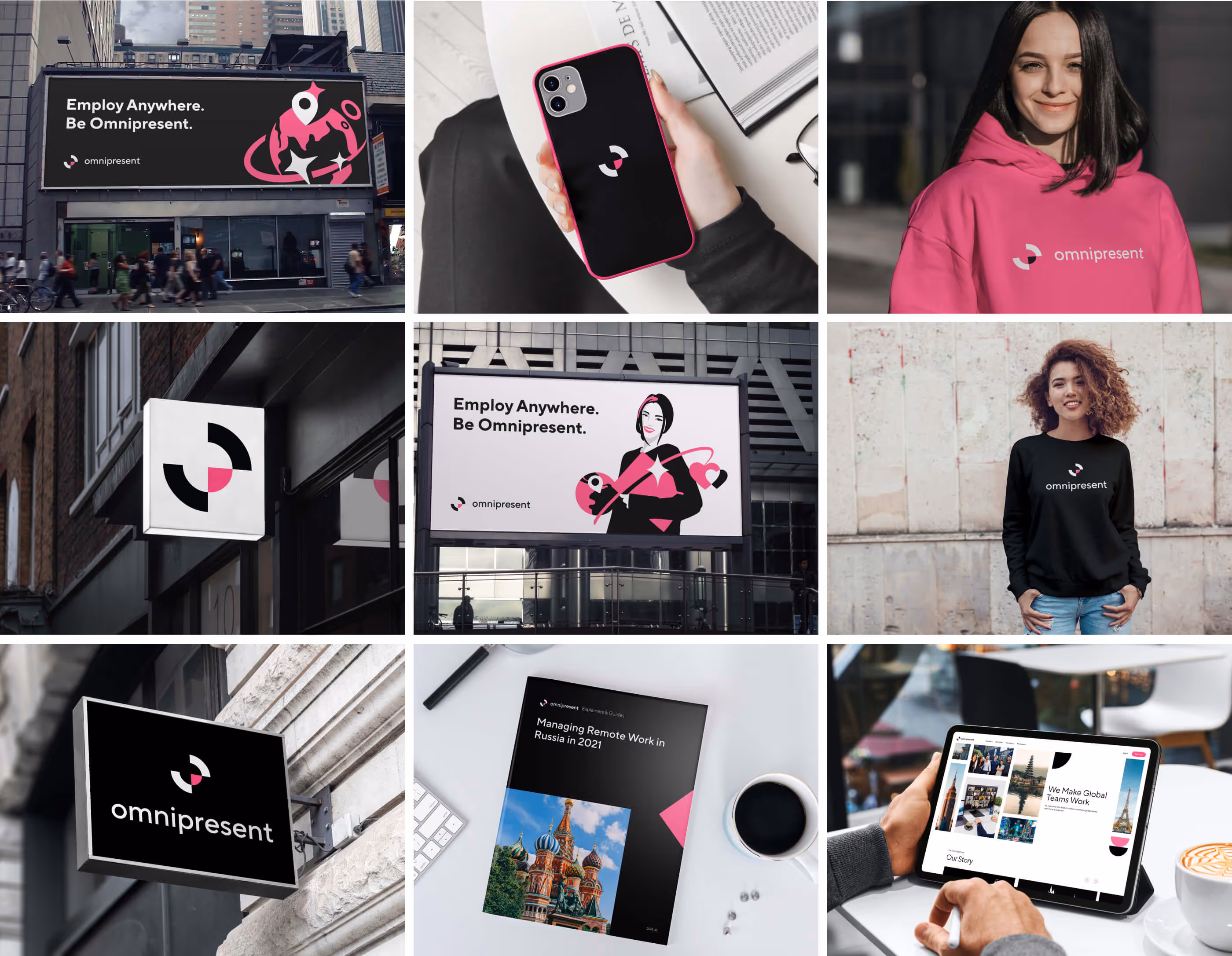
Additionally, mockups work as complementary imagery for the brand guidelines and other branded material to visualize the brand in collateral. The ones related to the digital experience, like the website or platform, will be great companions in providing better scenery to the audience.
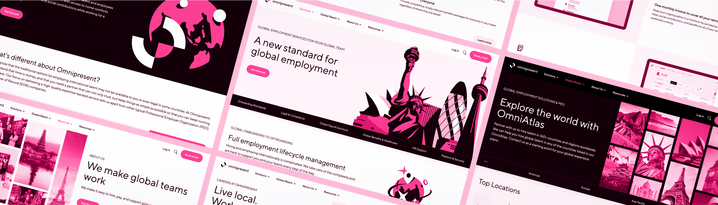
Moving to the website, the agency was commissioned for the design and development. The revision cycle for the high-fidelity mockups took too long, and the Figma design file needed to be simpler to follow regarding versioning. Meanwhile, they also started to build the Webflow project and had similar issues.
With the pressing deadline for the upcoming funding announcement, we decided to skip the mockups, go straight to Webflow, and build it correctly. Webflow is a visual development tool, after all.
The brand guidelines are ready, the copy outline is complete, the information architecture is clear, and the existing mockups give us an initial styling and layout idea. This is a fantastic opportunity to test our new brand identity on a blank canvas.
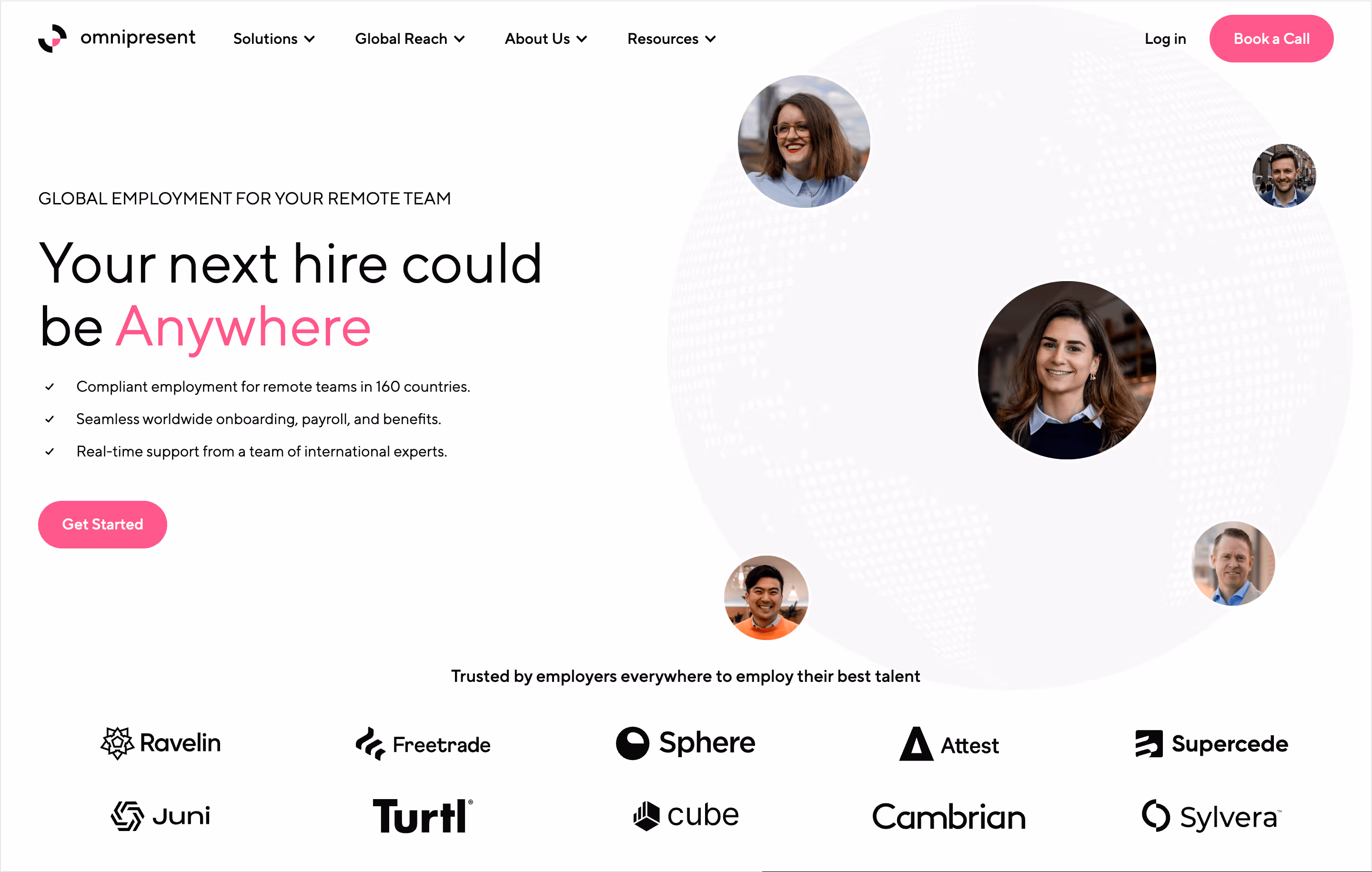
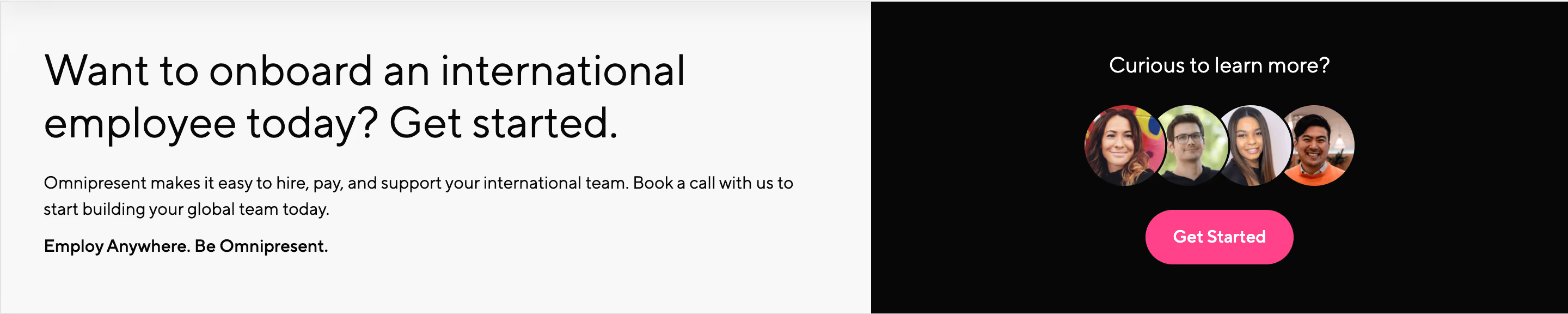
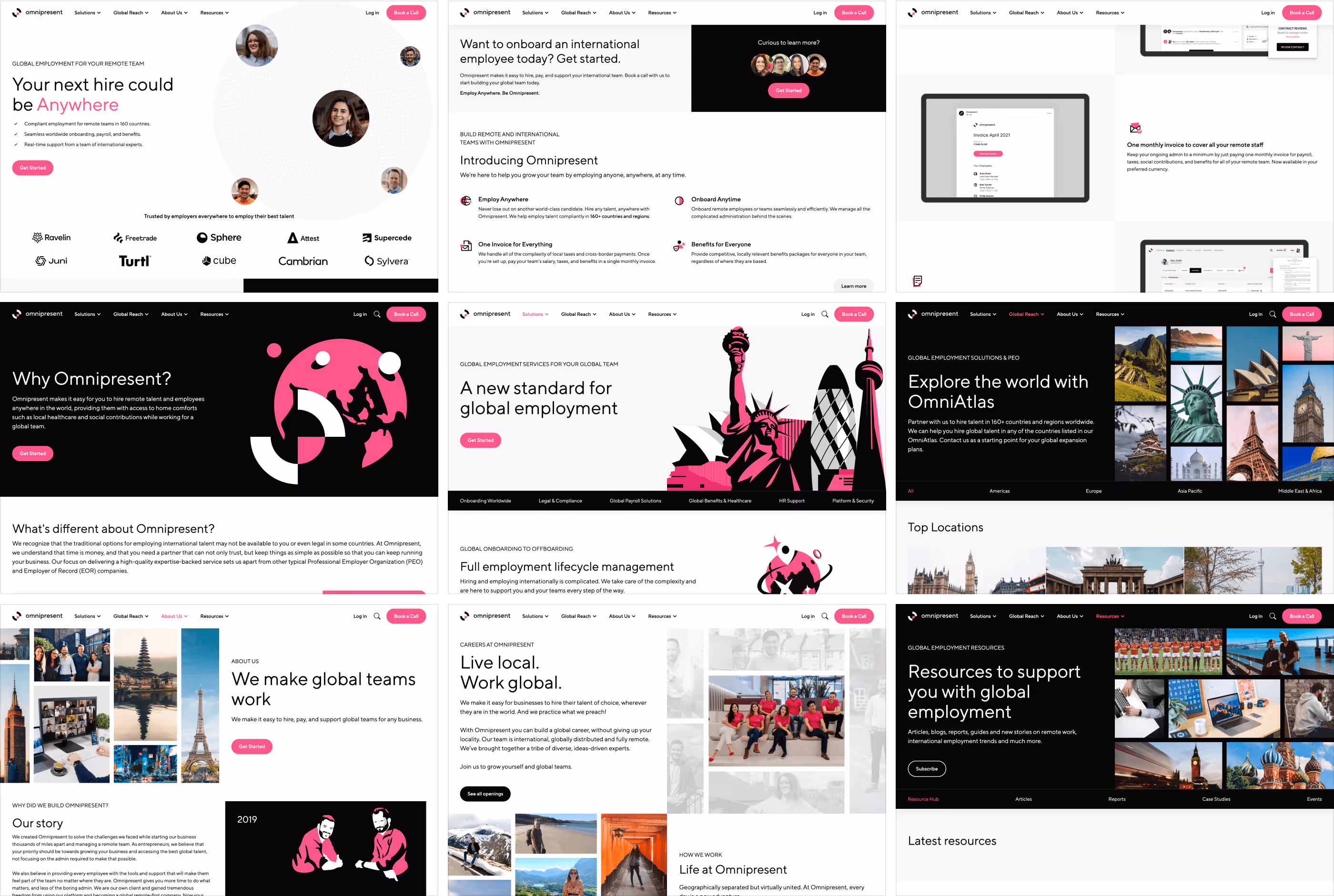
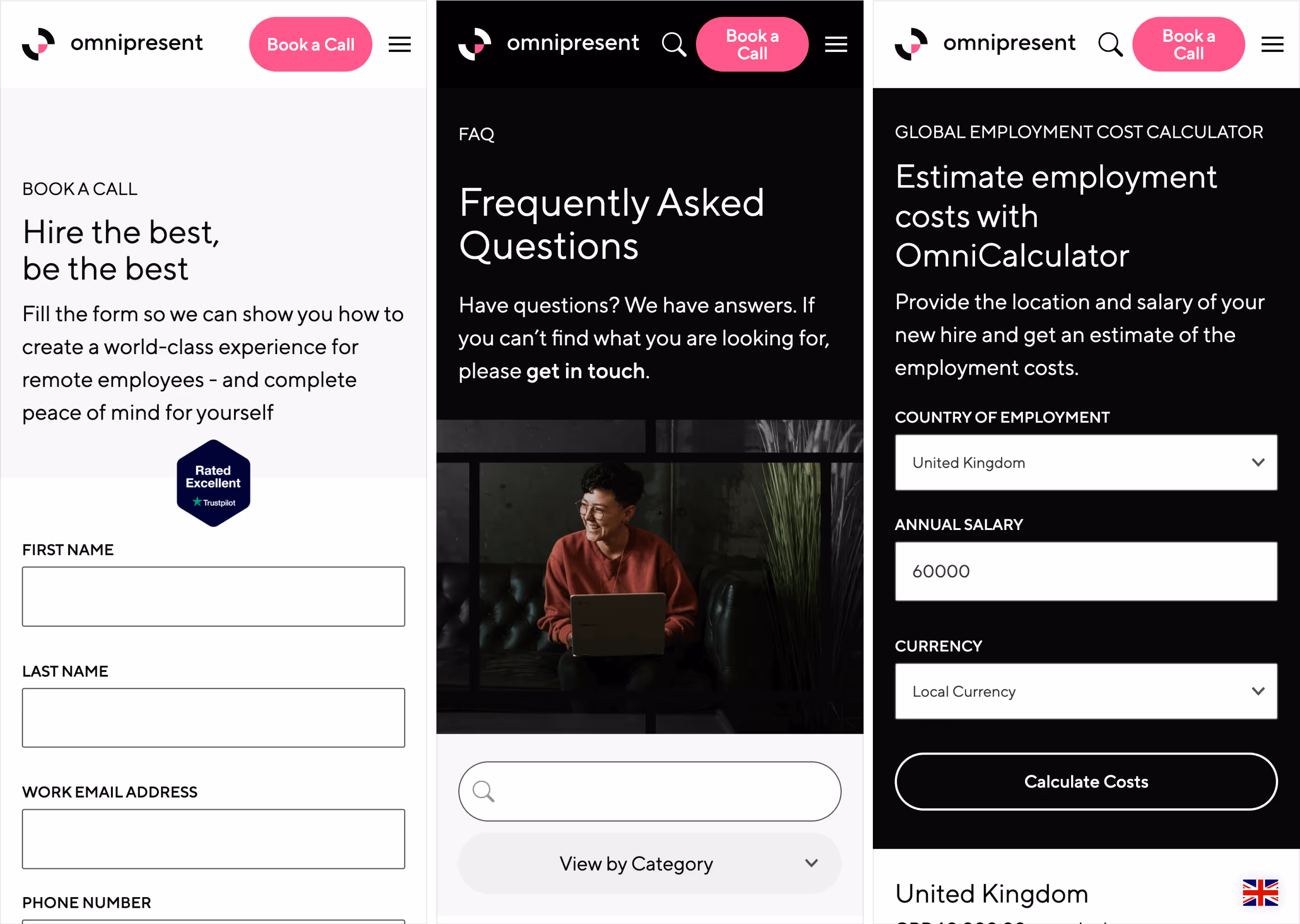
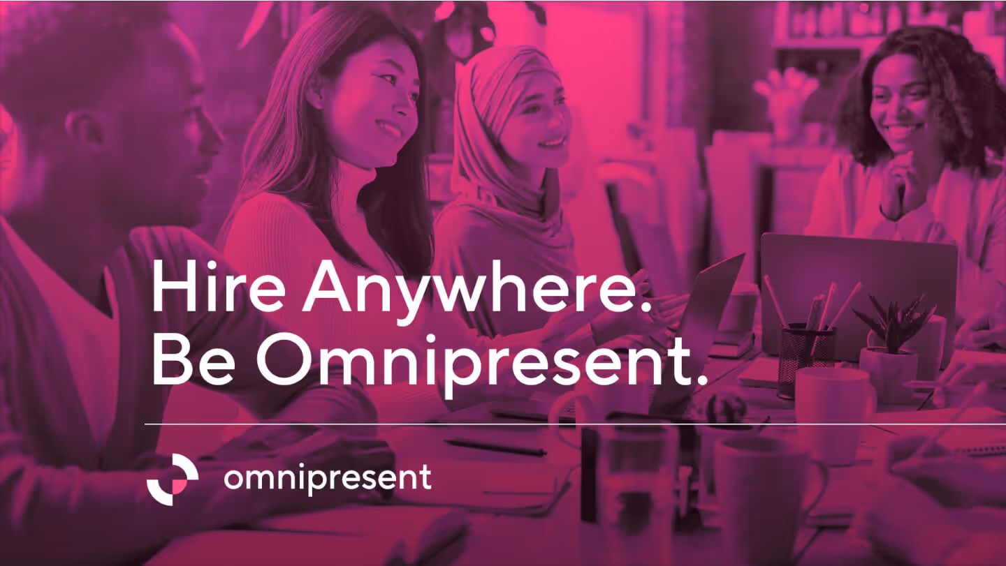
The content above the fold on the home page is the first impression of a website, which is the visible part at first glance without having to scroll. Introducing the brand, value proposition, and call to action is essential. This becomes the primary hero of the website.
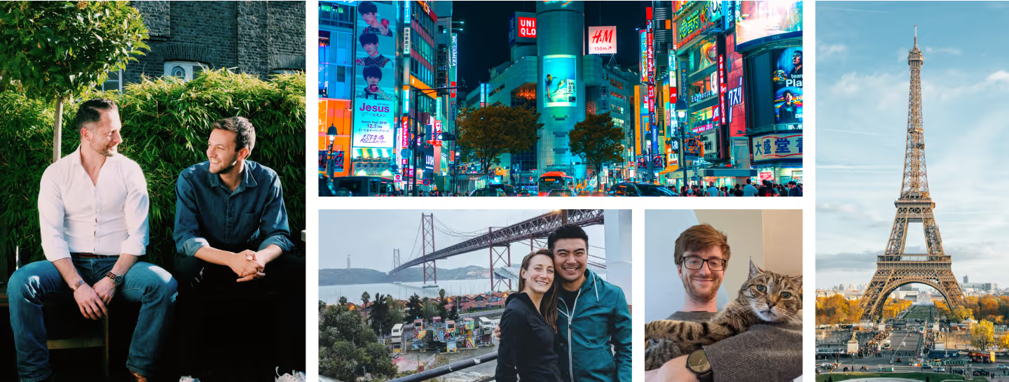
What makes Omnipresent unique is the stellar service and human expertise. The product is compelling but too technical and complex to lead the value proposition with it alone. Instead, we highlight the people. It's about people, after all—people who get hired and make teams. The marketing team gathered the leads in London for a professional photo shoot, so we have high-res assets. We wanted to portray our authenticity; there is no better way to show our people on the front page. They're distributed as avatars in a softened world to symbolize these people being on a global team.
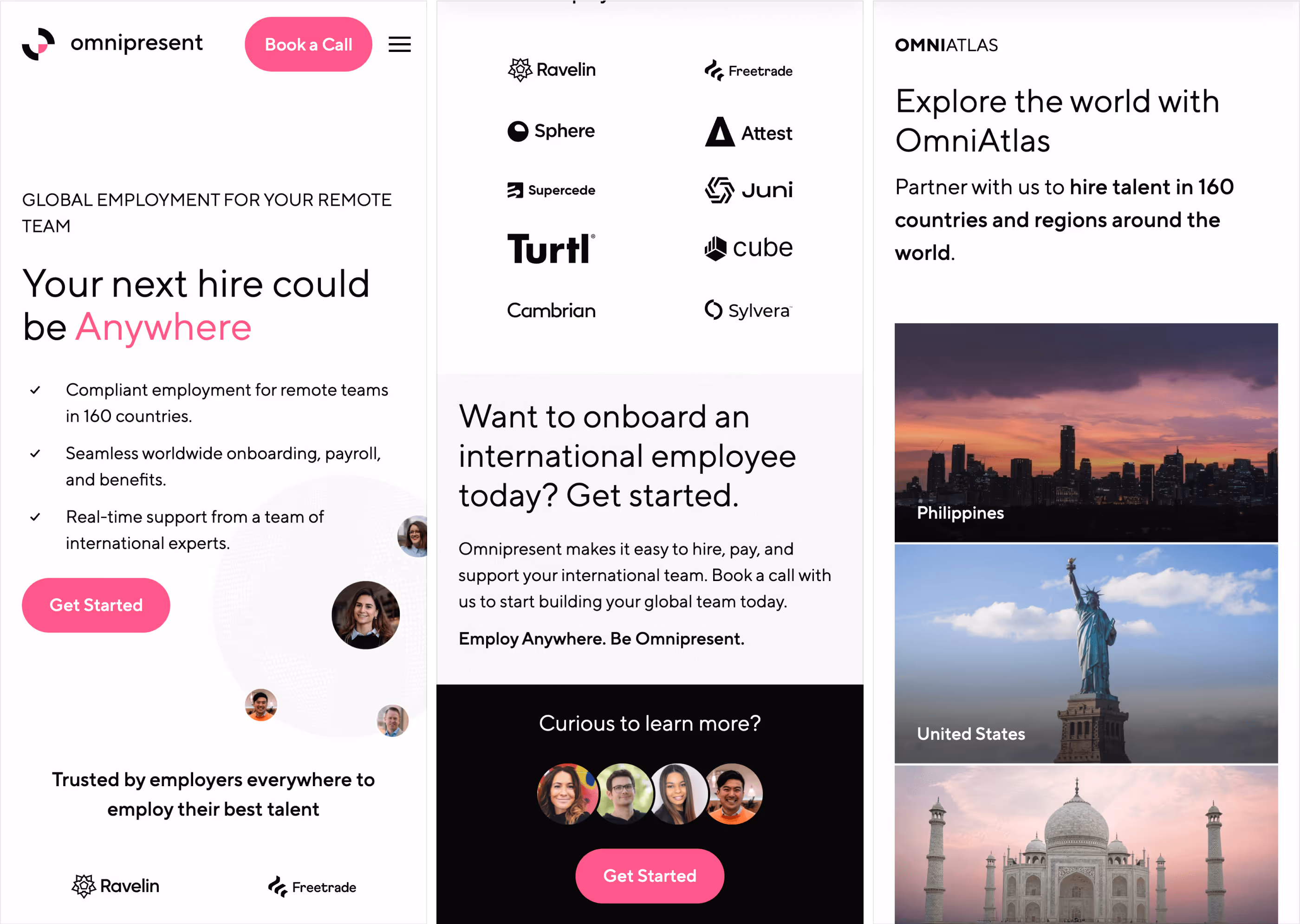
The most effective primary hero sections include social proof and detours to allow visitors to consume more content before taking action. It is crucial to showcase existing global companies using Omnipresent to employ talent everywhere. These will build confidence and validate the offering by relating to accountable employers. They're presented as trust logos on a small grid of two rows.
Our website's primary action is to Book a Call. The primary button will remain pink-colored across the website exclusively for this action and will be promoted within the global navigation, hero, and outro sections.
We should keep promoting the primary call to action while wrapping up each page. This is an opportunity to reinforce the value proposition in its simplest form and strengthen the brand visuals in an impactful way that makes it hard to miss out. Again, we opt for giving human faces because it's our distinctive touch. For this version, we get even more authentic with less polished photos and more actual user avatars from the sales team, the ones attending the call. Everything should drive attention to our call-to-action button. This whole section is like a colossal call-to-action button.
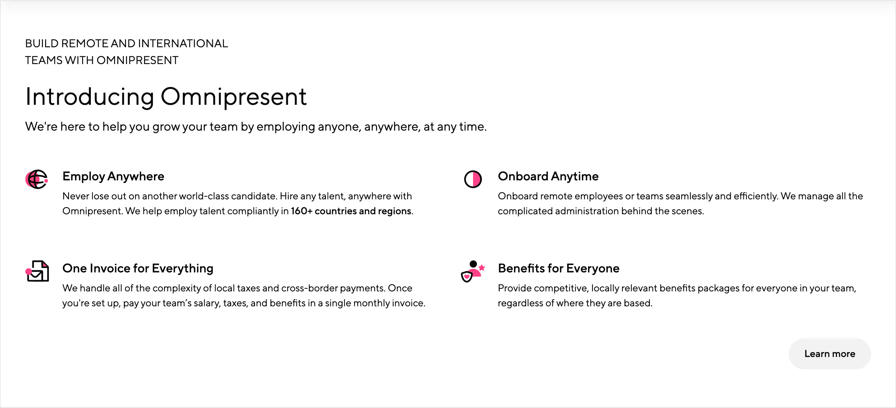
We introduce the solutions after covering the basics of the brand and website navigation. Here, we list the top four features as icon badges in a grid list.
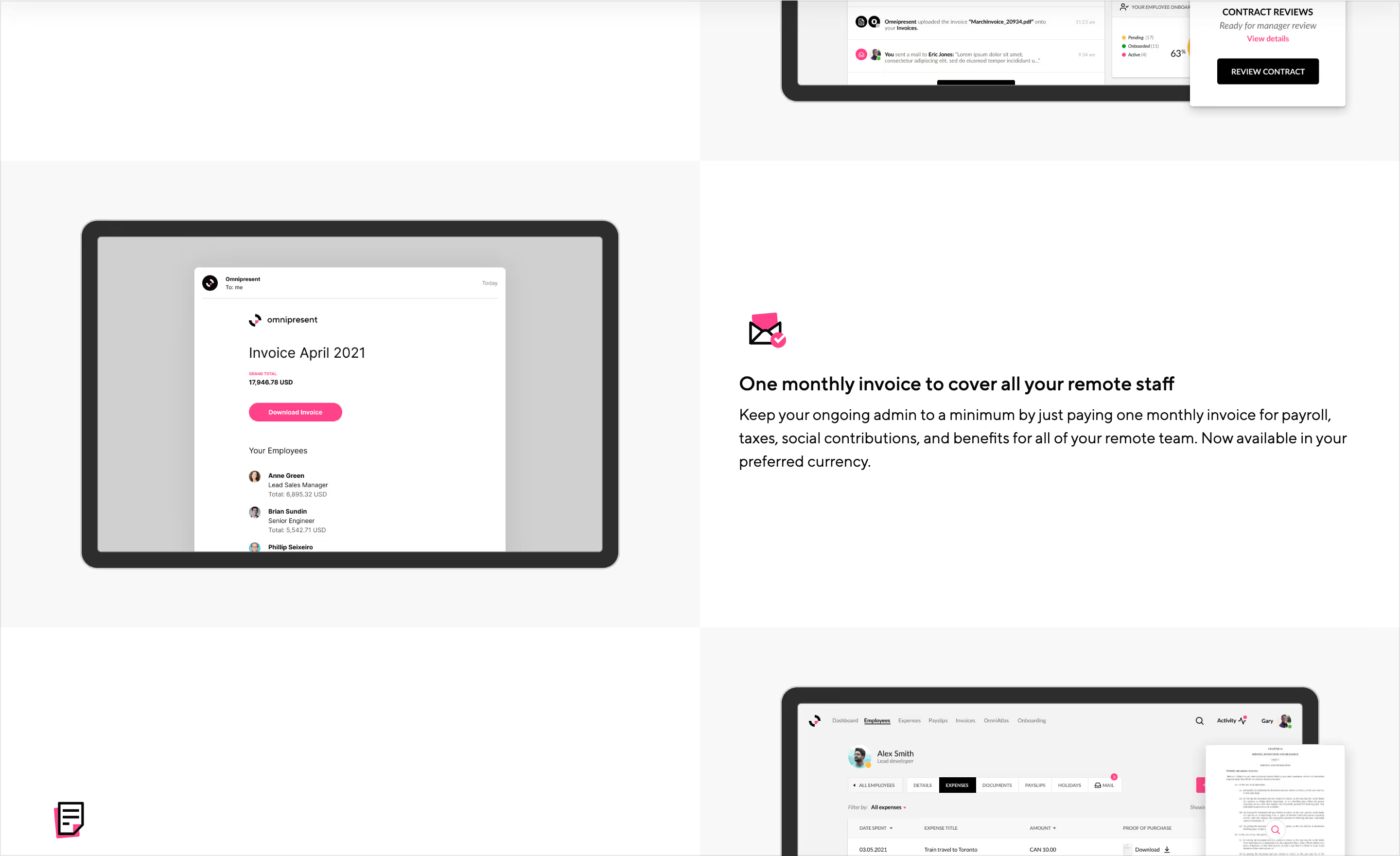
Following the intro with the top features, we go into the features with UI mockups and stacked icon badges to provide more details.
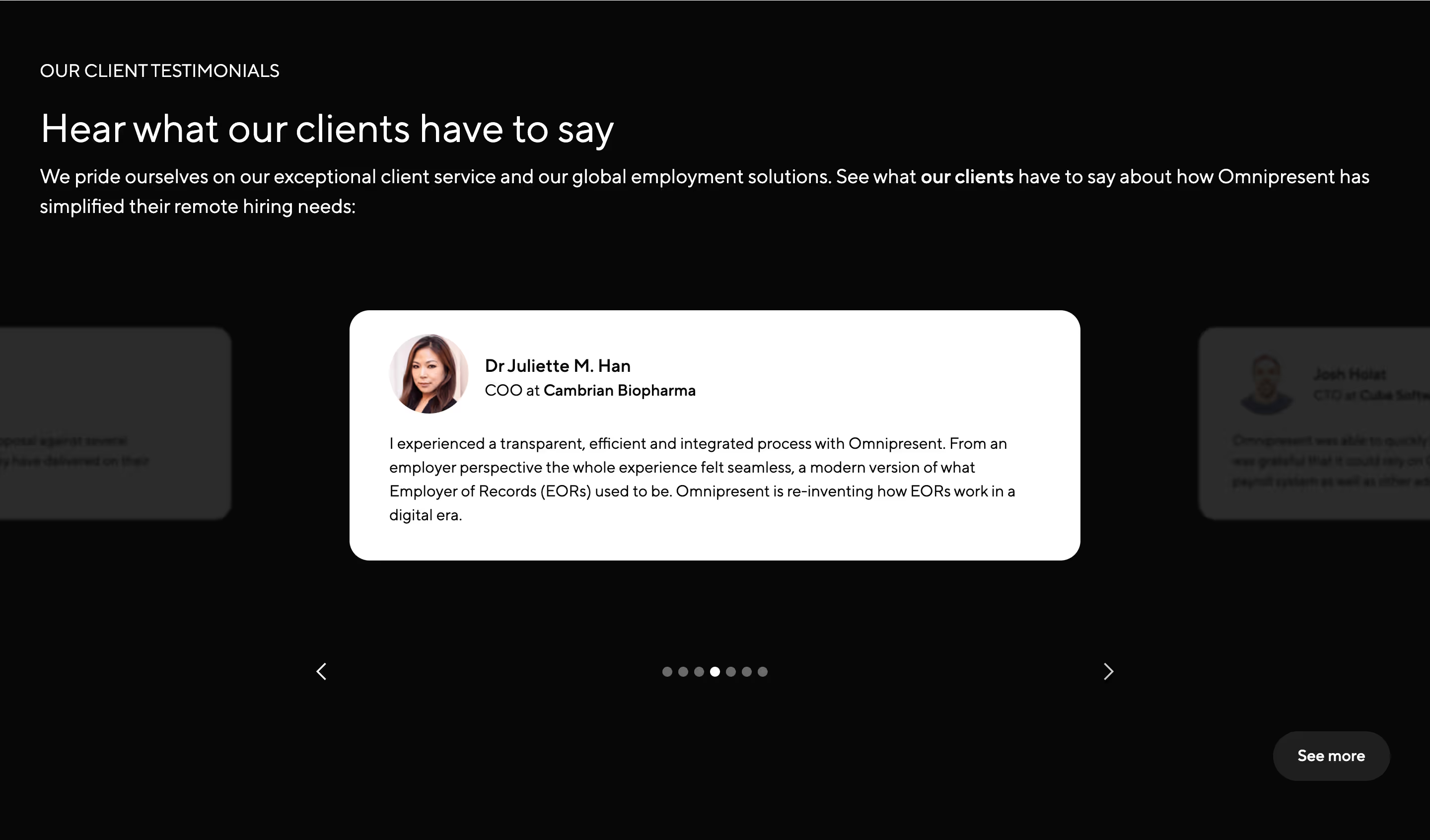
To continue building trust, we cite testimonials as more social proof. The quotes are taken from reviews. To provide more authenticity to the reviews, we link them to the direct source in G2, a specialized third-party review platform. There are a lot of helpful quotes, and some are dense; a slider is the most efficient way to keep them compact.
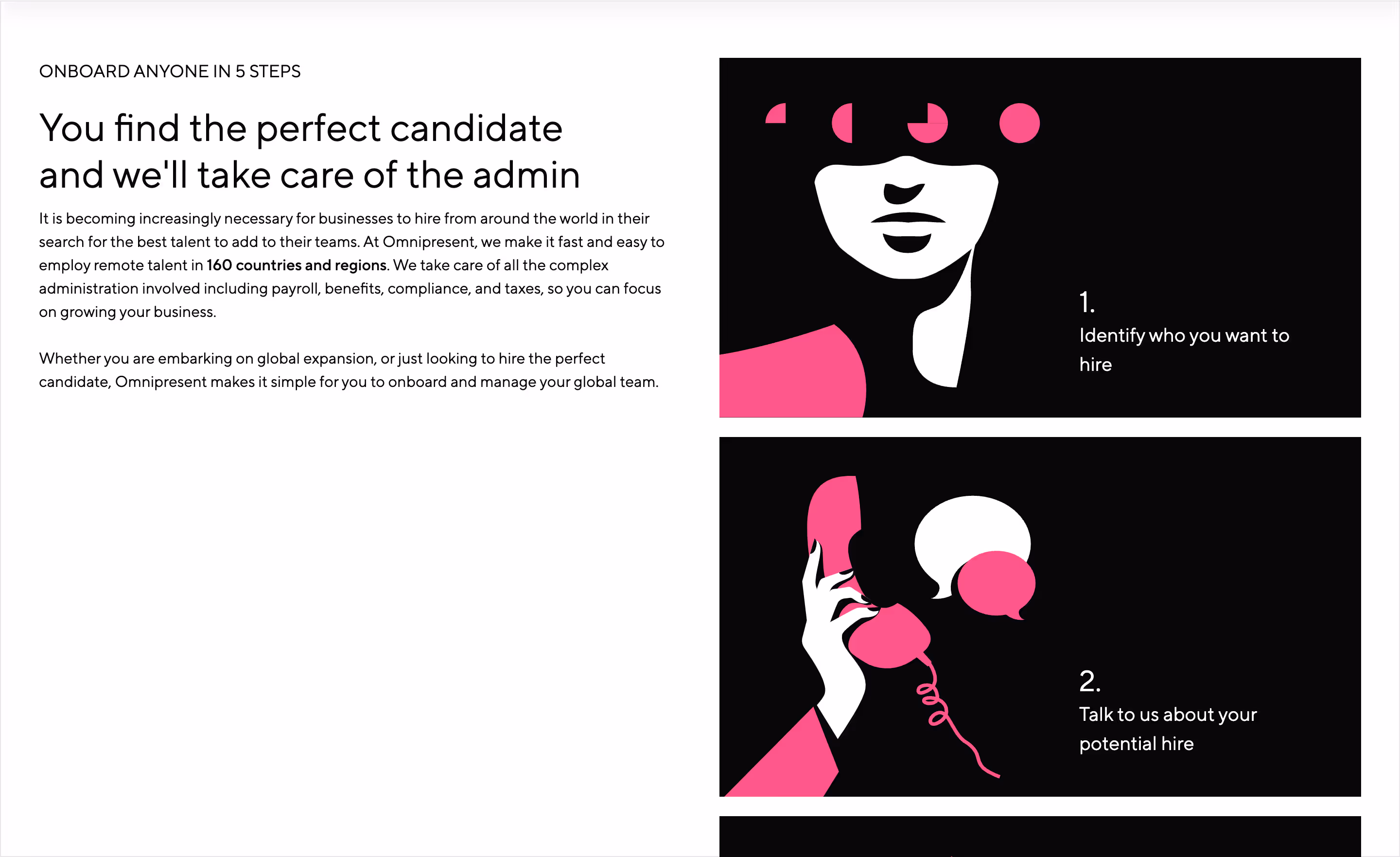
Adopting a new platform could be daunting, especially for employment. Setting expectations is essential to making the process less intimidating. The onboarding tour section helps us showcase the steps, familiarize ourselves with the process, and start seeing the value.
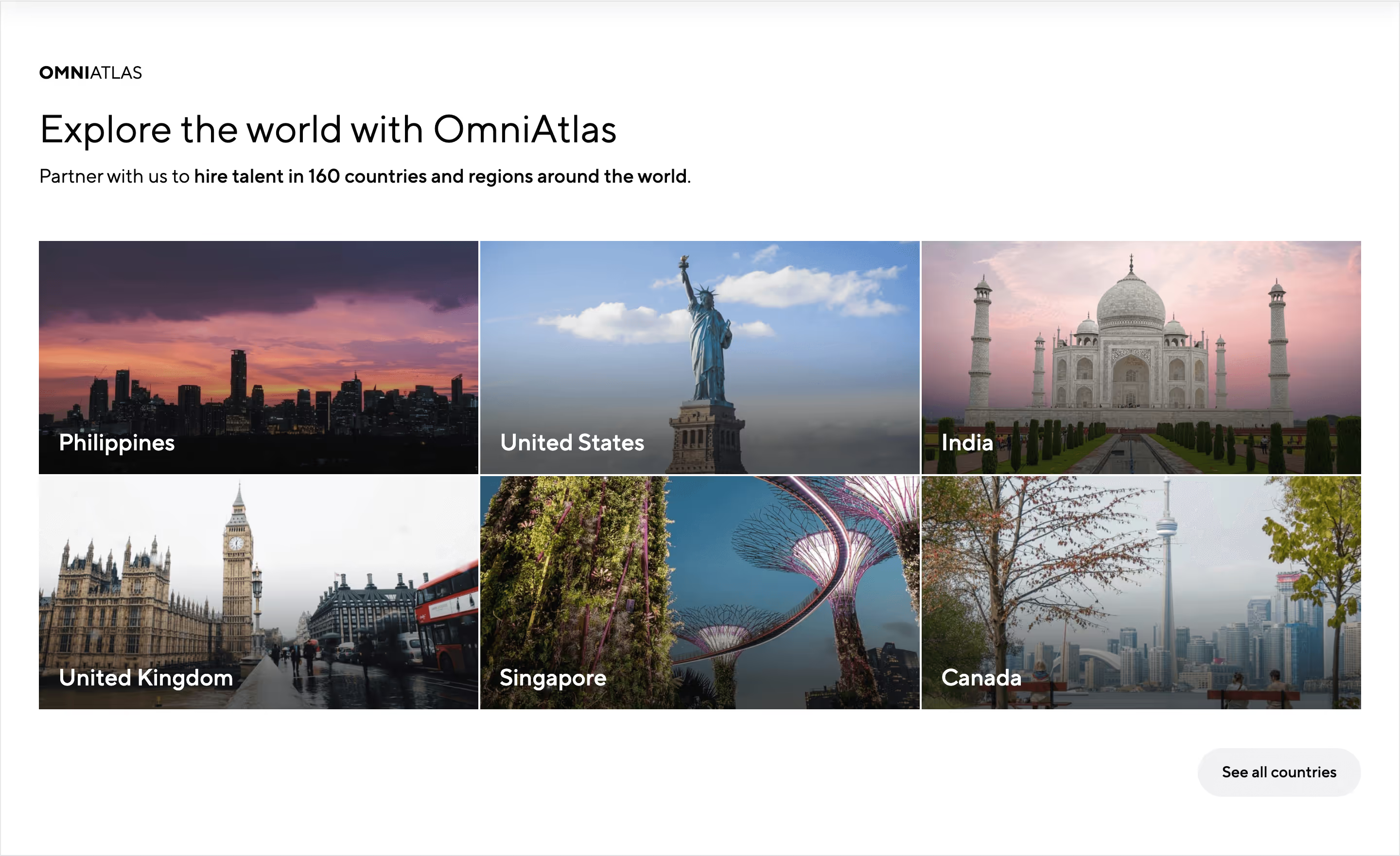
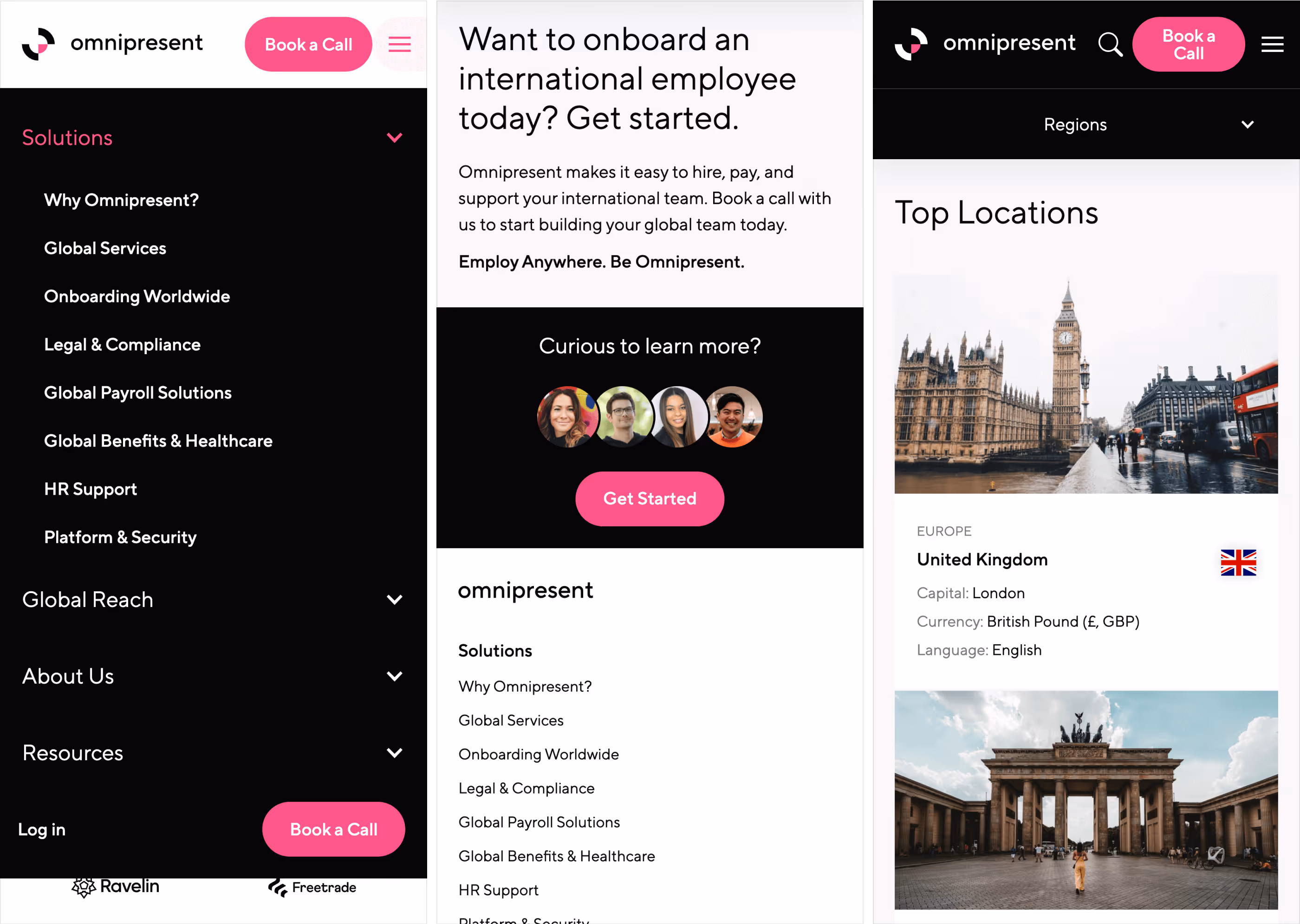
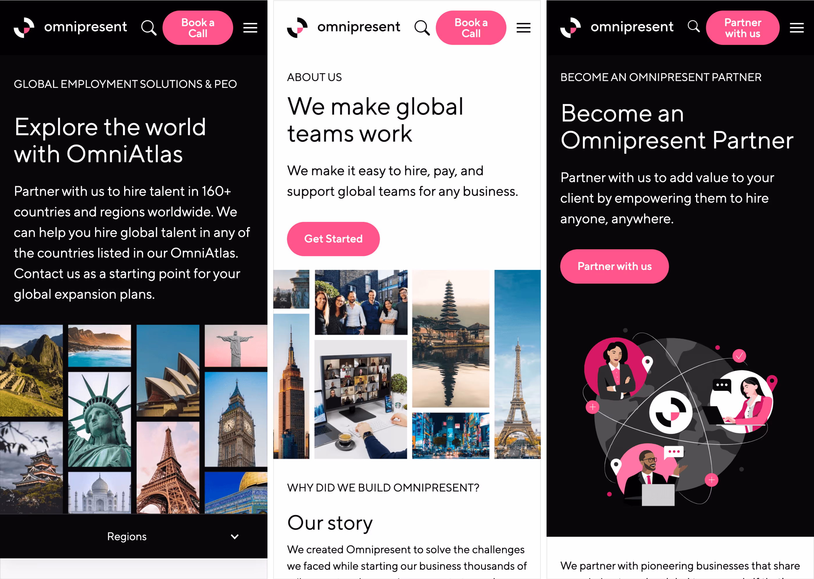
Navigating where to hire globally is complex. The legislation and culture could be very different. Until now, OmniAtlas, a library of all the information about employment in each country, has been used as an internal tool. The information from this tool, which is in a different format for internal consumption, has been adapted for non-technical readers to be published on the website. The home page has a callout to link to that dedicated experience.
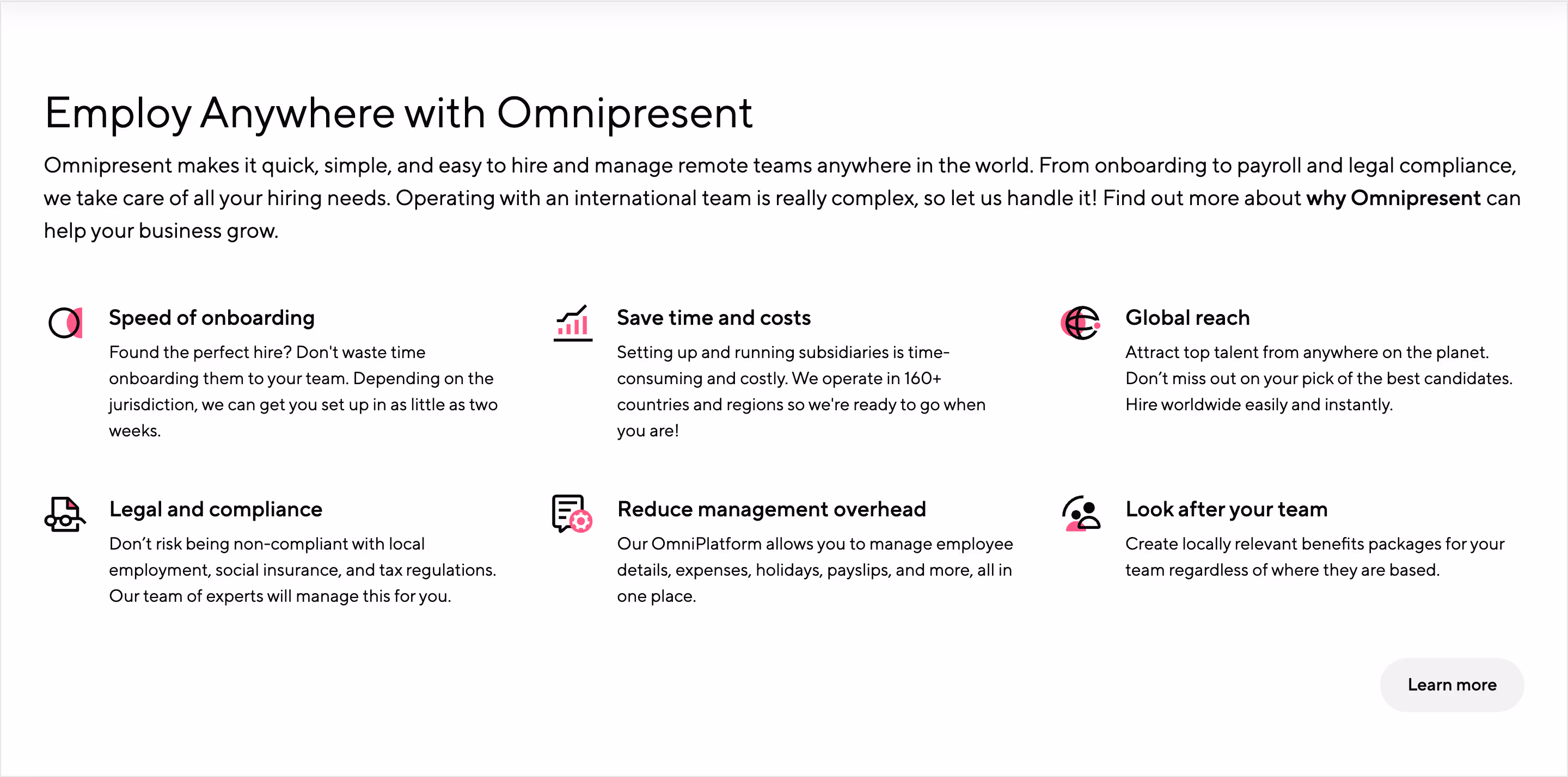
A summary of the benefits is included in an icon badge list on a grid to summarize the value proposition.
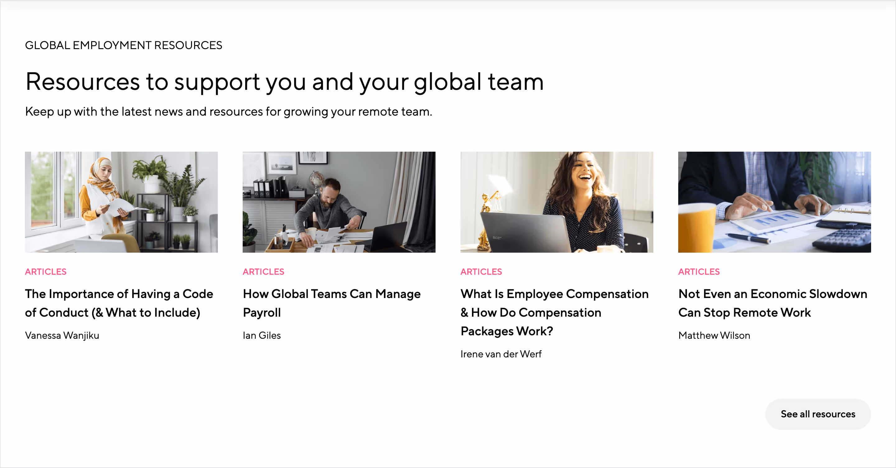
In addition to the rebranding and more comprehensive pages, the website will house the dynamic content that will be created more frequently. There is so much to cover in many different formats that a center needs to converge and serve as a starting point. The resource hub is this new place, and the home page will feature the latest content to drive traffic there.
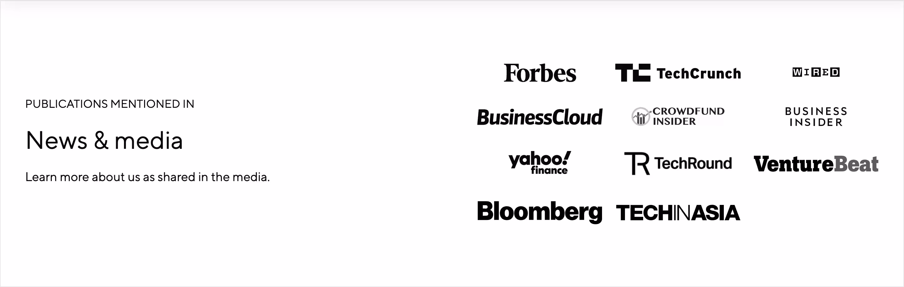
In addition to the trust logos of existing companies trusting Omnipresent to hire globally, the media coverage by prominent media outlets is another form of social proof, and we showcase it on the home page, too.
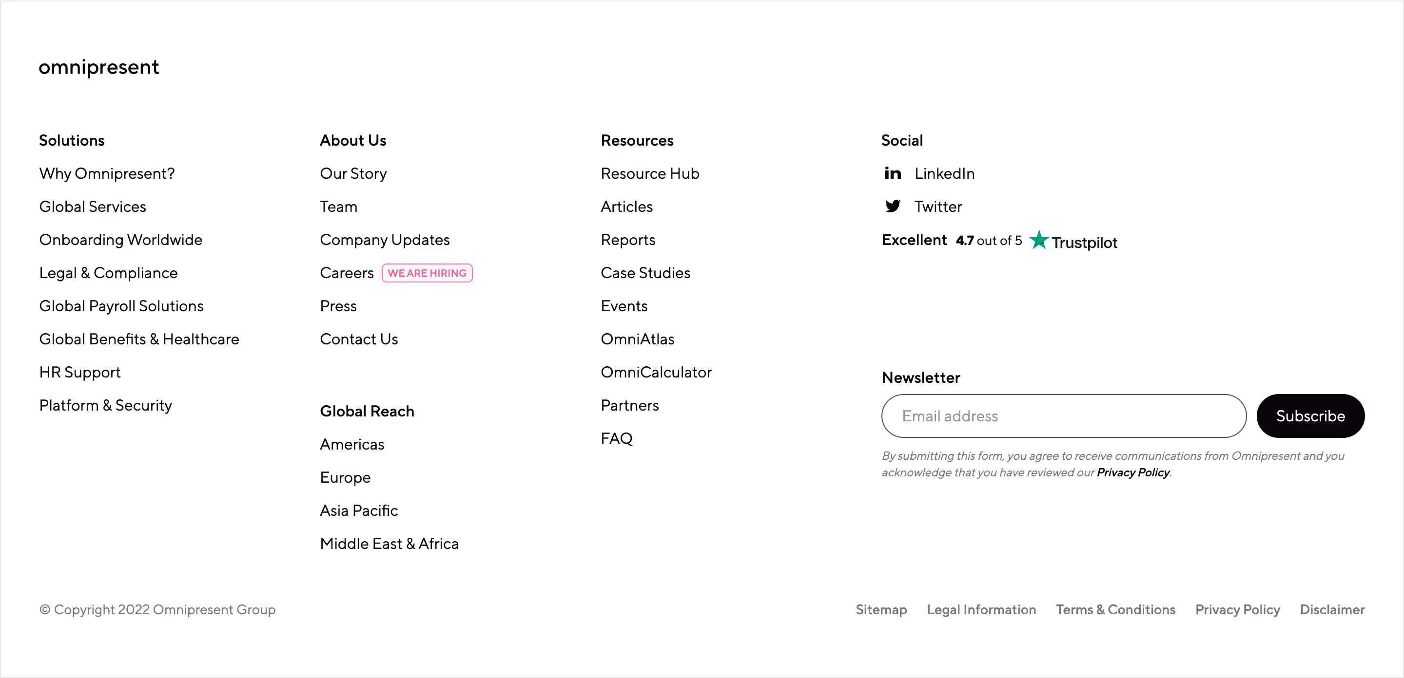
Finally, the end of a page has the usual closing footer. As a utility component, the mandatory elements include legal info and links and usually mirror the top menu navigation. We take it further with the rating from Trustpilot; we have already shown reviews from G2 on the slider. In addition to the global navigation, contact info, and social media links, we have added a newsletter sign-up form.

The Solutions page starts with an illustration-based hero section and a sticky sub-nav bar listing the services.
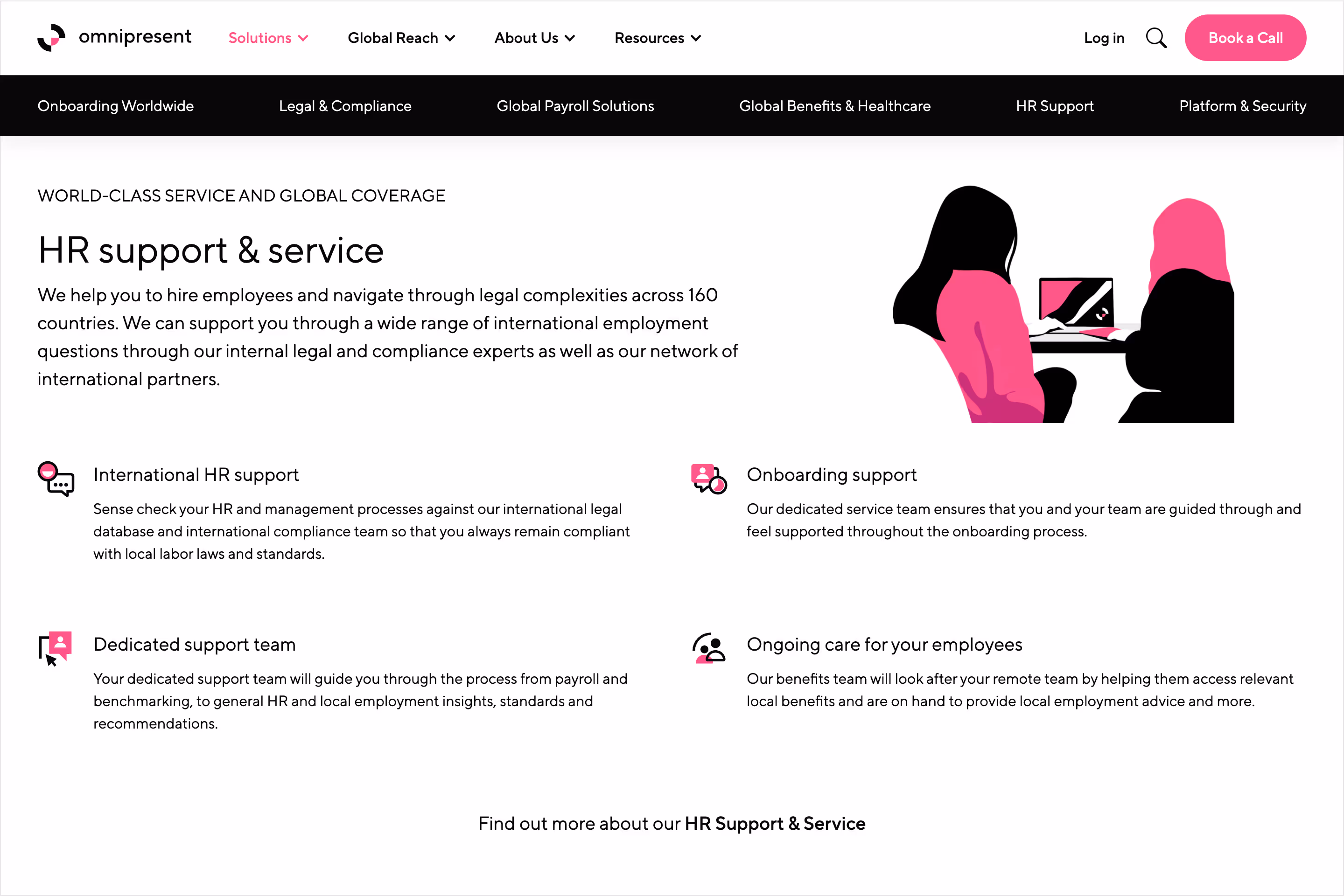
Going into a specific service will appear more details, a complementary illustration, and a feature list on icon badges.
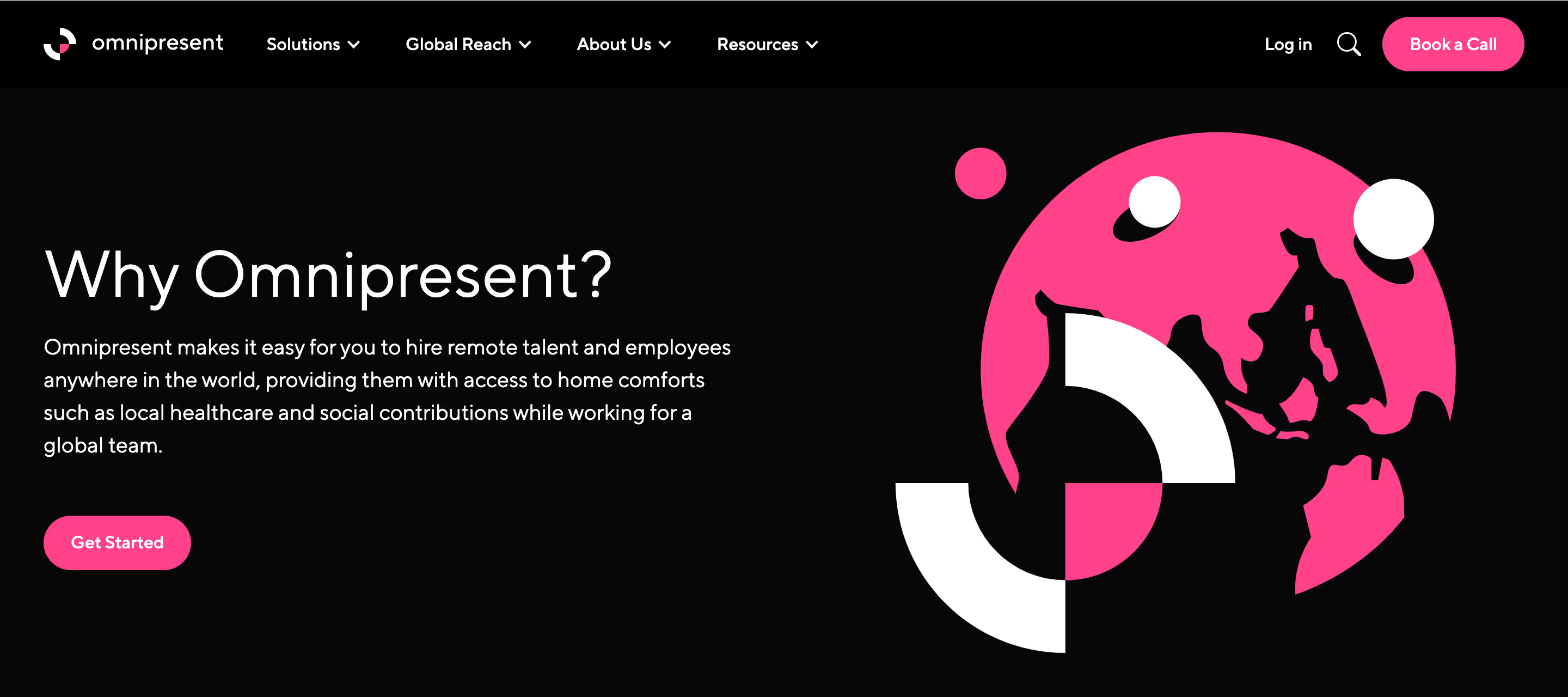
Taking a step back, a more holistic approach to the value offered by Omnipresent is covered on the Why page. This is more high-level and covers the benefits instead of getting technical with features. The hero uses an alternative version with a black background, and the elements remain similar to other illustration-based hero sections.
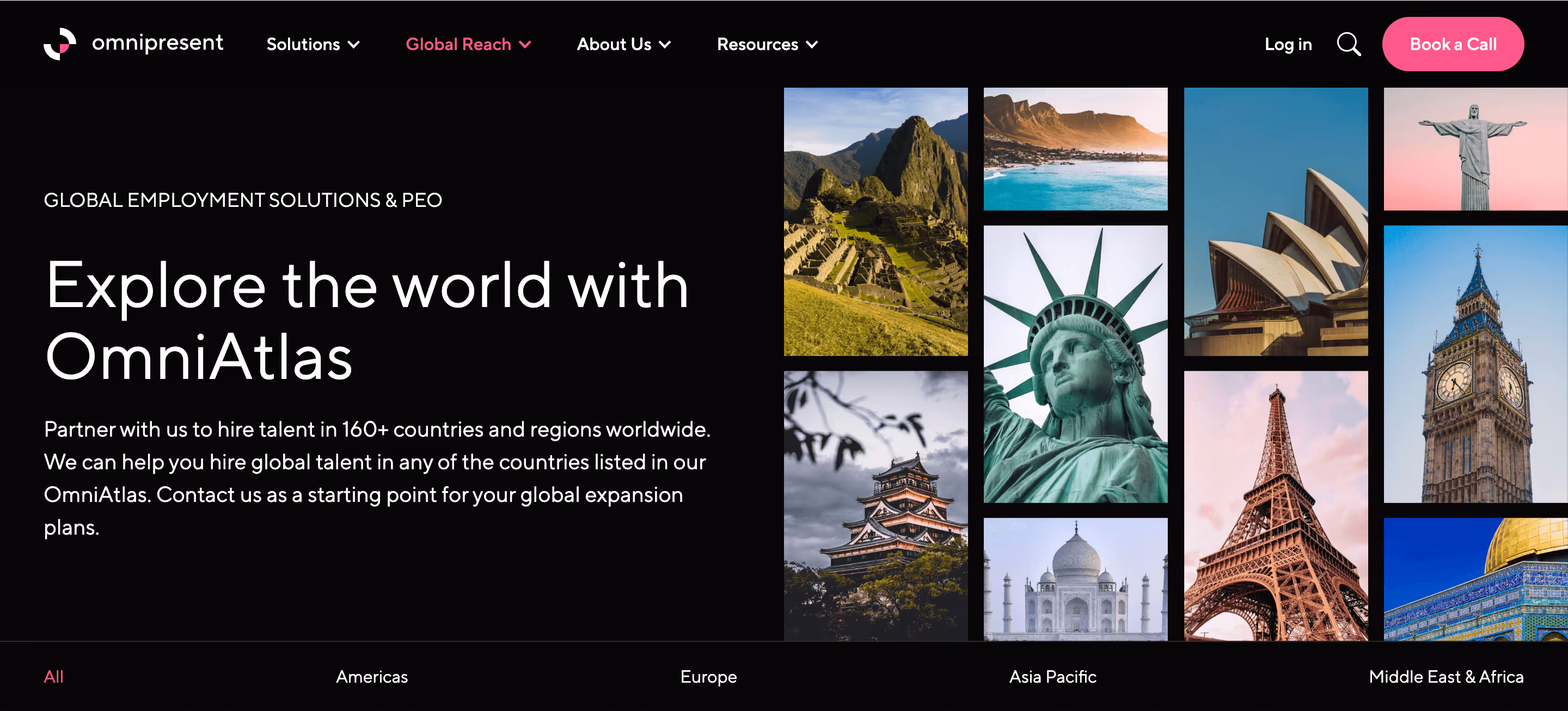
The OmniAtlas page's black hero section introduces a collage composition with a straightforward grid layout. It also has a sub-nav bar for territories across the globe. The content here was highly curated and adapted for what could be publicly disclosed, with SEO in mind to promote organic reach. It would not have been possible without Nikoo Sarrafan, our expert who led this monumental task alongside the legal and success team.

The front page of OmniAtlas will feature the top locations, which are the most popular countries for which the companies are hiring.

The country page for OmniAtlas was more information-dense. The hero section had vital information relevant to employment in that country. It also featured photography of the country's landmarks and official flag.
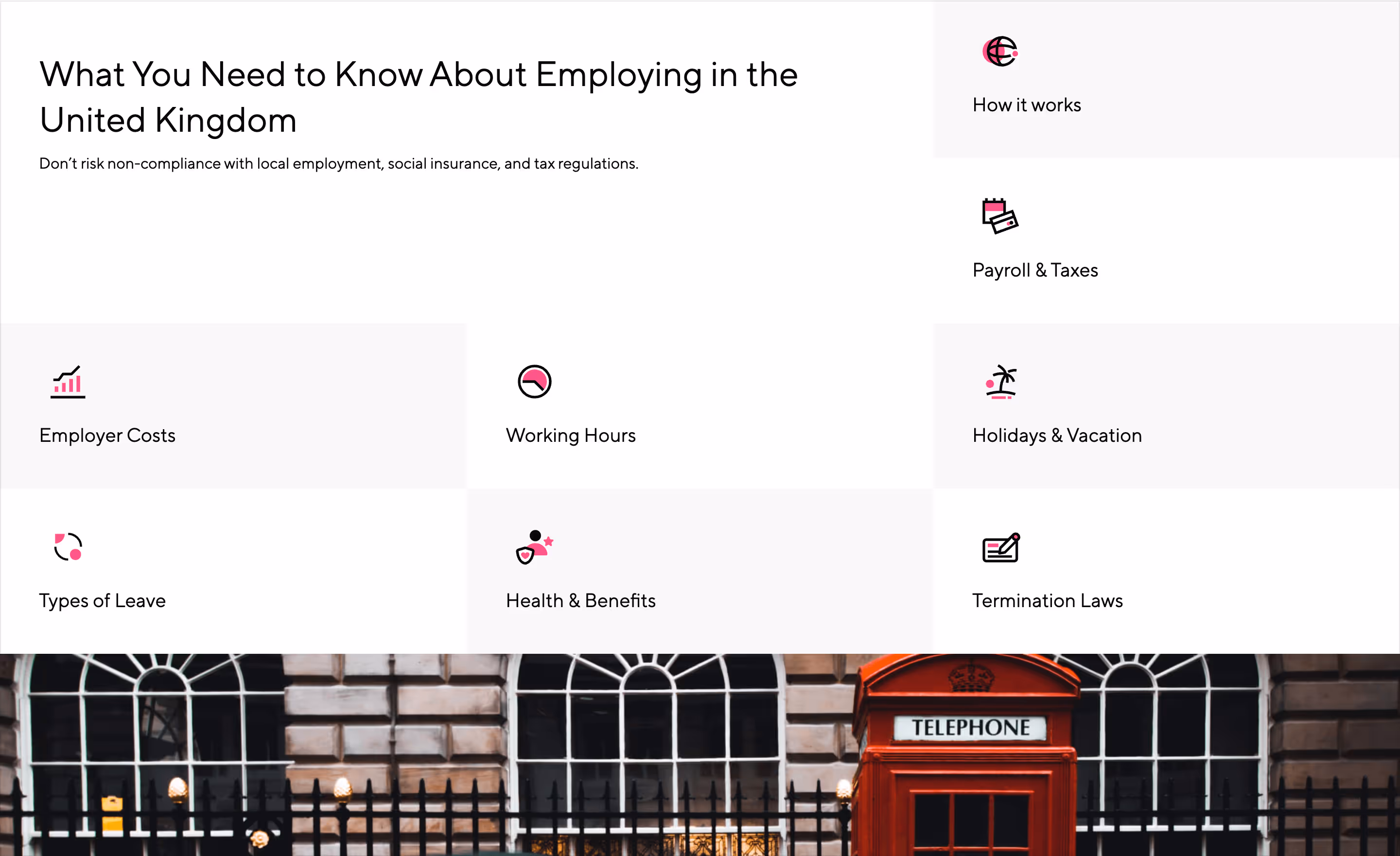
The country pages have a consistent structure and need to cover the same topics that impact how people are employed there. After the hero section, there will be a table of contents with an index of all these individual sections. Each section will have an icon and, for the detailed part, a photograph of a country's landmark.
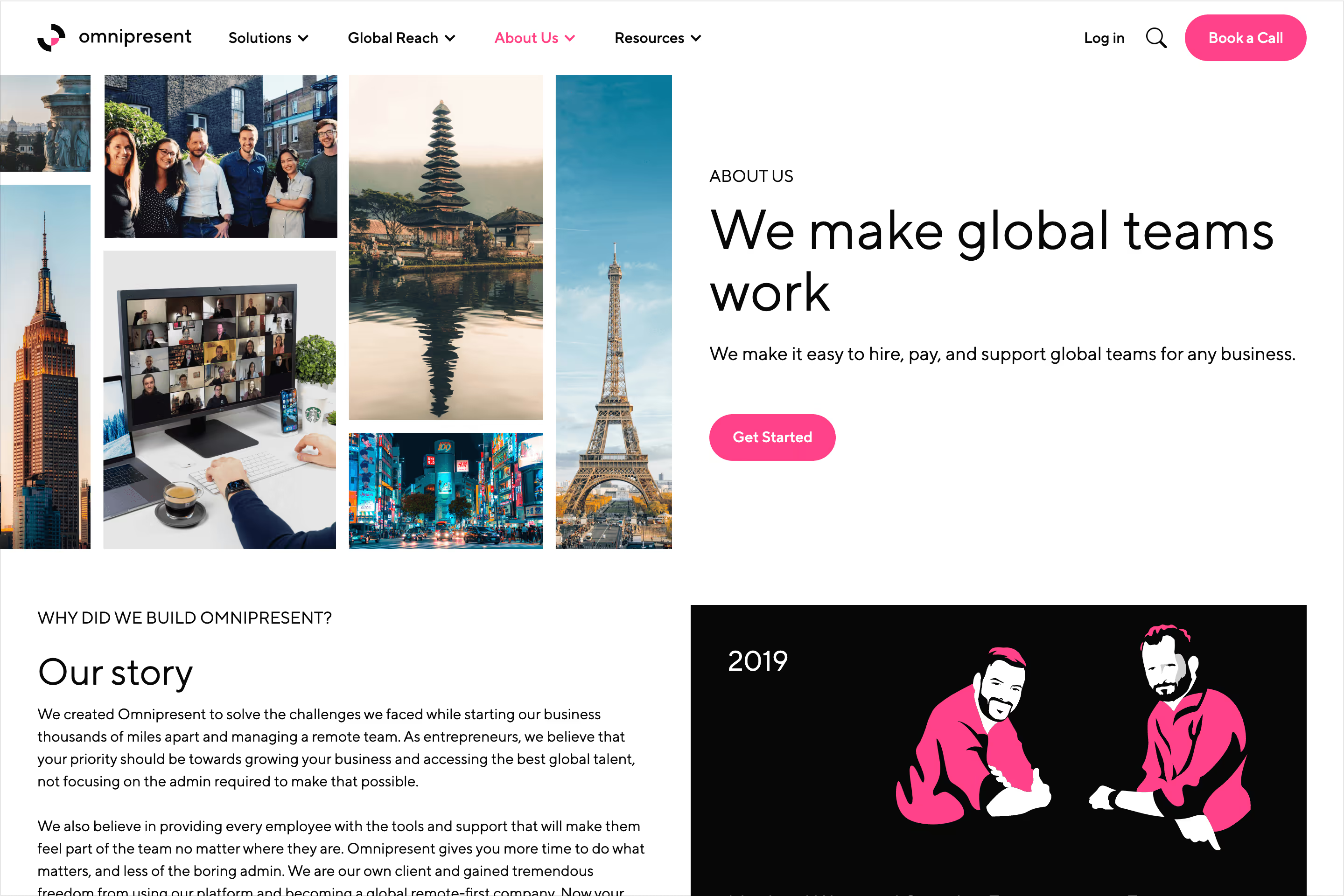
The About page returns to the lighter version and includes a collage grid. In this case, the collage portrays a little of everything: product, team, and the world. After the hero section, a story section will be a comic strip-like experience using illustrations to narrate the timeline of Omnipresent's current state.
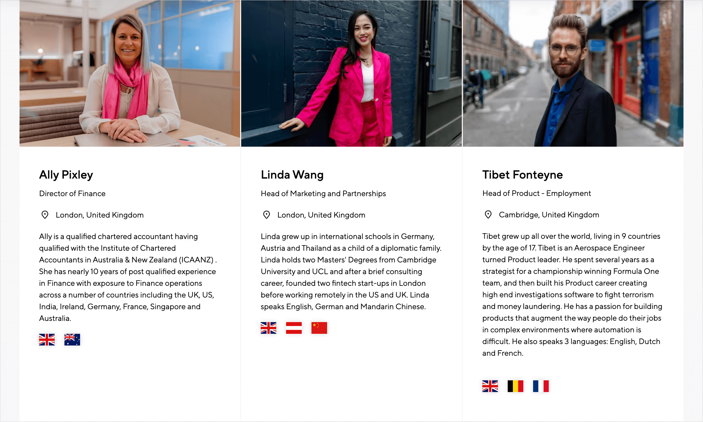
Everything is about people. The primary hero and call-to-action section highlights real people who are company employees. The About page has a dedicated section to showcase the leadership team; by now, the company's hypergrowth will make it hard to include everyone. The team members here have been part of the photoshoot in London and have fantastic pictures. In addition to the photo cover, it will portray their name, title, primary location, bio, and flags for a combination of languages and nationalities.
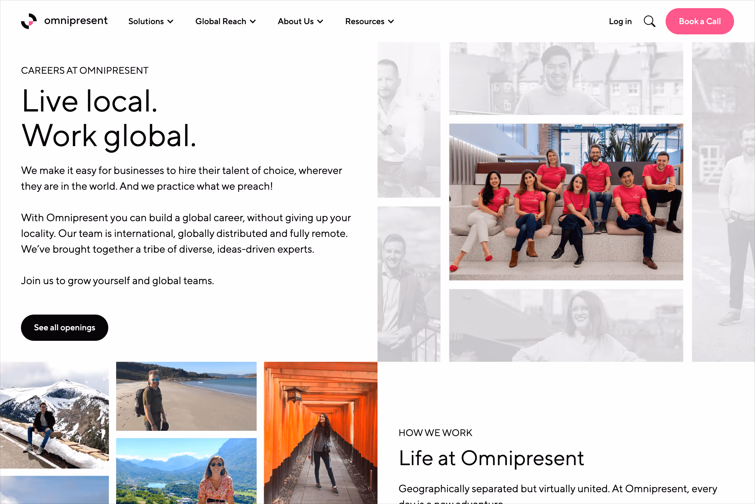
The Careers page takes a similar approach to the About page. The collage in this version focuses on the middle tile and mutes all the rest. The image in the spotlight is a team photo; individuals surround it. After the hero section, there is one more collage with more relaxed shots taken by employees about their moments working remotely.
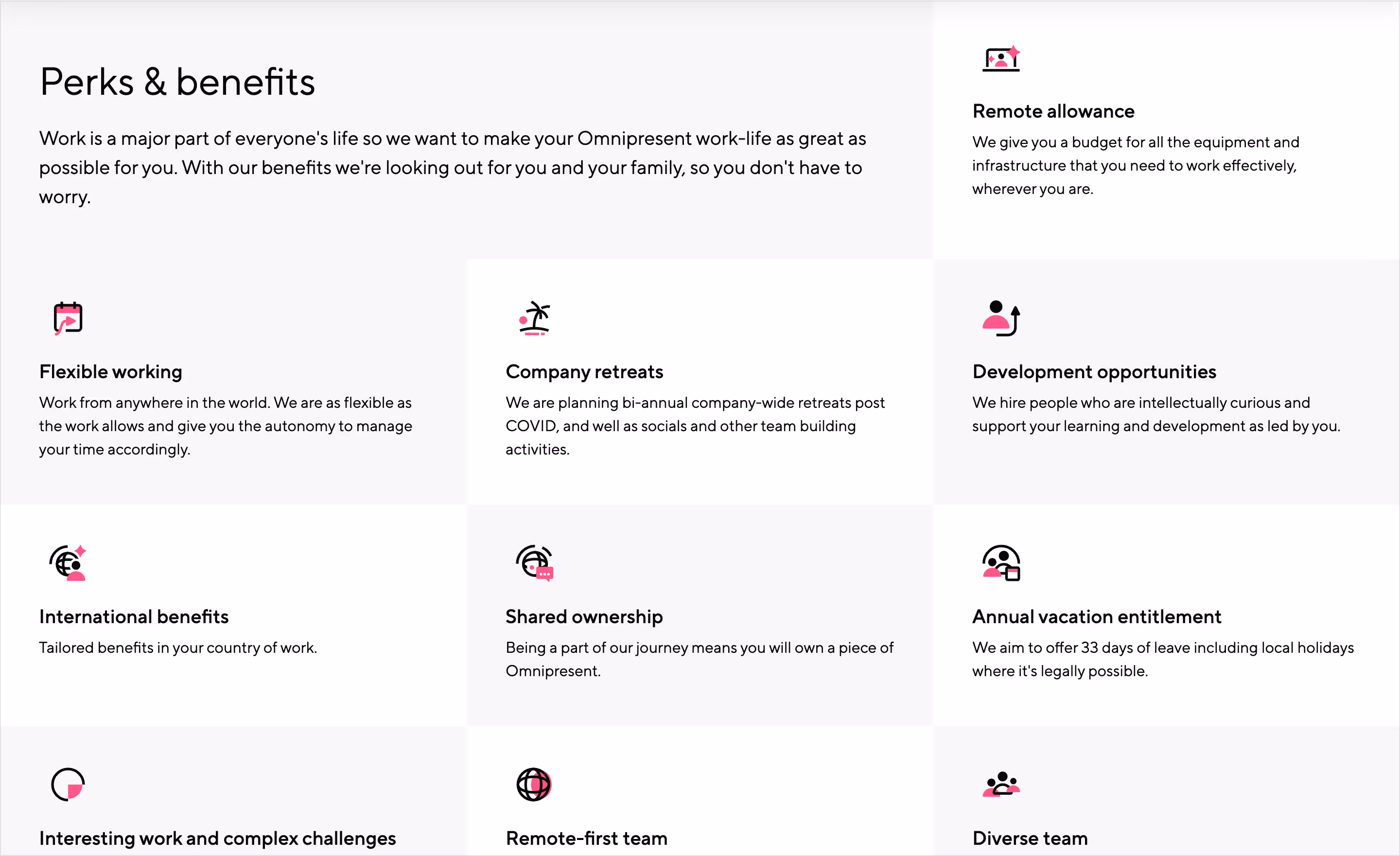
Introduced on the country pages of OmniAtlas, the table of contents grid can also be used as a list of icon badges. This provides a rich summary of the perks and benefits employees enjoy.

By now, the resources hero section looks very familiar: black background, sub-nav bar for each type of resource, and a collage grid made of post covers. After the hero section, featured pieces for each resource's type are featured.

Another widget like OmniAtlas will be OmniCalc. This global employment cost calculator widget will be added to the website after the launch. More on it later.
After the initial launch, more pages will come, and the foundation we built will prove to be strong as it supports the rapid development of new pages and features for the website. It also allowed illustrations to evolve and get a more refined style, introducing more tones but sticking to the core palette.
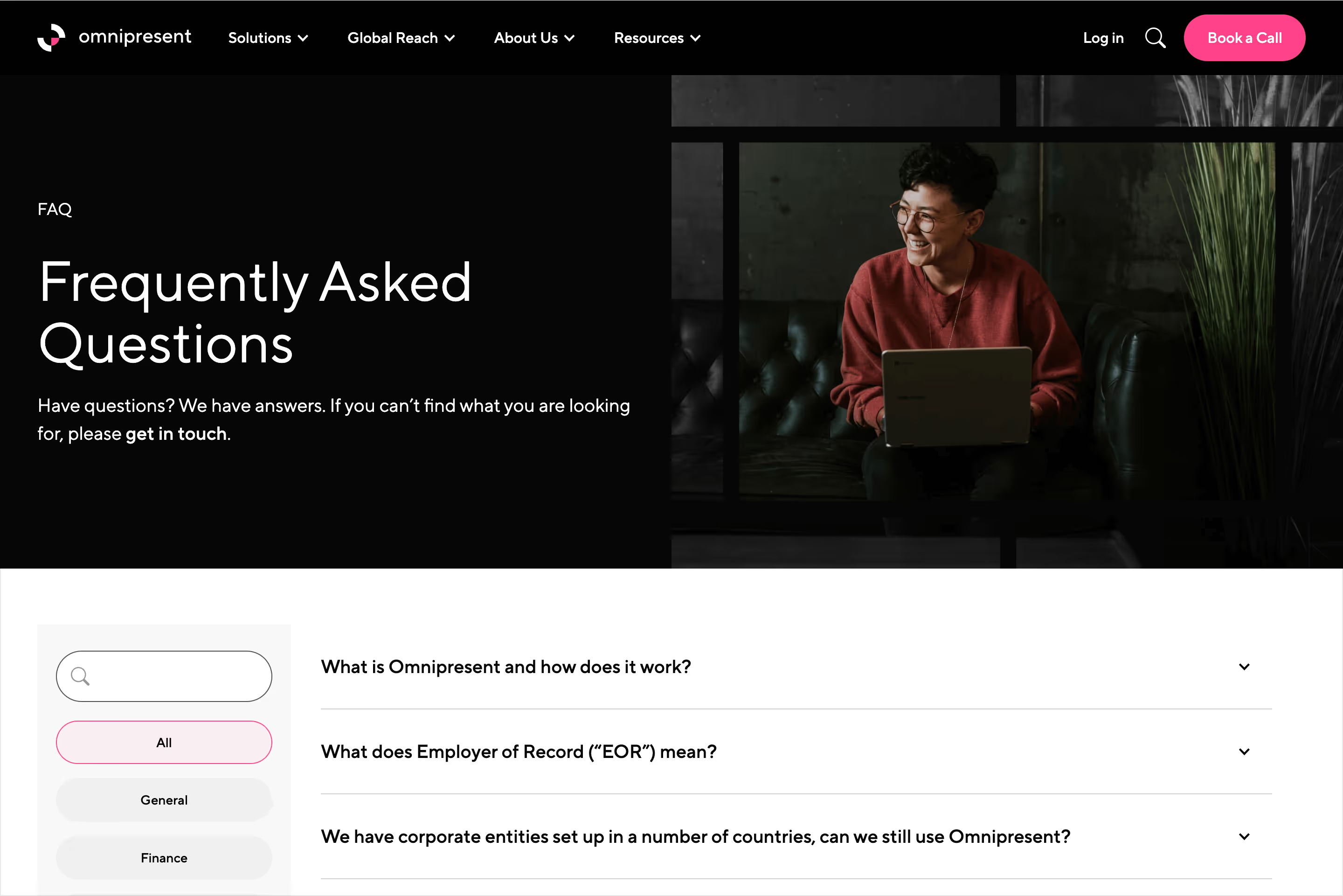
Not only were pages added after launch, but they also evolved as we added more features. The FAQ page is an excellent example of how we launched an extensive page with an accordion grouping of questions and answers to a local page search engine with tagging filters.
Either a page, section, or feature for a website of this scale to house all the content from static and dynamic pages, we made sure to create the structure and components that keep consistency and speed up development.
We had an idea of how the sections and components would transform, and Webflow is a visual development tool that makes it faster. The flexible layout on mobile allows minimal adjustments that feel natural.
The navigation on the top menu is collapsed by default under the top-level nodes. Expanding these will reveal the links within only one level deep; no extra expandable panels are present. These panels allow touch-friendly buttons for toggles and links, making the menu scannable. Sub-nav bars will turn into dropdowns for more straightforward interactions.
With the less real-state on mobile, the hero sections will prioritize text content to lead the page. Alignment will keep the left on brand, and imagery such as collages and illustrations will go full width.
For the more dynamic hero sections featuring rich content, the elements are stacked to allow the text part to grow freely.
In addition to building the website visually with Webflow, we follow the standard best practices for SEO, including performance, speed, semantics, and asset production.
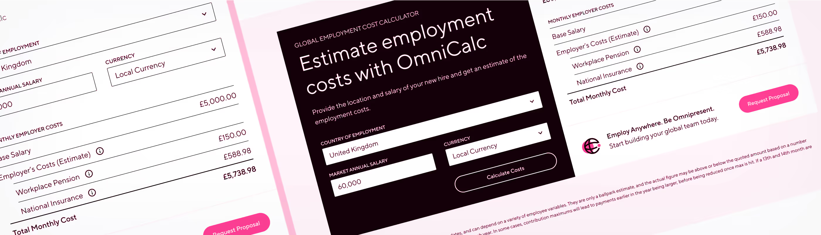
The OmniCalculator, or OmniCalc for short, is a global employment cost calculation widget used internally and externally to determine the feasibility of hiring someone or assigning salary compensation.
The initial tool was created only for internal use; back then, it was a spreadsheet with comprehensive rules and validations. The international expansion team developed this tool in the spreadsheet, and we worked together to elevate the experience and portability.
We needed to publish it under the website's resource hub and allow internal users to migrate from the spreadsheet to a version multiple people could use simultaneously.
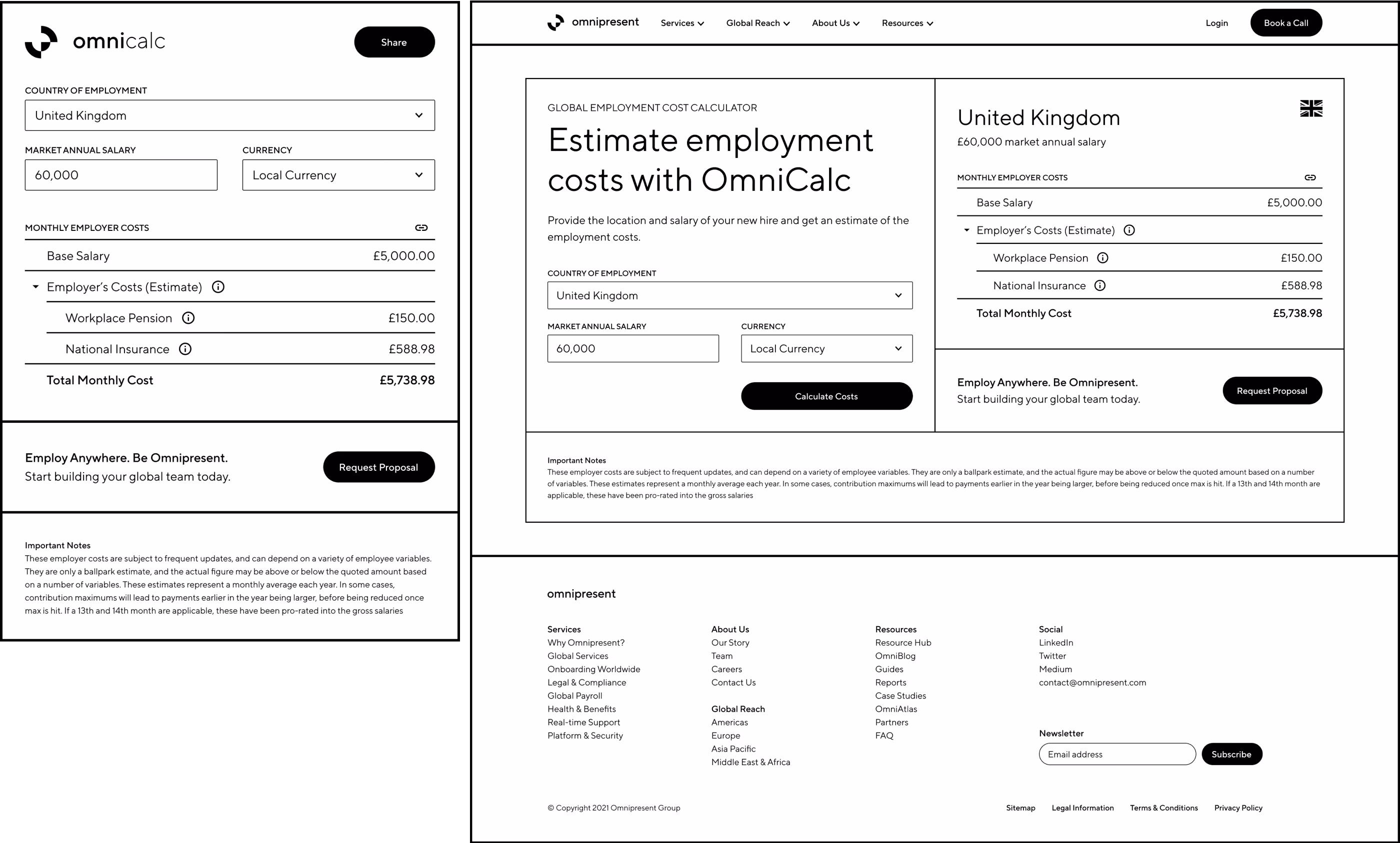
The structure would be straightforward. After a few variables regarding location and salary are set, a complete employment cost breakdown will be provided. The internal version will have all features unlocked, while the external public version is lighter and aims to provide an estimate. The public will also live under the marketing website's frame on each page and, in the future, embedded in articles and OmniAtlas.
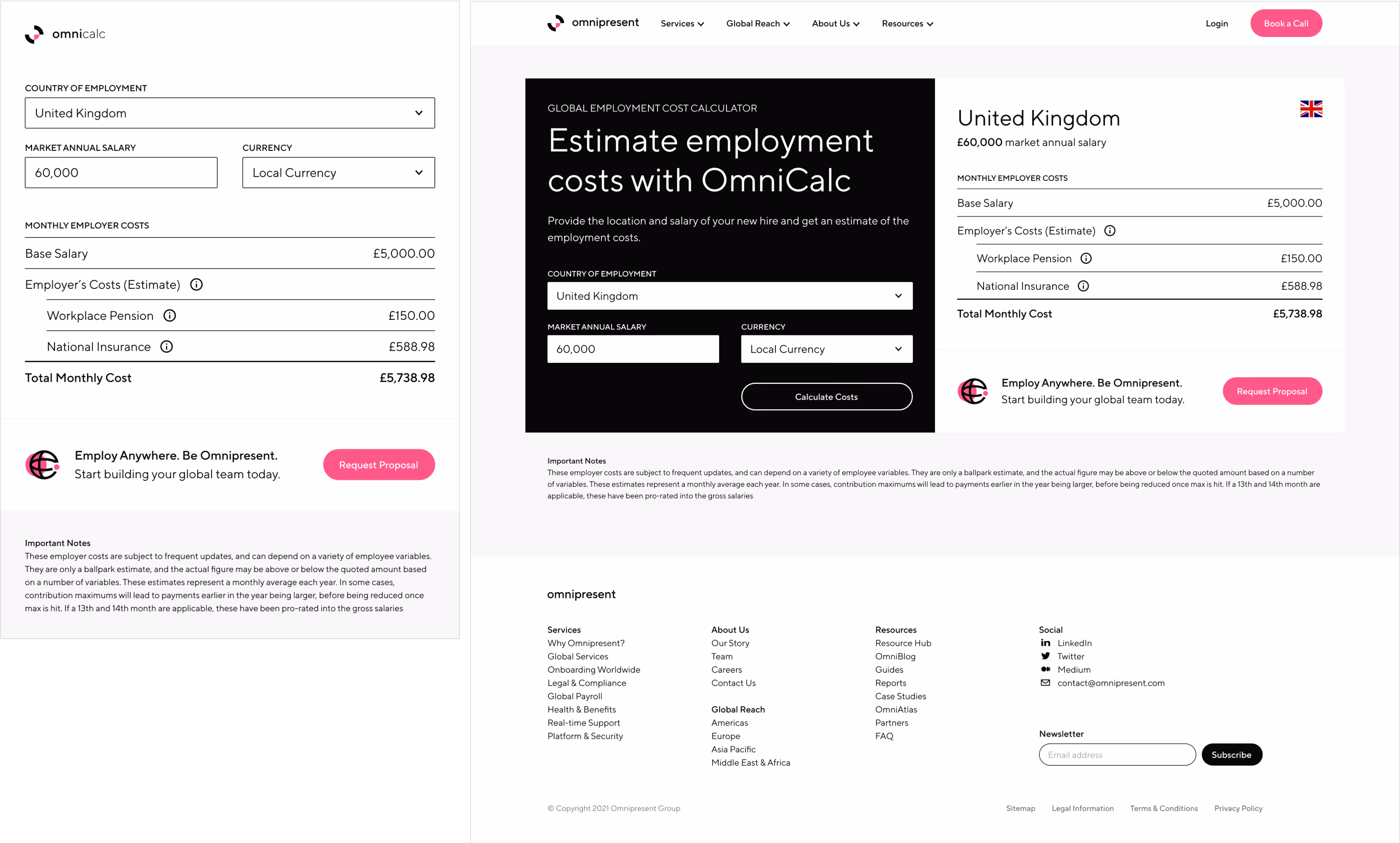
The widget was an excellent opportunity to showcase a proper design process with visual research of boards, UX design of wireframes, visual design of high-fidelity mockups, and development documentation. We leverage no-code tools for the stack and deliver quickly within a quarter. Just like a standard Model-View-Controller architecture, the widget will follow that structure. The database was on Airtable, the logic was in Autocode (deprecated) with a functional and documented API, and the interface was in Webflow as usual. Additionally, due to the elevated experience for internal and external users, the widget allowed the engineering and product teams to take it as an MVP for migrating to an internal codebase.
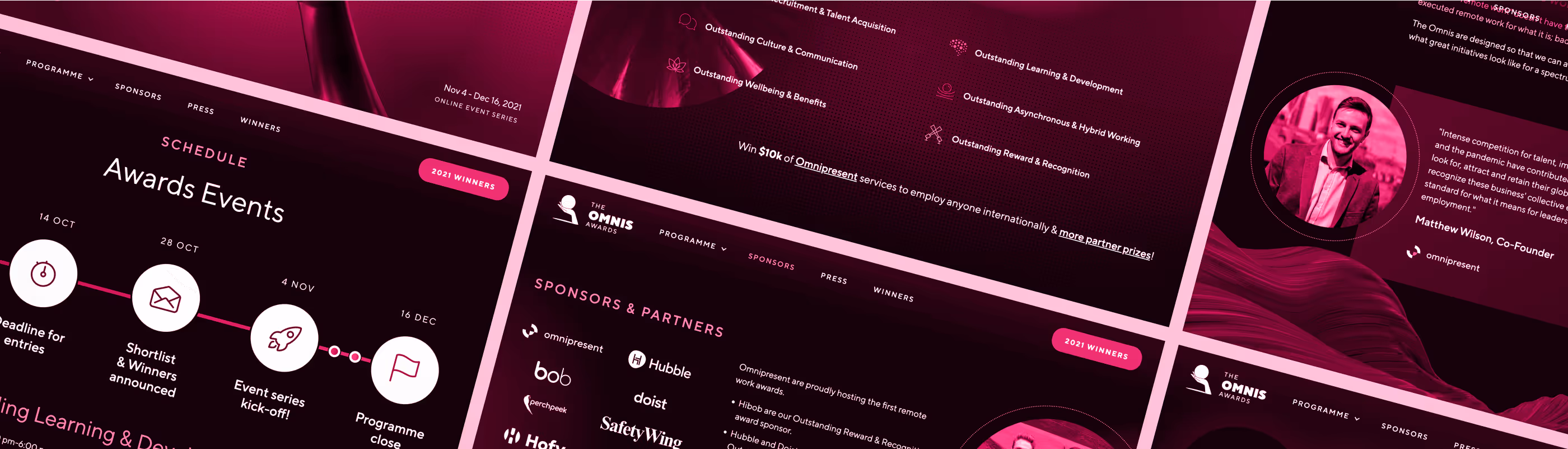
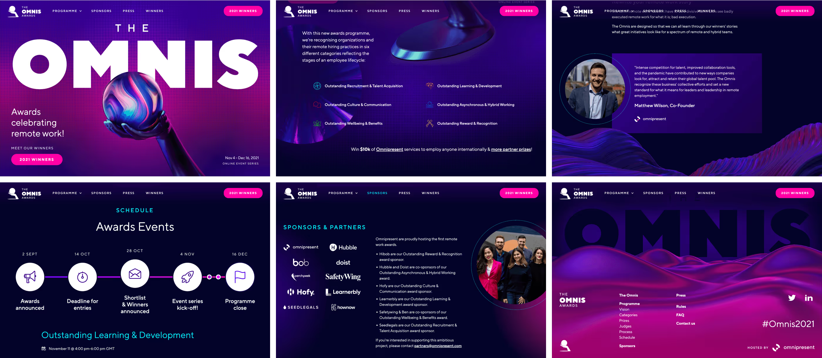
After over a year of uncertainty driven by the pandemic, we've been forced to rethink how we work. As a global employment services partner, Omnipresent wanted to recognize the leaders in the global remote workspace. The marketing team led the creation of a new awards program, The Omnis.
The Omnis was designed entirely for a virtual, global environment, allowing entries for employers in any country with remote team members based in other countries. In addition, the award ceremonies are divided into six individual and interactive online events to feature remote work success stories, discussion rooms, and on-demand learning opportunities for global audiences.
This ambitious global online event required specialized capabilities we didn't have in-house. Not directly tied to our company brand, we had room for creative freedom and exploring different visuals for a sub-brand. We worked with an external agency to host the event and produce the necessary resources for the campaign.
We aimed for a heroic concept as a nod to the efforts made by leaders during these difficult times. Keeping the global element was essential to acknowledge its impact. The trophy could be a hand holding a globe to symbolize this global element.
The agency delivered impressive architecture and logistics. Even when we had creative freedom, the sub-brand and digital presence had a pop-art style that fell into needing to be more geeky and way off-brand. We had to get hands-on with the design to rectify the direction less than a month before the official announcement.
Taking advantage of this project's creative freedom and in contrast to our company brand, we aimed for an identity with reversed proportions without going off-brand. The styling could go from regular to irregular, light to dark, warm to cool, and neutral to bright while keeping our pink accent, typography family, and authentic photography.
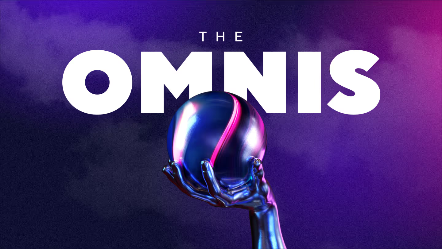
We took a more cinematic approach to the heroic concept: movies over comics. This deviates the art direction from pop art and halftones to high-fidelity and darker tones. Noise texture and blurred gradients provided a dramatic look. One of the main issues we saw in the creative from the agency was the trophy being static and cropped at the bottom. We developed a 3D version from scratch with a more realistic look and the capability of animating it. We also simplified the name from OmniAwards, which was used by the agency, to only The Omnis to provision a sense of sophistication similar to The Oscars.
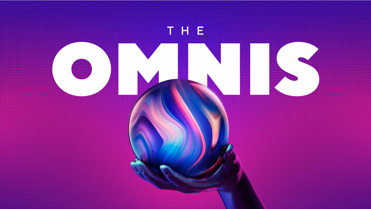
Circling back with the agency, we learned our proposal needed to be brighter but stressed out the flaws in the original creative. We collaborated to combine both directions to find the best balance for the event and the brand. Rolling back to the heroic concept, we kept in check the overuse of pop art. We ended up with a brighter version incorporating subtle halftone gradients instead of the grainy noise textures from our cinematic proposal. Most importantly, pink was predominant, and the original trophy was completed with no cropping parts.
Another missing piece of the creative was the identity. Everything was referred to the key art, which generated busy compositions and lacked consistency and portability. We developed a custom sub-brand identity for the event based on the key art.

The trophy symbolizes the global component of remote work, and we illustrate it in an iconic style to create the mark for the sub-brand.
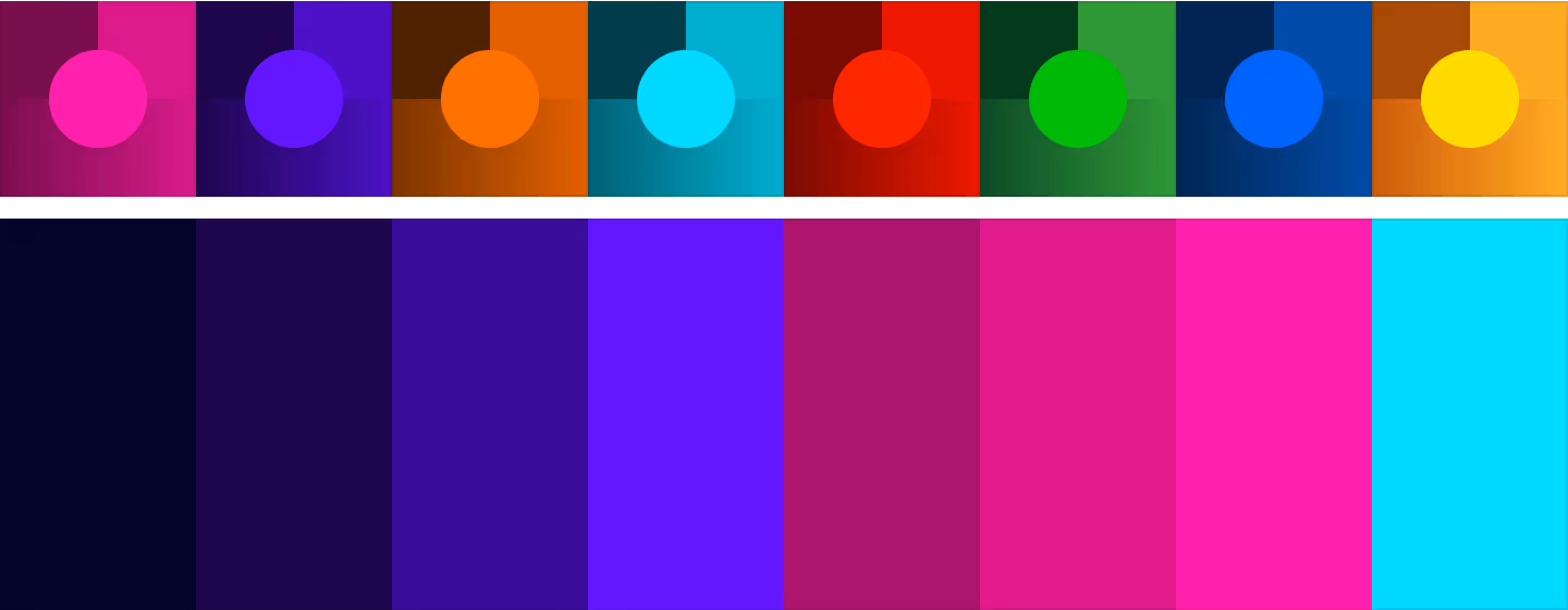
Keeping our primary pink, the extended palette had more tones than our company brand. The dark purple tones will be the base, while pink and cyan will be the accents. In addition to the palette for the interface and identity, the categories had their own color, expanding the palette even more.
With the key art and identity framework ready, we designed and developed the landing page, which will evolve into a microsite. Depending on the event stage, the CTA will change to signing up, logging in to the event platform, or seeing the winner list. Not surprisingly, Webflow was our web builder.
We approached the page as a blank canvas and built it from scratch. The composition and layout had different elements and treatments not used on our marketing website.
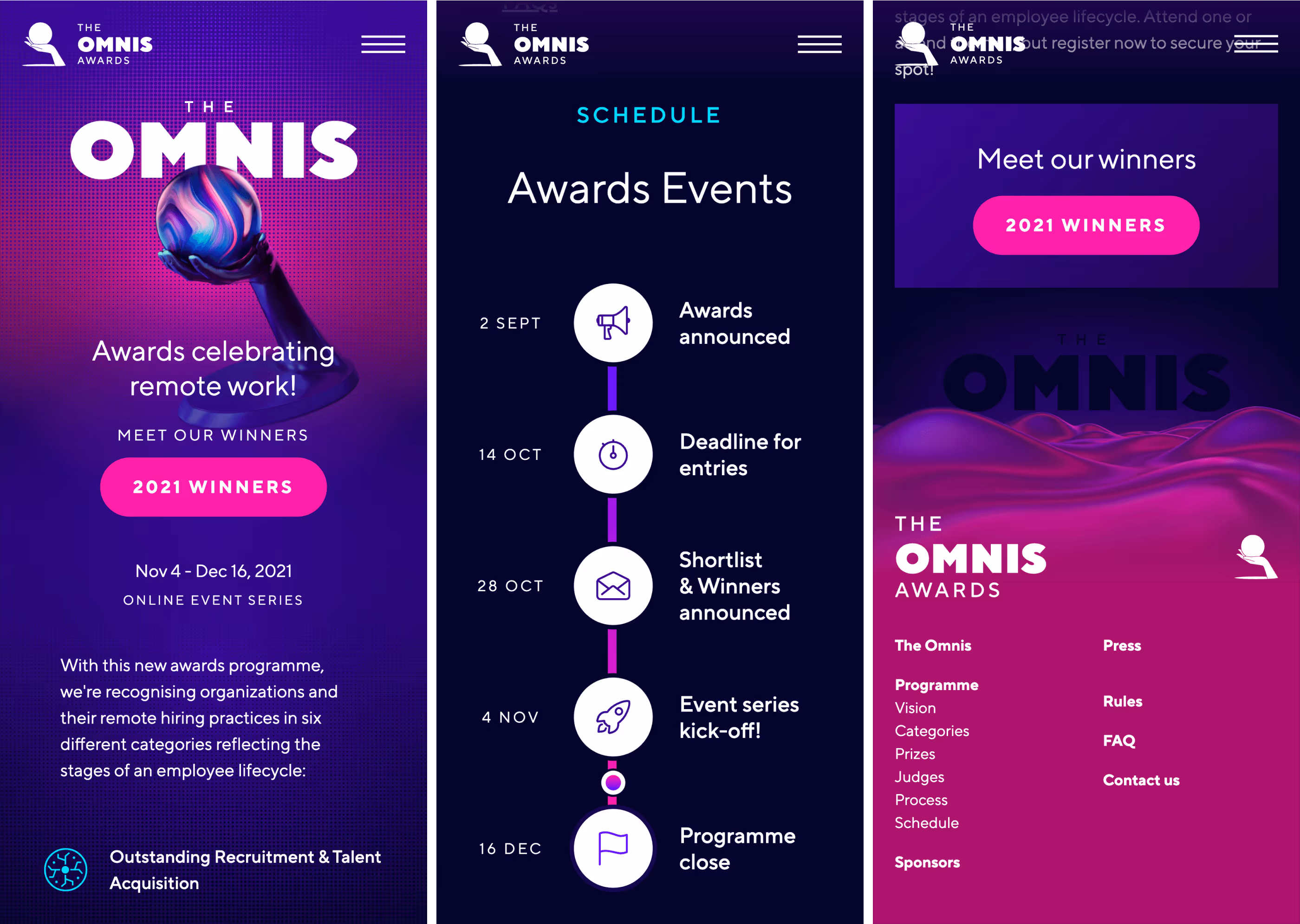
The mobile version followed as closely as possible to the aimed immersive experience on the desktop. Most indented and irregular layouts are adapted to be stacked and usually center-aligned. New elements like the timeline will turn from horizontally to vertically oriented.
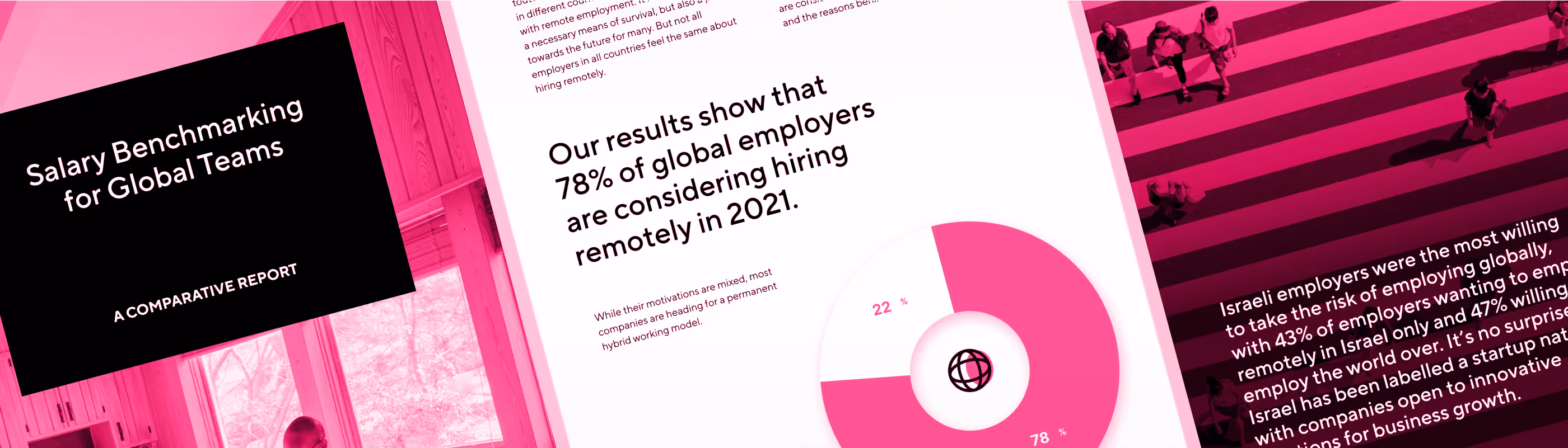
The flagship report was valuable content that quickly became popular. Before the new website, the sales team shared this report regularly with potential clients. After the new website, we shared a copy after booking a call, our primary promoted action. This is another excellent piece by Priyanka Hutschenreiter, who owned the research and content.
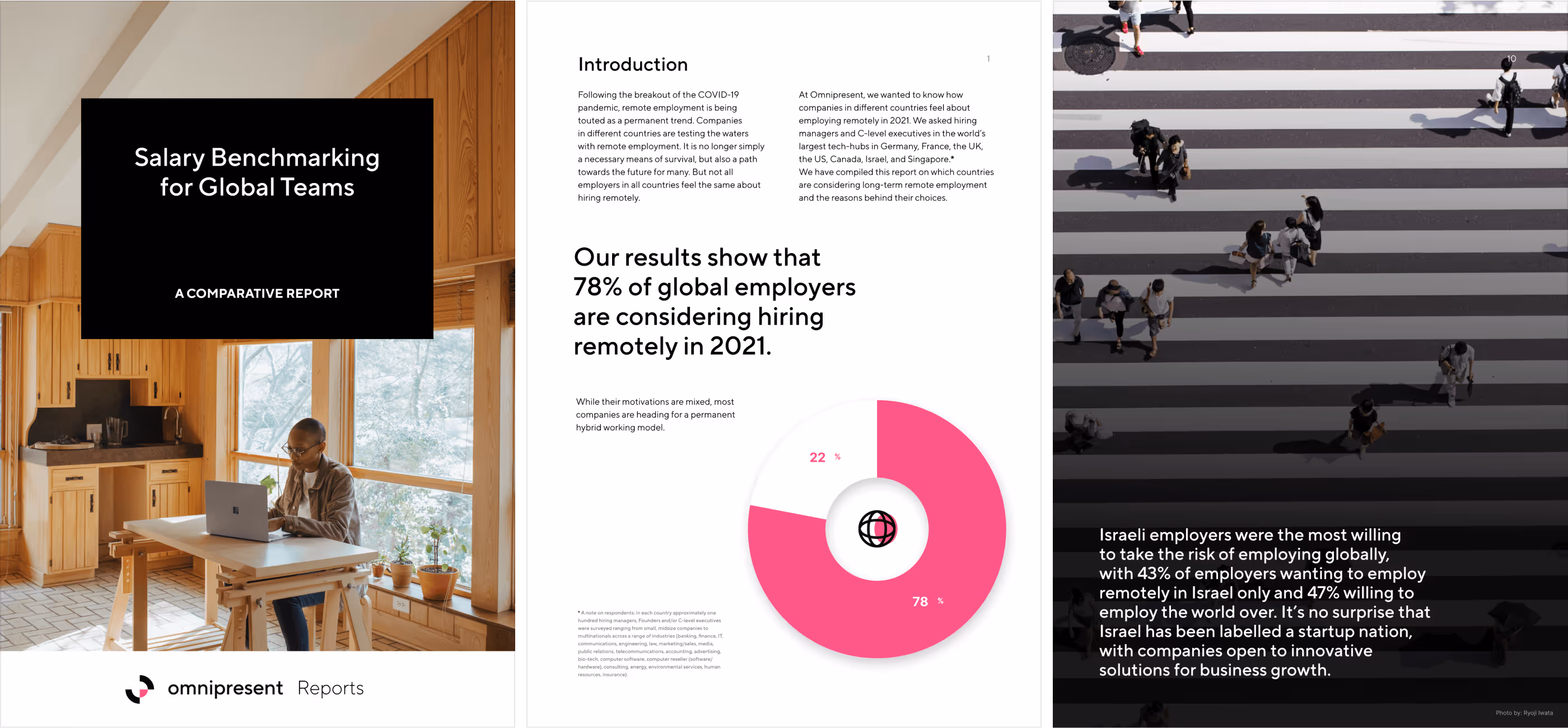
The report was in PDF format, which is convenient and portable. However, with most of our audience using laptops and working remotely in Zoom calls on and off, we wanted to provide a more illustrative, enjoyable, and immersive reading experience. The flagship report will be re-adapted as a microsite to enable the most efficient use of screen real estate while showcasing richer visuals.
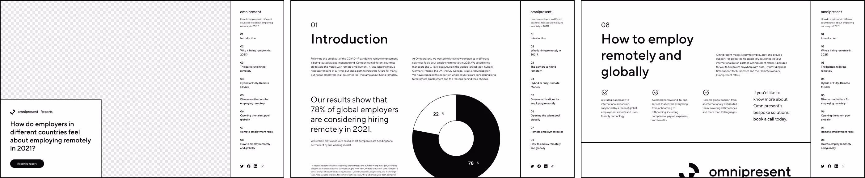
We turned it into UX design and crafted the wireframes to imagine a compelling framework for the layout. The cover needed to be striking and seamless. We should keep the editorial layout that makes the print format enjoyable and visually rich. Following that same path, the navigation should feel something between a table of contents and a menu.
With the visual framework for the microsite and the visual language from the PDF version, we had enough to build the microsite on Webflow. Thanks to our rockstar developer Jason Roach, who owned, built, and went the extra mile to elevate the experience with parallax effects, audible functionality, stunning interactions, and much more.
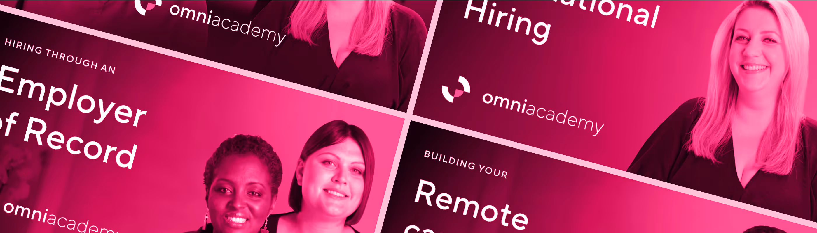
Going global is complex, with many variables, benefits, and implications. Global-first is the future and an evolution of what we saw during the pandemic when we were forced to become remote-first. We wanted to provide a way to allow businesses to learn how to navigate these challenges. OmniAcademy will be a free online learning platform dedicated to helping companies that want to go global. Our creative team has now expanded into supporting video production capabilities, and we got the opportunity to go around the world to shoot members of our team to be the instructors for the upcoming courses.
Kicking off with research, we grasped other learning platforms as structured and richer forms of distributing educational content by companies with products with a steady learning curve or complex services like Omnipresent. However, we didn't find anything related to our topic, so we took inspiration from subscription-based courses like Masterclass and a handful of good product-based technical academies like Webflow University.
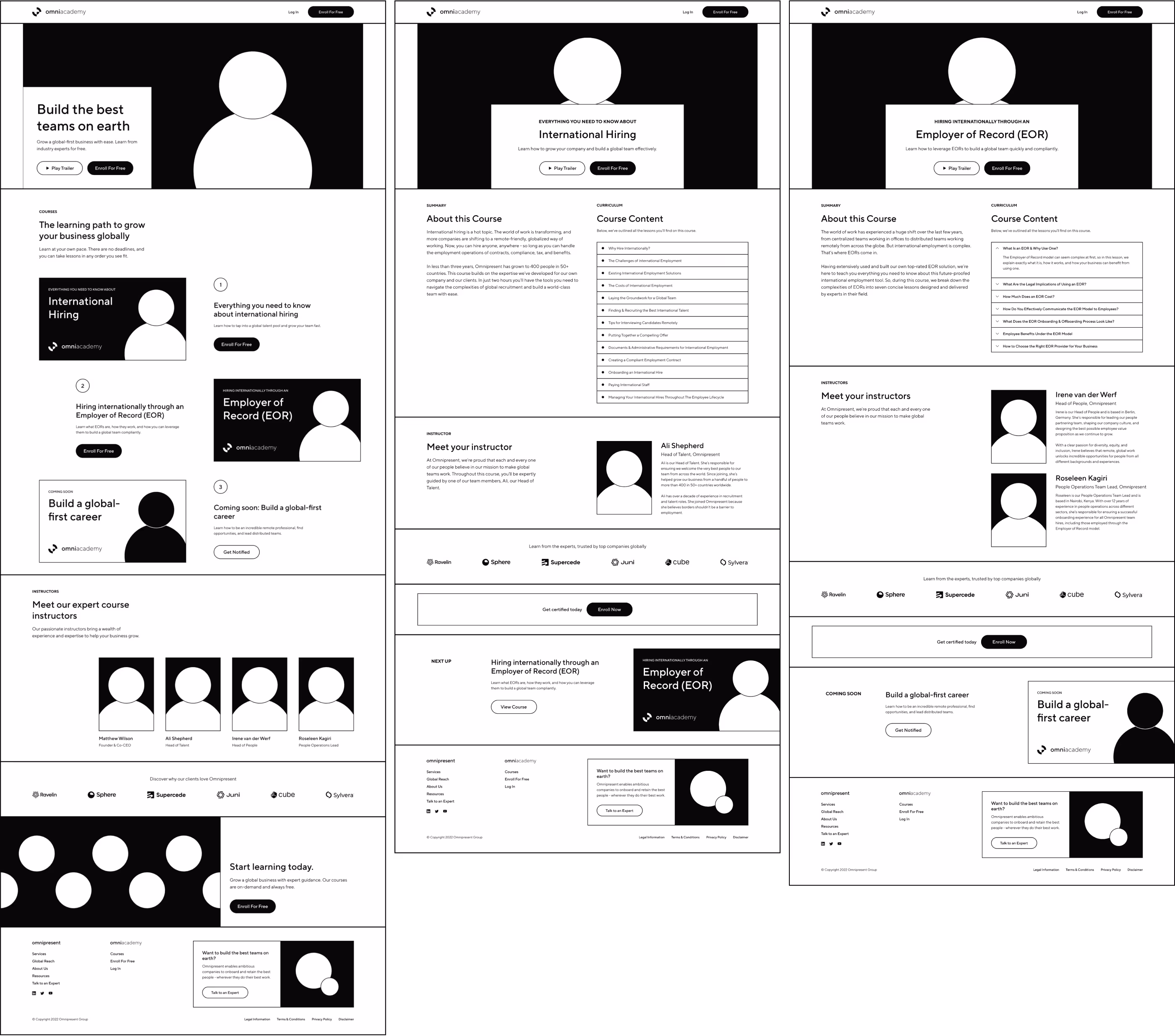
While exploring the UX journey, we aimed for a lean approach. We'll reuse building blocks from the marketing website and integrate them with a Learning Management System (LMS) that will provide the most seamless experience. After evaluating different vendors, we decided to implement Thinkific. It gave us control over customizing the course experience and seamlessly transitioning from our website to the LMS without too much friction.
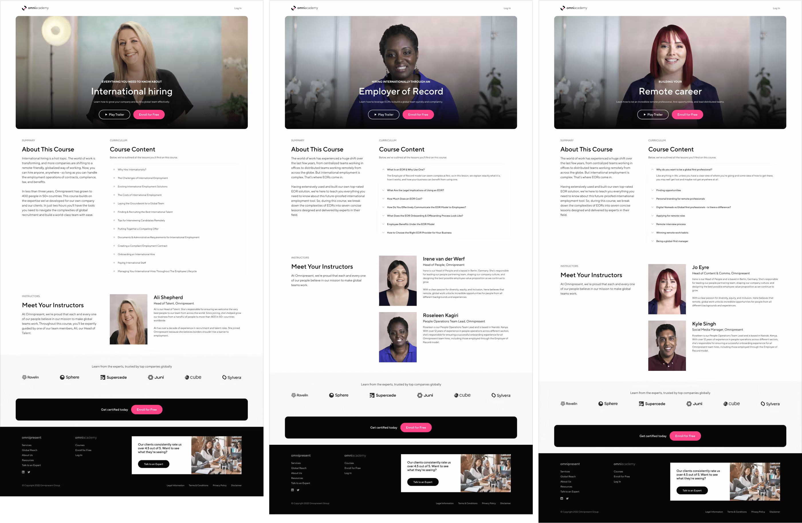
The OmniAcademy logo will be a standard lockup, and the identity will be the same as the company brand. The website's building blocks will be simplified but share the same visual language. The most notable difference will be the course covers. The covers will model rounded corners to provide a touchable feeling to video content.
The hero was an essential element of the website's pages, which felt familiar to streaming services such as Netflix or Apple TV. The course trailer will automatically play in the background while we overlay basic information.

After successfully launching the first course, more will follow in staggered launches. Each time with new people from the company across the globe covering different topics.
In addition to implementing the LMS and adding the content, we created the microsite for our weapon of choice, Webflow. The academy was a massive project involving cross-department collaboration and global logistics over video production. Shoutout to Jo Eyre, Charlotte Darrell, and Michael Sugrue for creating and producing the content.
The journey, which started with an ambitious rebranding and saw the company experience unprecedented hypergrowth, demanded multiple campaigns in different channels. The marketing team grew 10x, diversified more, and specialized more. We supported more capabilities and designed our creative process to work as an internal agency.
Internal stakeholders will make creative requests, which will follow a discovery phase and be assessed individually to include in our broader roadmap and resource allocation, just like an agency but serving internal clients. As a remote-first company, documentation and async collaboration are crucial. Along with implementing these processes and practices, we empowered our colleagues to self-serve as much as possible. For example, we have Webflow to quickly update our website and produce on-brand creatives using Figma templates.

Illustrations with a distinctive style are an excellent opportunity to differentiate as a brand. They empower creatives to produce imagery with virtually no limits. Visually, our style was high-contrast and flat to ensure it stayed within a familiar framework that speaks to our high-contrast compositions of solid and bold colors. Following its guidelines enables us to collaborate with different illustrators while keeping a consistent style.
Assessing a value offering could be overwhelming. One-pagers are fantastic because they summarise information in bite-sized chunks. Some of the most efficient product marketing campaigns included one-pages at the top of the funnel.
The slide deck was one of the team's preferred formats for communication. From sales to product, the deck templates were heavily used and customized. The templates included tons of layouts, variations, styles, and covers. Clearly, this is the most self-serve template system used across the company.
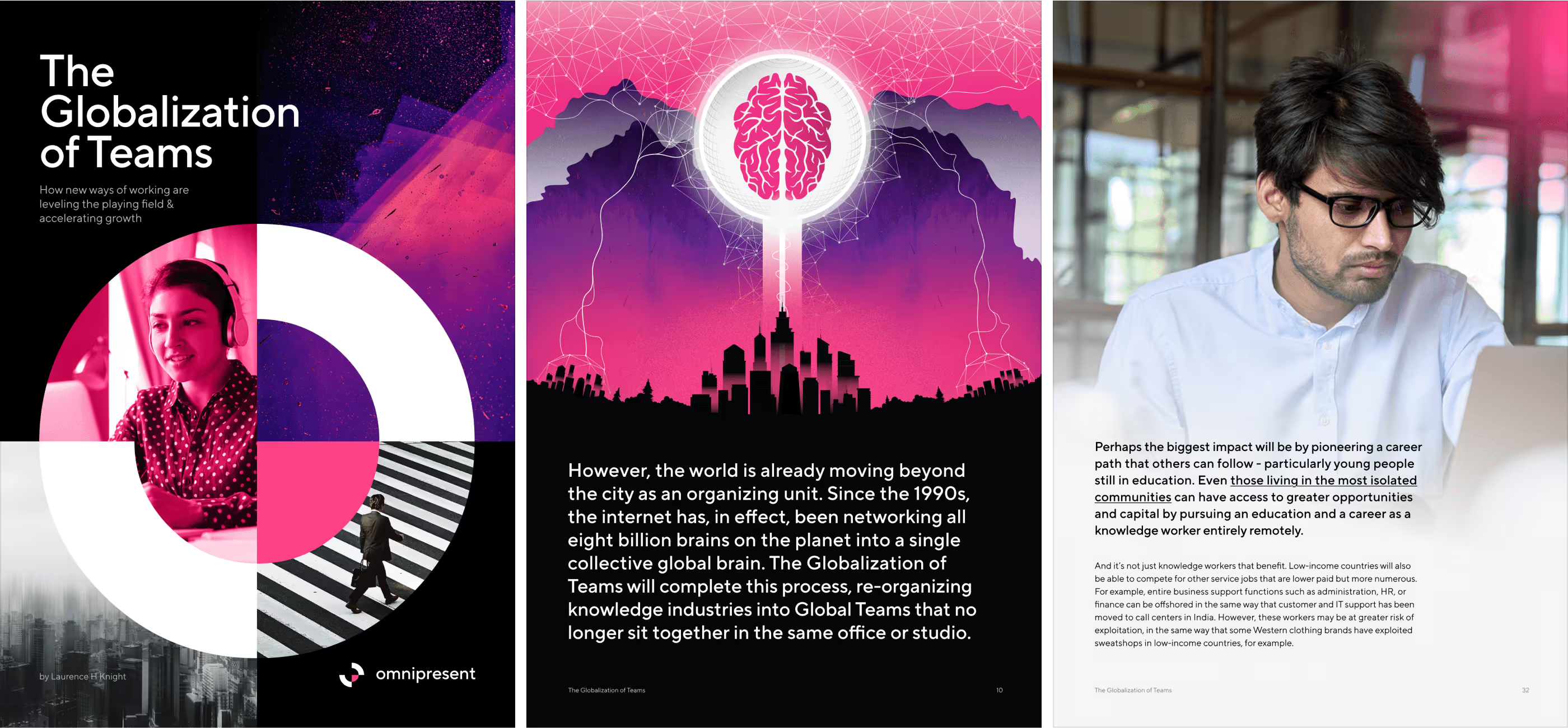
We frequently created many reports, which were always very engaging and valued by our audience. Each new one involved more people, and it became more ambitious. Aiming to repeat the success of the flagship report that inspired us to create an interactive microsite, now with a larger team, we aimed for a higher quality and editorially worthy piece. We used this opportunity to explore more visually rich compositions and discover new elements we could reuse for this elevated content quality experience. The Globalization of Teams was the result of that vision. Written by Laurence Knight, an established author, and designed by Mathew Kerber, our new skillful designer.
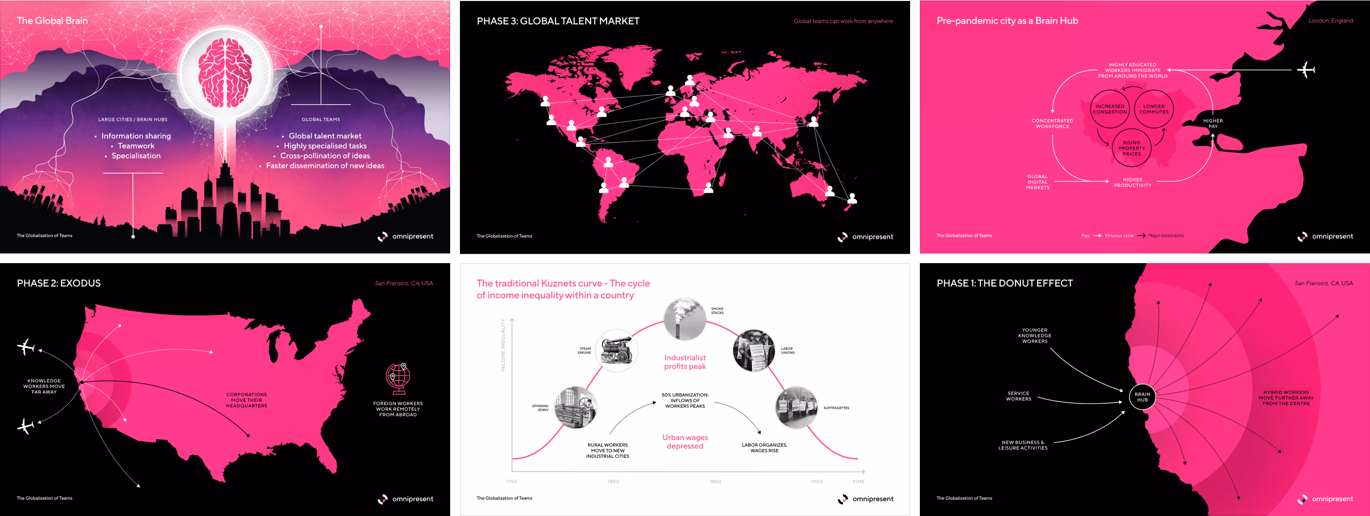
Infographics were also a recurring request on reports and decks. These allowed us to be very creative while staying on brand.
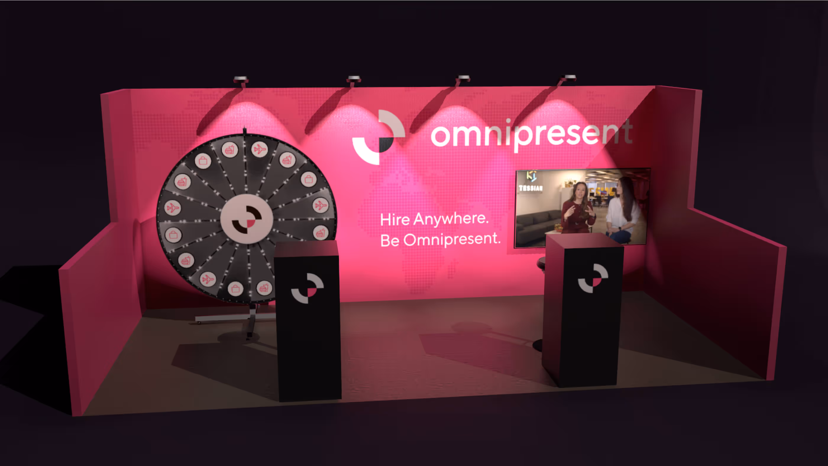
When in-person events returned, at the creative team, we supported our parent marketing team in putting together our product activations.
Creative production using motion design was another capability we enjoyed the most. The compositions that have been bold and clean so far really came to life and told our brand story in a more relatable and powerful way. The animation about the Series B funding round was exceptional when we saw it showcased in Times Square NYC.
Things moved so fast at the time that relying on a trusted freelance network was instrumental in delivering the quality the brand demanded on time with the resources available. It was so intimate that my brother, Jorge Martinez, and his team at Maleiwa Studio were the top recurring partners. Some notable projects they worked on are the animation shown at Times Square, the booth design for the product activation at SXSW, and the alternative trophy design for The Omnis.
As an internal agency, also known as a Brand Studio, our audience inside the company was essential for our work on the creative team. We partnered closely with the people team to build a strong employer brand.

One of our first internal projects was about company values. The iconic representations of each value were created under a shared framework that will lead to different implementations. From physical stickers to emojis on Slack, the team made the values their own. They also became a central piece on the OmniAwards, an internal chapter honoring our most remarkable people.

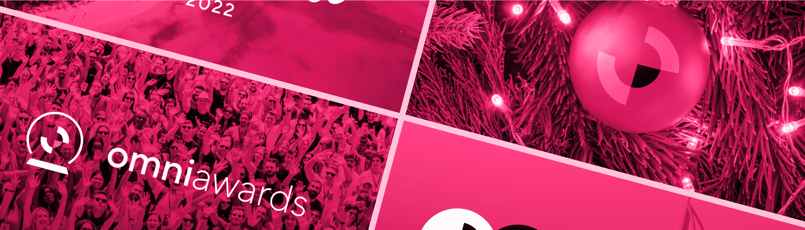
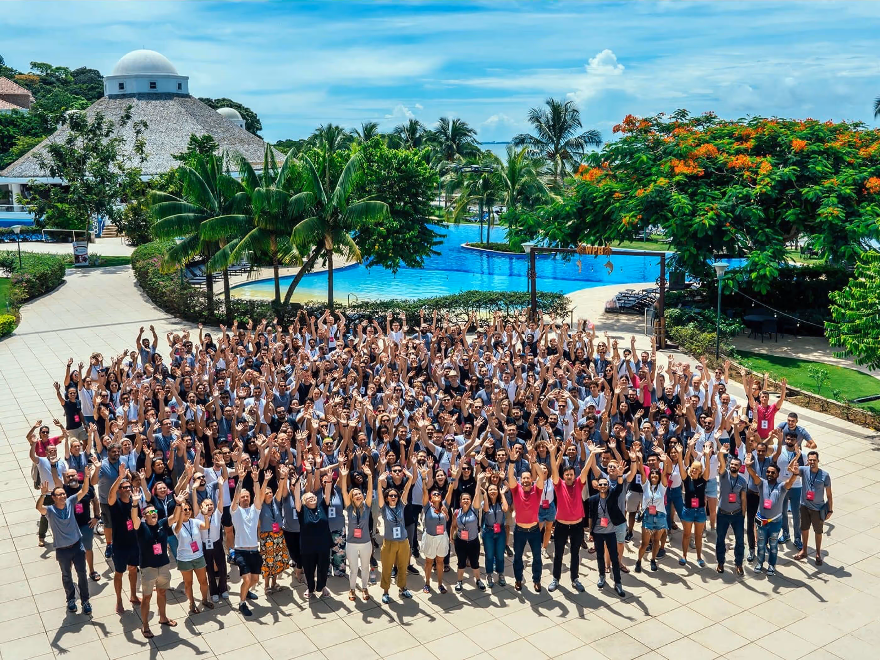
Like sub-brands in our marketing campaigns, we followed a more relaxed concept across the employee events, from online gatherings like the OmniAwards to in-person meetups like company-wide retreats and team offsites.

The people team started a fun tradition with a plushie flamingo they found at a local shop. Flossy, our internal mascot, was born. The tradition consisted of traveling the world along with our people, but it had to be handed off from one employee to another in person. As a fully remote company, this promoted one-on-one meetups to contribute to intricate fun logistics to achieve some challenges we set for ourselves. This is another fantastic way to create a more profound sense of belonging while having fun and bonding with the team. Thanks to the talented illustrator Zara Magumyan for helping us capture Flossy in its digital artistic form.
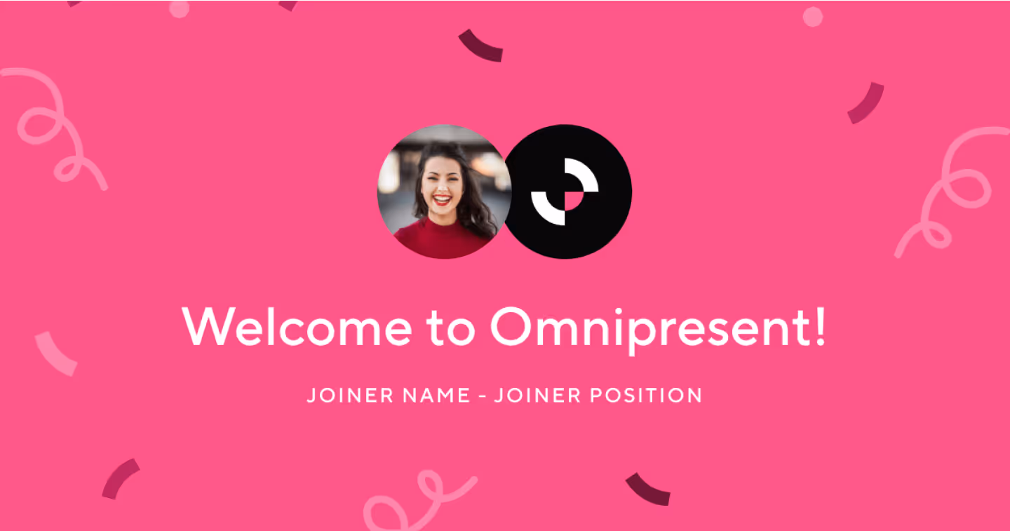
In addition to working regularly on improving our careers page, templates were specially created to be used internally or shared on social media, such as welcoming new joiners on LinkedIn.
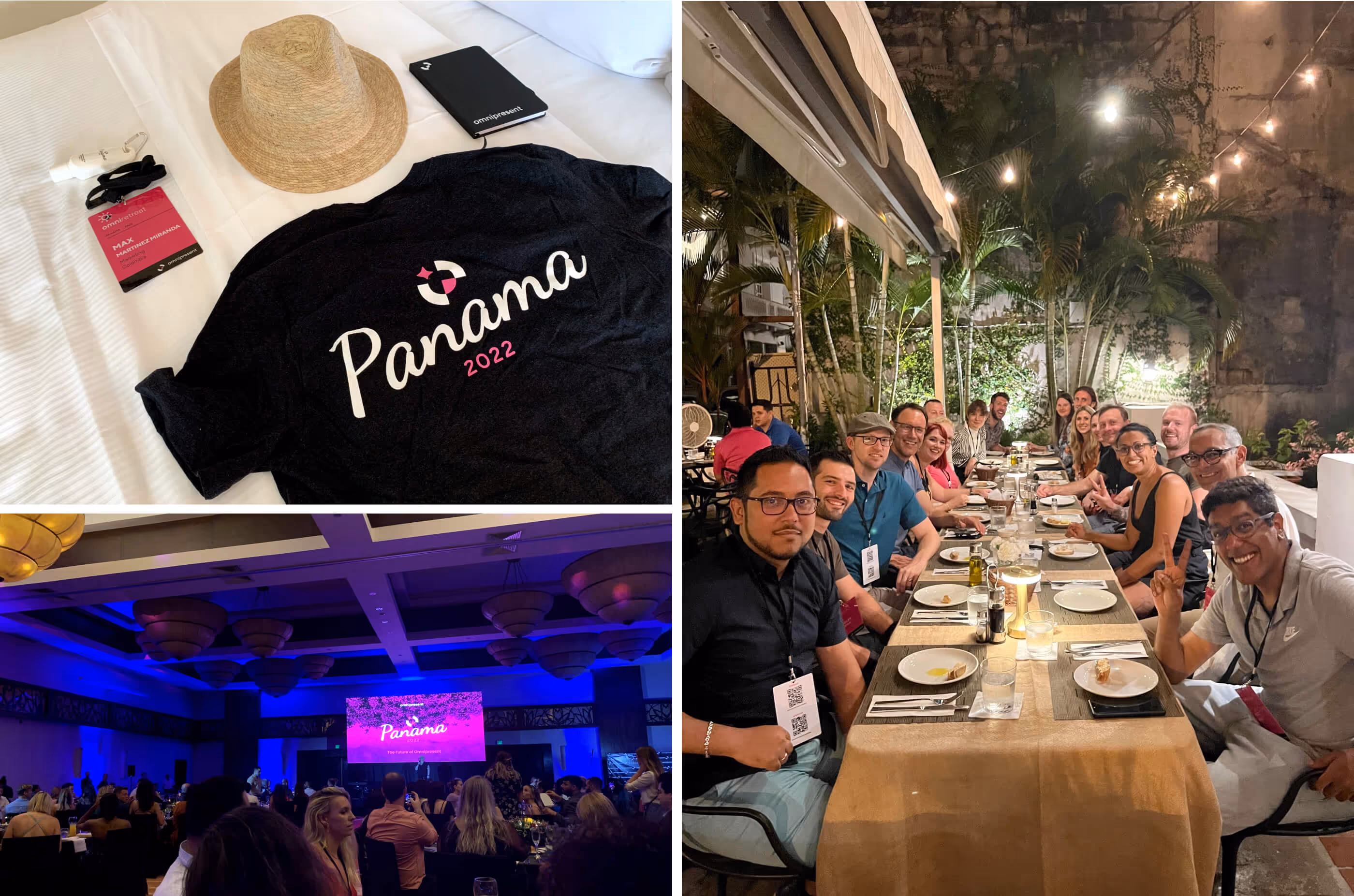
We worked closely with the people team to create merch and materials to embody our brand in person at retreats, meetups, and offsites.
It was a fantastic journey at Omnipresent. We were fortunate to experience remarkable growth while building a brand and digital presence that made us proud and enabled the most talented people to work from anywhere around the globe.
I worked with Max over two years at Omnipresent. He was a creative lead who not only built a distinctive brand from the ground up but also provided great direction to the whole marketing team in terms of brand, product and project design. He was always a perfectionist in his job and wowed the team every time he presented his ideas visions and execution. It's always a joy to work with Max who can not only provide creative direction and a sounding board for ideation. I recommend everyone to work with Max if they want their brand to come to life.

I had the pleasure of working with Max Martinez for 18 months at Omnipresent. Max led the design and development of our marketing websites with an exceptional blend of strategic thinking and creative vision. His interdisciplinary approach and attention to detail consistently impressed me. Max not only excels in design and development but also ensures that our websites are highly functional, clean, and optimized for performance and future growth, balancing value for both the company and the user experience.
Max's ability to combine his technical expertise with a deep understanding of branding and marketing sets him apart. His background in product and engineering, coupled with his proficiency in Webflow and other no-code tools, allowed us to ship new lead-generation projects to market rapidly without sacrificing quality. Max’s global perspective, gained through his experience working with individuals and teams from over 50 different countries, enriched our collaborative efforts and brought a diverse range of insights to our projects.
Working with Max was both inspiring and challenging in the best way possible. He pushed me to improve continually while maintaining a supportive and collaborative atmosphere that felt more like a partnership than a traditional supervisor-employee relationship. His dedication to ownership and going above and beyond expectations is truly remarkable. I highly recommend Max to anyone looking for a leader who can bring a brand to life with creativity, precision, and a forward-thinking mindset.