Soulful

Photo by Chelsea Gates
Photo by Chelsea Gates
Soulful Hotels is a curated collection of stays built around a simpler idea: travel can be more intentional, more connected to place, and lighter on the world around it.
The challenge was to turn that philosophy into a brand and digital experience that felt distinctive without becoming overly worthy, niche, or predictable.
Creative Director
Creative Direction, Brand Design, Website Design, Webflow Development
Philippe Demangeat, Founder
Alfredo Miranda, Visual Designer
Soulful was never meant to compete on inventory.
The value was curation: hotels with a point of view, people behind them worth knowing, and destinations worth experiencing beyond the room itself.
The digital experience needed to make that difference visible while remaining practical enough to help travelers discover where to stay.
There was no previous website to refresh.
We were building the brand and experience from the ground up.
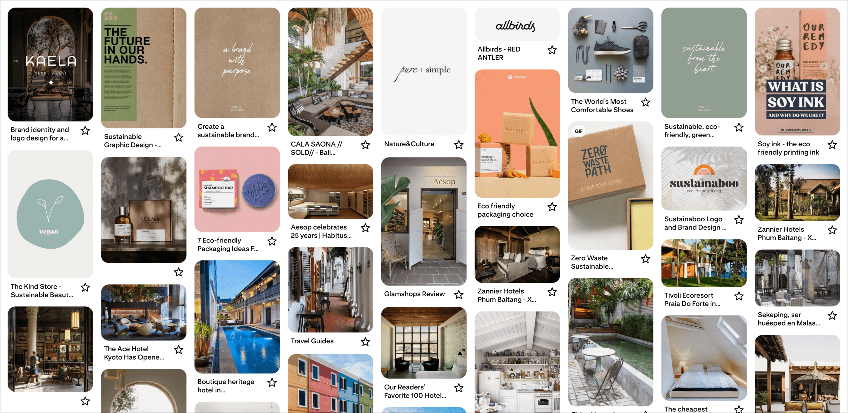
We looked across boutique hotels, purpose-led consumer brands, interiors, packaging, and travel experiences.
The category already had familiar signals: sage greens, earth tones, handmade typography, natural materials, and carefully composed photography.
Those cues communicated consciousness—but relying on them too heavily risked making Soulful feel interchangeable with wellness or lifestyle brands.
The opportunity was to combine the restraint of purpose-led design with the richness of editorial hospitality.
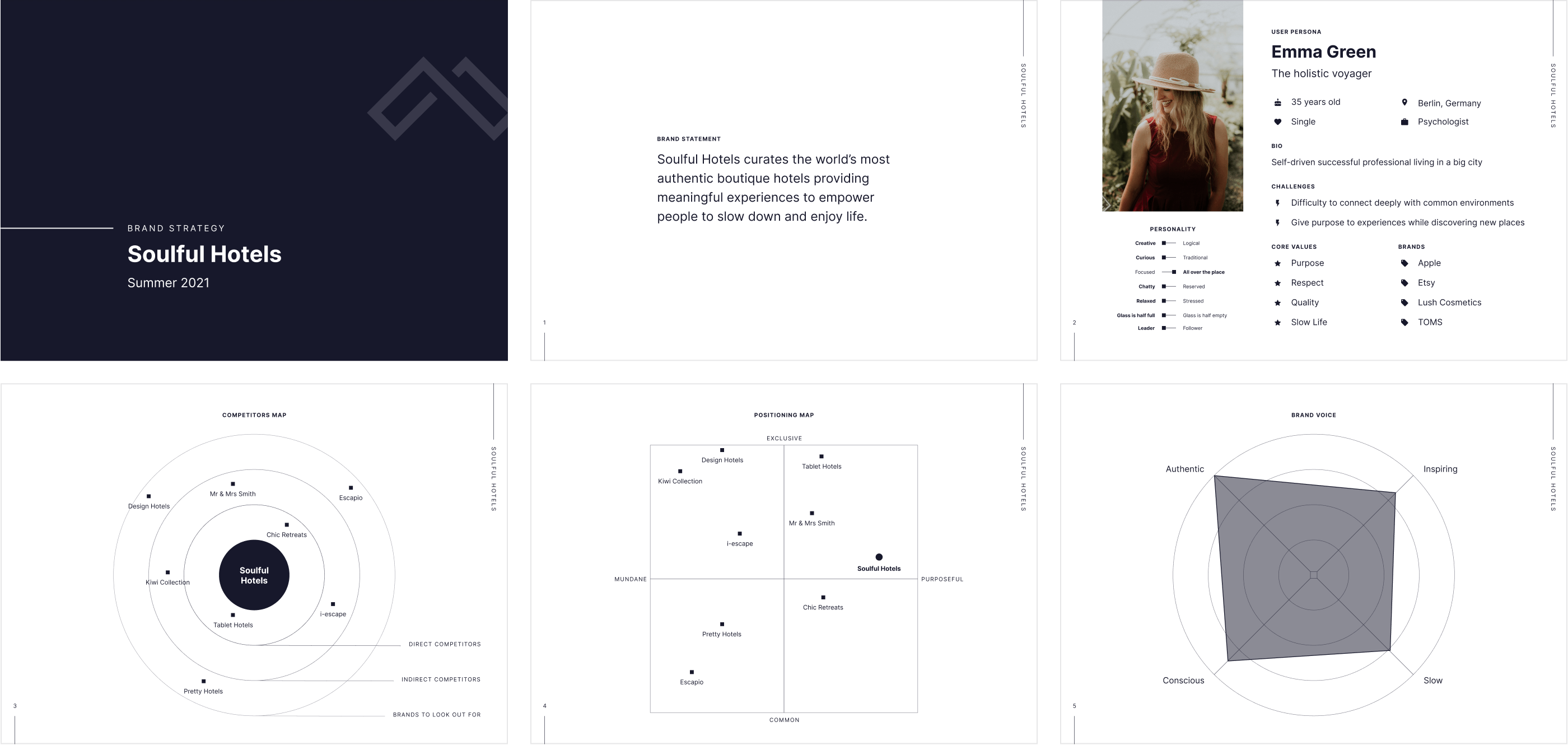
The strategy centered on a traveler looking for more than a beautiful room.
Purpose, respect, quality, and slow living became the core values.
Rather than trying to out-inventory larger hotel platforms, Soulful would compete on a different reason to choose: a more considered collection with deeper stories behind the stays.
That gave the visual work a clear filter.
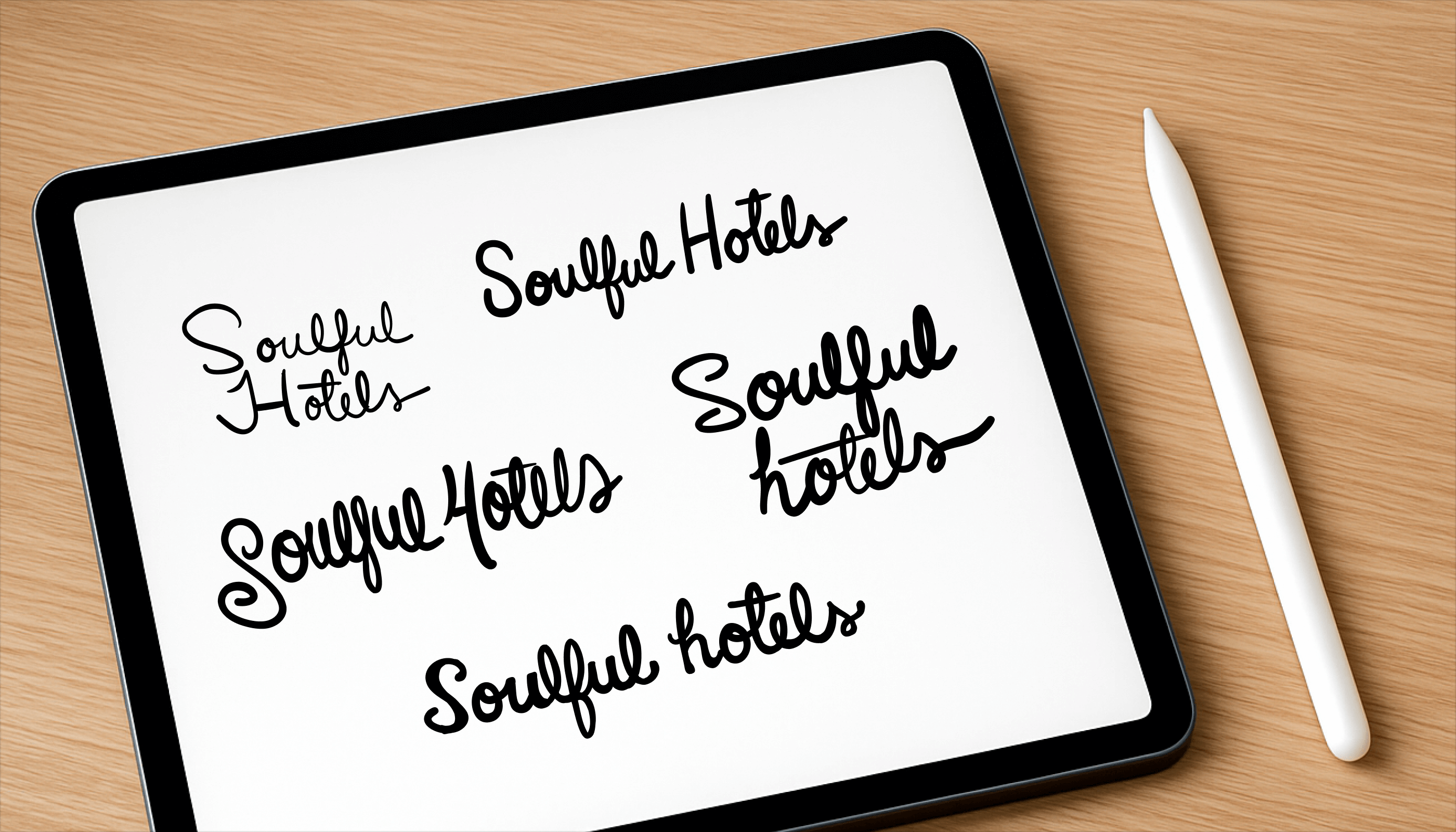
The name already carried most of the emotion.
Instead of adding a literal hotel symbol, we explored ways to make the wordmark itself feel more human.
Hand-drawn versions of “Soulful” were paired with cleaner, more architectural treatments of “Hotels.”
That tension became the foundation of the identity: expressive enough to feel personal, structured enough to work as a hospitality brand.
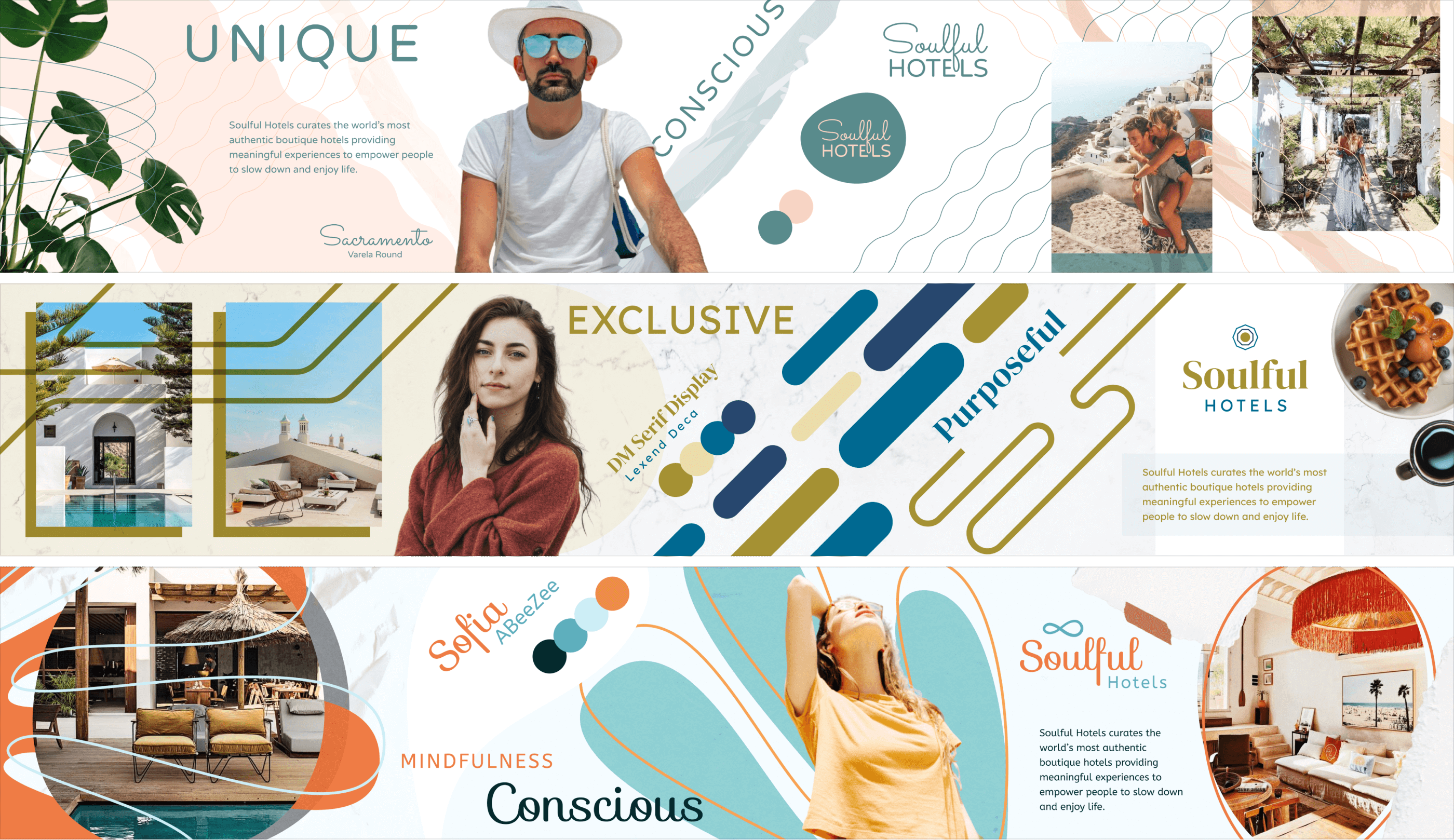
The early directions intentionally pushed the brand toward different extremes.
One leaned organic and conscious.
Another felt more exclusive and luxurious.
A third moved closer to wellness and lifestyle.
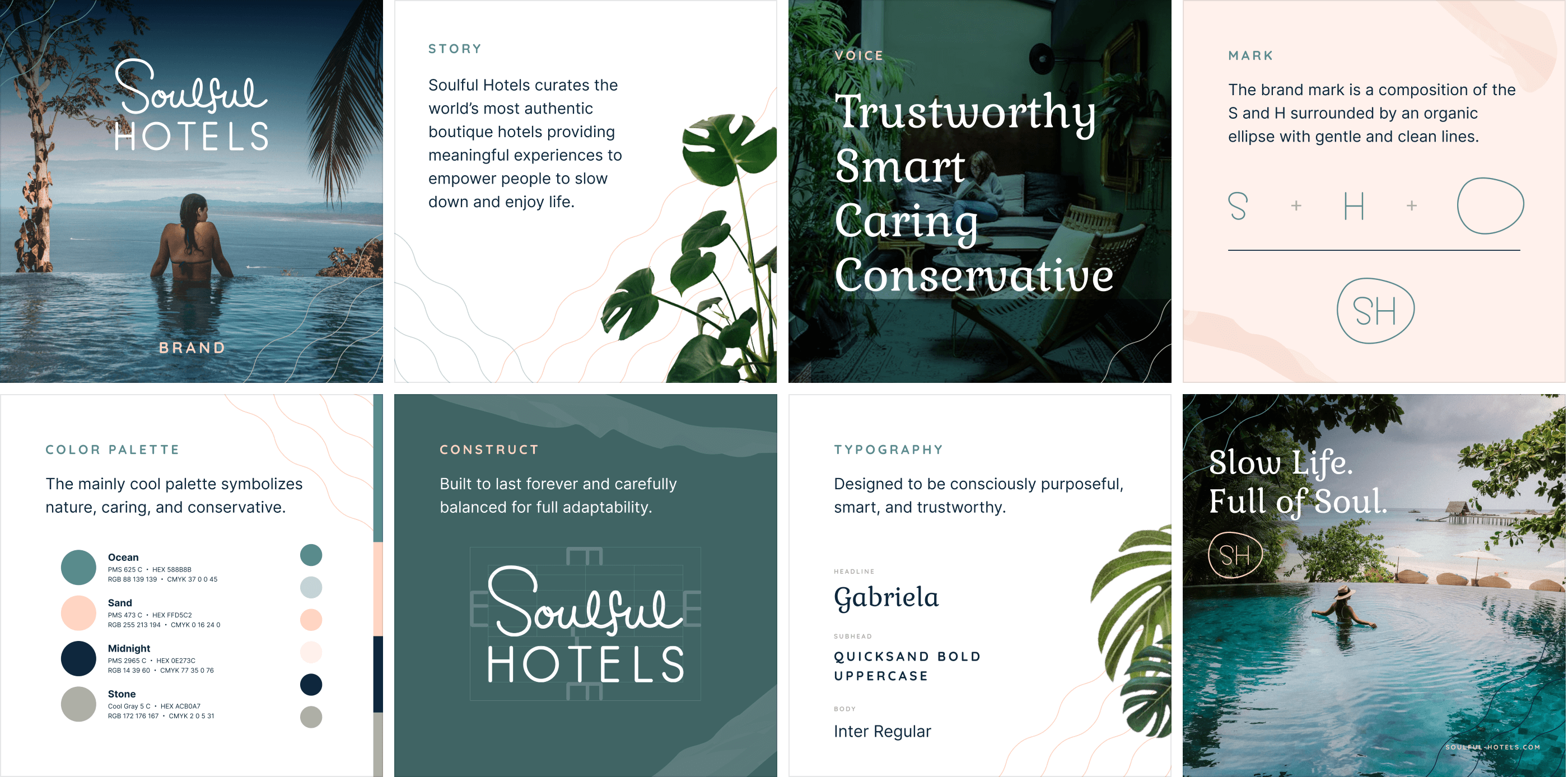
The selected direction found the strongest balance: warm without becoming casual, premium without becoming cold, and purposeful without preaching.
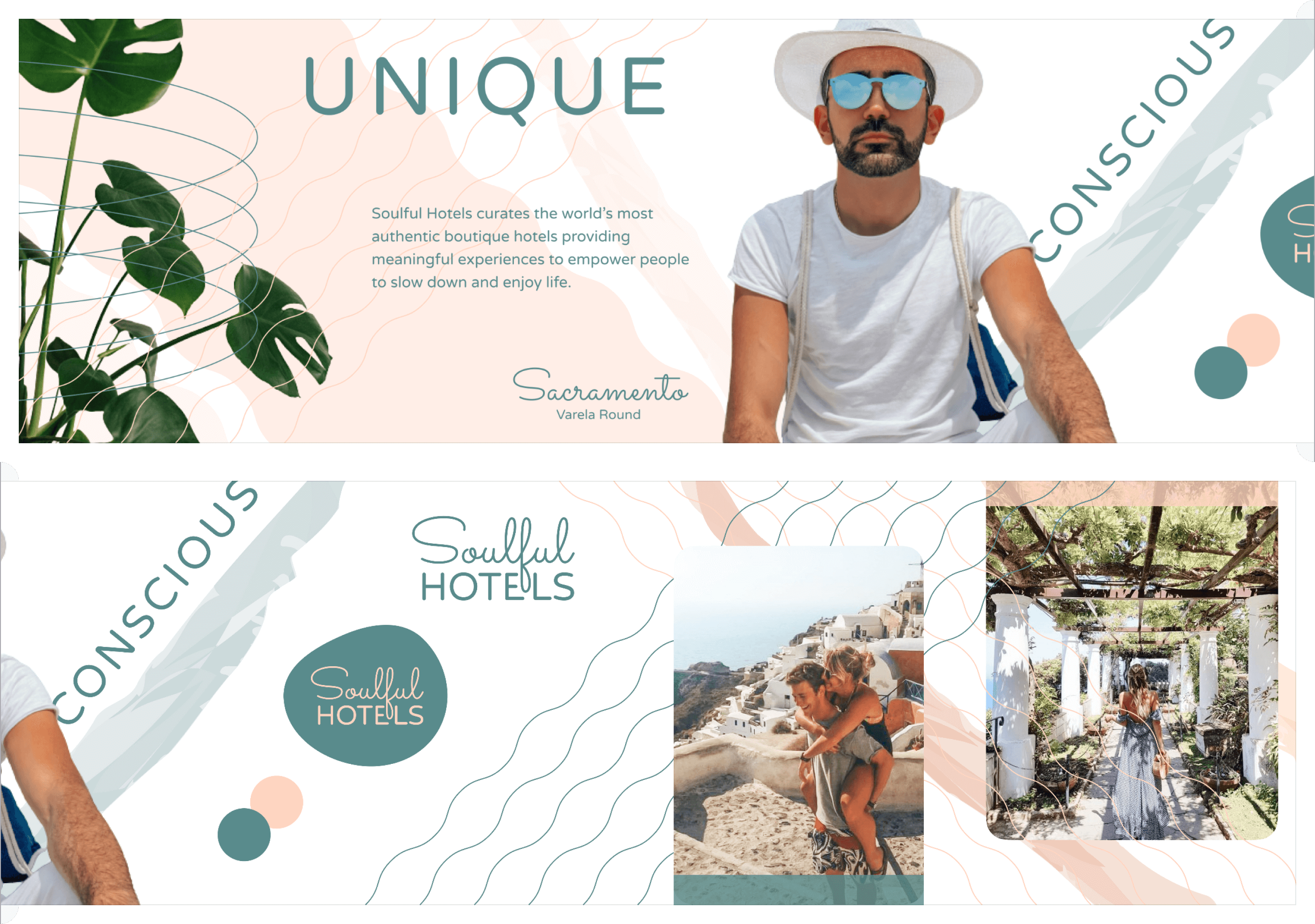
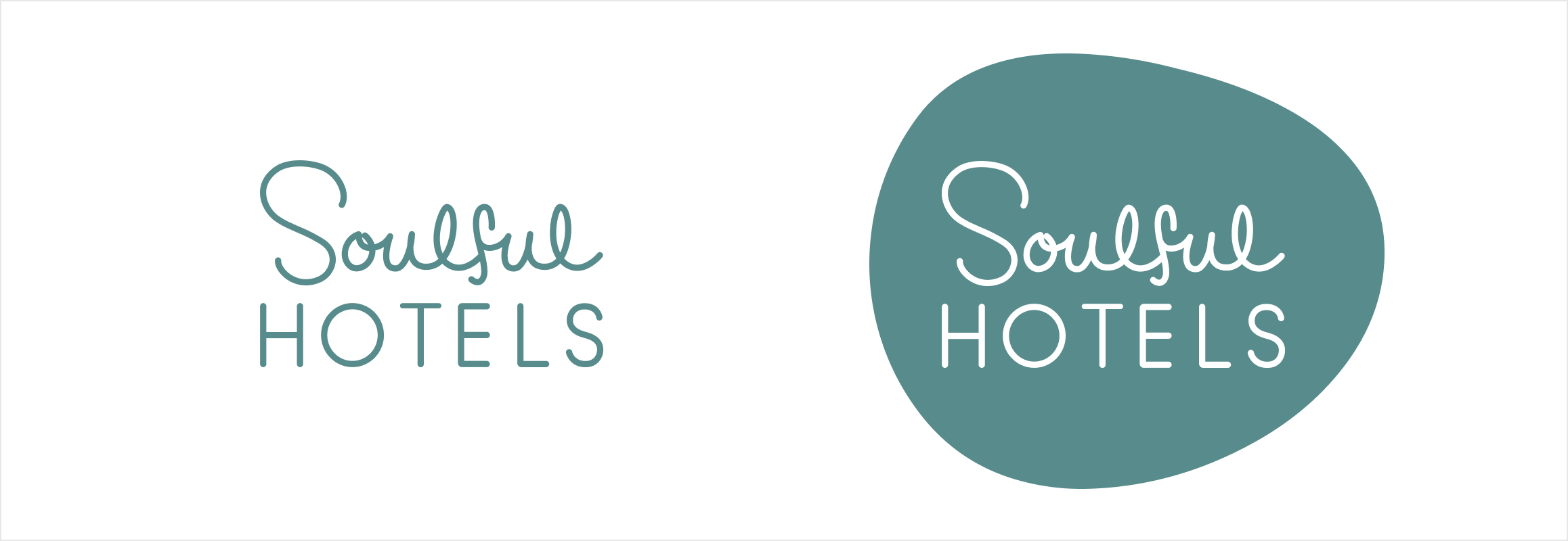
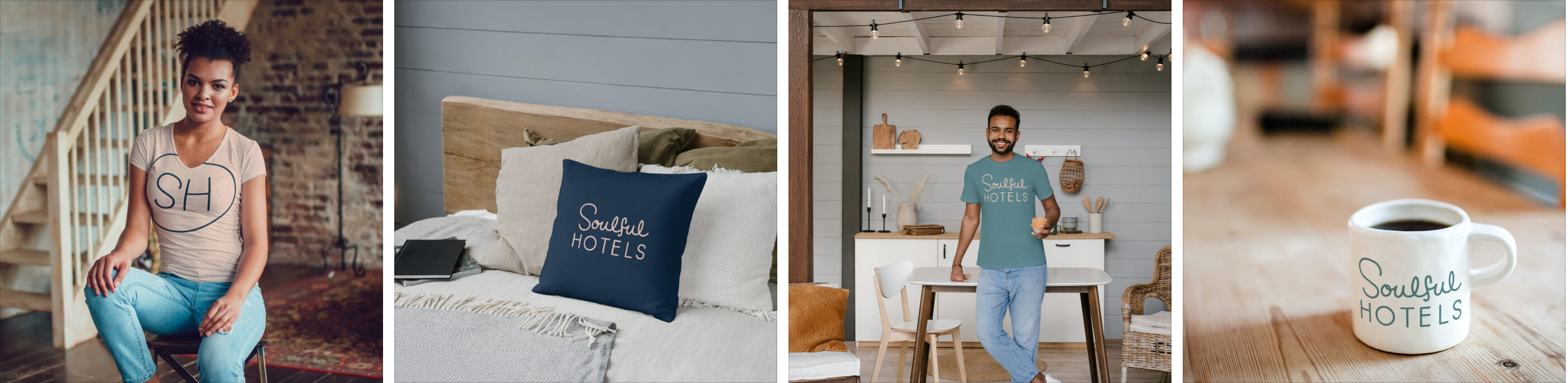
The final identity pairs a custom script wordmark with a simple, geometric counterpart.
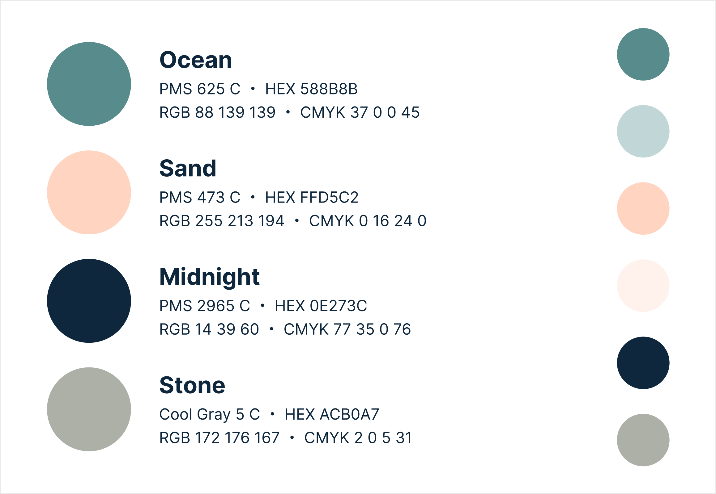
An organic SH monogram provides a more compact signature, while ocean, sand, midnight, and stone create a calm but recognizable palette.
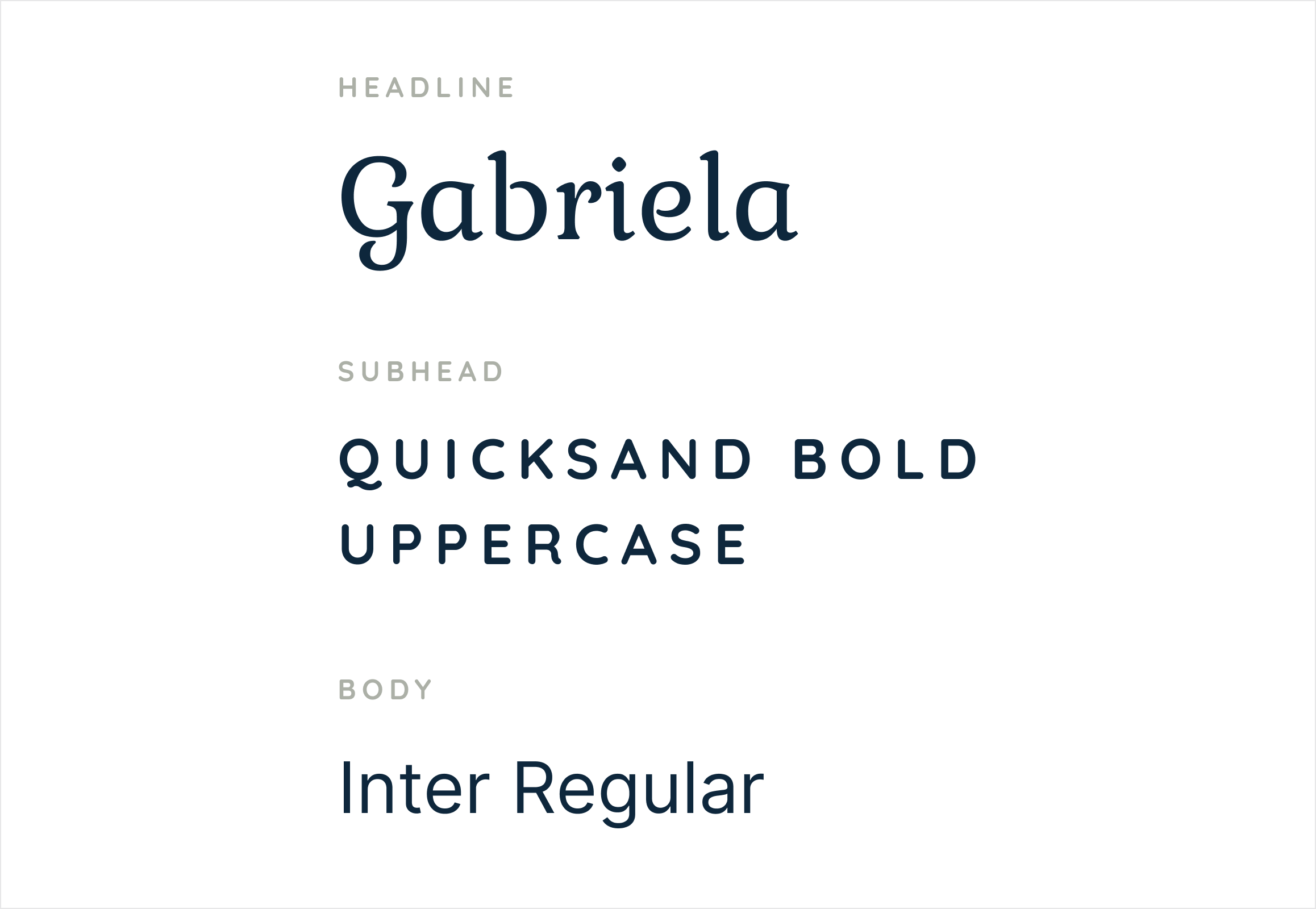
Typography, illustration, and supporting elements were kept intentionally restrained so the hotels themselves could remain visually dominant.

The website needed to do two jobs at once.
Travelers needed to browse hotels and destinations efficiently.
But Soulful also wanted them to understand why each property belonged in the collection.
That led to an experience closer to an editorial travel publication than a conventional booking engine.
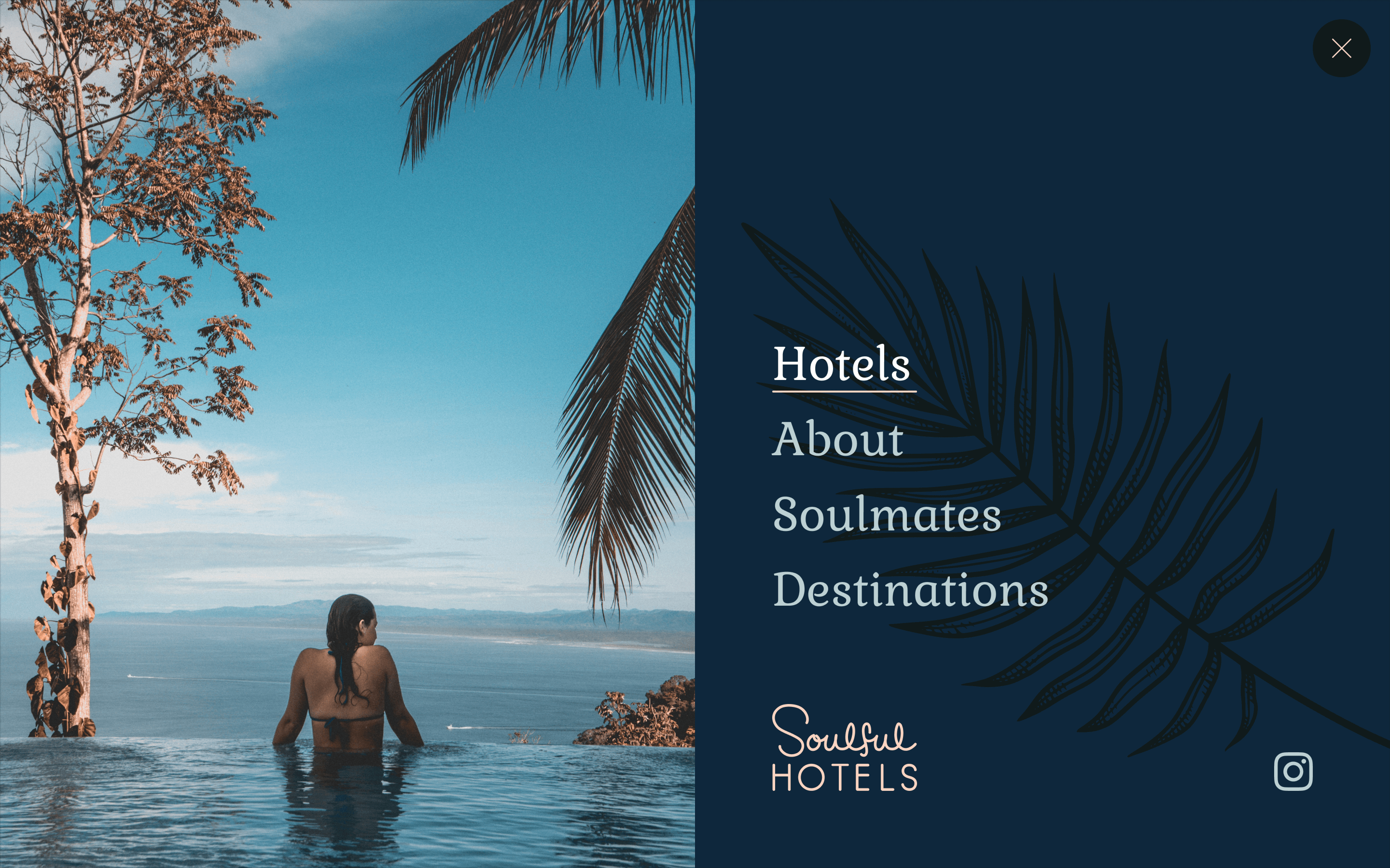
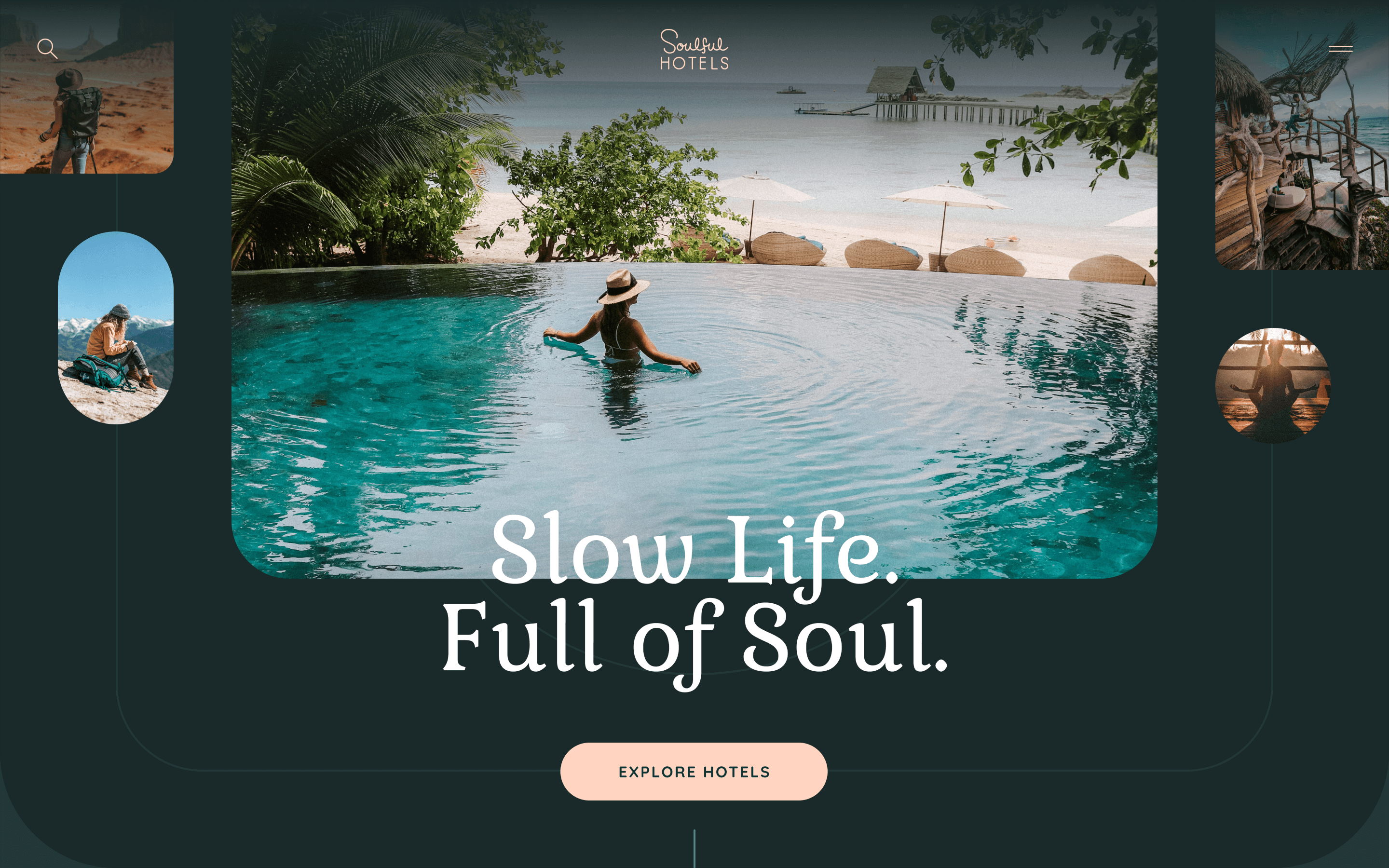
The selected direction came to life through rich photography, large typography, layered compositions, and a quieter interface around them.
The homepage moves between featured stays, destinations, stories, and the broader philosophy behind the collection.
The brand supports the experience without competing with the places themselves.
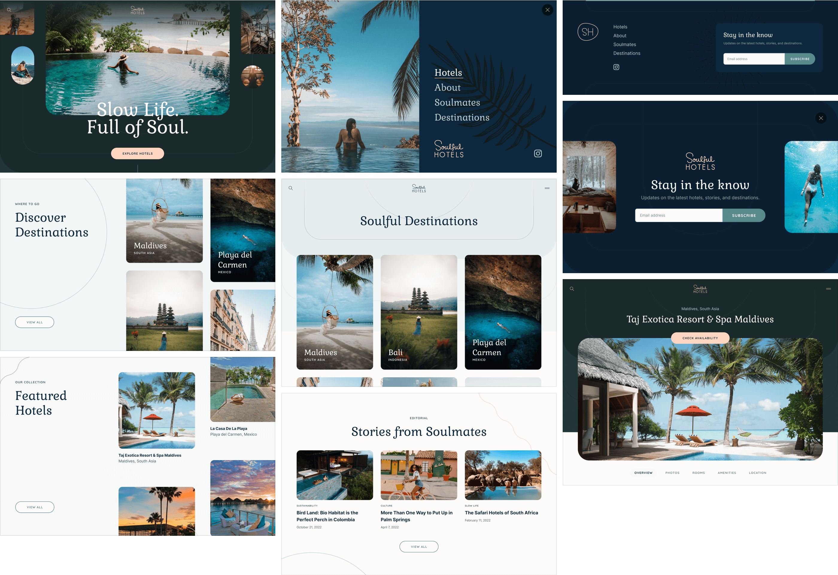


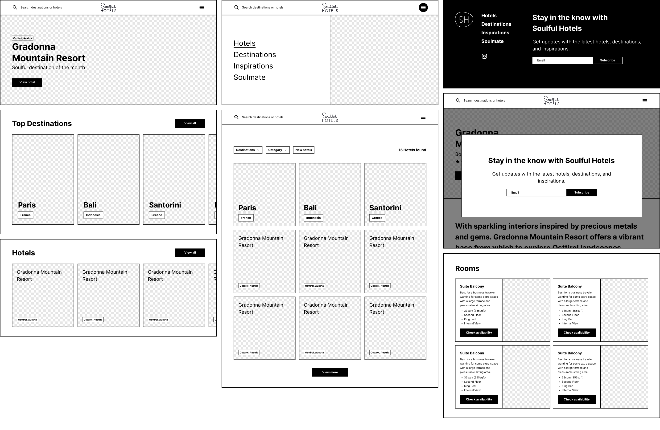
The hotel collection needed to stay practical without losing the editorial tone.
Search and filters help visitors narrow the collection, while photography and restrained metadata keep each property feeling like a destination rather than a product card.

Individual hotel pages needed to create desire and support a real decision.
Large photography, destination context, room options, amenities, location, and availability all live within the same visual rhythm.
The result keeps the story of the place intact without hiding the information travelers actually need.

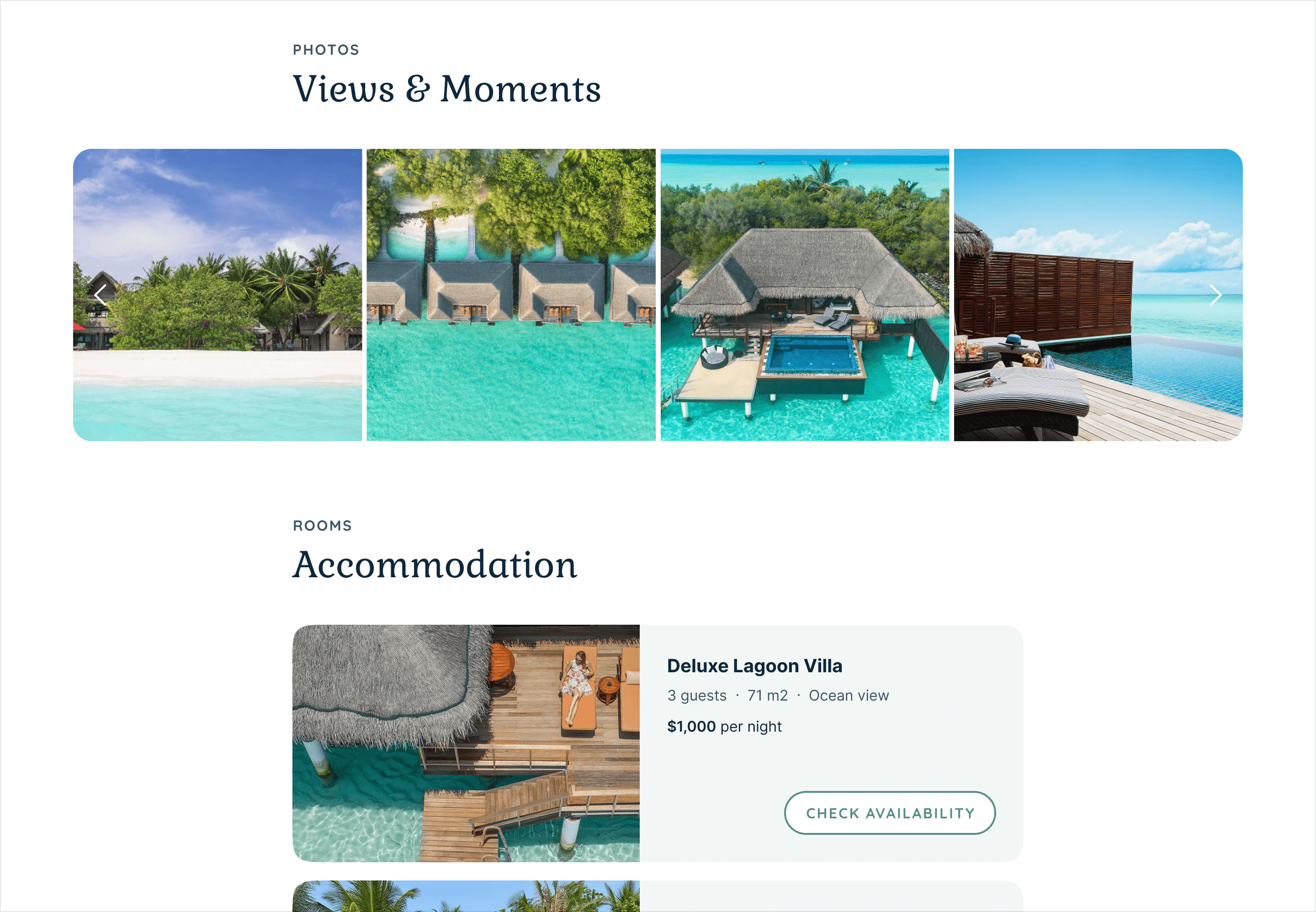
The site was developed in Webflow around CMS collections for hotels, destinations, and editorial stories.
That allowed the team to expand the collection without rebuilding the experience each time.
Responsive behavior was handled as part of the same system, preserving the visual rhythm while simplifying richer layouts for smaller screens.

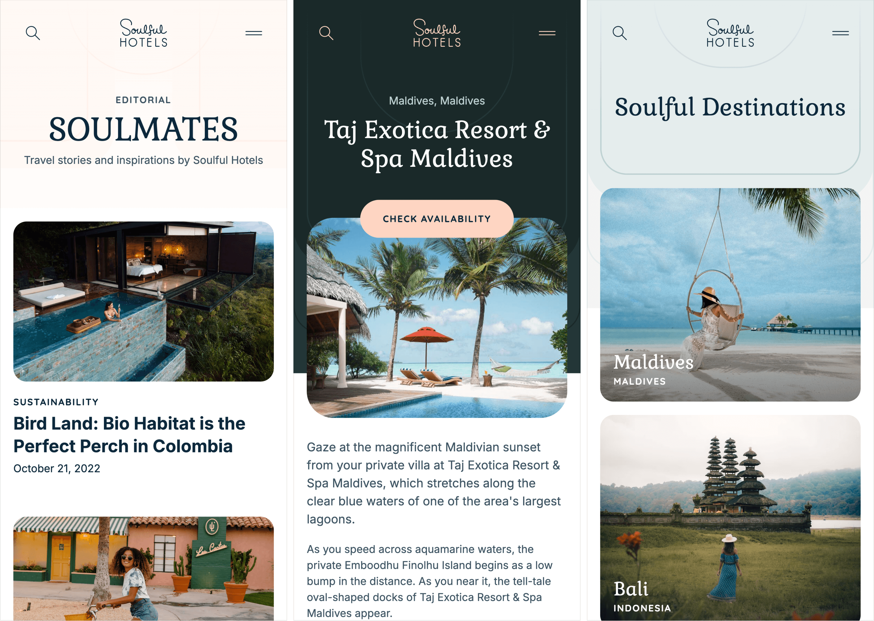
Soulful ended up with more than a hotel directory.
The brand and website created a distinct point of view around travel: fewer places, chosen more carefully, with more attention to the people, purpose, and destinations behind them.
The system gave the team room to grow the collection while keeping that philosophy visible at every step.
Soulful turns hotel discovery into something more considered—without making it harder to choose where to go next.