Teammates
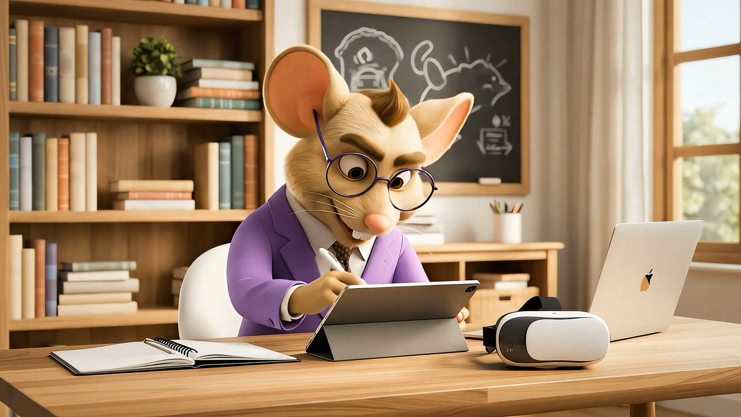
Teammates is an end-to-end platform for building and managing a virtual workforce.
Its AI employees live inside the tools teams already use, plan their own work, and behave less like assistants waiting for prompts and more like colleagues with jobs to do.
The challenge was to make that new model immediately understandable—and give it enough personality to feel different from another AI agent platform.
Digital Designer
Creative Direction, Brand Design, Product Design, UI/UX Design, Website Design, Webflow Development
The company started as Perpetual, with an illustrated office full of unusual coworkers: a hamster at a keyboard, a robot in a sweater, a Viking with a spreadsheet.
The personality was already there.
What was missing was a cohesive brand and product system capable of turning that idea into a credible software experience.
The goal was not to make another agent builder.
Teammates needed to feel like hiring quirky but capable colleagues you could @-mention, assign work to, and trust to get moving.
Playful enough to be memorable. Serious enough to sit inside real company workflows.

We started by looking at how AI and people-operations products were already presenting themselves.
Most serious players leaned toward restrained palettes, simple interfaces, and abstract technology language. More expressive brands brought in warmth and illustration, but still presented the product primarily as software.
That revealed the opportunity.
Teammates could retain the clarity expected from B2B software—light interfaces, recognizable tools, real product UI—while putting an actual cast of characters where generic nodes, gradients, or stock photography would normally appear.
The product was software.
The brand could feel like a workplace.

The name already contained the metaphor.
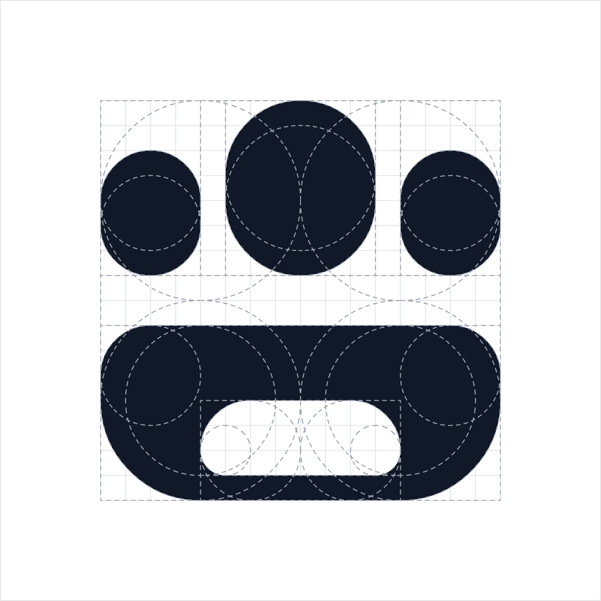
The identity needed a mark that suggested both a group and a friendly face, while remaining simple enough to work inside product UI, app icons, and tiny interface moments.
Early sketches explored people, clusters, initials, and facial forms before resolving into a geometric symbol combining a group icon with a smile.
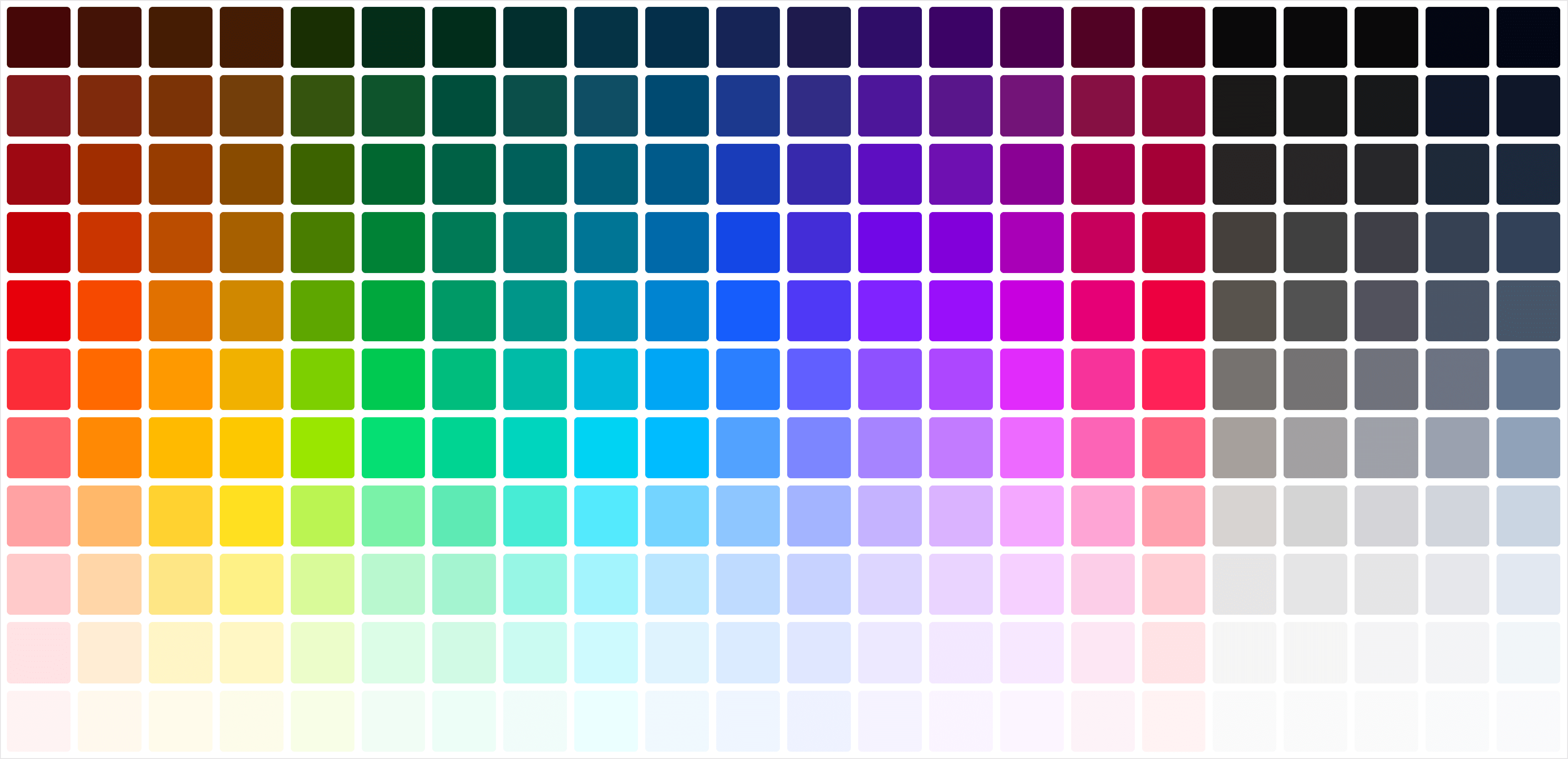
The rest of the system stayed intentionally restrained: magenta, ink, white, one primary type family, simple components, and a flexible shadow system.
The characters provided the chaos.
Each teammate could have a distinct color and personality, while the core brand remained recognizable around them.


The central product question was simple:
If these are teammates, where do they work?
Early concepts treated the product more like a messenger than a traditional AI interface.
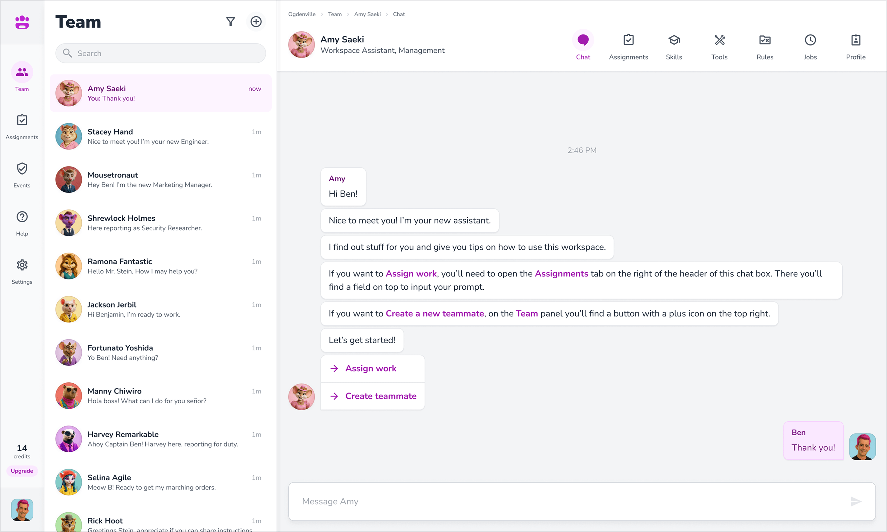
A roster lived on the left. Conversation occupied the center. Goals, assignments, tools, skills, and work history gave each teammate something closer to an employee record than a chatbot profile.
That created the basic product loop:
Hire → Meet → Talk → Assign → Review
The metaphor influenced the architecture itself.

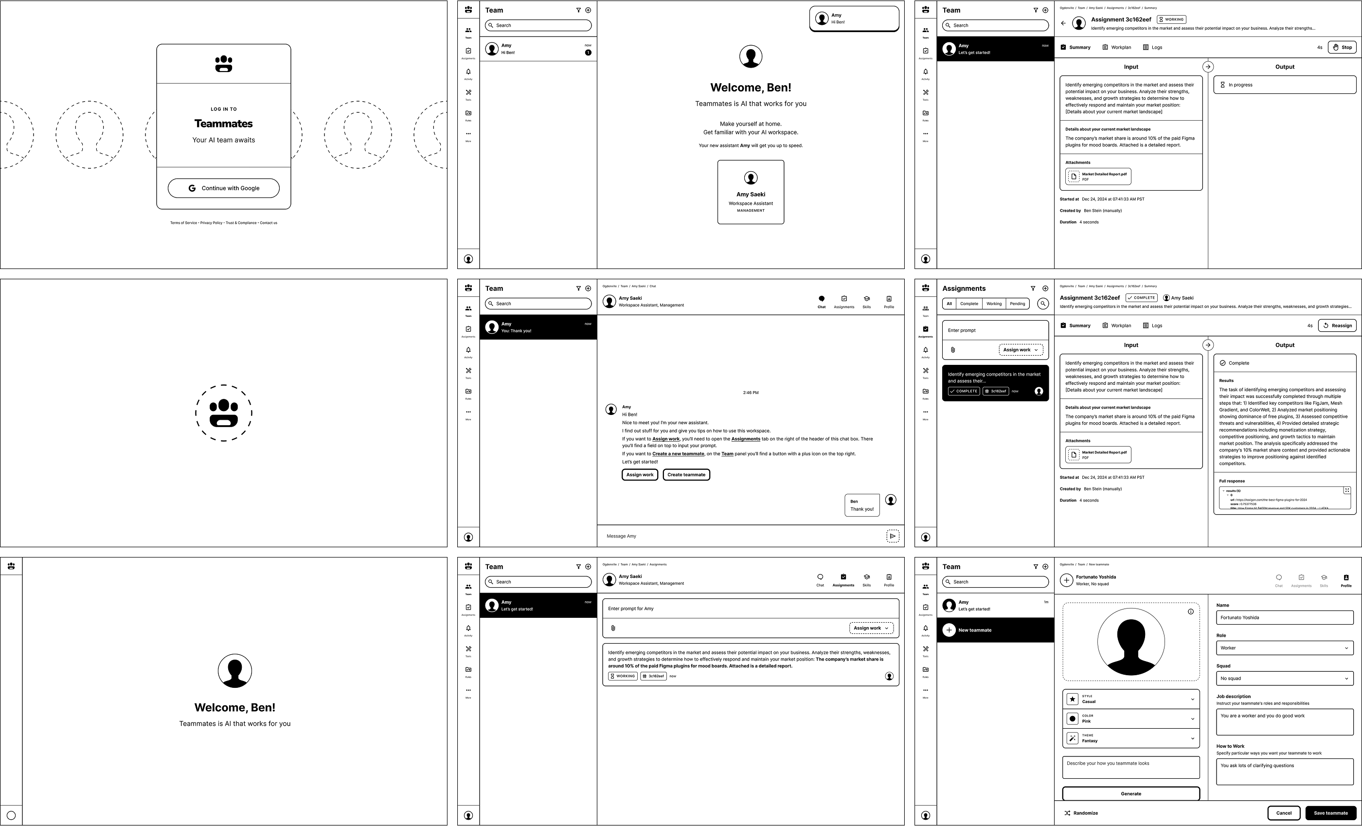
Once the structure worked, the brand moved into the interface.
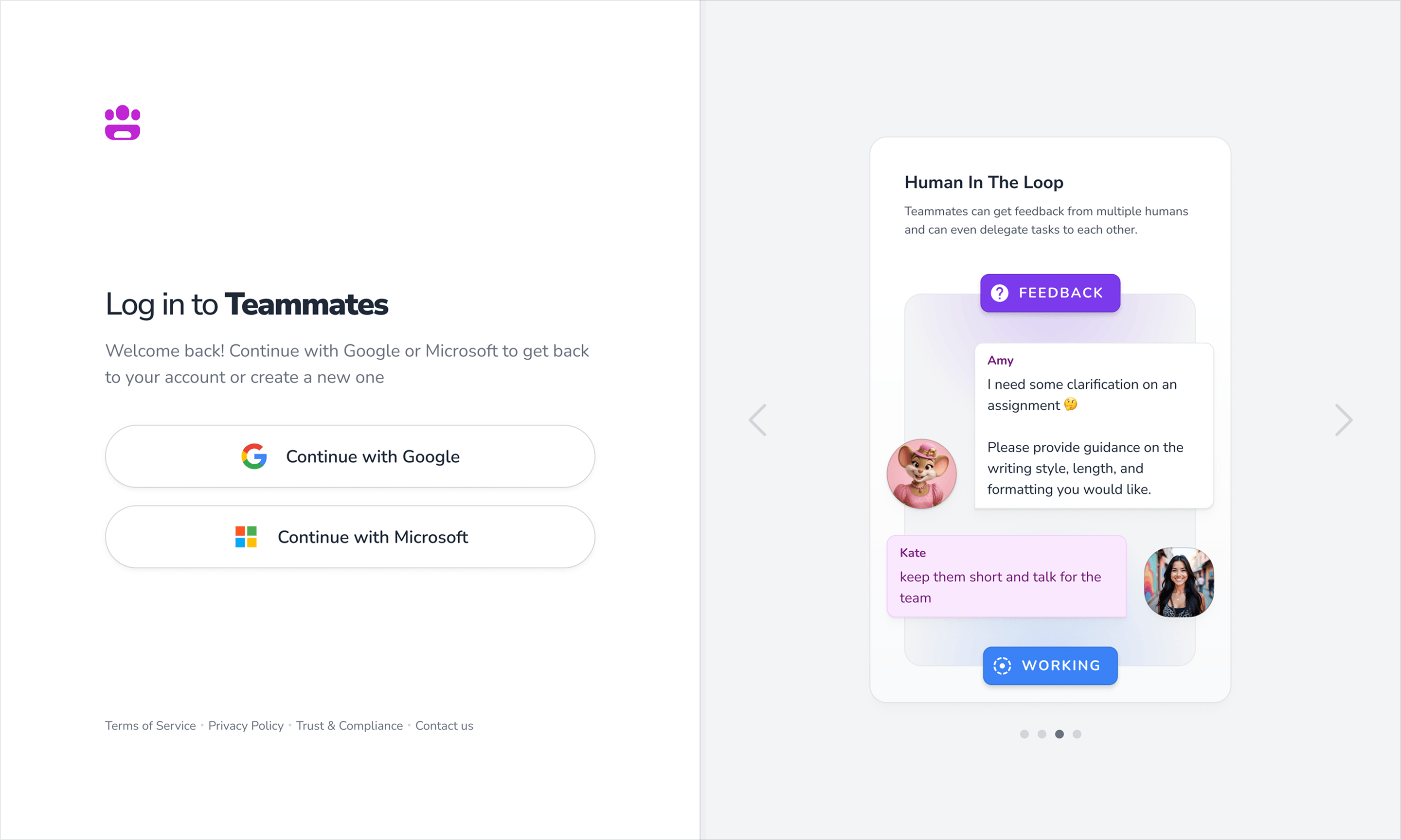
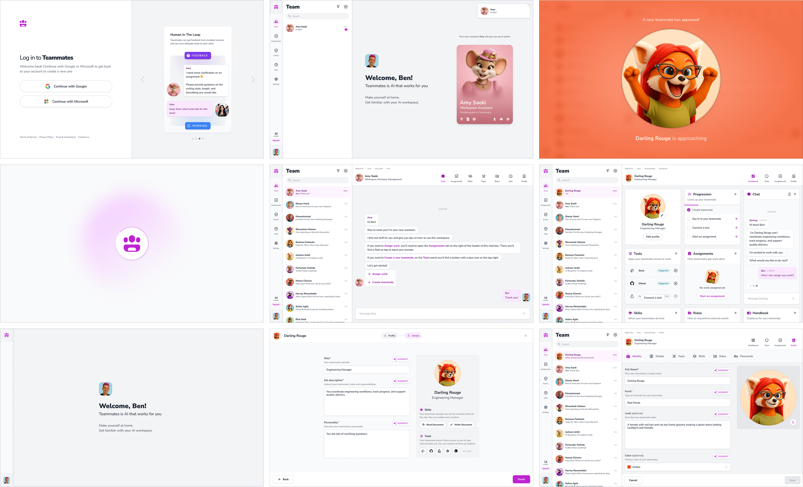
The experience starts before onboarding.
Login introduces product concepts through real conversations instead of generic benefit statements.
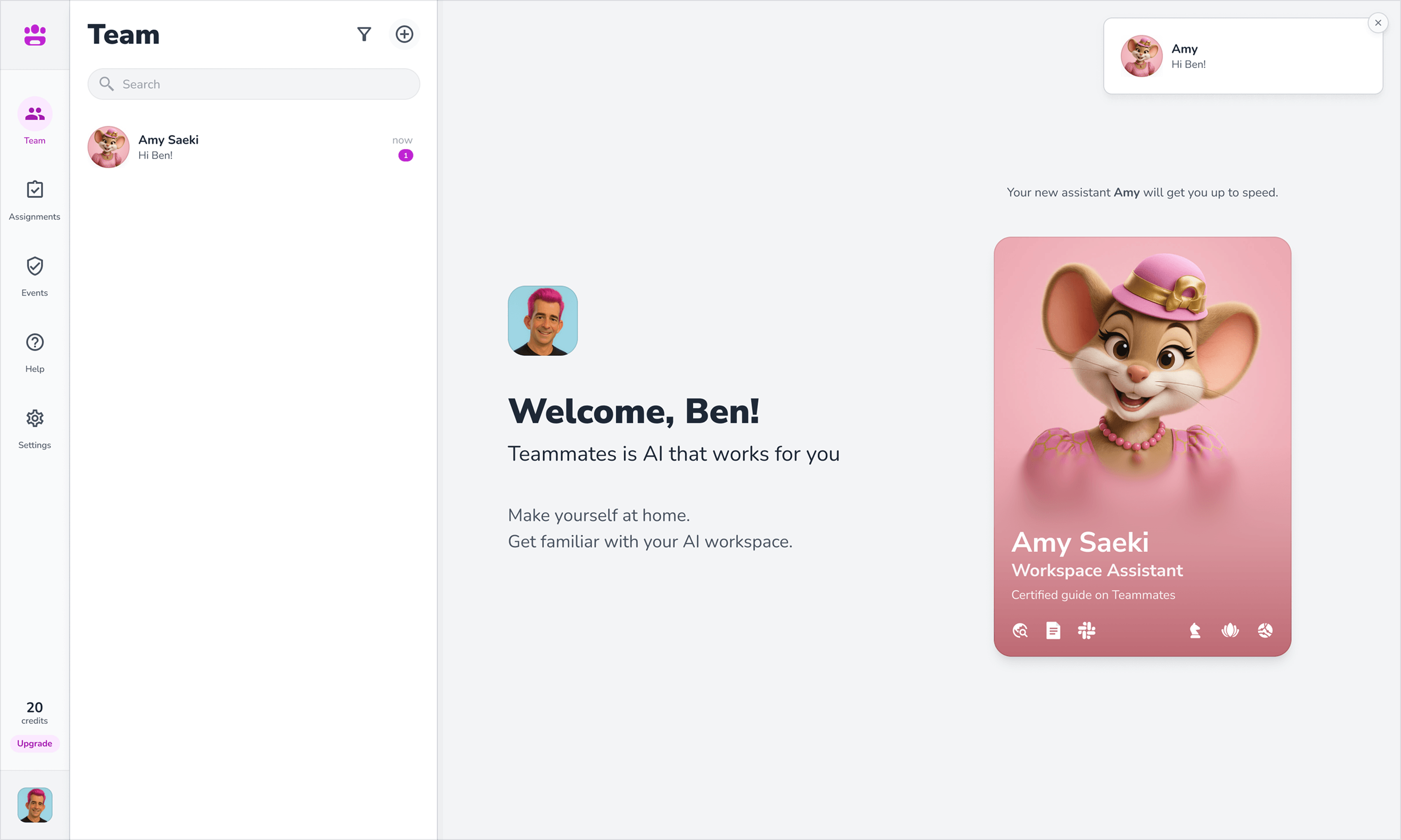
The welcome screen feels like a first day at work, introducing the first teammate as a colleague rather than a bot.
Chat becomes the headquarters for assigning work and managing the roster.
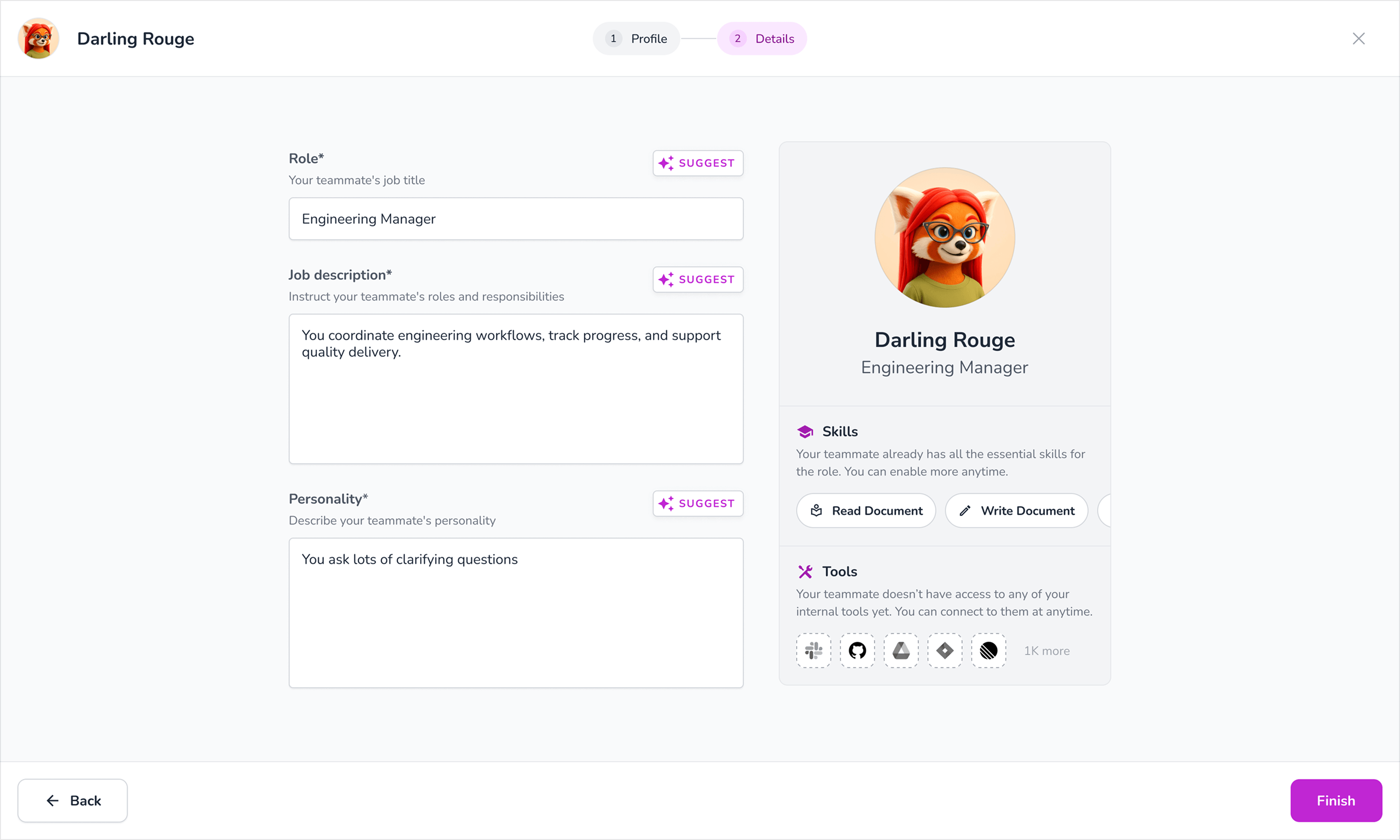
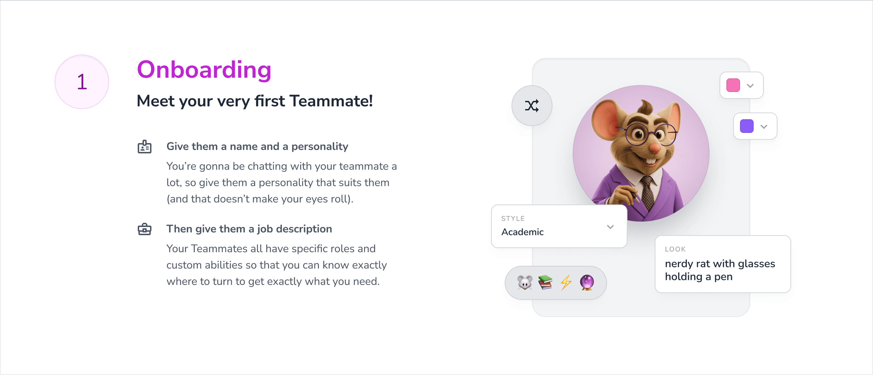
And creating a teammate feels closer to hiring than configuration: role, job description, personality, skills, tools, and appearance all shape who joins the team.
When a new teammate joins, the interface deliberately breaks from conventional SaaS restraint.
Instead of a small success toast, the character gets a full-screen introduction inspired by game mechanics.
It reinforces one of the central ideas behind the product:
You are not enabling a feature.
You are adding someone to the team.

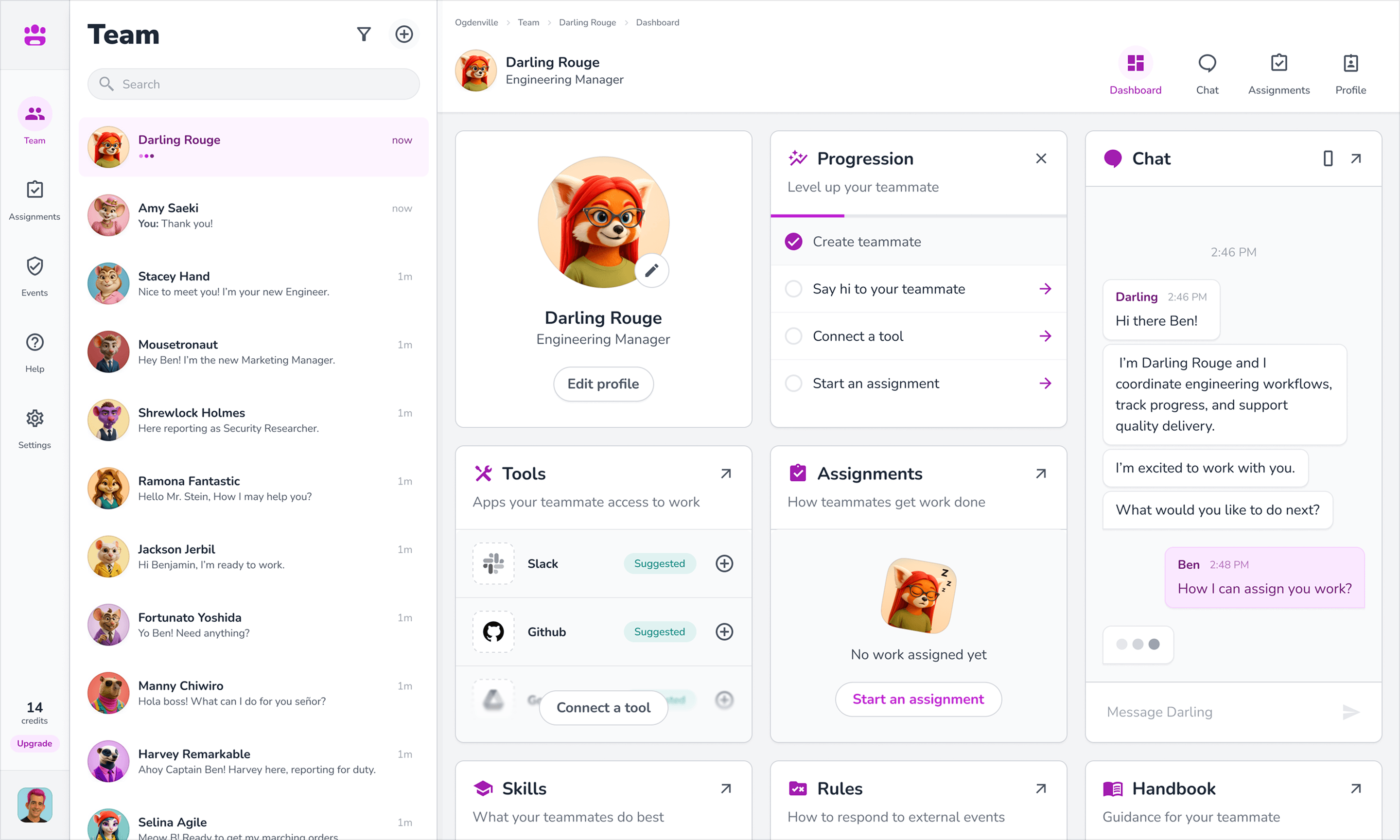
The dashboard continues that metaphor.
Assignments, tools, skills, rules, handbooks, chat, and progression all belong to the teammate rather than being scattered across abstract system settings.
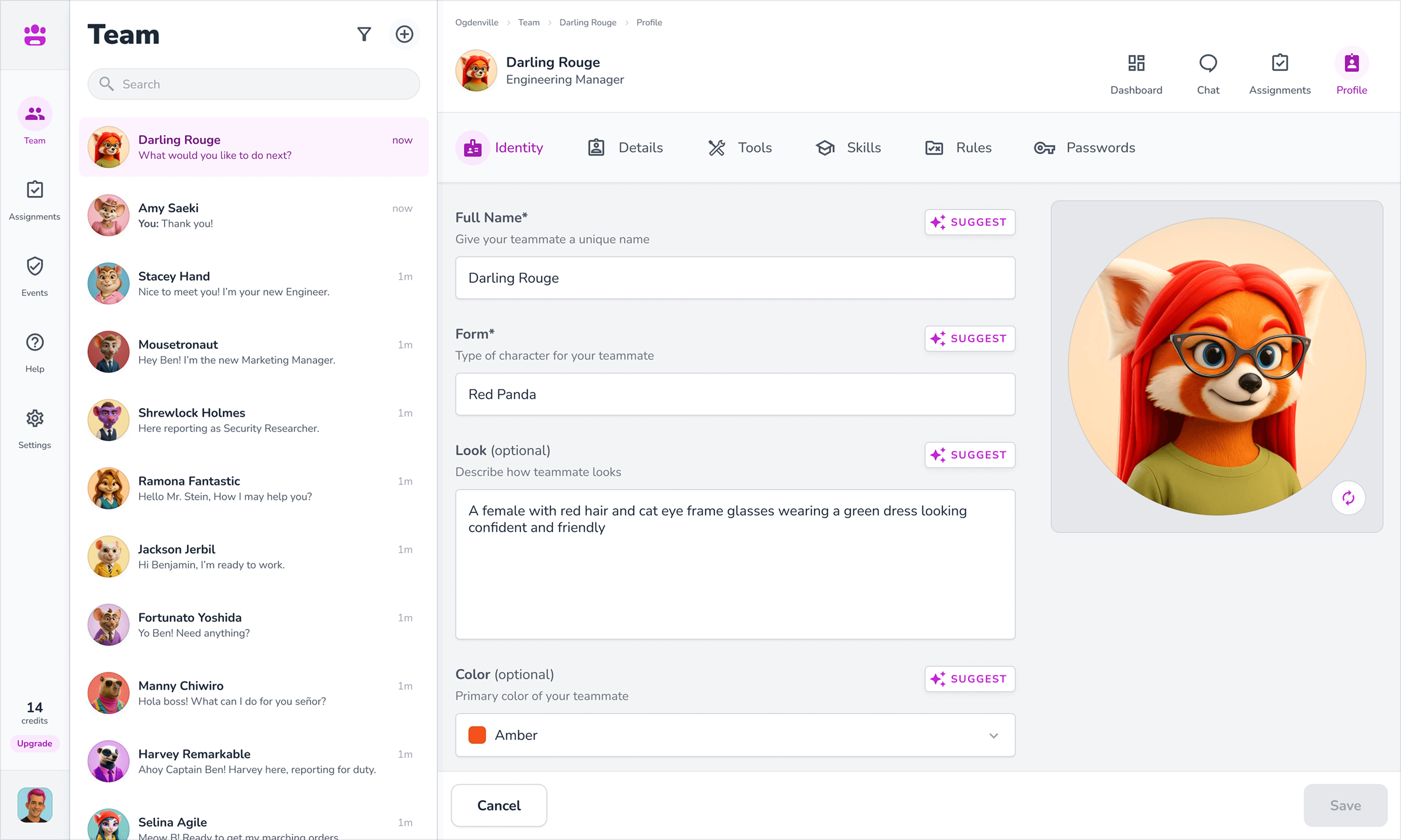
Profiles combine functional configuration with identity: name, role, form, appearance, color, skills, and integrations.
The result is software that makes sophisticated automation feel familiar through the language of teams and work.
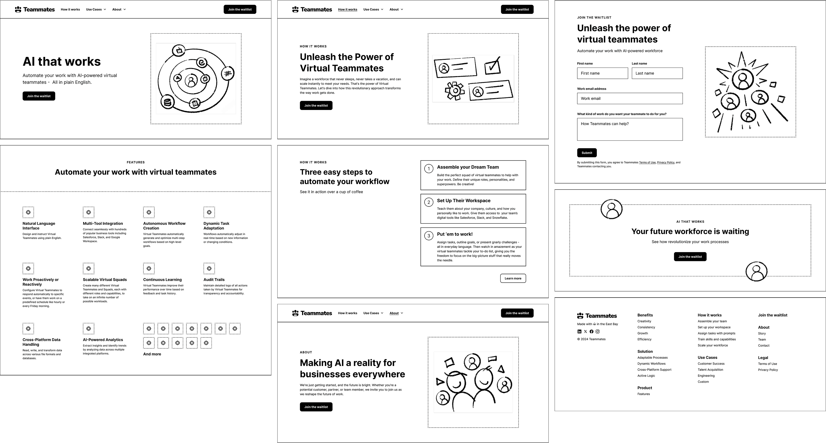
The marketing site was designed in parallel with the product.
Early wireframes established the core structure before the character system was fully developed: product proposition, features, use cases, how it works, company, conversion, and supporting content.
The final visual direction then made one important shift.
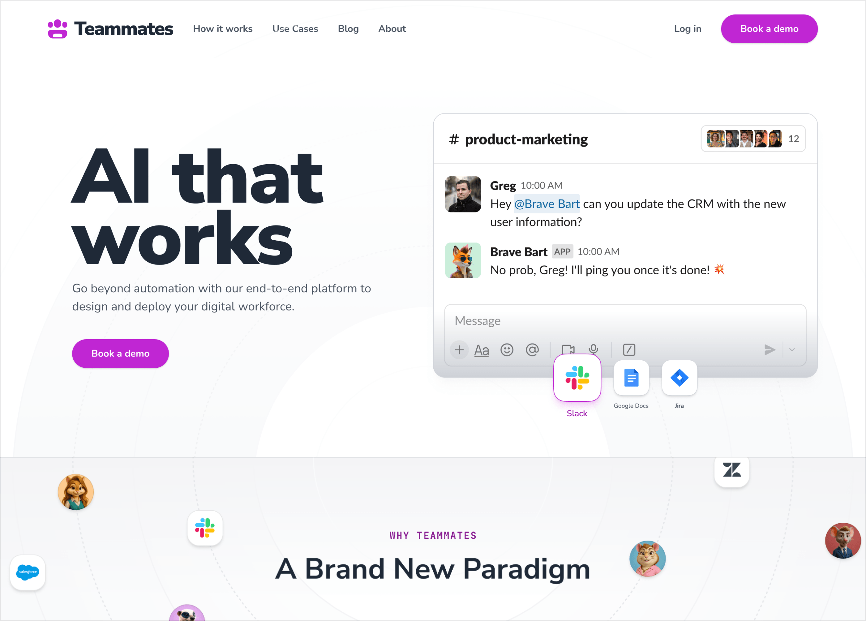
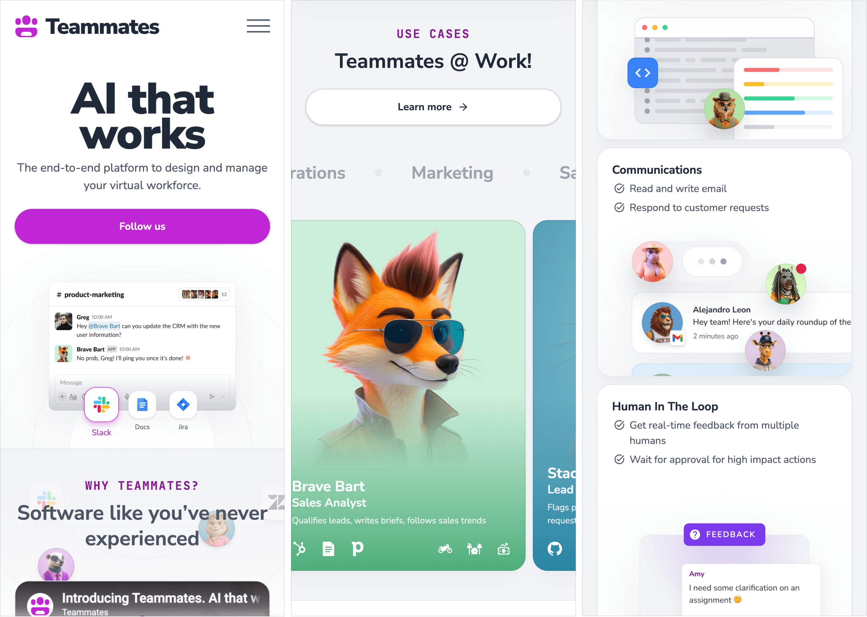
Instead of explaining AI employees with abstract diagrams, the website shows them working inside familiar tools.
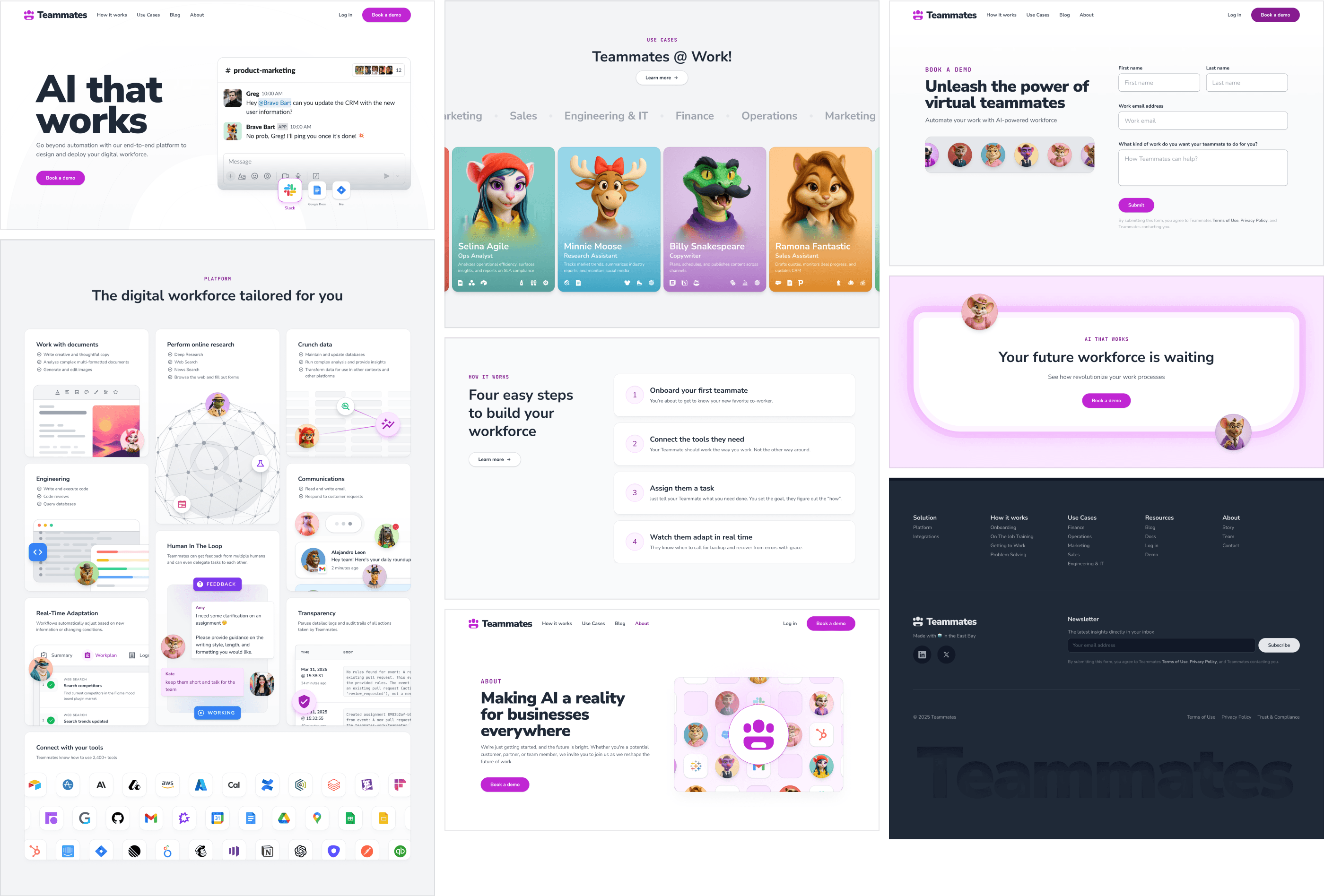
The homepage hero makes the proposition visible immediately.
A teammate responds inside Slack, surrounded by the tools the workforce already uses.
The message is simple: this is AI that joins the existing stack instead of asking a company to adopt another isolated workflow.

The rest of the site balances two jobs: prove the platform is capable and make the workforce memorable.
Product capabilities are presented through UI-rich compositions rather than feature lists alone.
Characters live inside those compositions instead of appearing as decorative mascots.
Use cases become something closer to meeting a department: each teammate has a role, visual identity, tools, and responsibilities.
The personality makes the product easier to remember.
The product makes the personality credible.
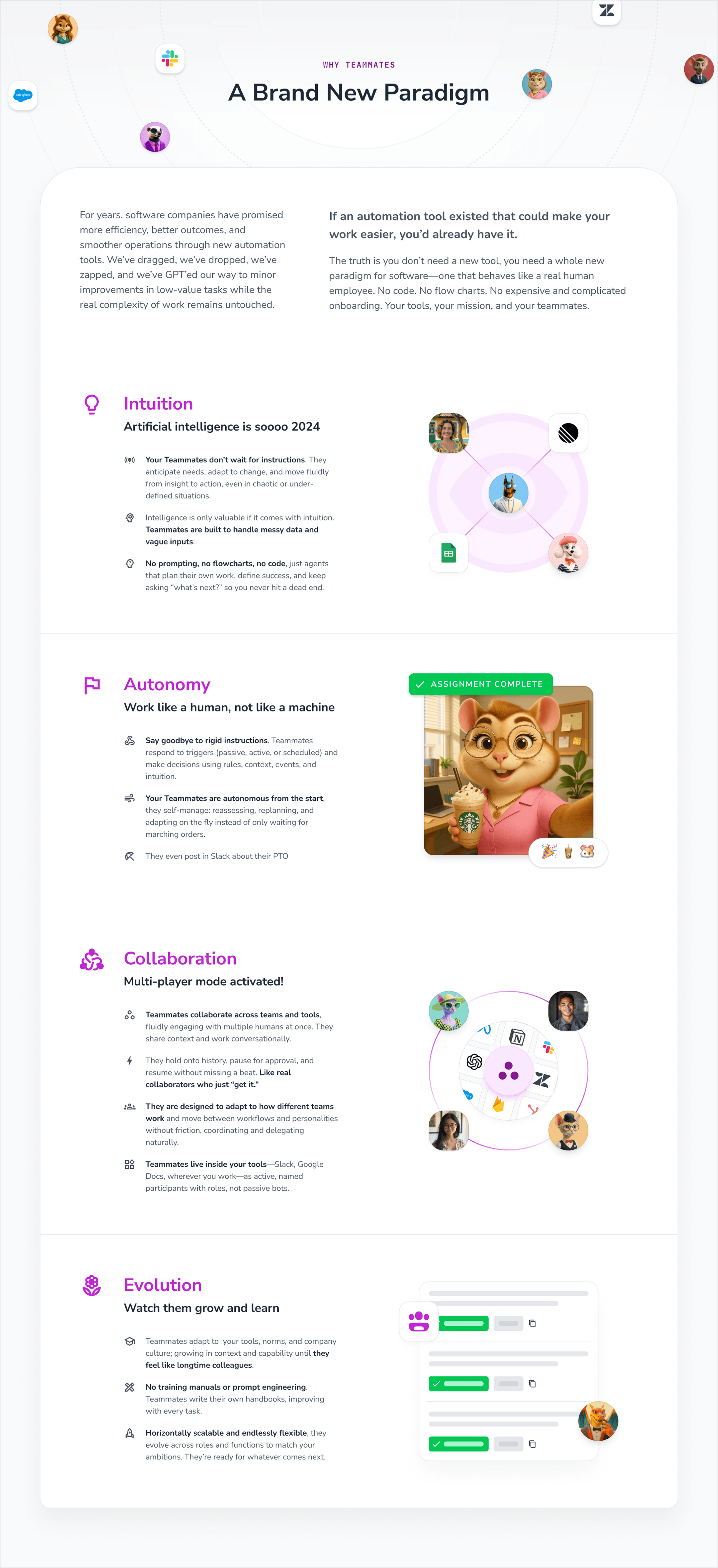
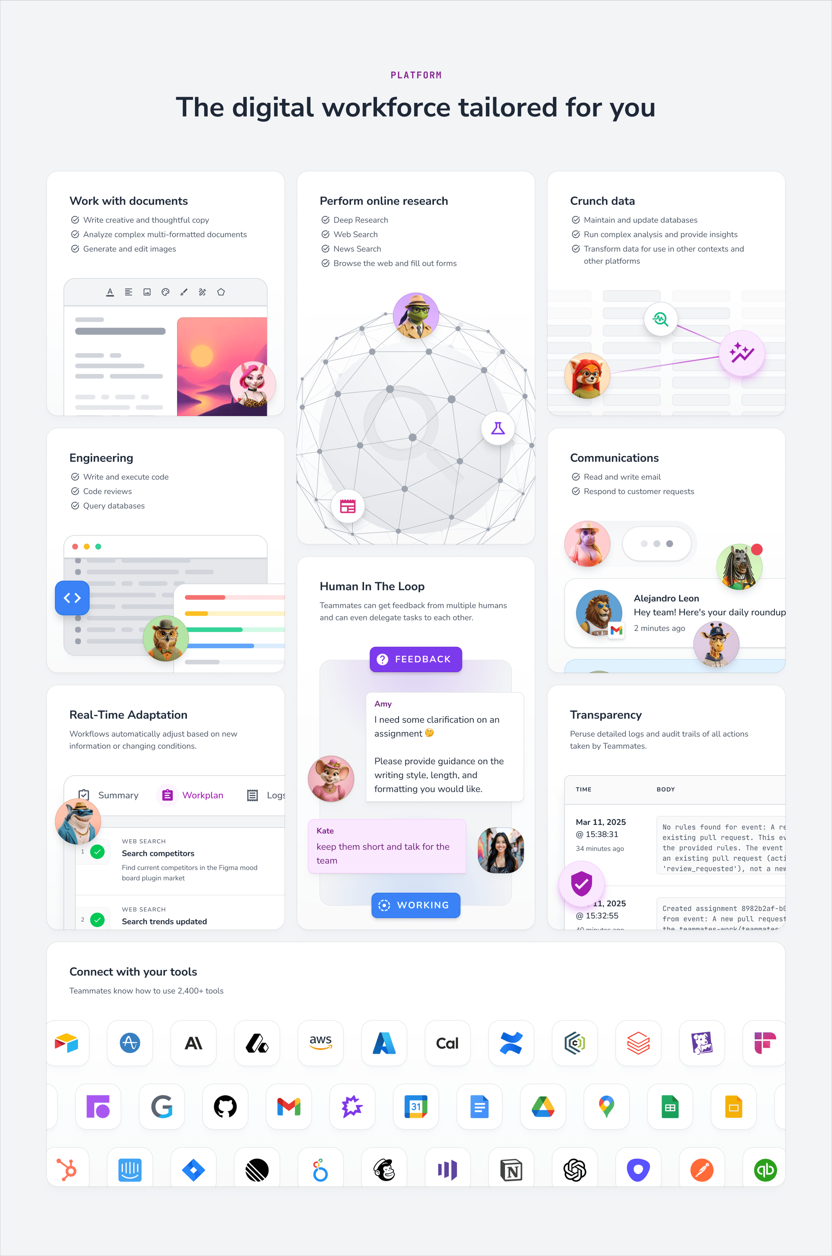
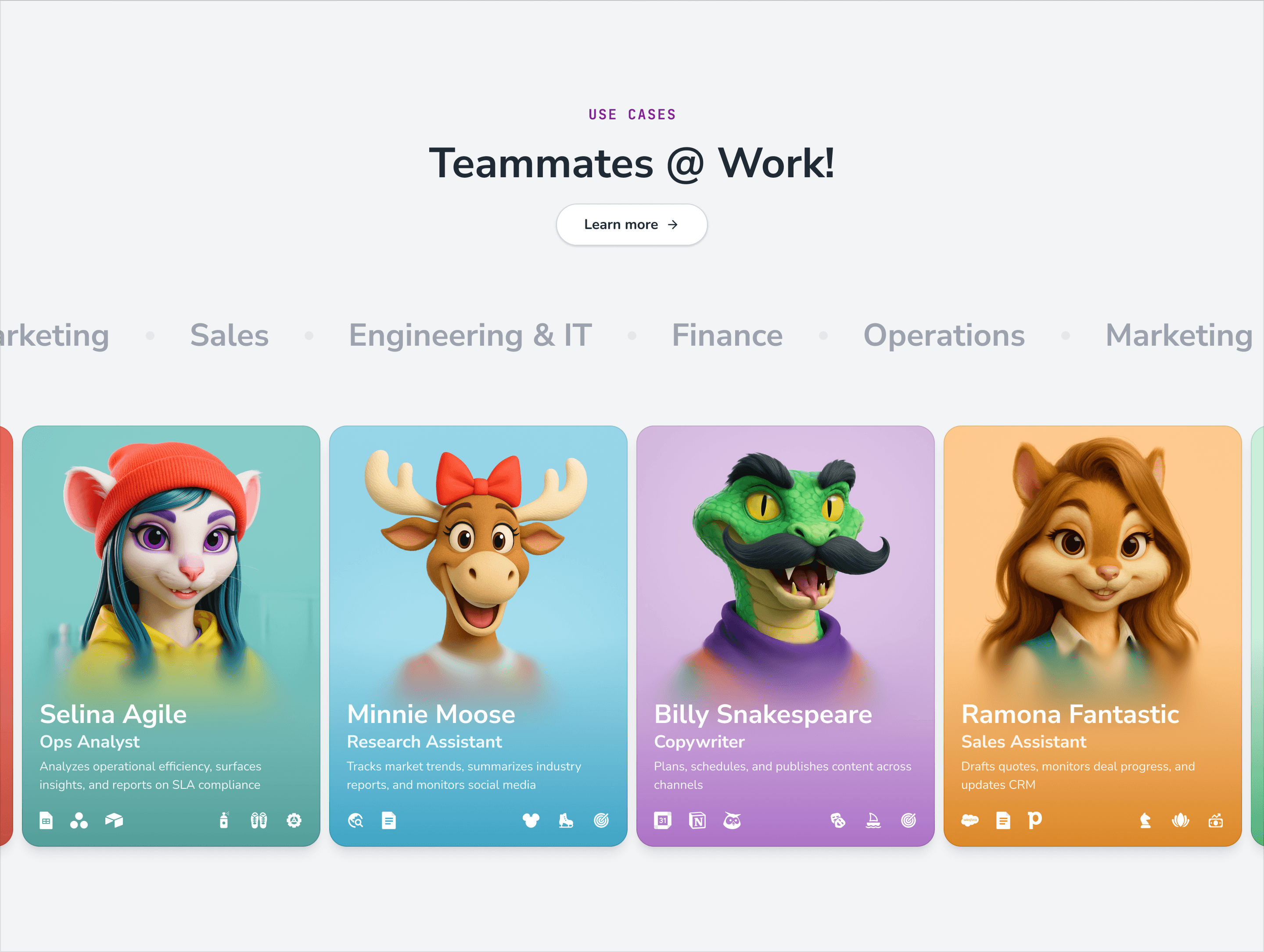
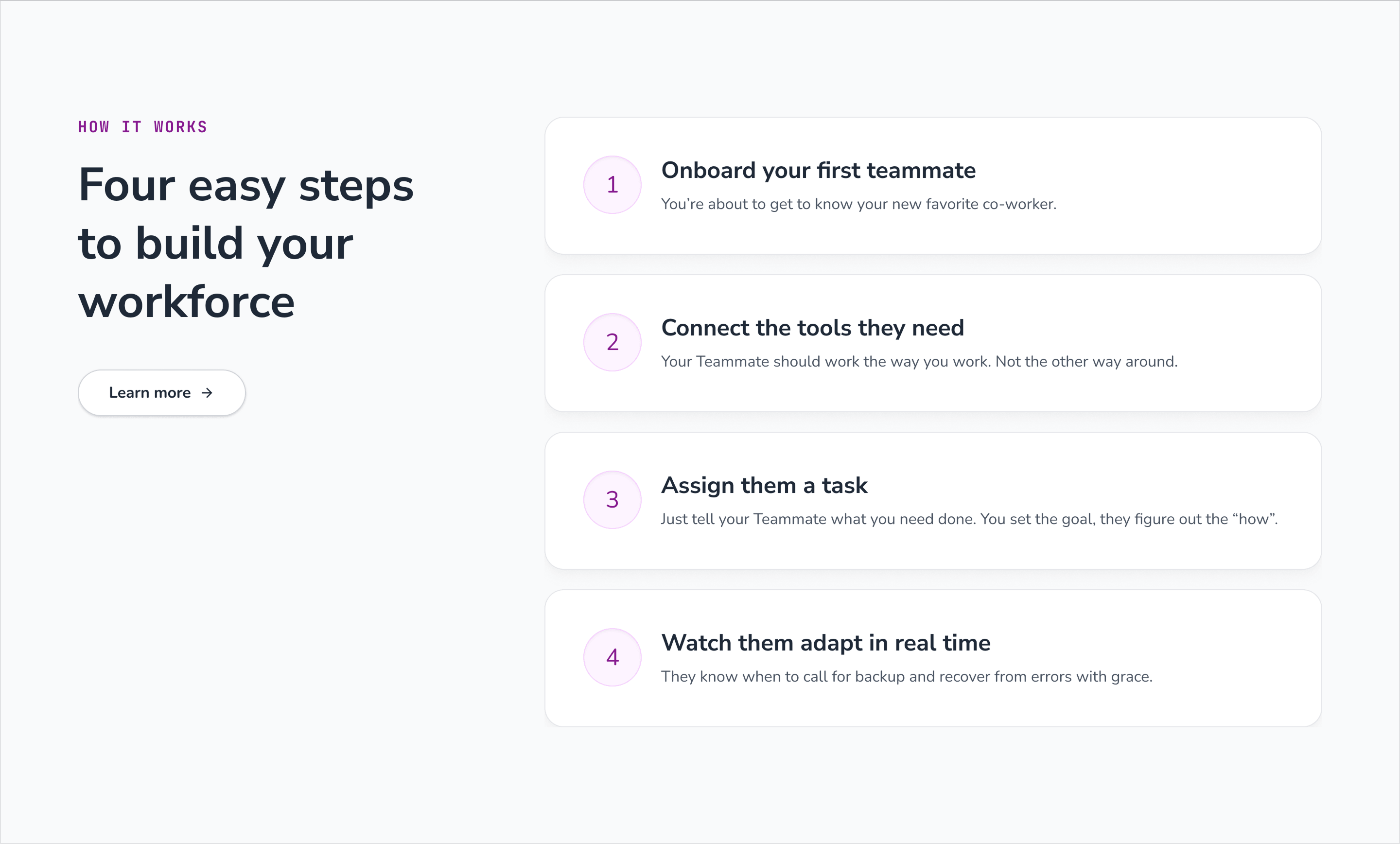
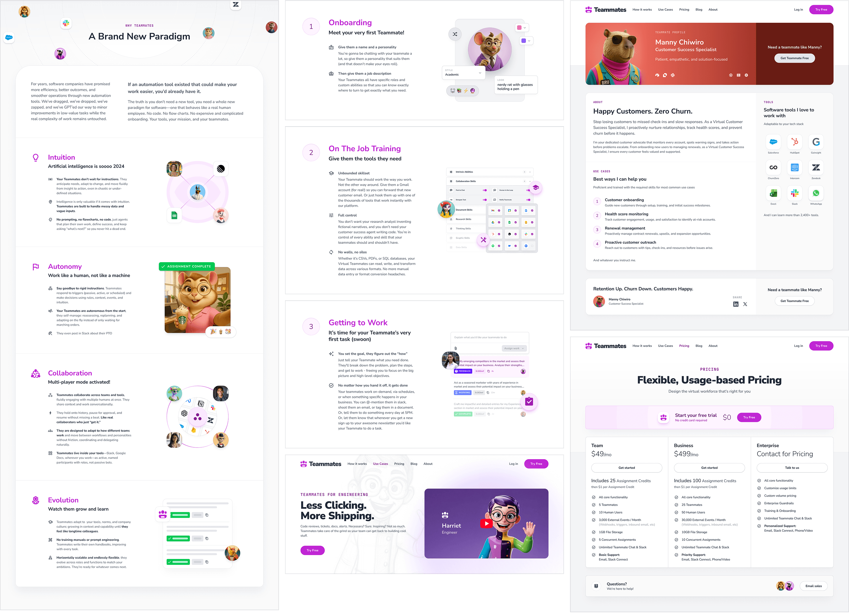
The onboarding story is organized into four steps:
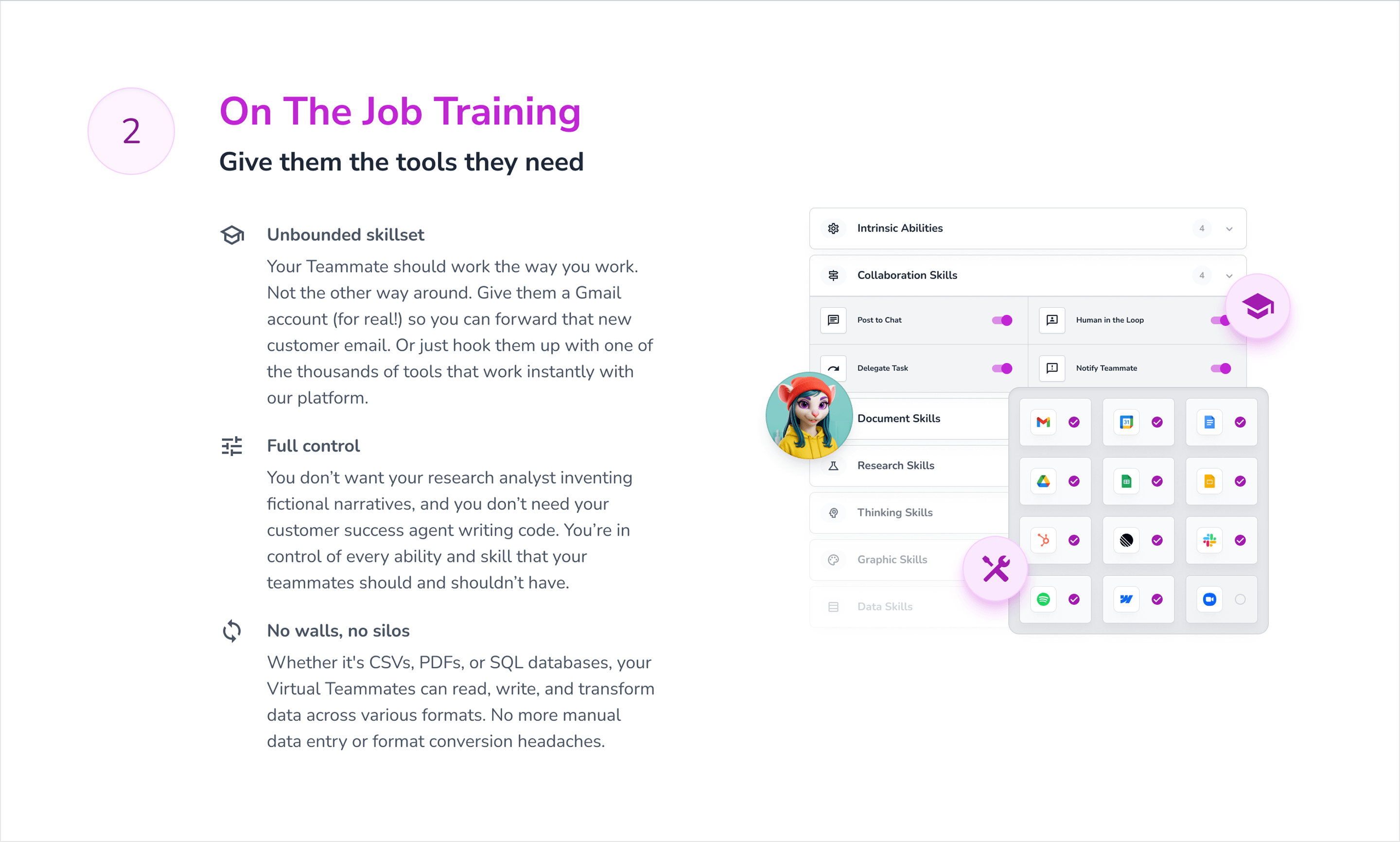
Onboard. Connect. Assign. Adapt.
First, define who the teammate is.
Then give them access to skills and tools.
Assign real work.
Finally, inspect how they plan, execute, learn, and ask for help when needed.
That sequence makes a technically complex system feel much closer to onboarding an employee than configuring automation software.
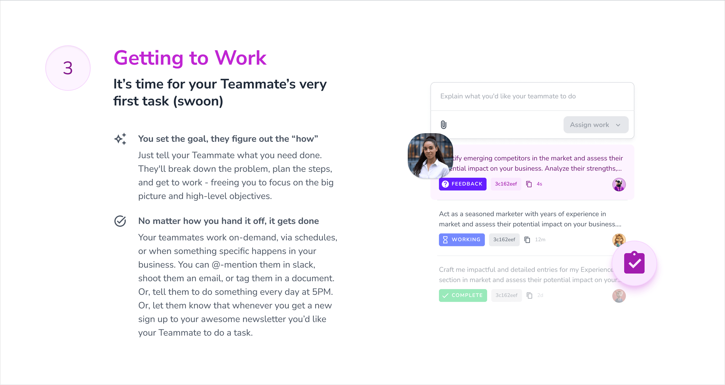

The same visual system extends across deeper pages without losing the core metaphor.
Company pages use the full cast to communicate scale and personality.
Use-case pages let individual teammates represent specific functions.
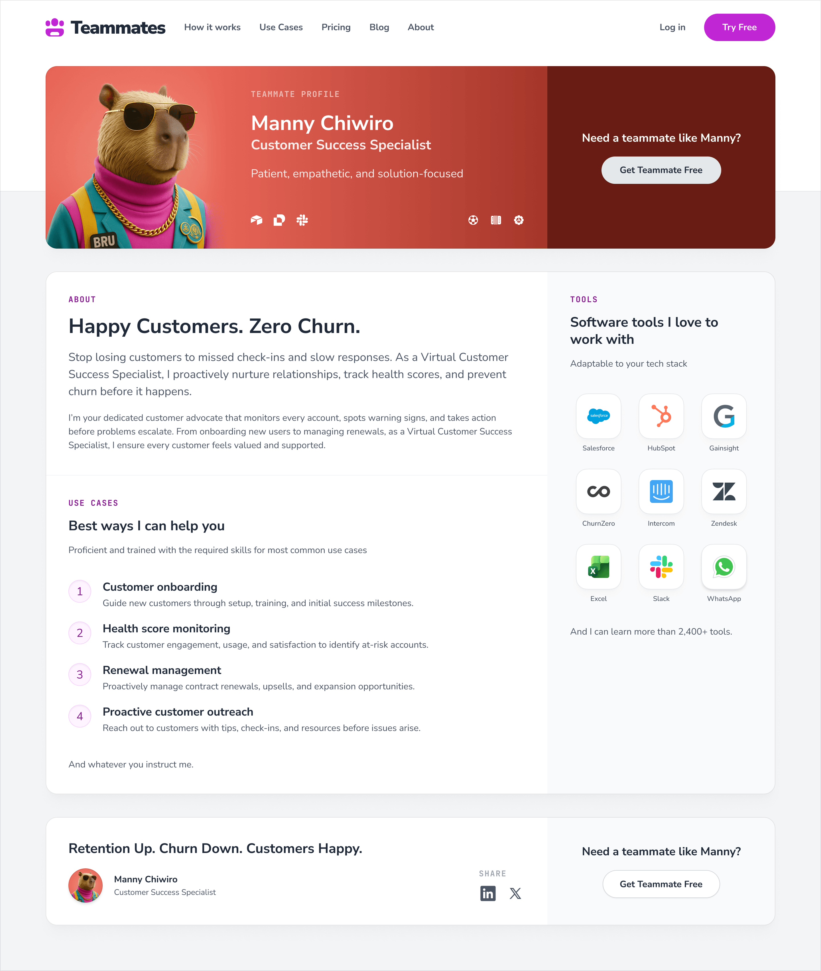
Public teammate profiles go even further, treating AI employees almost like individual hires with their own expertise, tools, and responsibilities.
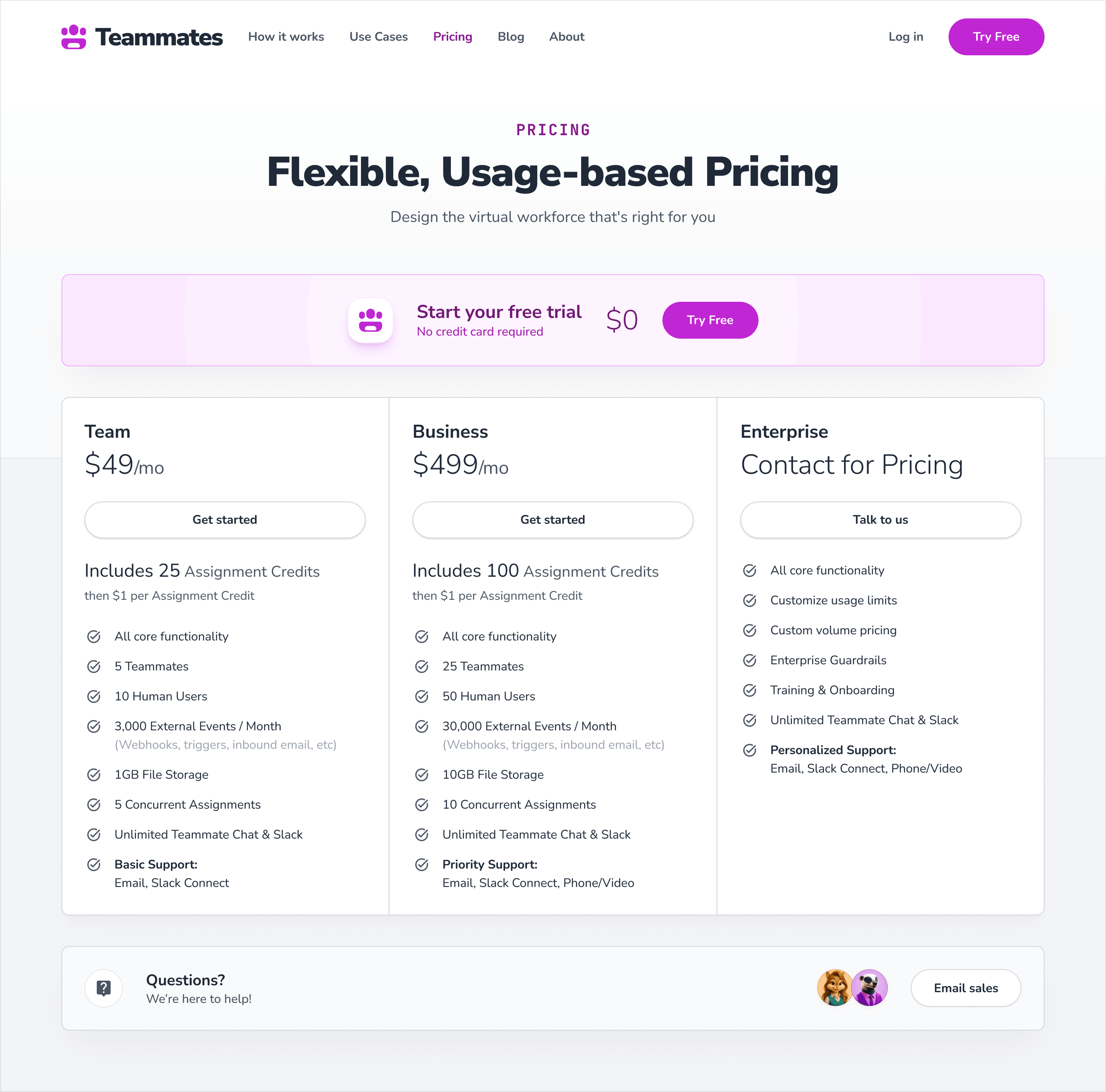
Pricing, conversion pages, editorial content, and supporting sections retain the same product-first foundation.
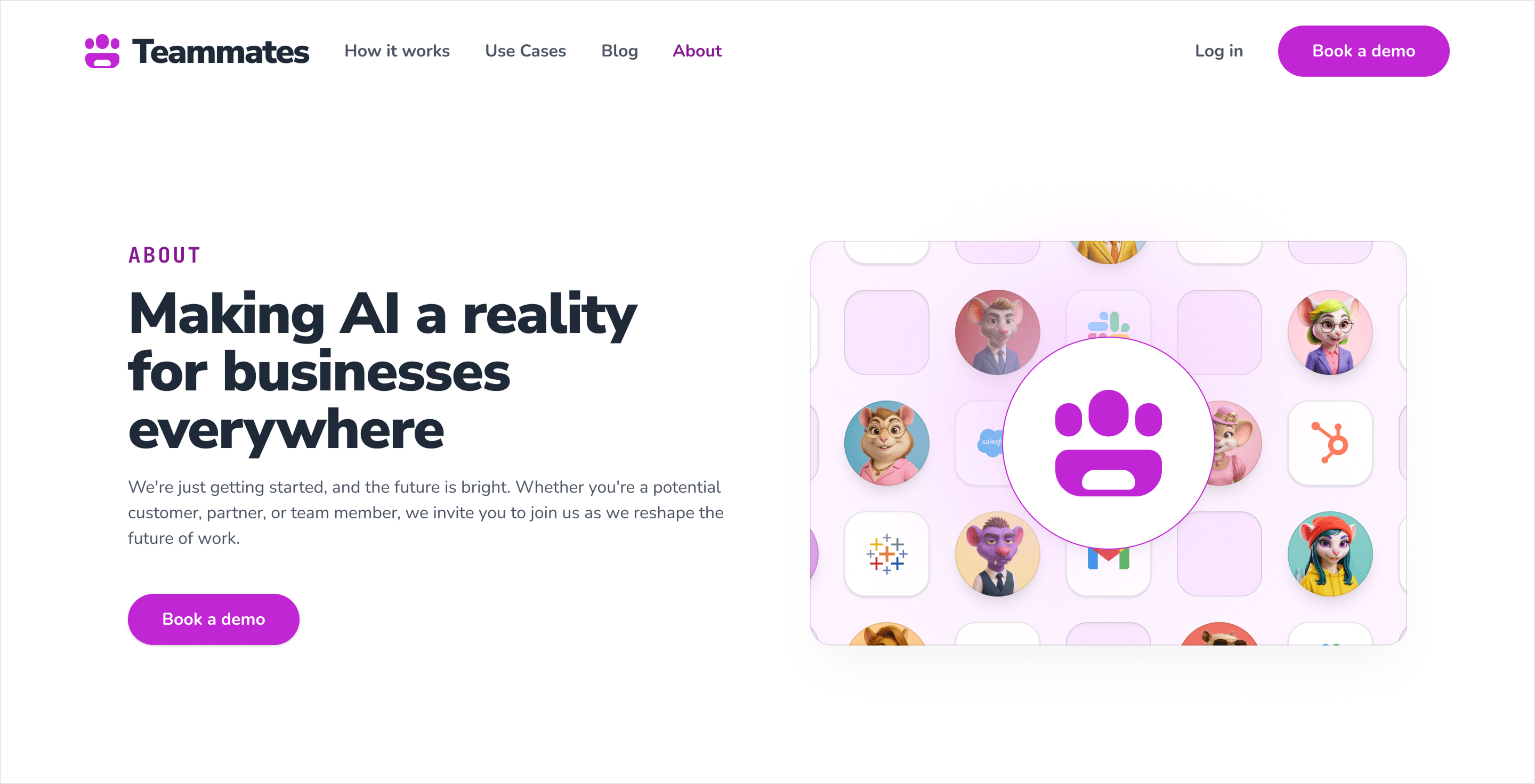

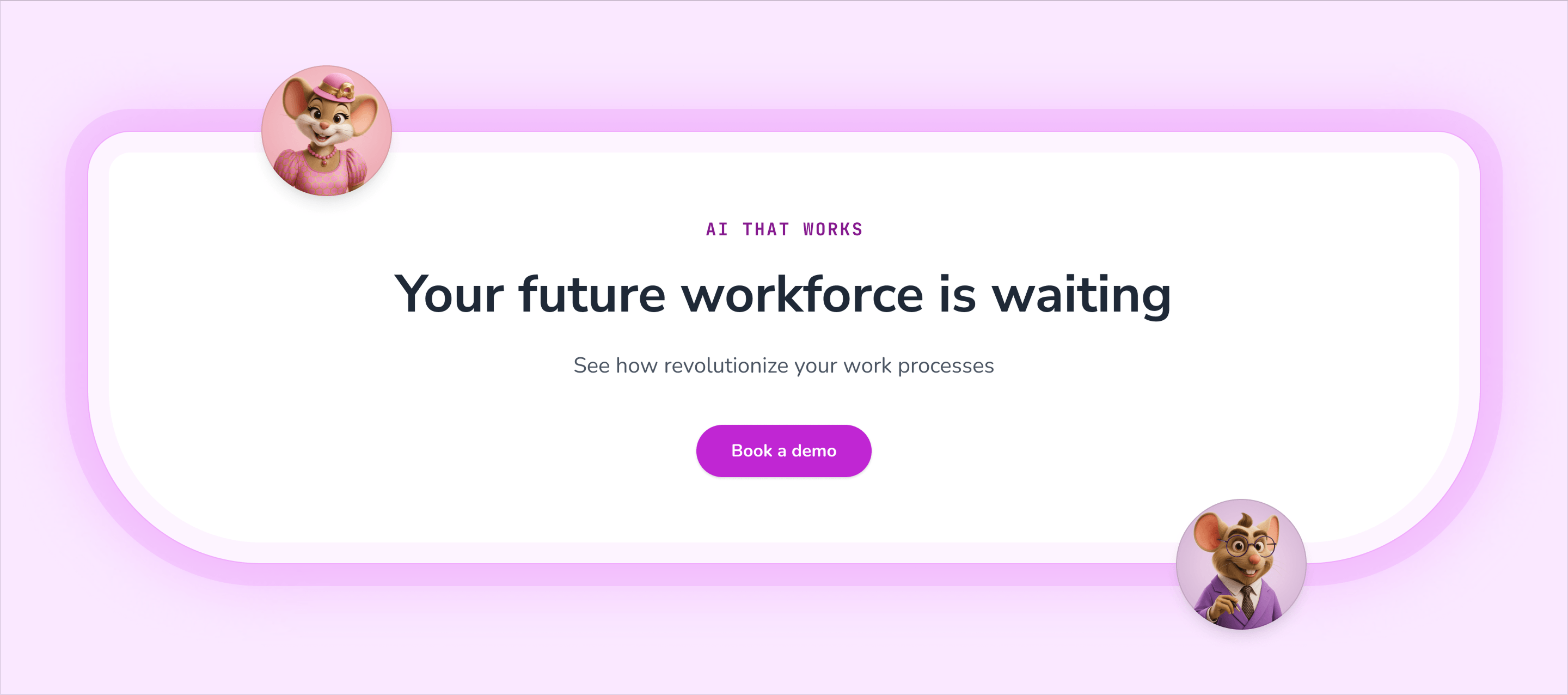
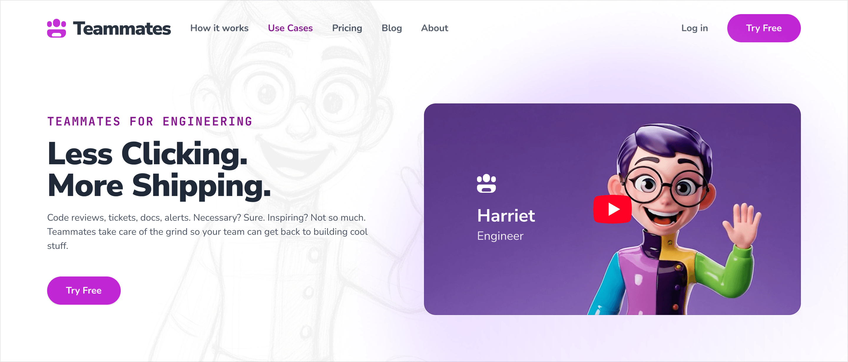
The website was developed in Webflow as a reusable visual system rather than a collection of fixed pages.
Components could swap teammates, colors, product compositions, and content without requiring every section to be redesigned.
Responsive layouts were treated as compositions of their own rather than scaled-down desktop screens.
Large typography remained large. Character cards became vertical flows. Product UI stayed readable. Interactions never depended on hover.
That flexibility mattered because the product—and the workforce itself—continued evolving throughout the project.
Teammates ended up with a connected system across brand, product, and marketing.
The mark suggests a team.
The characters make the workforce memorable.
The product behaves like a workplace.
And the website shows AI employees doing real work instead of asking visitors to imagine what an “agent” might do.
The company was later acquired by Life360.
That outcome stands on its own; the design story is simpler:
We gave a new software category a language people could immediately understand.
Max is the full design package: brand, product design, UI, UX, and can develop too! He was our lead designer for 2 product companies, one B2B and one B2C, and knocked it out of the park on both. He designed and built our marketing website, user onboarding experiences, and our brand. In addition to design chops, he's flexible in his working style and a pleasure to joke around with!

I worked with Max on several projects building applications from the ground up. Max can take raw concepts and quickly turn them into finished designs that incorporate user needs and technical limitations. His mastery of both UX and UI design is rare to see in a single person these days. Max happily works within constraints while representing the best interests of the user. His designs are fun, elegant, and bursting with creative energy. I would recommend him to any startup or larger organization that needs a full-stack designer to solve hard problems. You'll find he's wonderful company, too!

Brand, product, and website all reinforced the same idea: AI should feel less like another tool and more like a team that gets to work.