Ed Farm
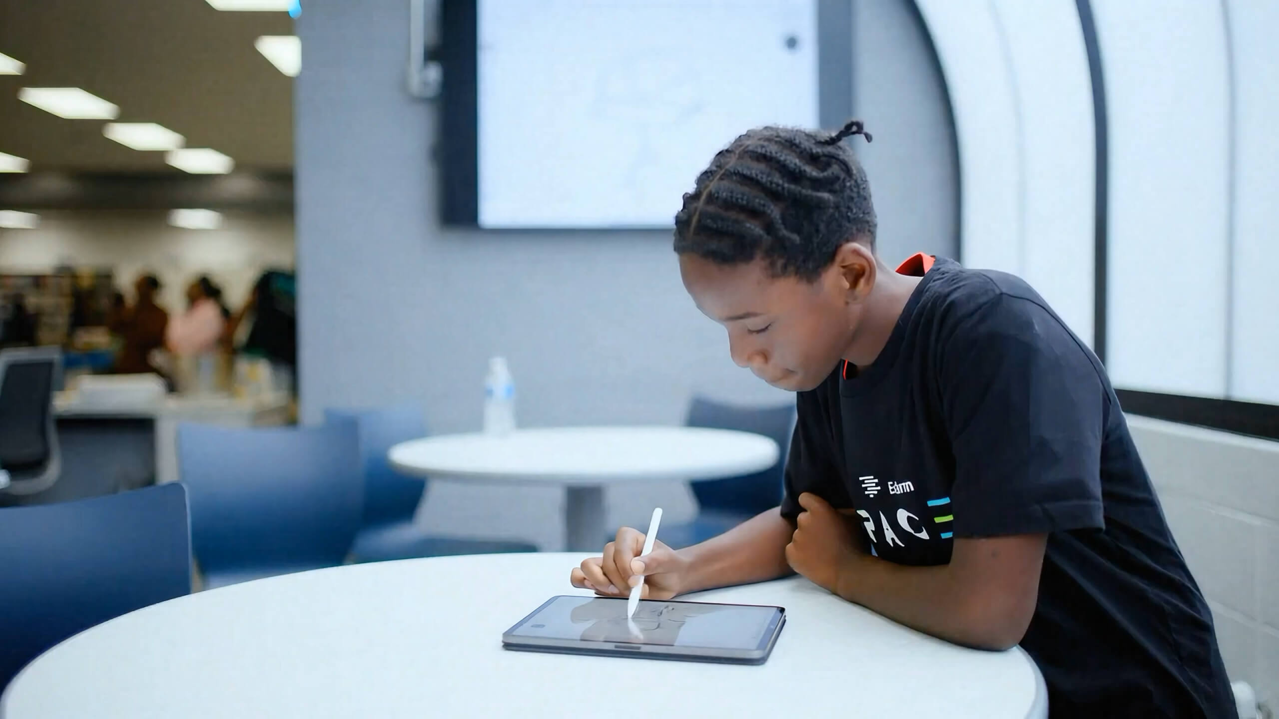
Ed Farm is an education ecosystem helping communities close digital skills gaps across students, educators, and the workforce.
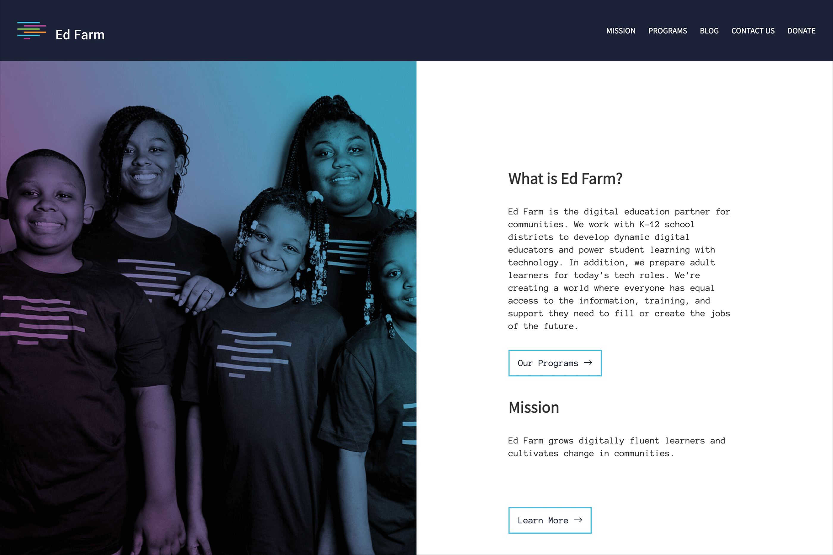
Founded in partnership with Apple and the Alabama Power Foundation, the organization needed a digital presence capable of communicating a broad mission without losing clarity, energy, or accessibility.
Digital Designer
Creative Direction, Brand Design, UI/UX Design, Website Design, Webflow Development
Toni Dawkins, Director, Strategic Communications & Marketing
Ed Farm works across several connected groups.
Students need opportunities to build digital skills. Educators need tools and programs that help them teach those skills. Communities need pathways connecting learning with future opportunities.
The digital experience had to bring those audiences together under one coherent story while helping each quickly find what mattered most.
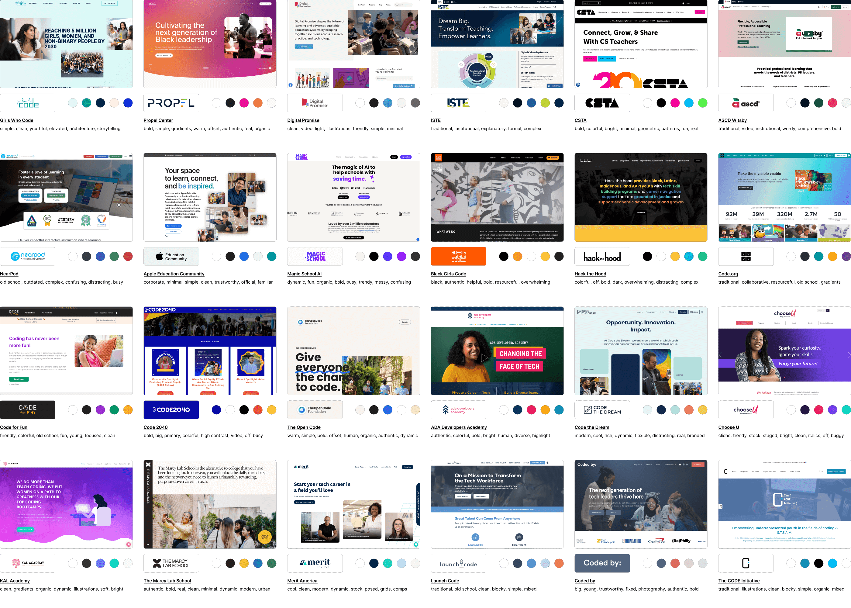
We explored education, workforce, and technology brands to understand how they balanced innovation with trust and accessibility.
The strongest opportunity was already inside Ed Farm itself: real students, educators, programs, spaces, and communities.
Rather than making technology the visual protagonist, the new direction would put the people using it first.
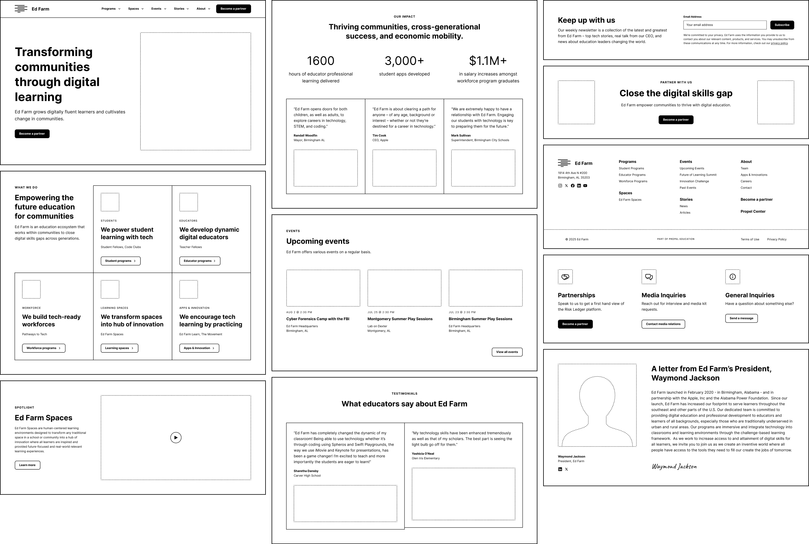
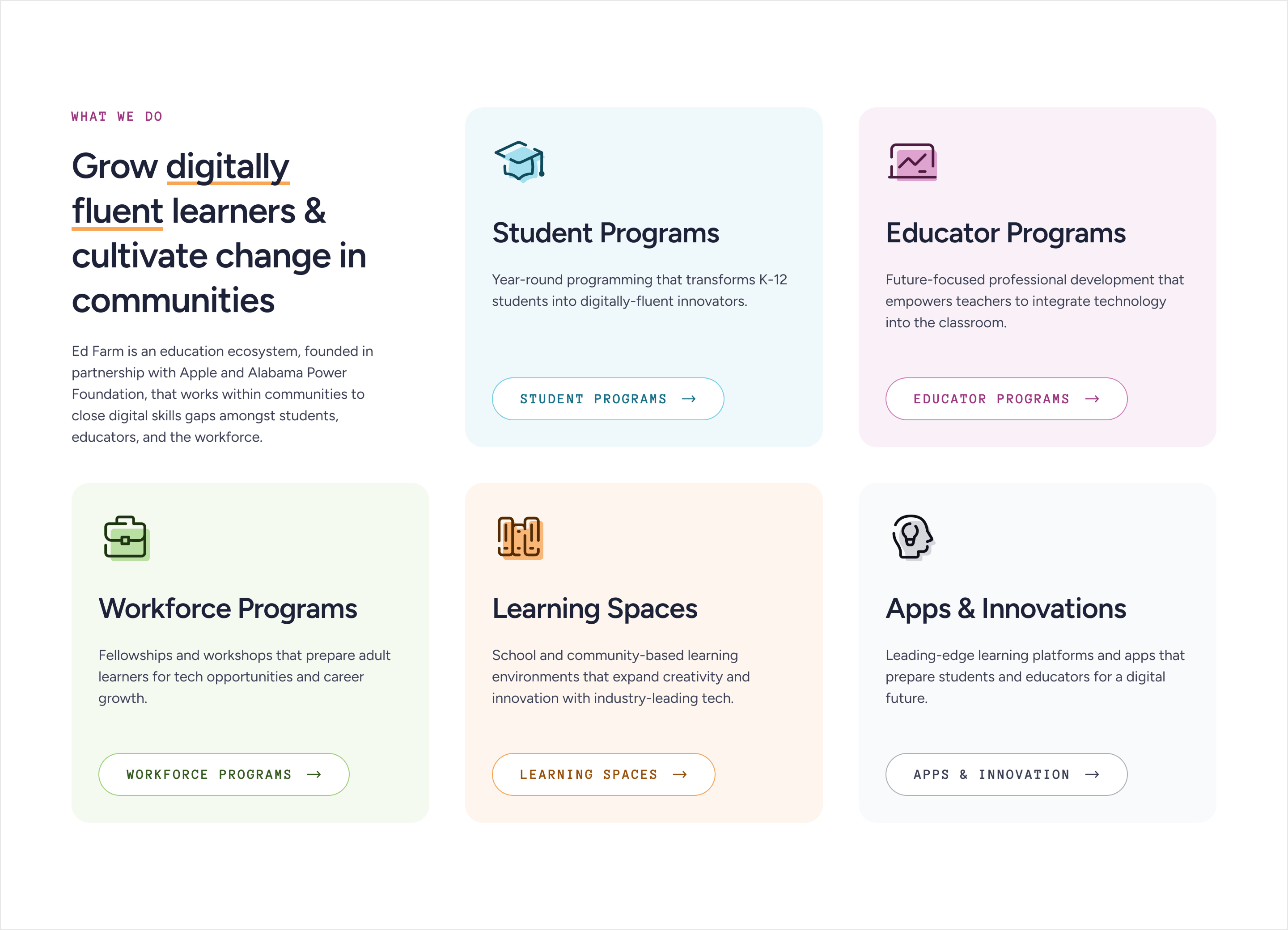
Before styling the site, we simplified the experience around Ed Farm’s major areas of work.
Programs for students, educators, and the workforce became clearer entry points, supported by learning spaces, apps and innovations, stories, events, and partnership opportunities.
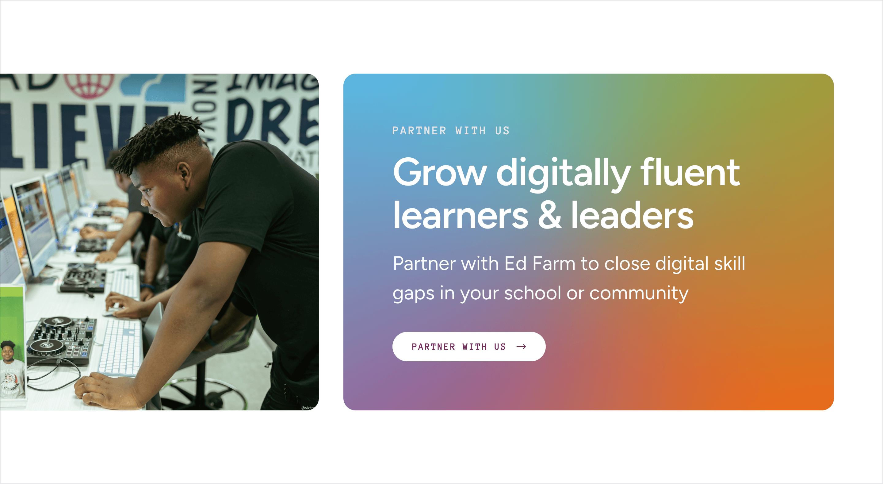
One action stayed deliberately prominent across the experience: Partner with us.
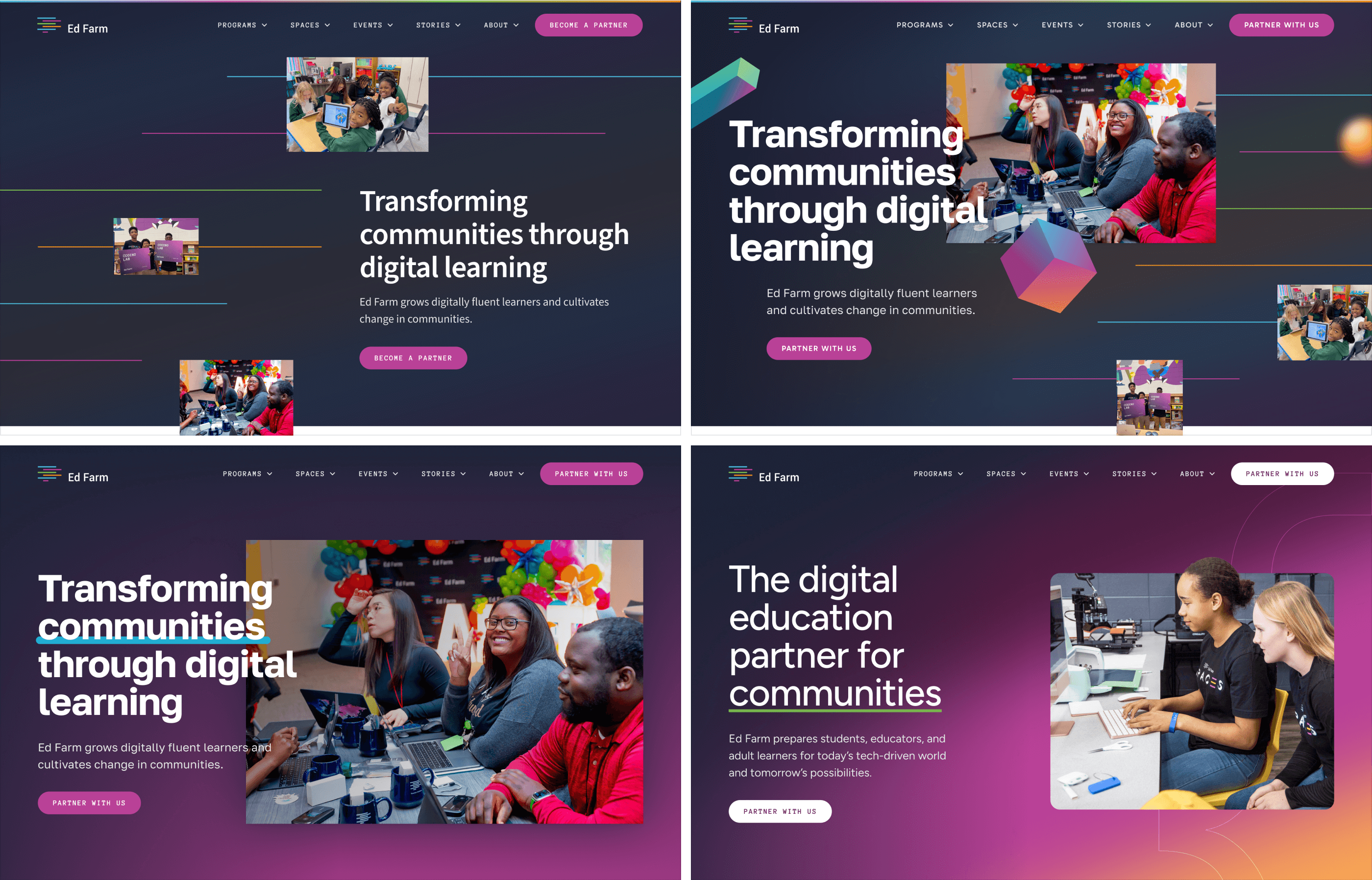
Two visual directions pushed the brand in different ways.
One leaned further into technology with darker surfaces, floating elements, and more graphic compositions.
The other made photography the centerpiece—real people, real spaces, bold typography, and the existing Ed Farm identity.
The second felt more authentic to the organization.

The final website combines bold typography, flexible gradients, real photography, and reusable components across programs, spaces, stories, events, partnerships, and organizational content.
The goal was consistency without sameness.
Each area could have its own focus while still feeling unmistakably part of Ed Farm.

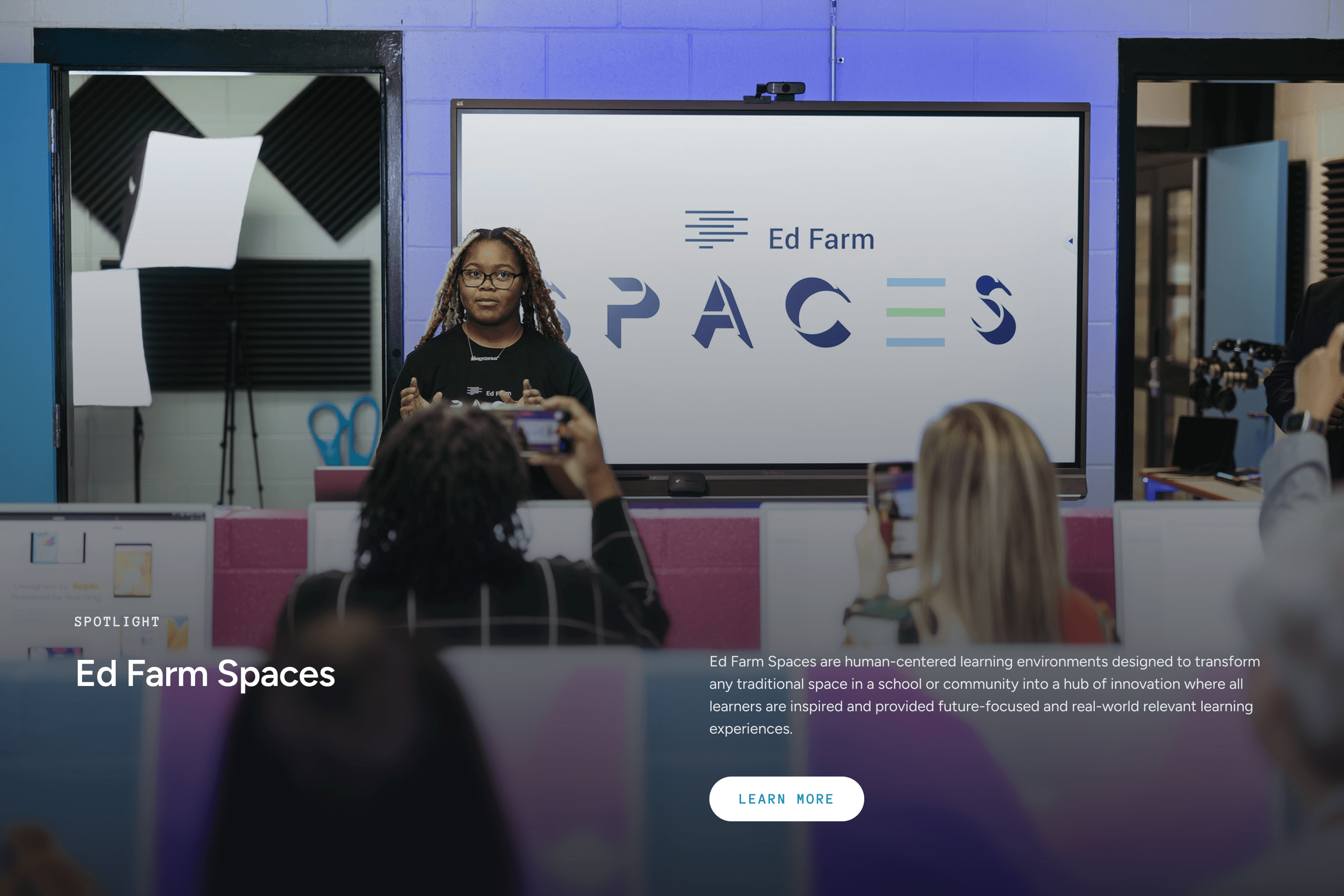
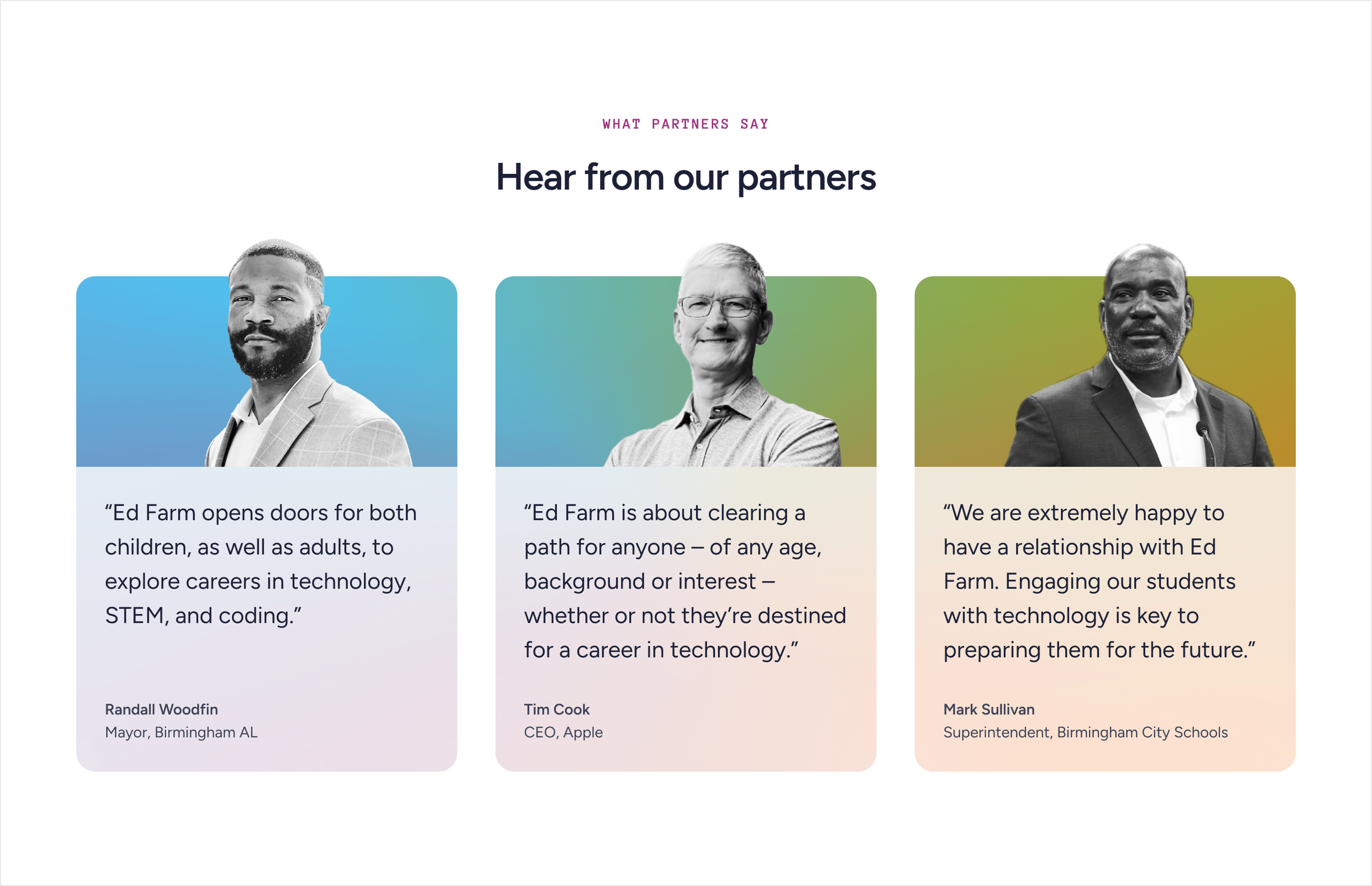
Ed Farm’s impact is easier to understand through the communities participating in it.
Full-bleed imagery gives physical learning spaces room to feel tangible, while partner voices and stories add proof from the people closest to the work.
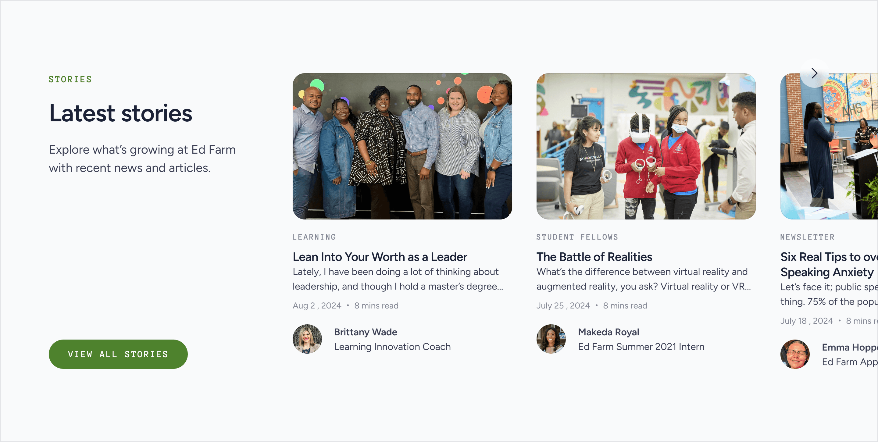
The site keeps the action hierarchy simple.
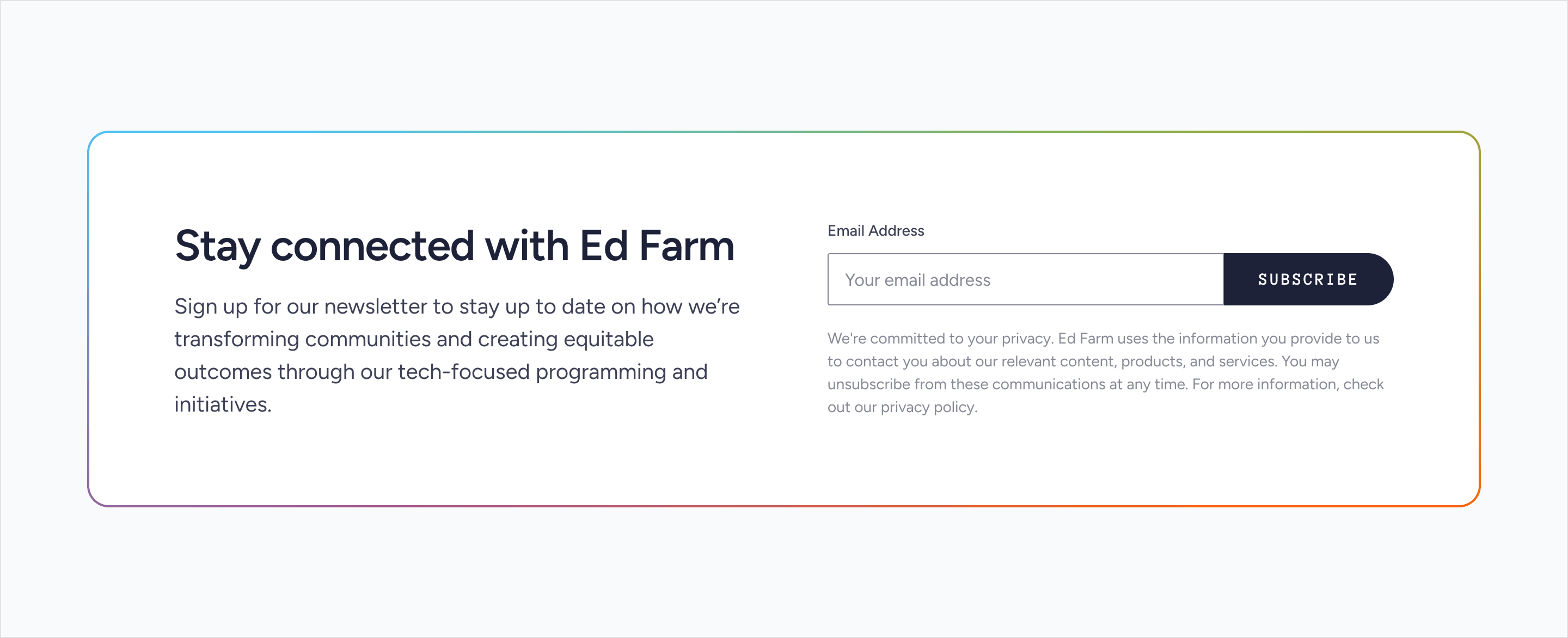
Newsletter signup provides a lightweight way to stay connected, while partnership remains the primary conversion goal throughout the experience.
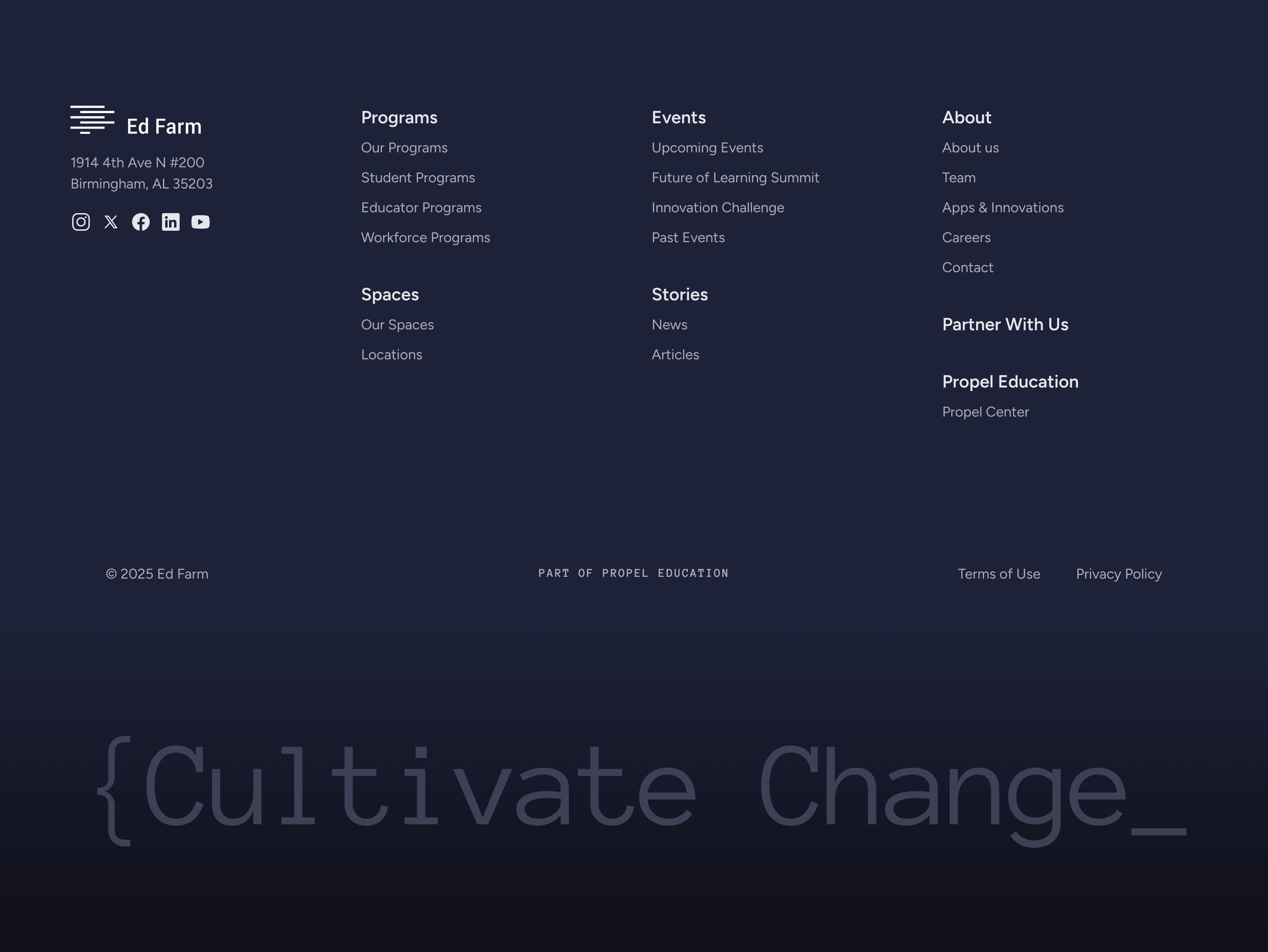
The same visual system extends into organizational storytelling, testimonials, history, locations, team content, and contact paths.
That gives Ed Farm room to evolve without turning every new need into a separate design system.
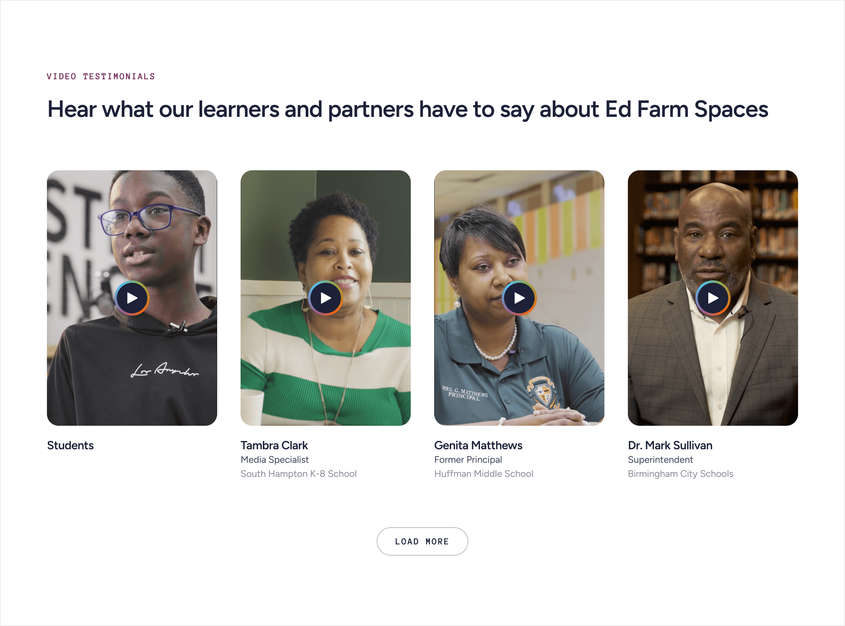
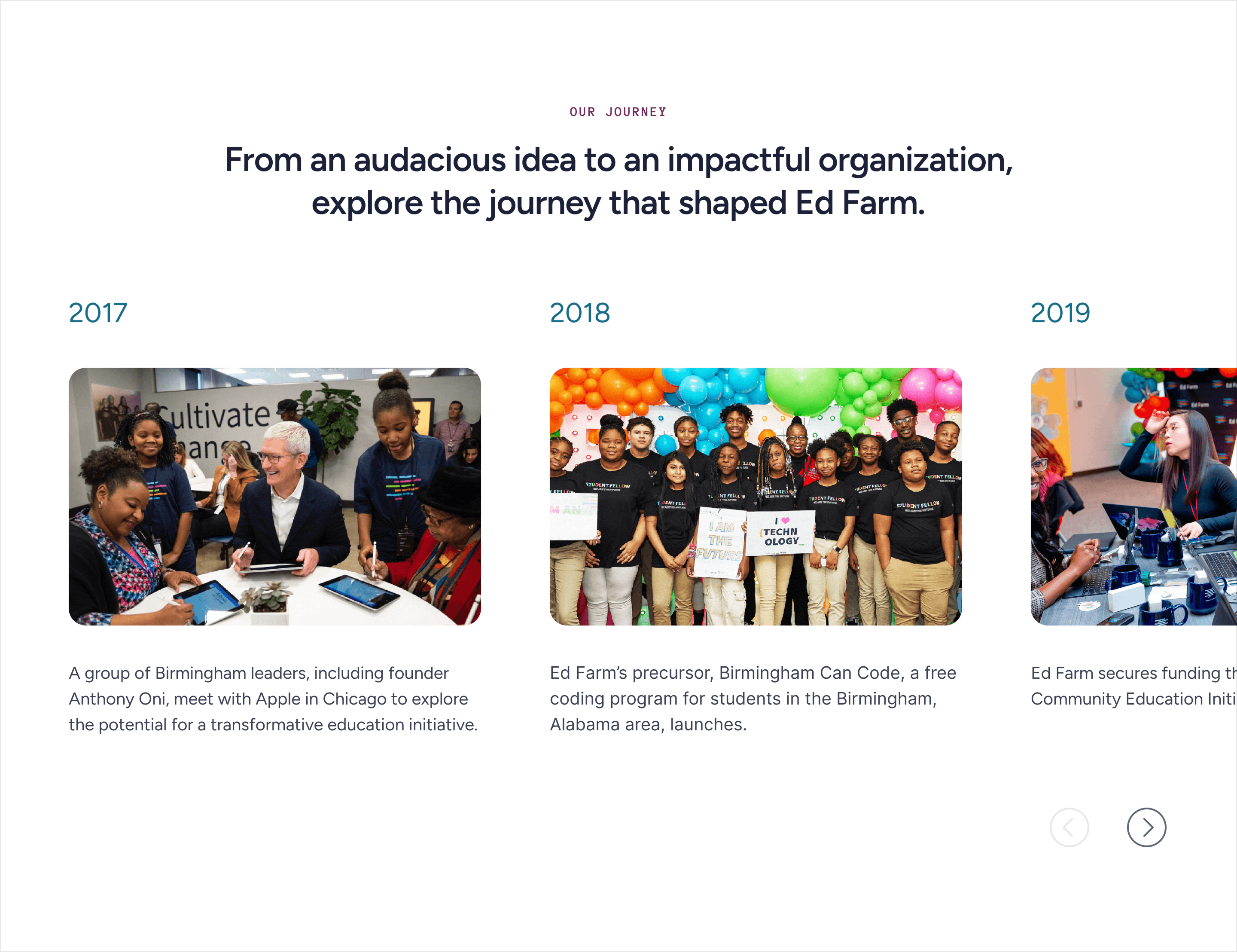
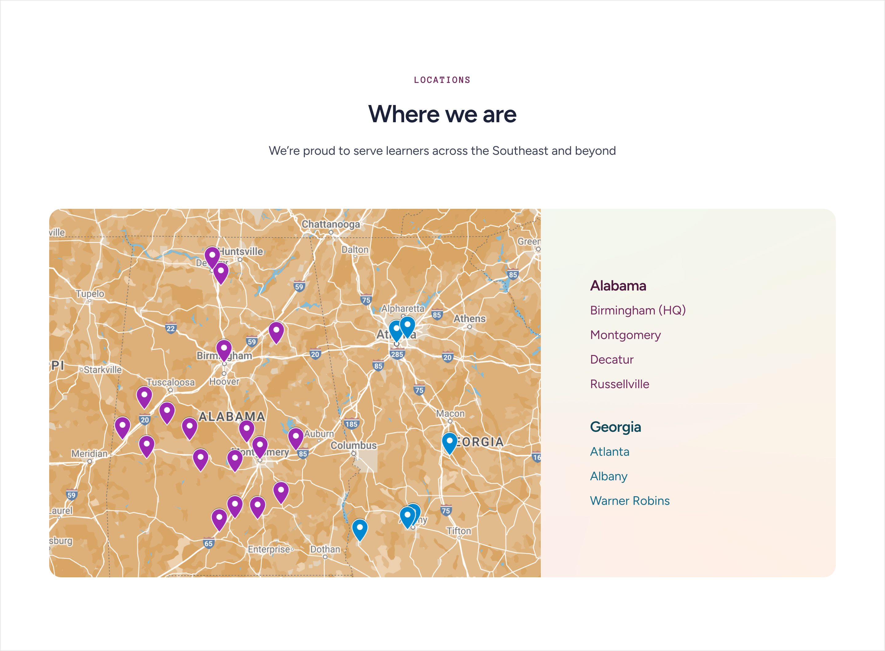
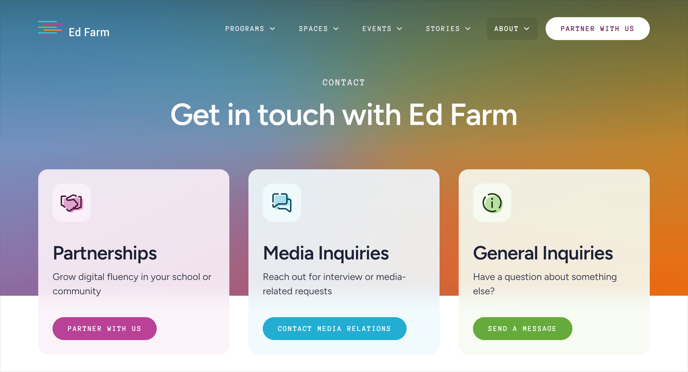
The website was built in Webflow around reusable components and CMS-driven content.
Programs, events, stories, team members, and other evolving content can grow without requiring a new design or development cycle every time.
Responsive behavior was handled as part of the same system so the content hierarchy remains clear across screen sizes.
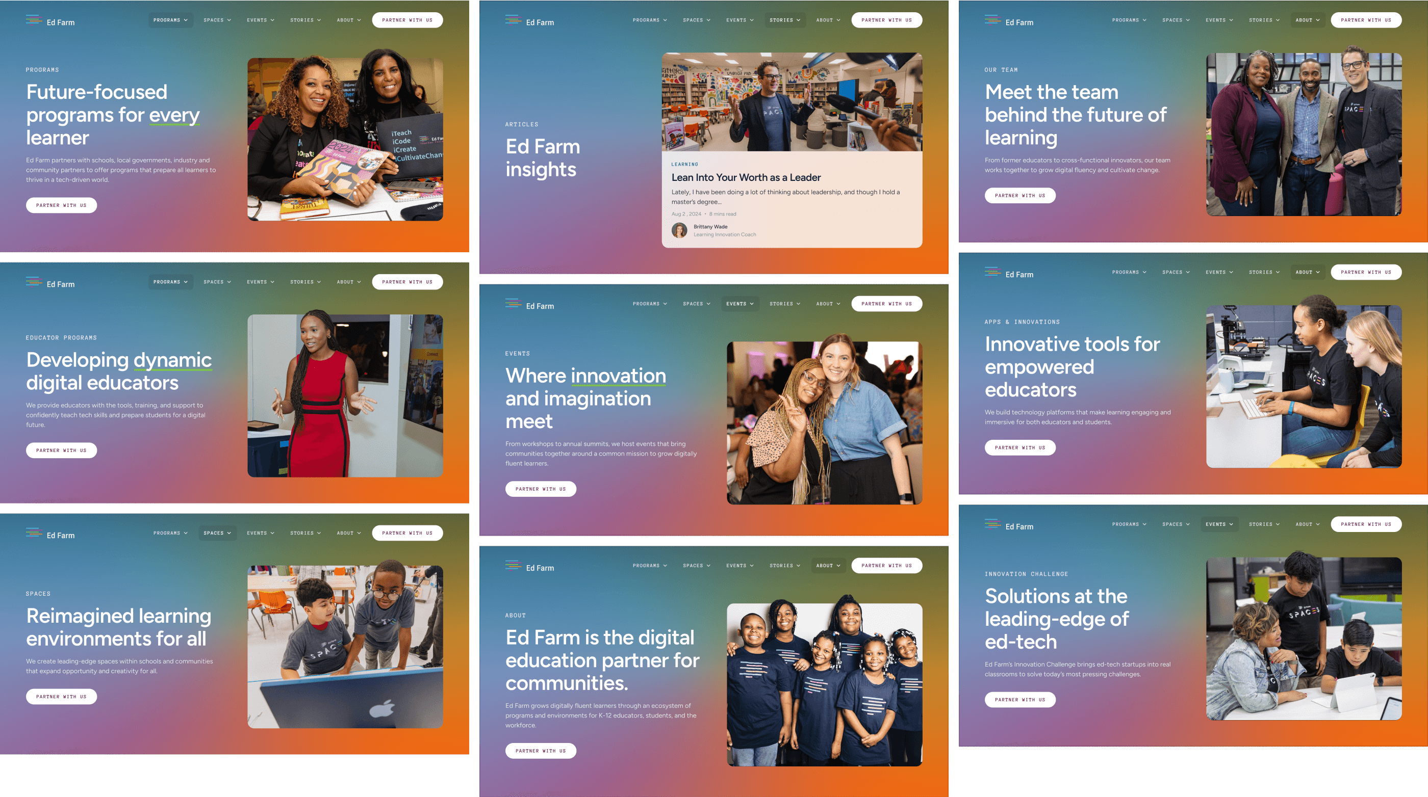
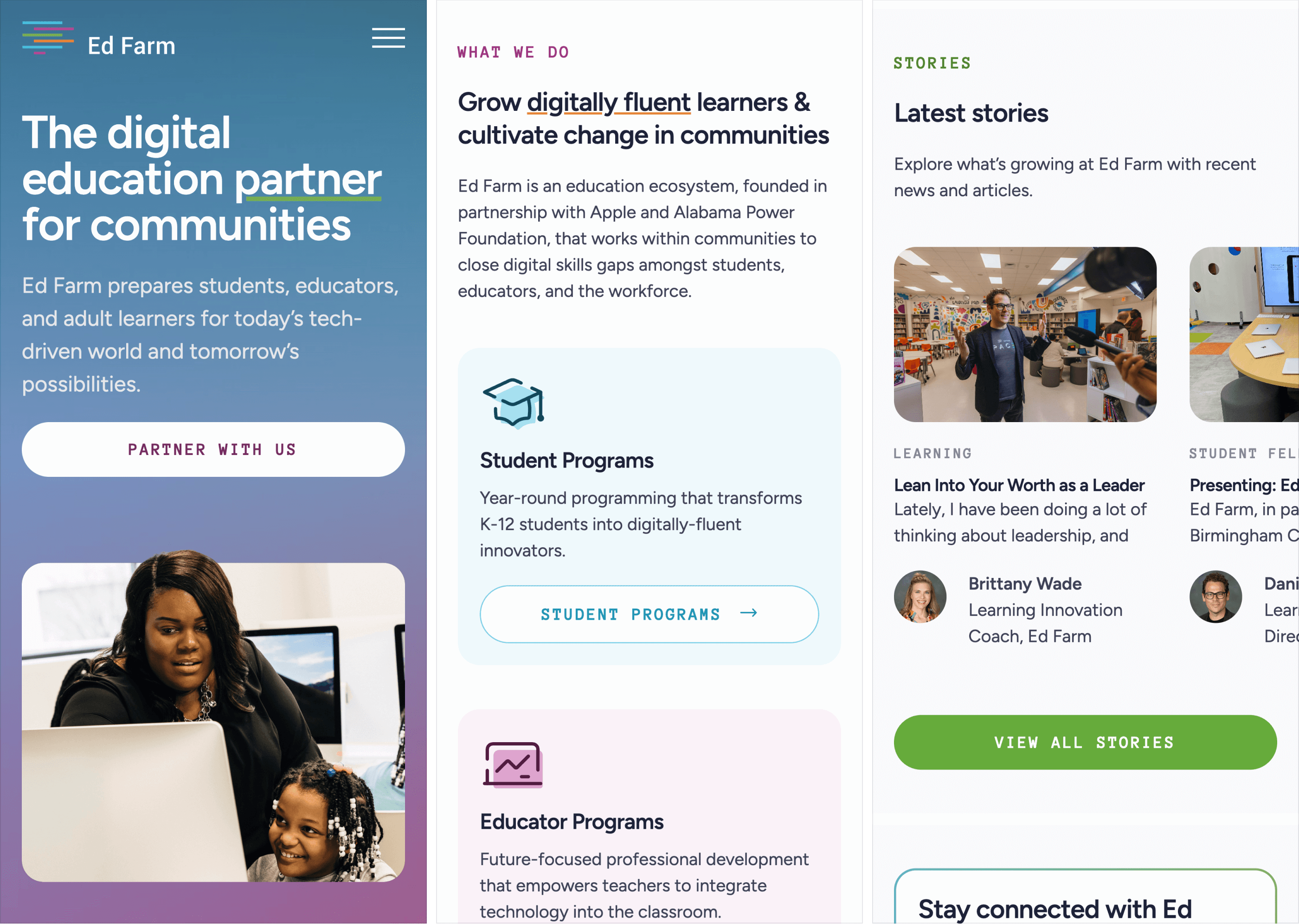
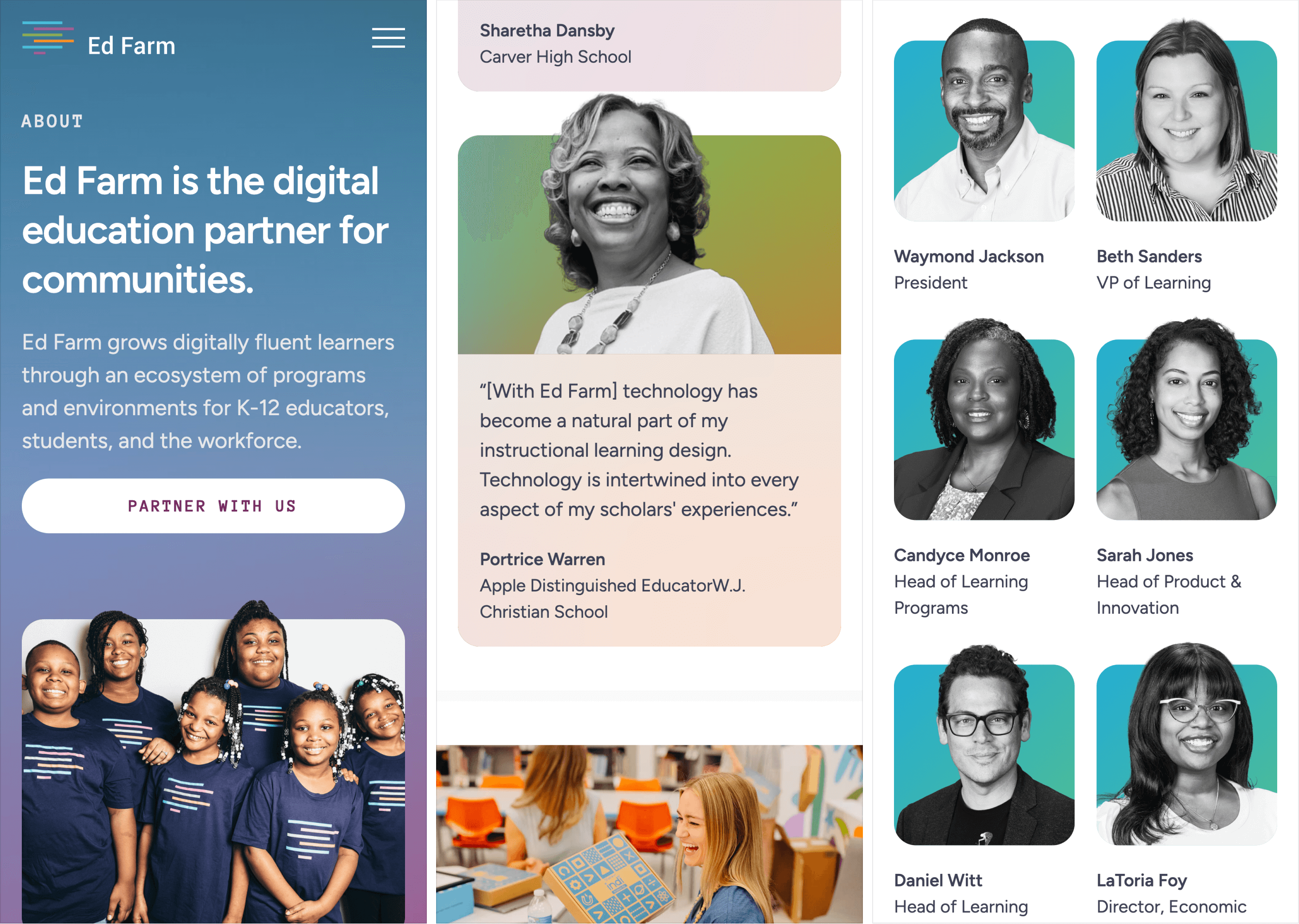
The new site gives Ed Farm a more cohesive digital presence across programs, stories, spaces, and community impact.
Instead of treating students, educators, workforce development, and partnerships as separate narratives, the website brings them together around one larger mission.
Max was instrumental in Ed Farm's complete website overhaul. We needed a site that captured both where we are today and our vision for the future. Max expertly translated our high-level ideas into a clean, visually engaging identity and an intuitive UX. The new site clearly communicates our mission and has received rave reviews from our partners and stakeholders.

A flexible digital system gives Ed Farm room to grow while keeping its people, programs, and mission at the center.
