Found

Found is a personalized metabolic care program that adapts treatment around each member’s biology, history, and lifestyle.
The design challenge was to make a medically complex service feel credible, approachable, and easy to understand—without reducing it to another generic wellness brand.
Digital Designer
Creative Direction, Brand Design, UI/UX Design, Website Design, Webflow Development
Newt Porter, Head of Design
Alice Sykes, Director of Product, Growth
Weight care is crowded with strong claims, confusing options, and increasingly complex conversations around medications like GLP-1s.
Found takes a broader approach.
Members begin with an assessment, receive clinician review, get a personalized treatment plan, and continue with ongoing care that evolves with them over time.
The digital experience needed to make that model understandable quickly while building enough trust for someone to take the next step.
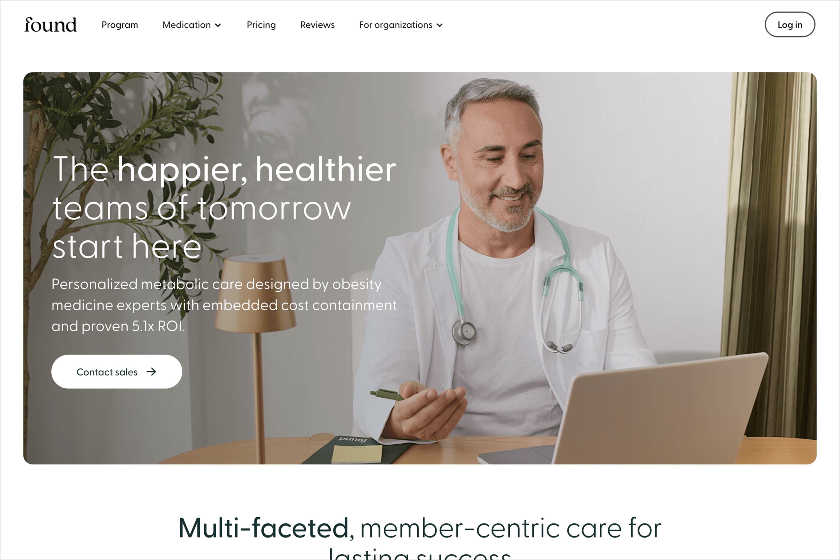
Healthcare design can easily become either too clinical or too lifestyle-driven.
Found needed both.
The brand had to communicate real medical expertise while still feeling personal, optimistic, and supportive.
That balance shaped the visual system: clear hierarchy, approachable typography, human imagery, product-led storytelling, and enough restraint to let clinical proof and member outcomes carry weight.
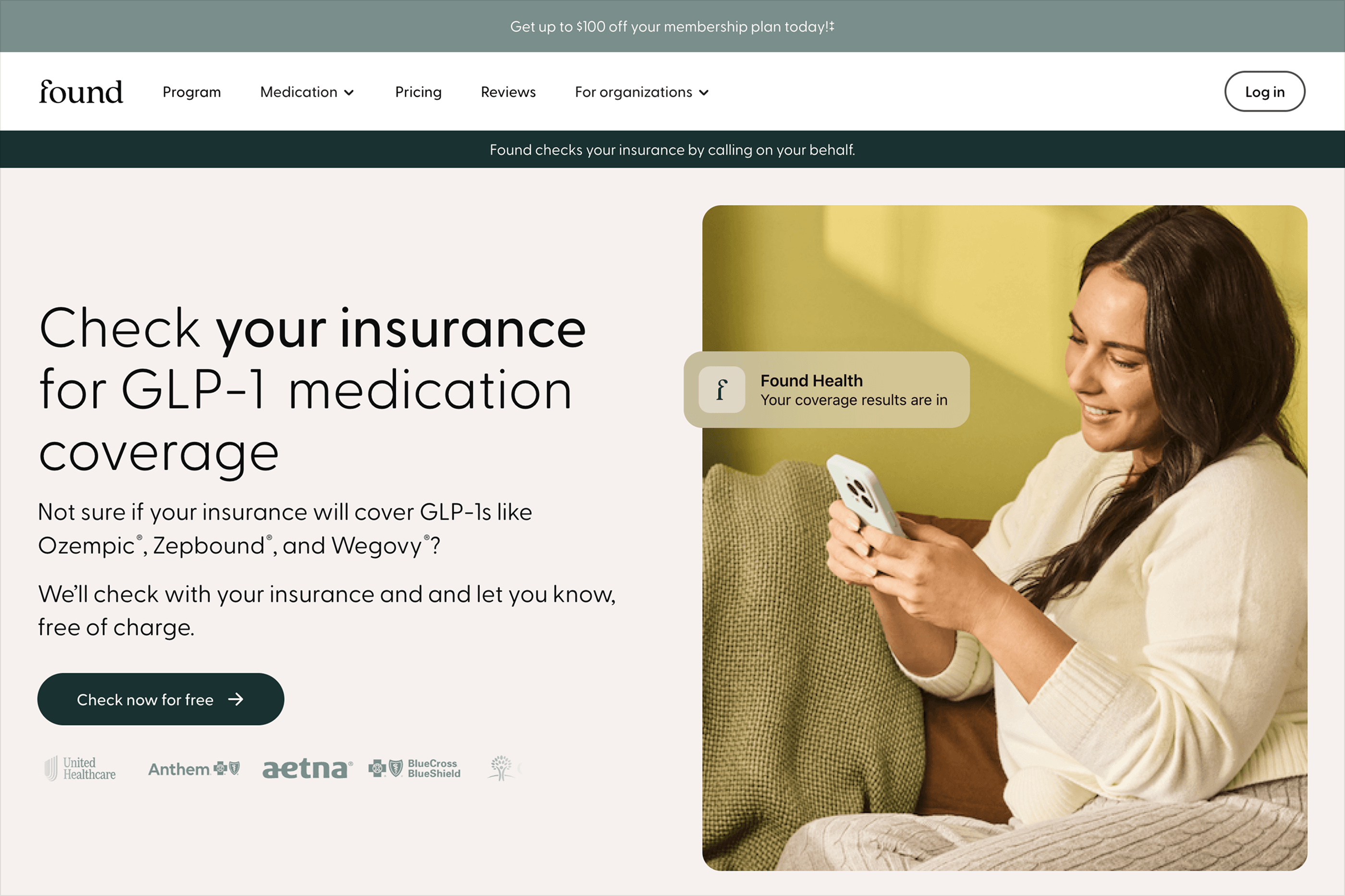
The website needed to answer a few important questions quickly:
What is Found?
How is it different?
What happens after I sign up?
Can I trust the people providing my care?
We organized the experience around those decisions rather than trying to surface every clinical or operational detail at once.
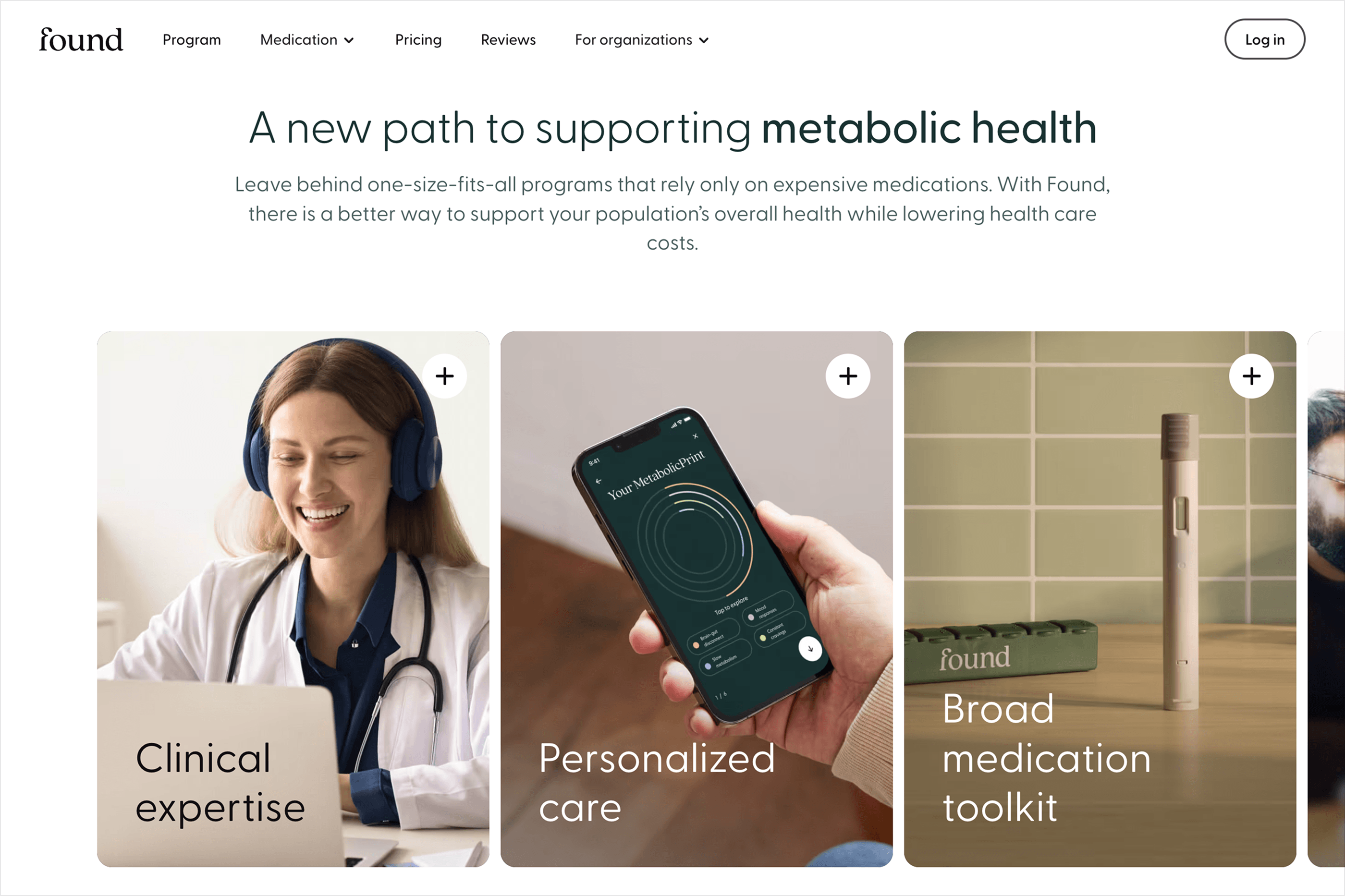
Personalization became the central thread, supported by clinician expertise, treatment options, real member stories, and a clear path into the assessment.
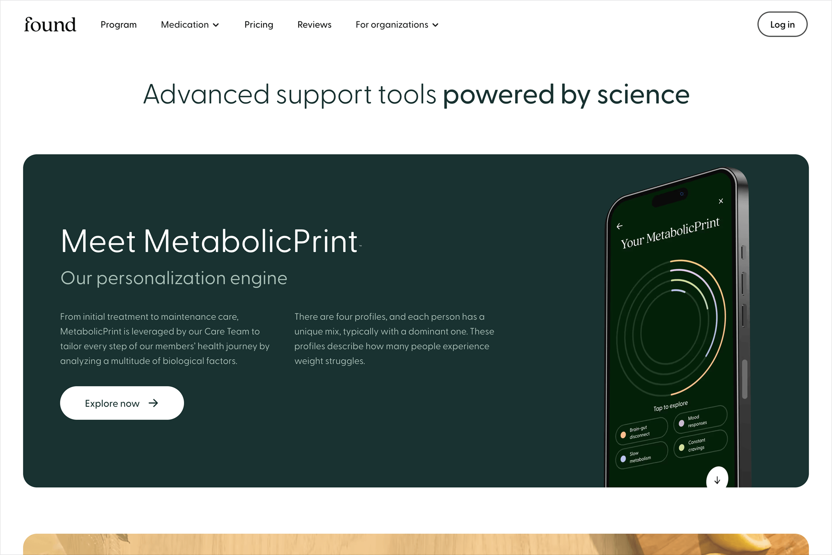
MetabolicPrint™ is central to how Found communicates personalized care.
Rather than presenting treatment as one-size-fits-all, the system helps explain that weight challenges can have different biological and behavioral drivers—and that care can respond accordingly.
The design challenge was to make that idea feel intuitive without oversimplifying the science behind it.
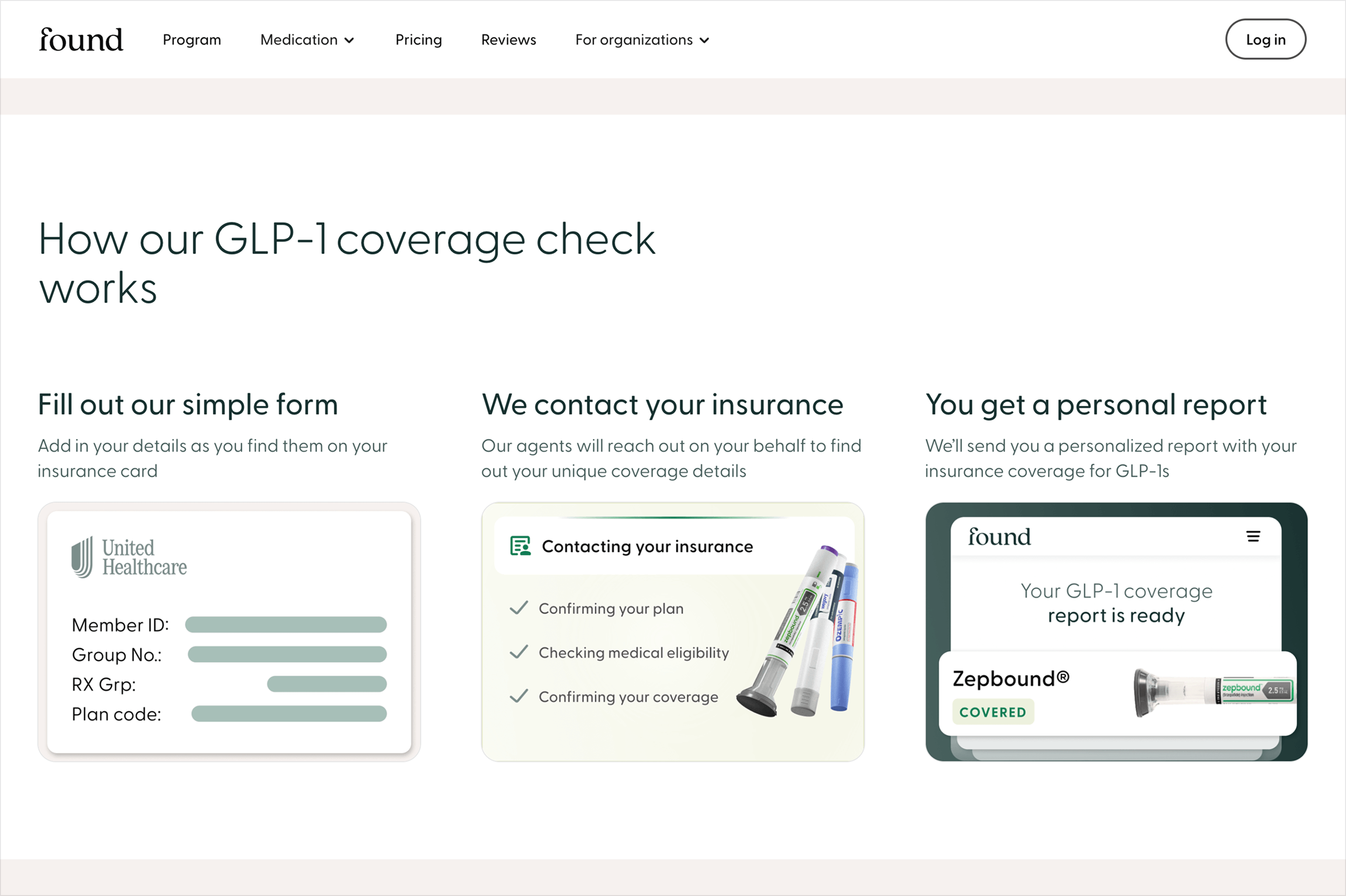
The experience breaks the program into a clear progression:
Assess. Review. Personalize. Adapt.
Members share their health history and goals.
A licensed clinician reviews the full picture.
The care team recommends an appropriate treatment plan.
And ongoing check-ins allow that plan to evolve over time.
Giving the process a visible structure helps reduce uncertainty around a service that combines telehealth, medication, coaching, and ongoing care.
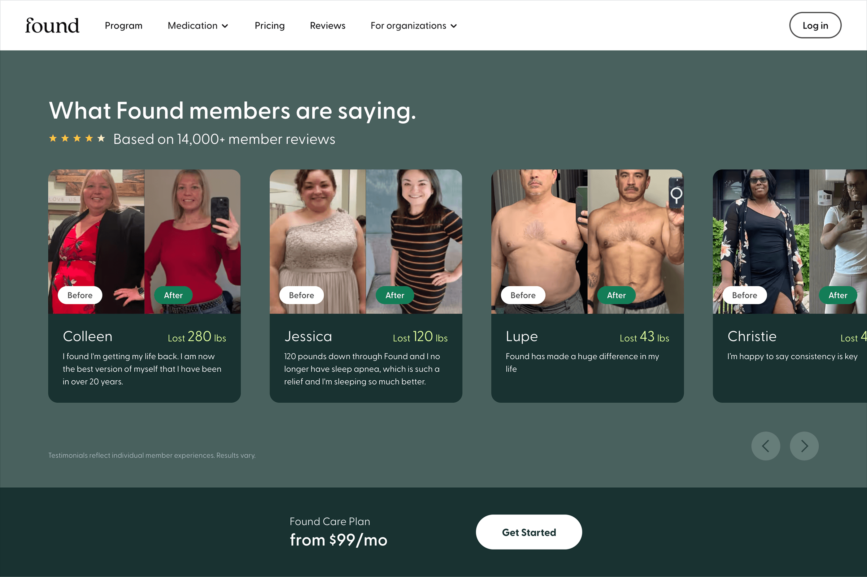
For a healthcare product, credibility cannot come from visual polish alone.
The website uses clinician credentials, real member stories, measurable outcomes, insurance information, and clear treatment explanations throughout the experience.
That proof is integrated into the journey rather than isolated in one testimonial section.
The result is a site that can feel optimistic without asking visitors to rely on optimism alone.
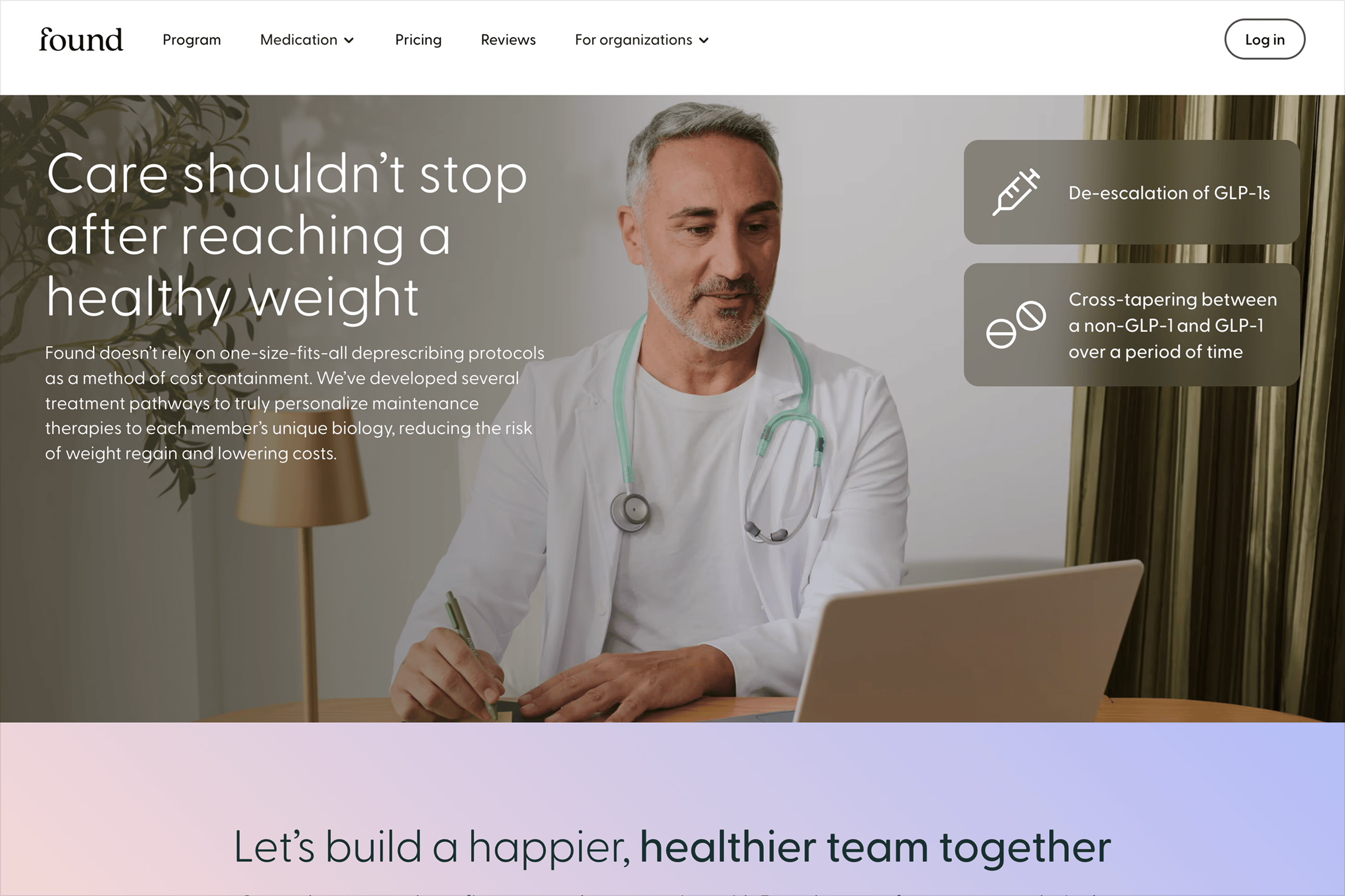
Not every visitor arrives with the same question.
Some are researching GLP-1s.
Others care first about insurance coverage, affordability, personalized treatment, or whether online care is right for them.
The broader design system supports those different entry points while keeping the brand, hierarchy, and conversion patterns consistent.
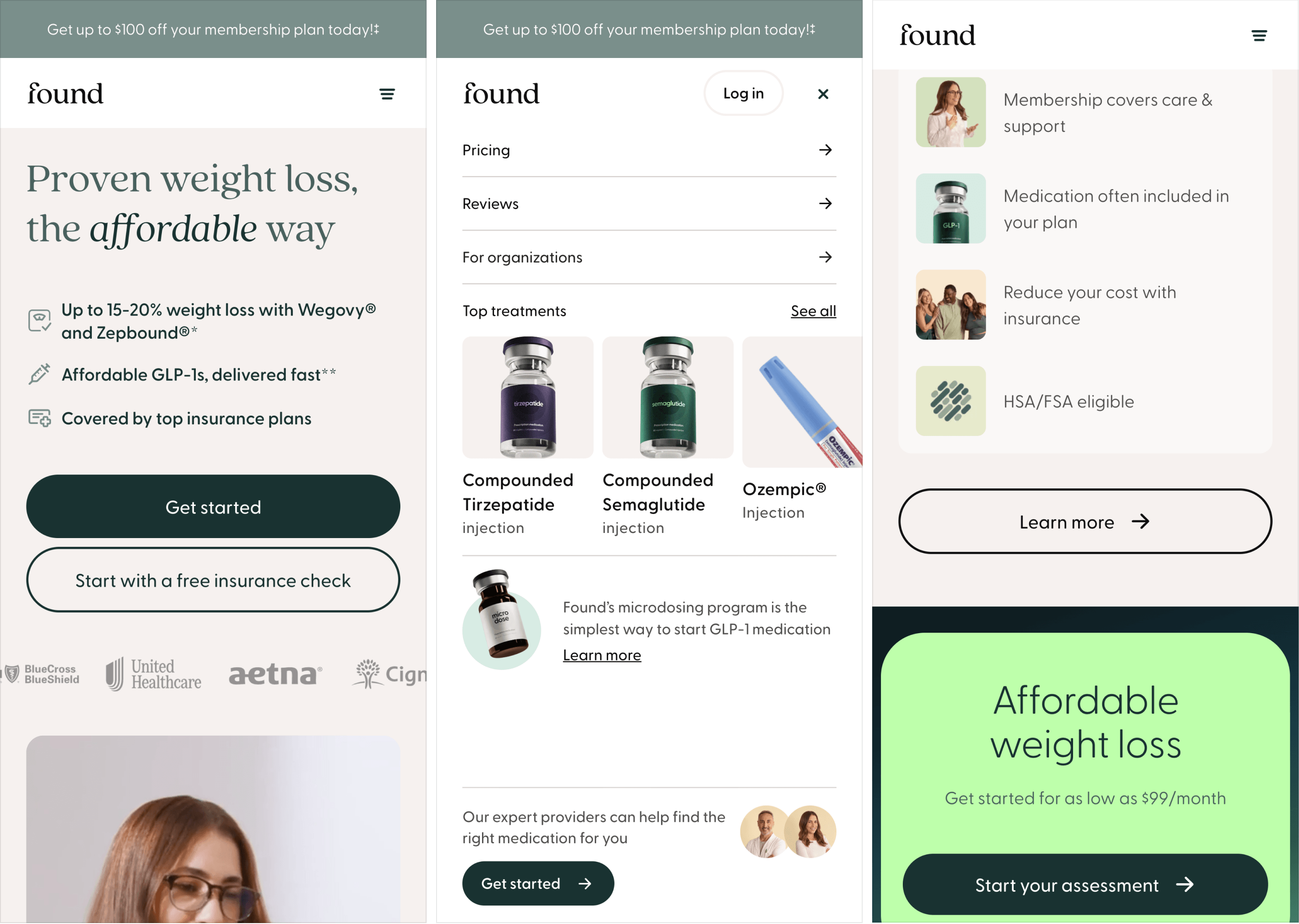
The website was developed in Webflow around reusable components and flexible page structures.
That made it possible to support evolving messaging, new treatment options, campaigns, and growth initiatives without redesigning every experience from scratch.
Design and implementation stayed closely connected so new ideas could be tested, refined, and shipped quickly while preserving consistency across the broader site.
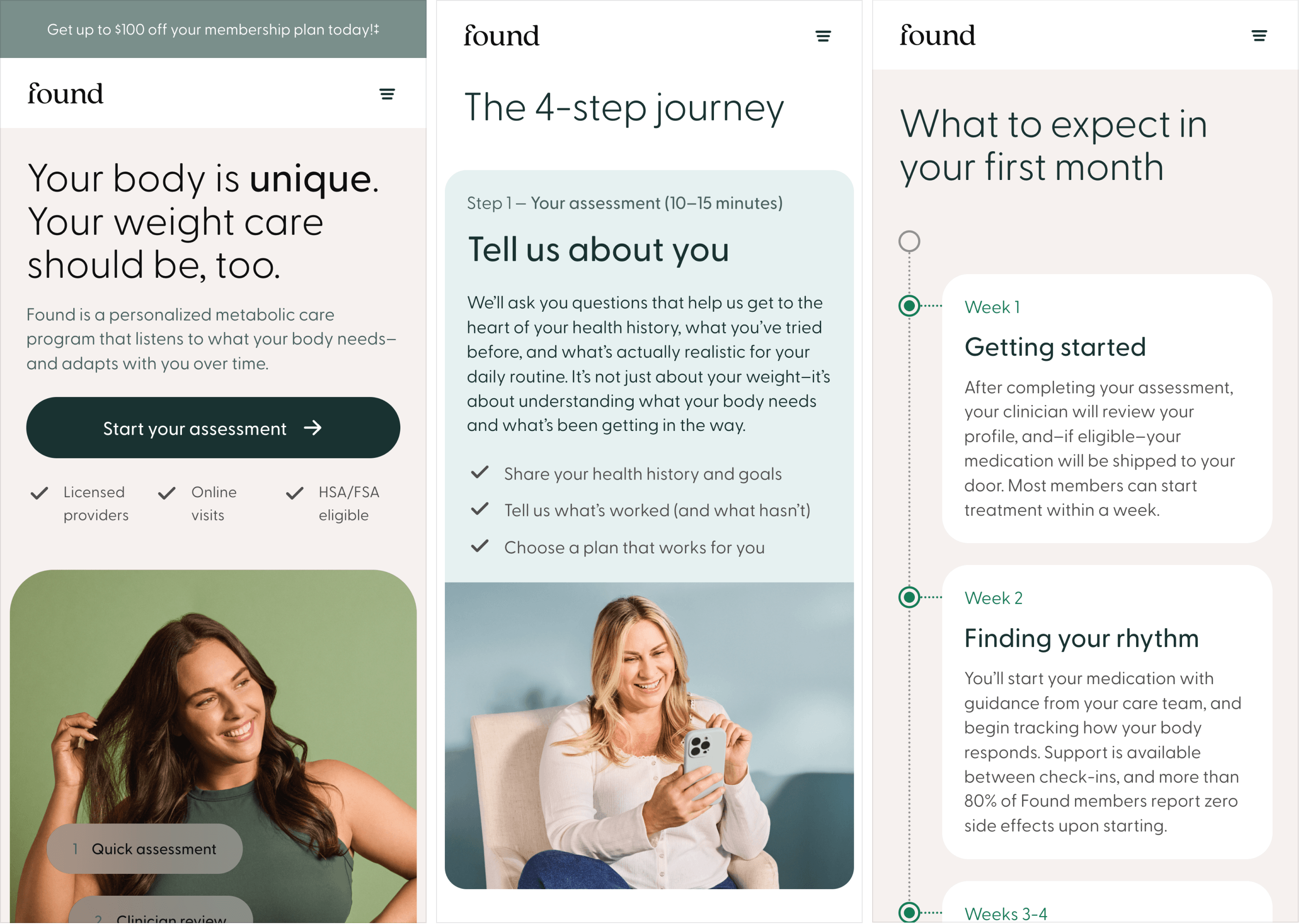
The work helped Found communicate a complex offering through a more focused digital system—one that balances medical credibility, personalization, human outcomes, and conversion.
Rather than asking visitors to understand every part of metabolic care upfront, the experience gives them enough clarity and confidence to take the next step.
Max is the rare designer who can hold brand, product, and web at the same time and make them feel like one thing. He moves fast, takes feedback without ego, and ships work that looks considered rather than decorated. I'd work with him again without hesitating.
The goal was to make personalized weight care feel less overwhelming without making it feel less serious.