MetaGravity
MetaGravity is building infrastructure for massively multiplayer games and virtual worlds, designed to support far greater scale without forcing teams to abandon the tools they already use.
The technology was ambitious. The digital presence needed to make that ambition easier to understand—and credible enough for an enterprise audience.
Digital Designer
Creative Direction, UI/UX Design, Website Design, Webflow Development
Linda Wang, VP Marketing
Mathew Kerber, Brand Designer
MetaGravity was preparing to introduce its technology at GDC in San Francisco.
The company already had a brand refresh underway, but the existing website lacked the clarity and consistency needed for the moment—especially with enterprise partners and technical decision-makers in the audience.
We had roughly a month to turn the new brand direction into a complete website and get it live before the conference.
The deadline was tight, but visual decisions still needed a reason behind them.
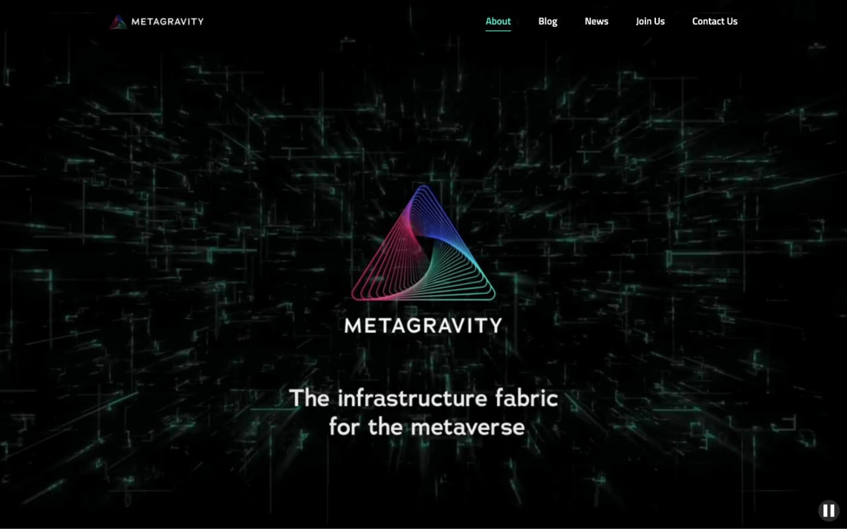
We mapped references across gaming, infrastructure, emerging technology, and enterprise software to understand what the category already looked like.
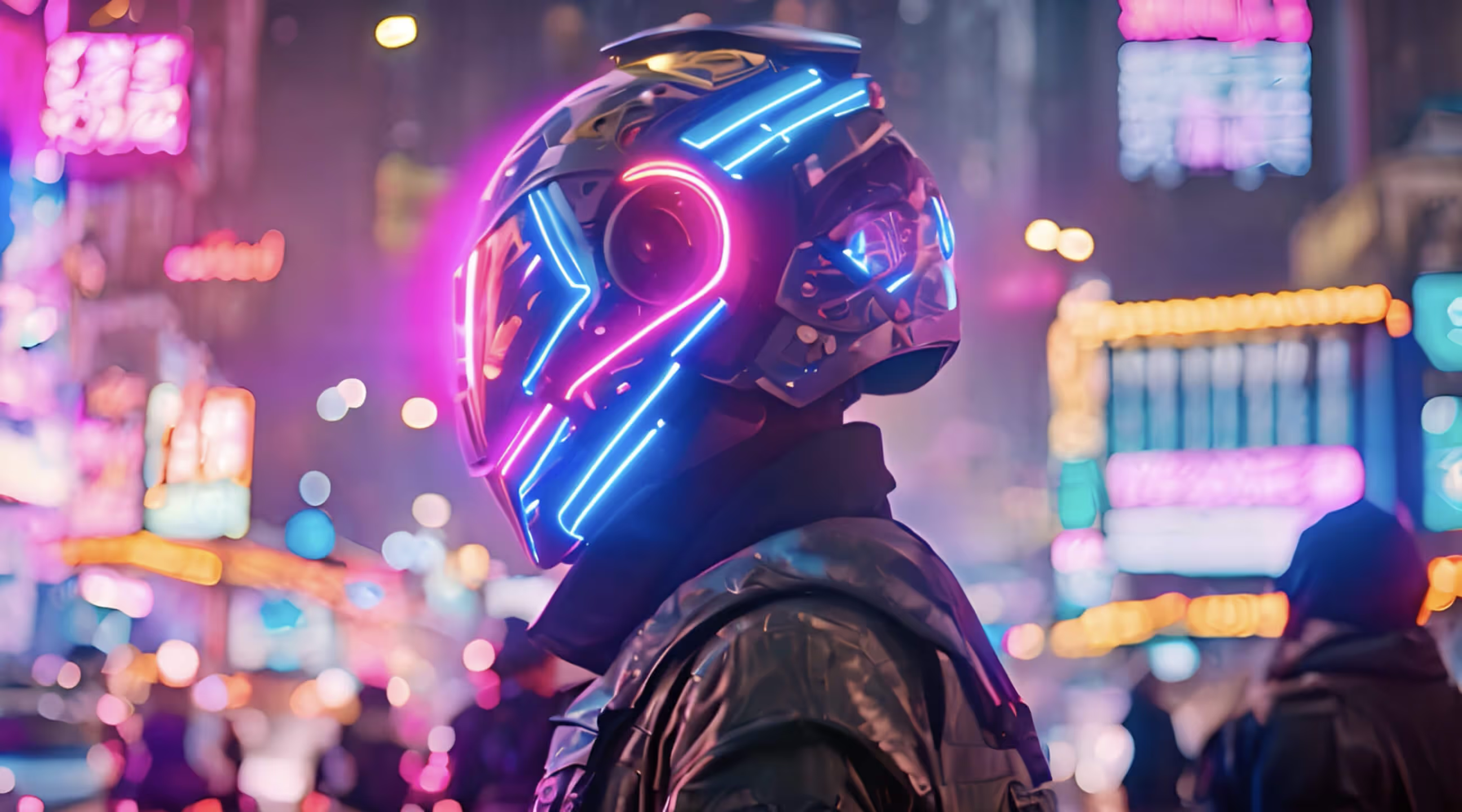
Dark surfaces, neon accents, and cinematic imagery were common on the gaming side.
Enterprise brands leaned toward lighter layouts, stronger hierarchy, and more restrained product storytelling.
MetaGravity needed both.
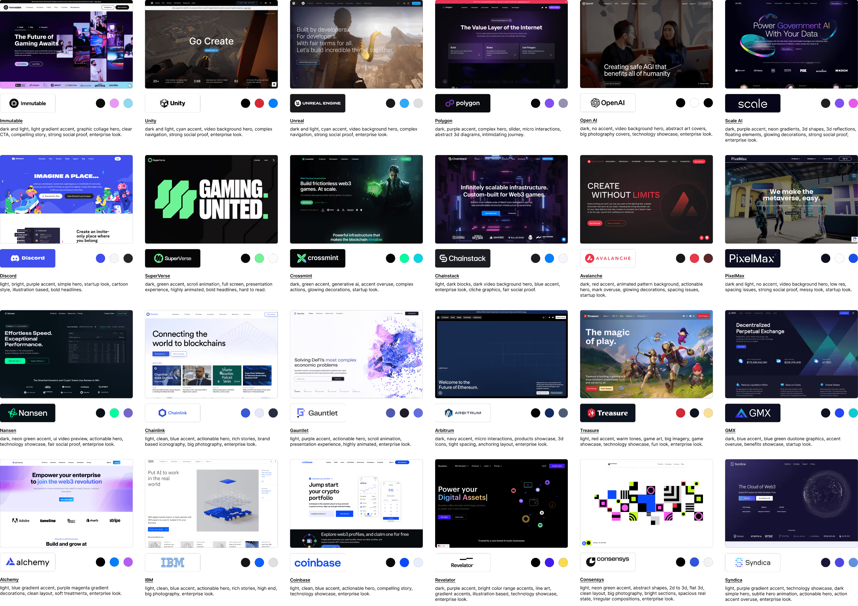
We also explored a more conceptual layer around the product itself.
Gravity. Infinity. Simulation. Parallelism. Interaction.
These ideas gave us a vocabulary for expressing scale, movement, and a different kind of virtual world without relying entirely on screenshots or generic infrastructure diagrams.
The metaphors were never meant to become literal brand symbols.
They were prompts for composition, motion, depth, and interaction.
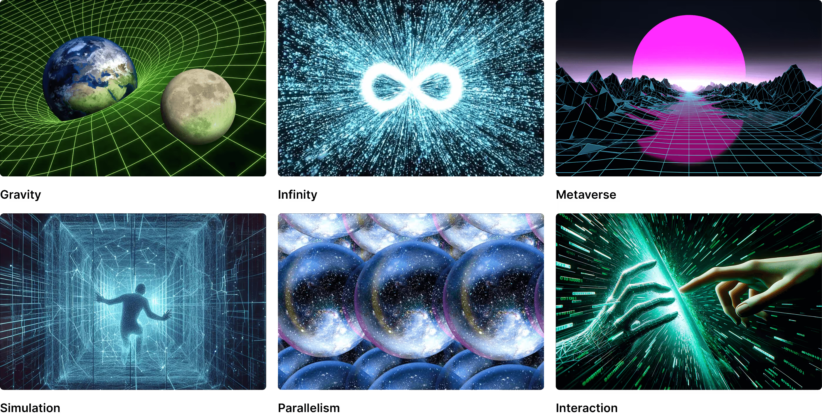
The refreshed identity from the internal brand team already pointed toward the right balance.
Dark compositions carried the more cinematic, high-impact moments.
Light layouts handled denser information and technical content.
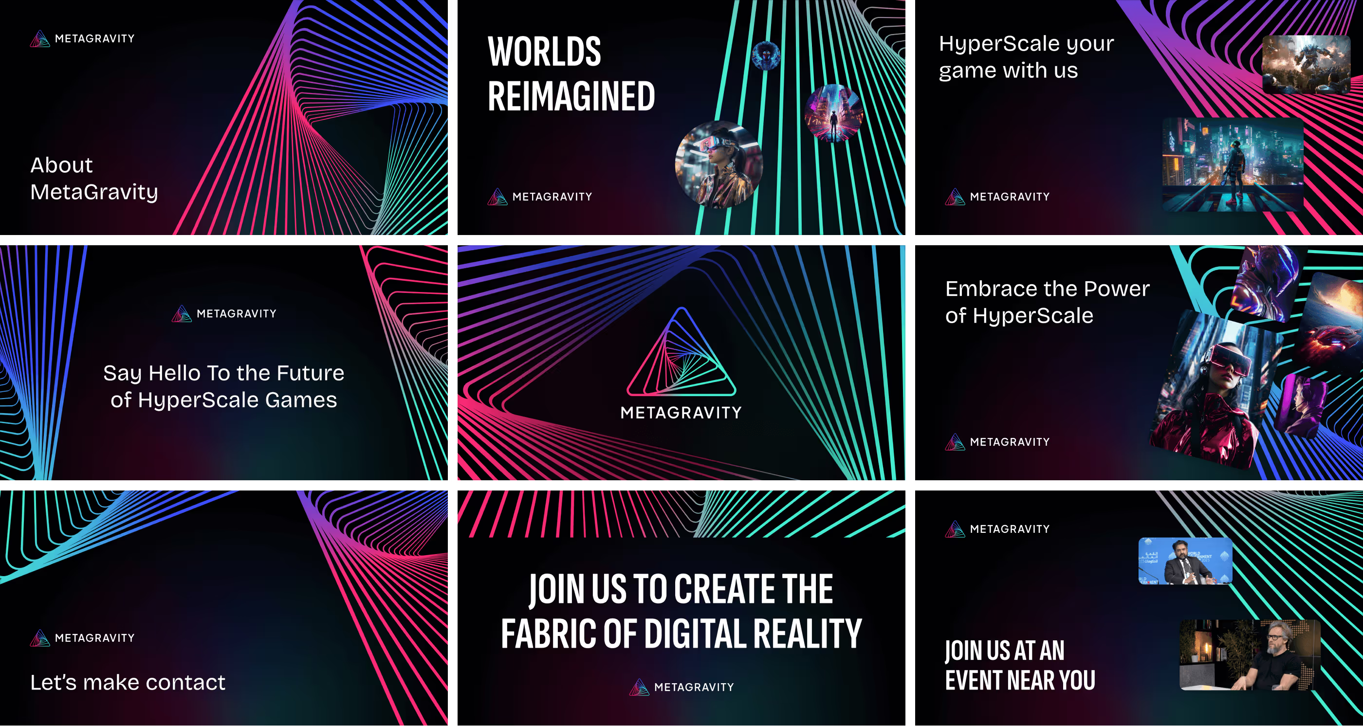
An oversized version of the MetaGravity mark became a recurring graphic device, often cropped into the edge of the composition to create depth.
That contrast gave the website a rhythm that could move between gaming spectacle and enterprise legibility.

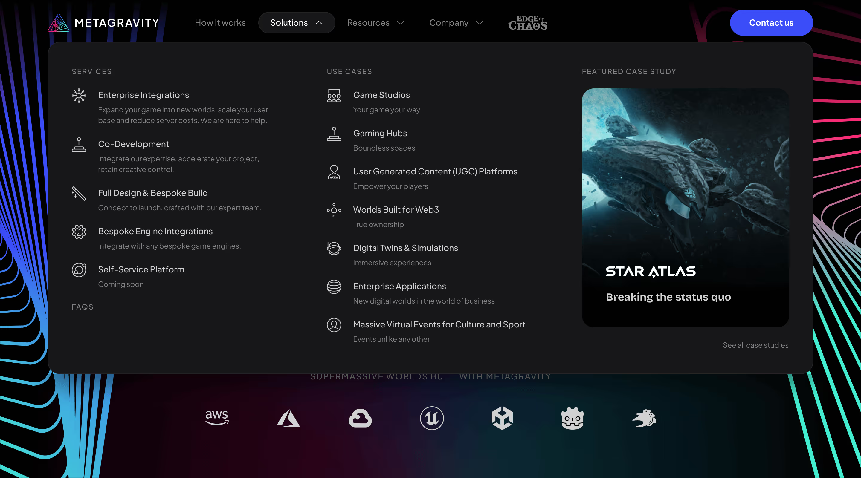
The homepage needed to introduce a technically complex platform without asking visitors to understand everything at once.
The experience leads with the core proposition, familiar technology partners, and one primary action: contact the team.
From there, the story moves progressively into how the technology works, where it applies, what it improves, and who is already building with it.


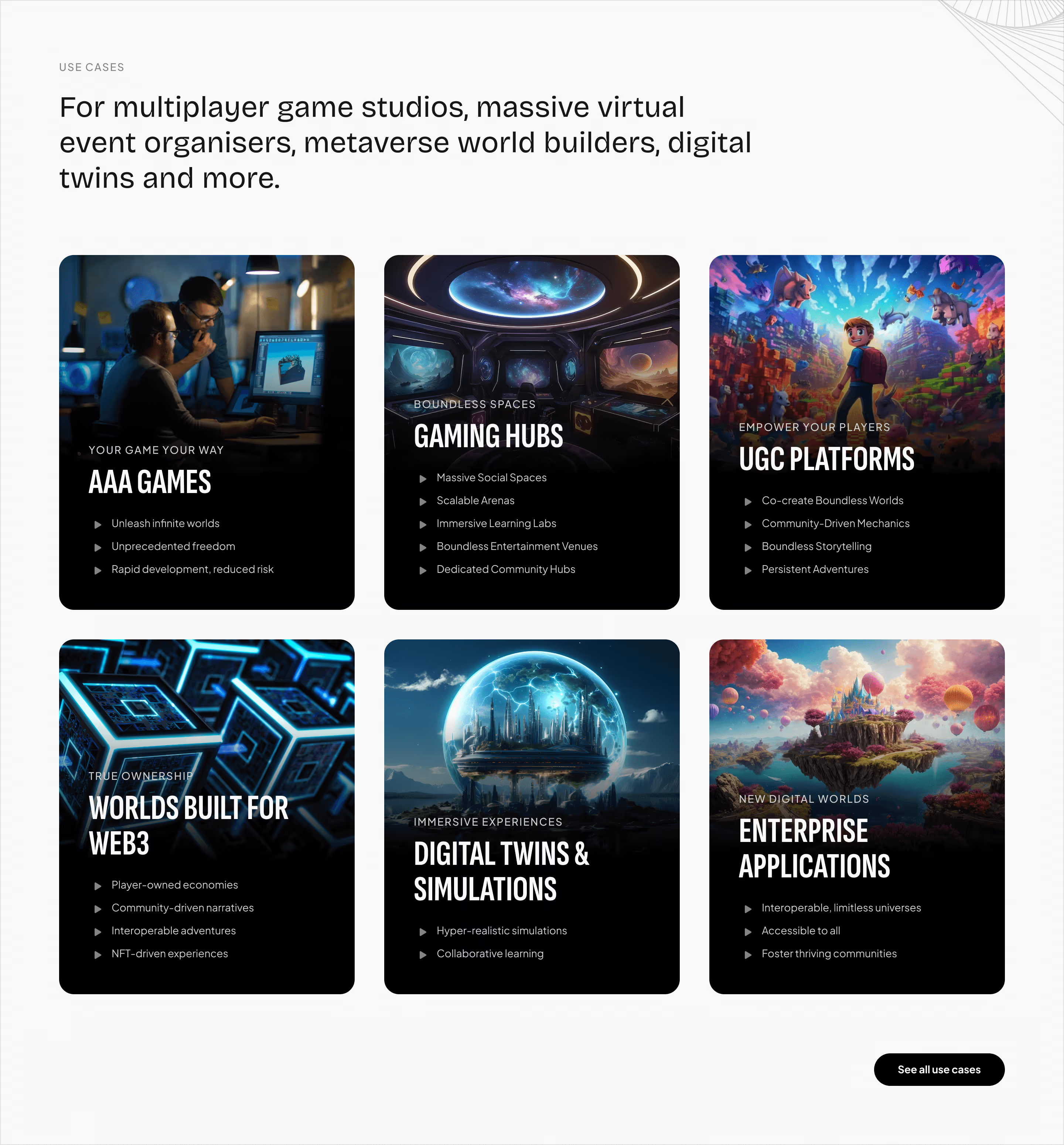
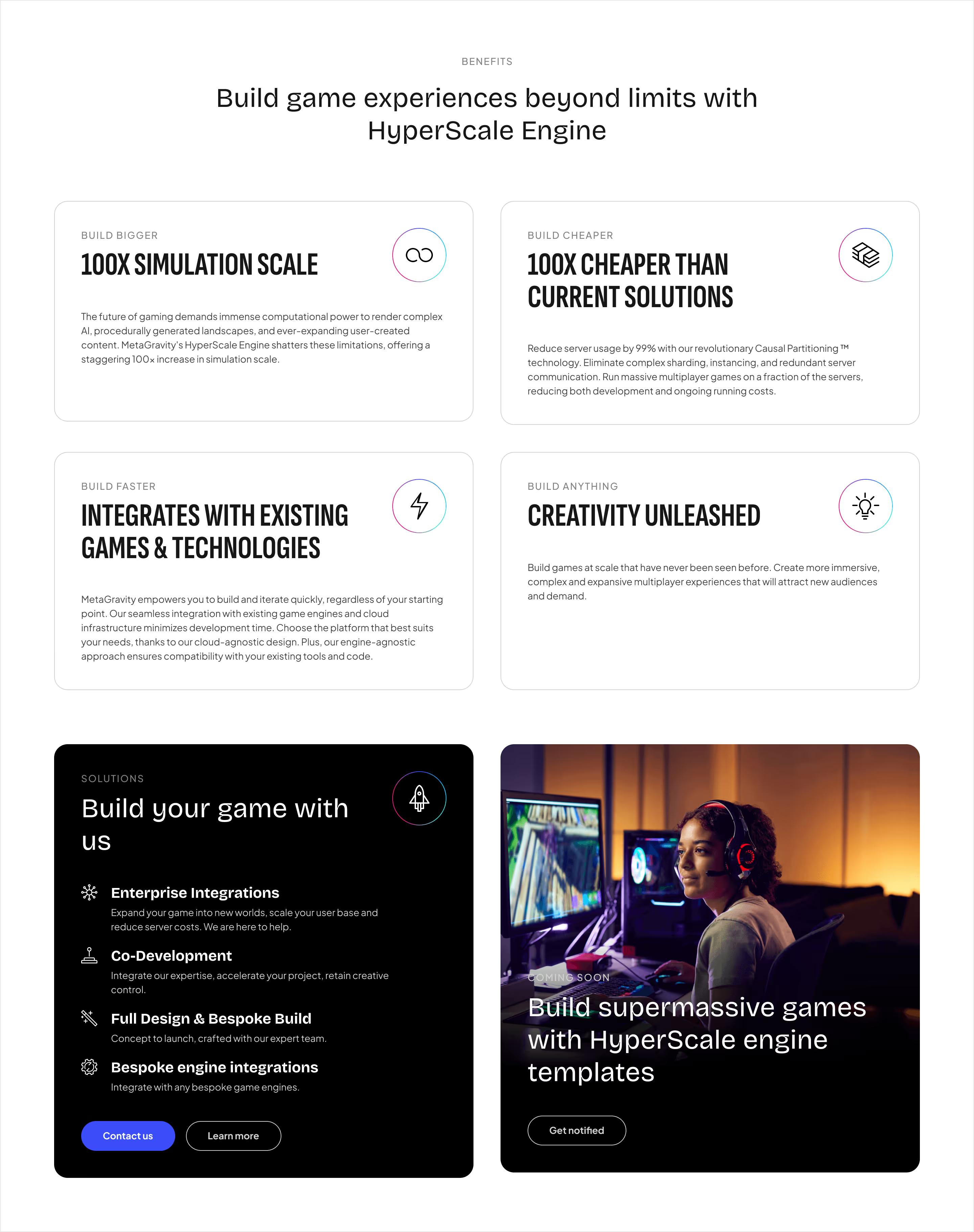
For emerging infrastructure, credibility matters as much as explanation.
Familiar cloud providers and game engines create technical context early.
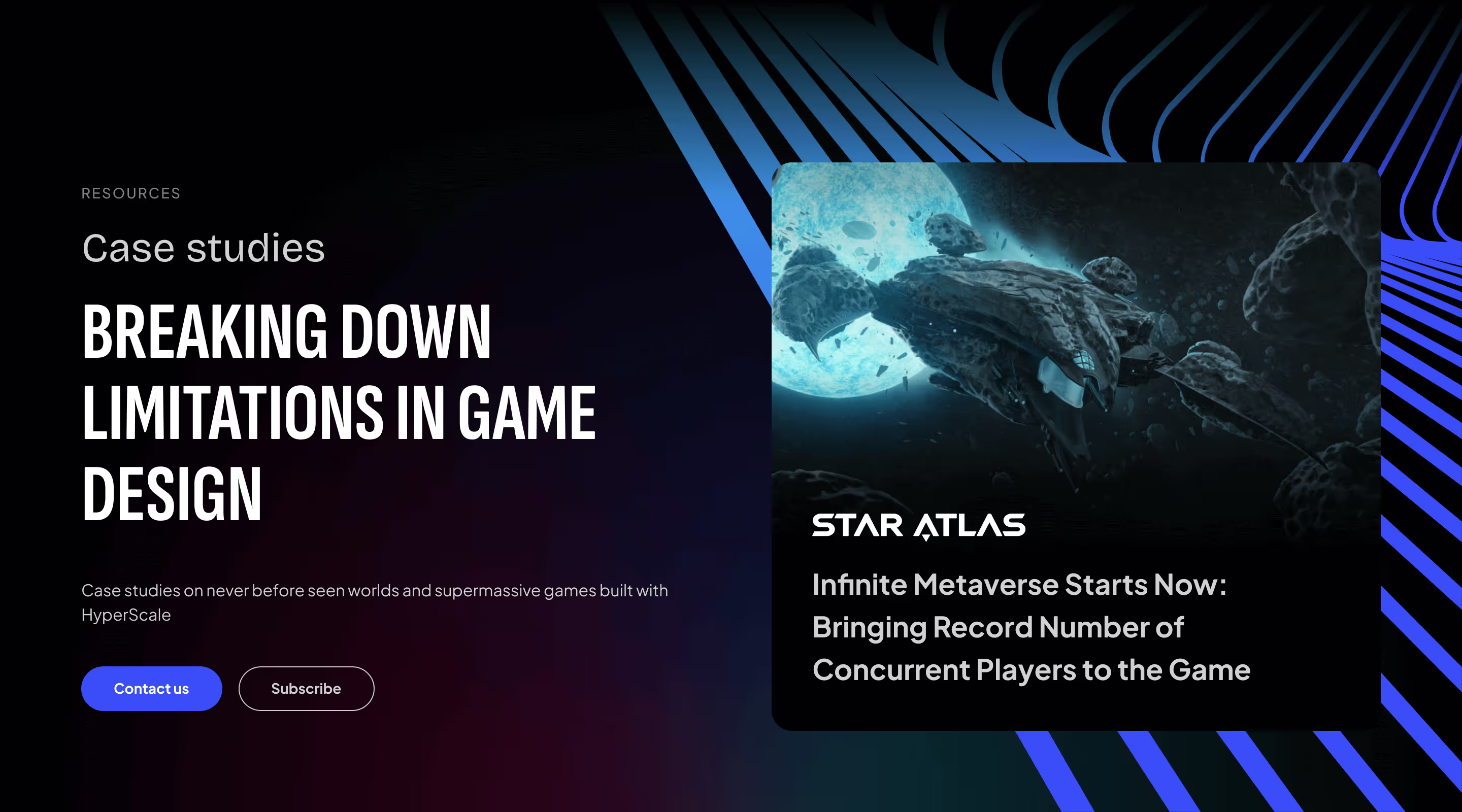
Case studies show the technology working inside real projects.
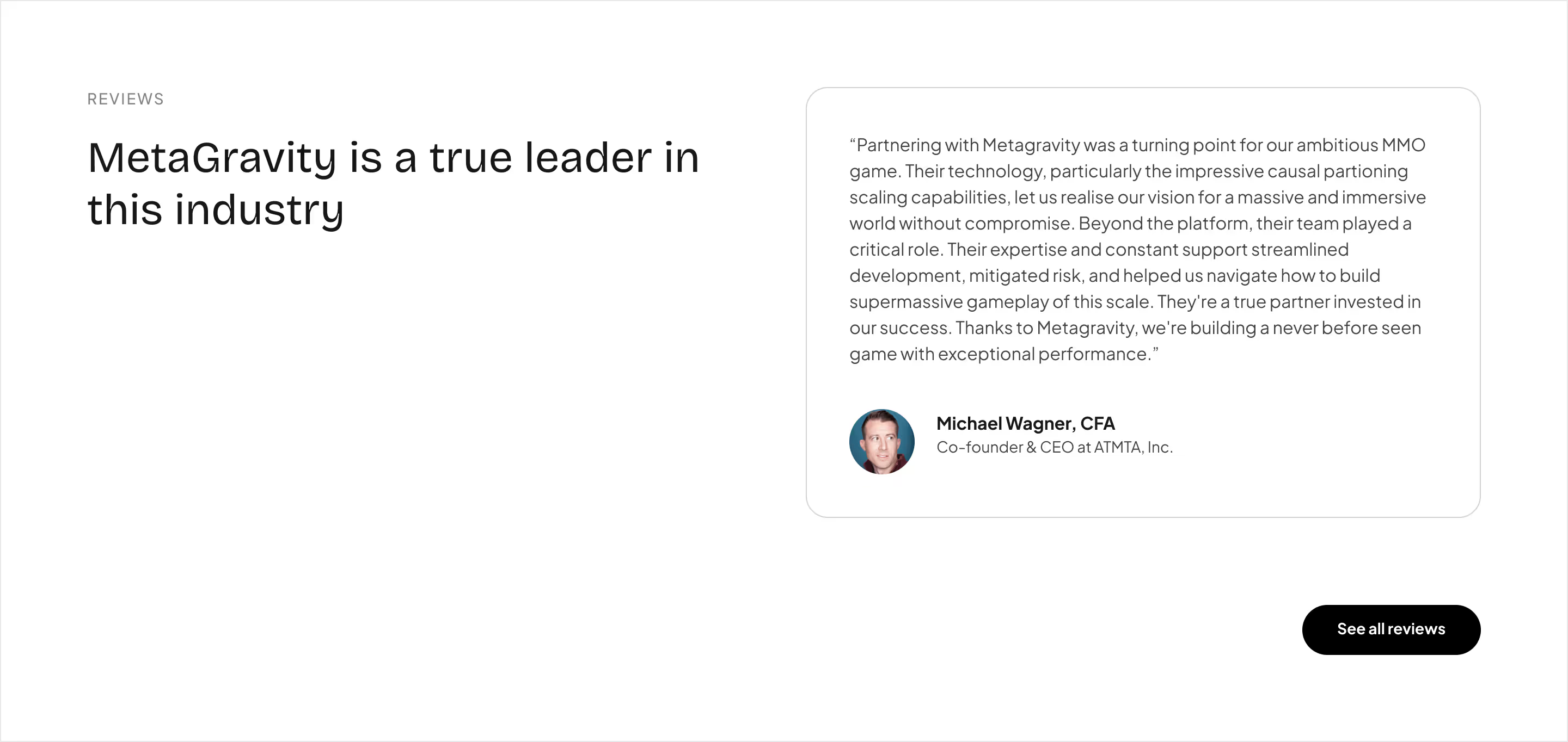
Testimonials add human proof from people already using or evaluating the platform.
The website uses those signals throughout the journey rather than isolating them in one trust section.


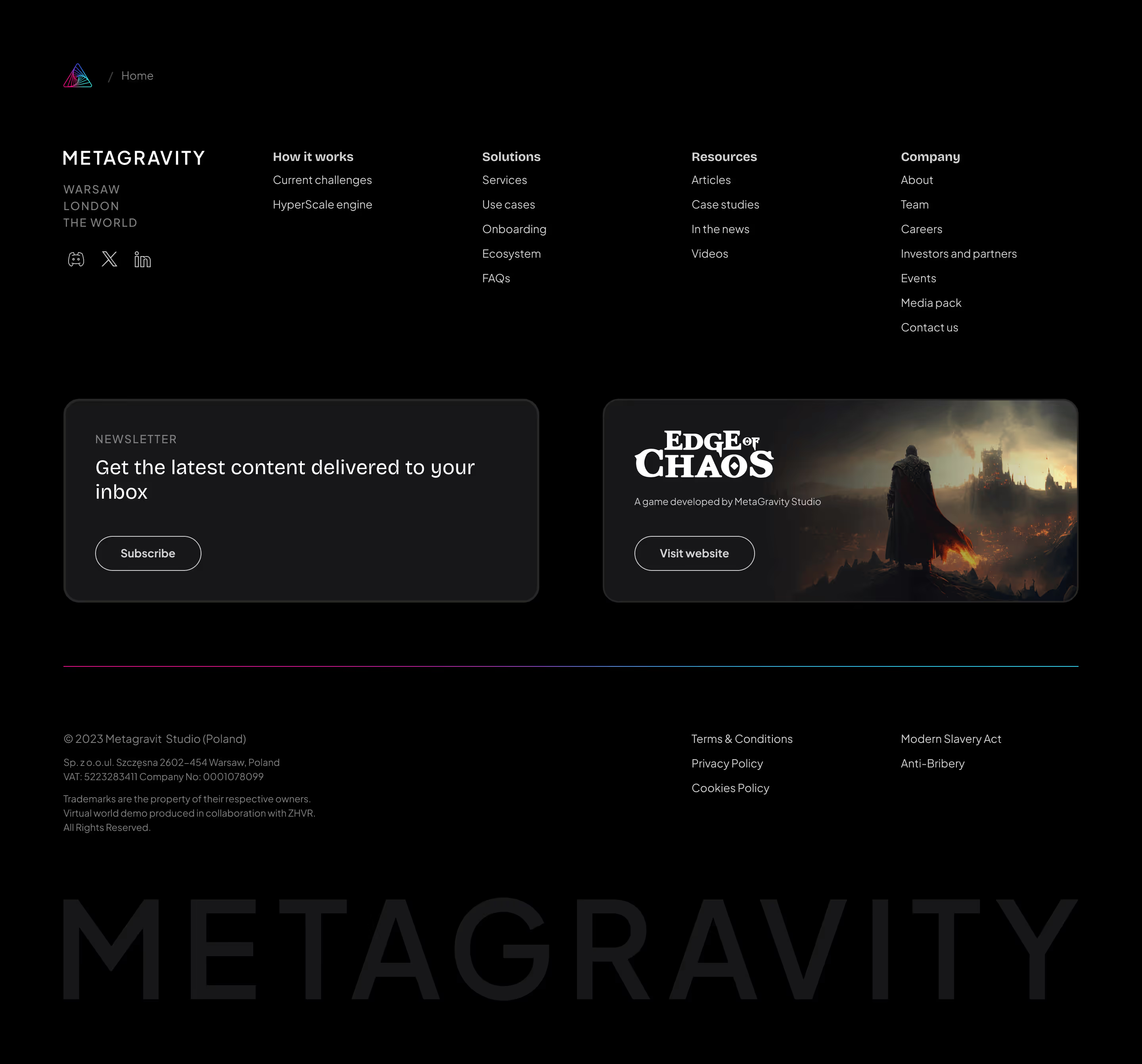
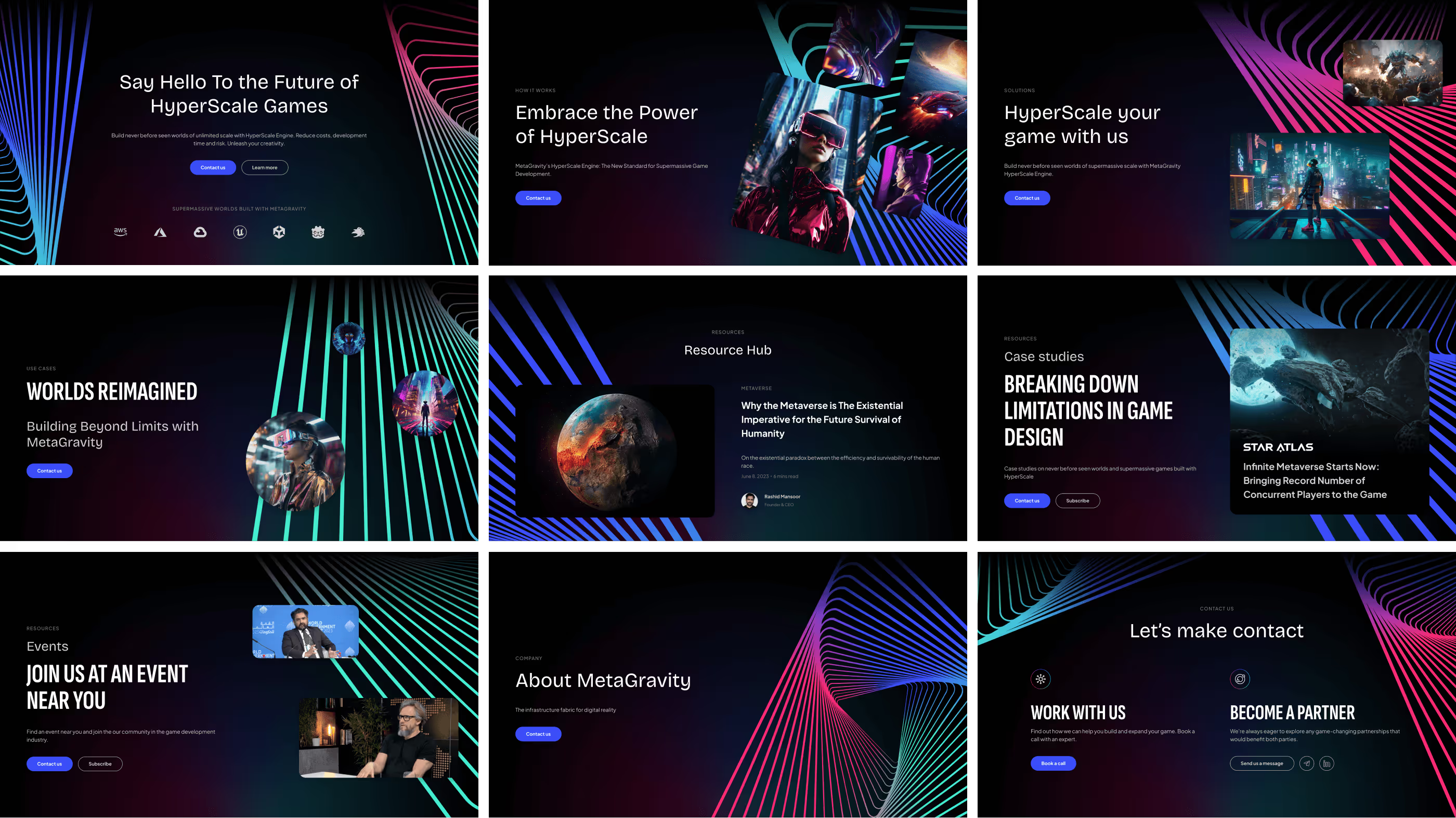
The same system extended across deeper technical pages, use cases, resources, case studies, company content, and conversion.
Heroes shared a consistent structure but could adapt their imagery, typography, and content density depending on the page.
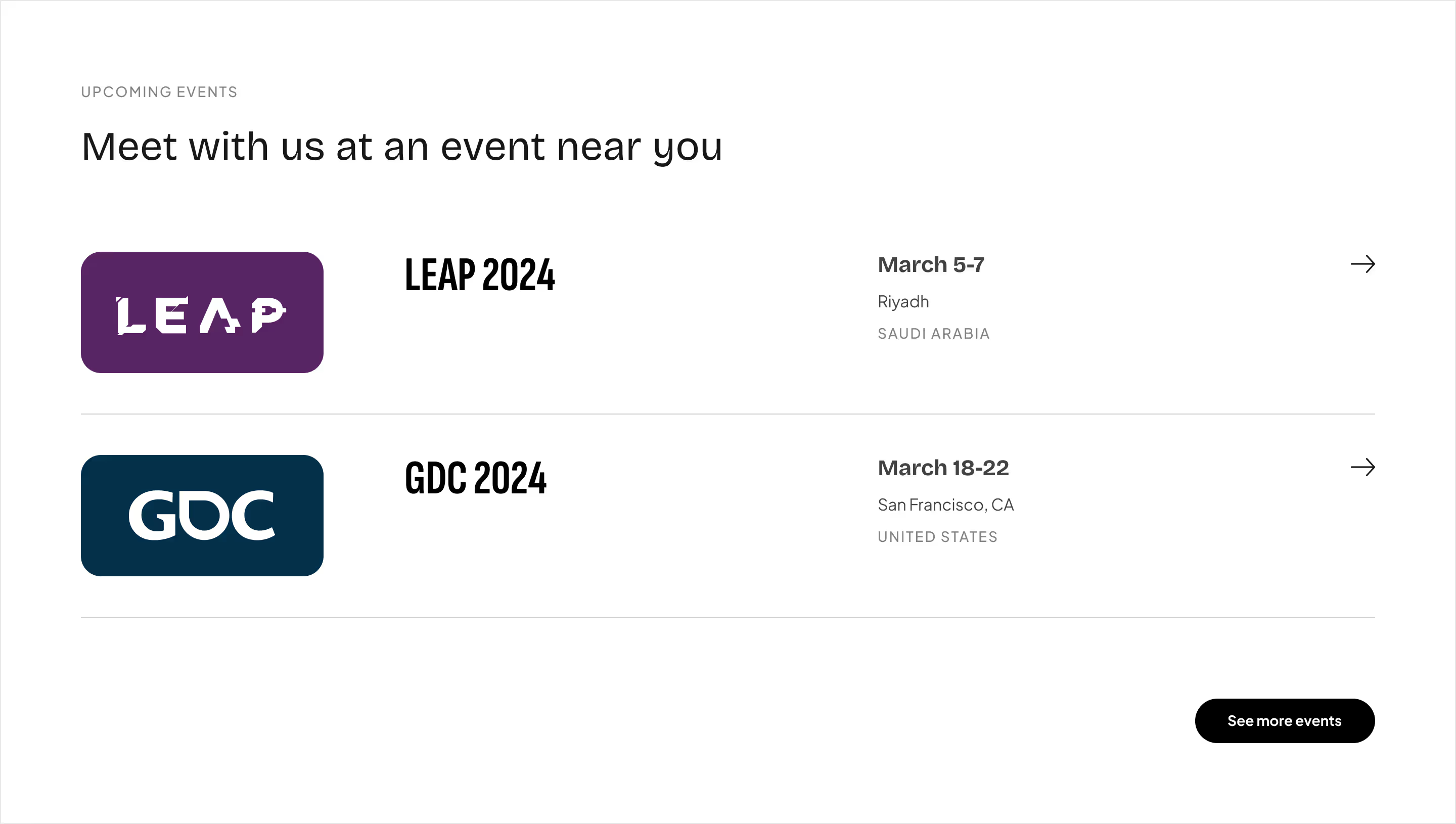
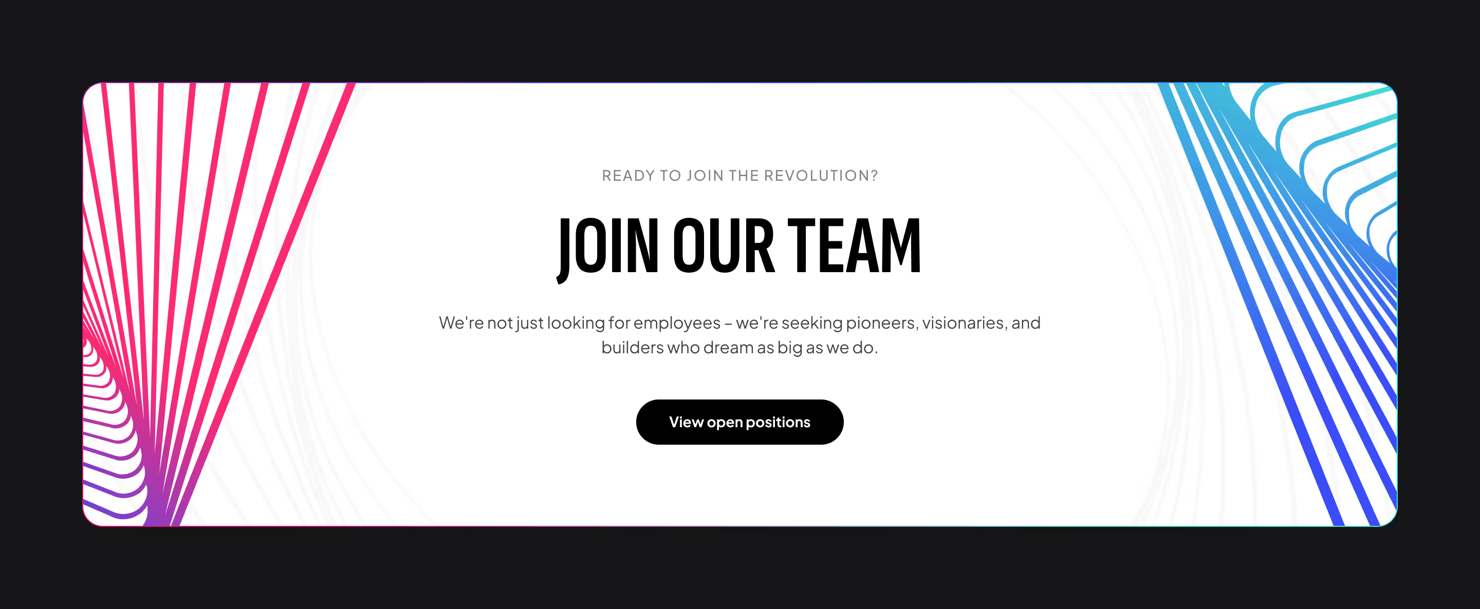
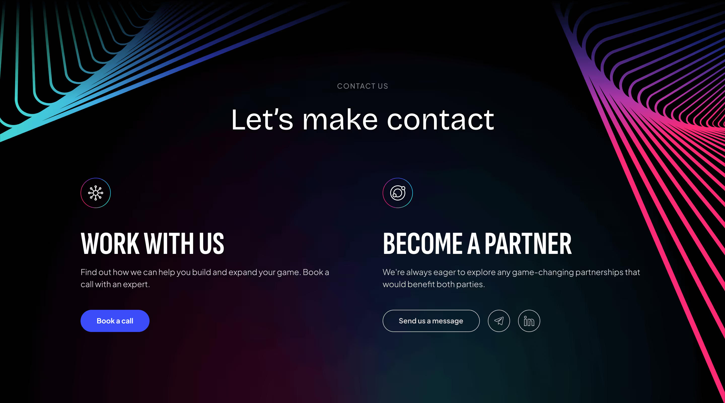
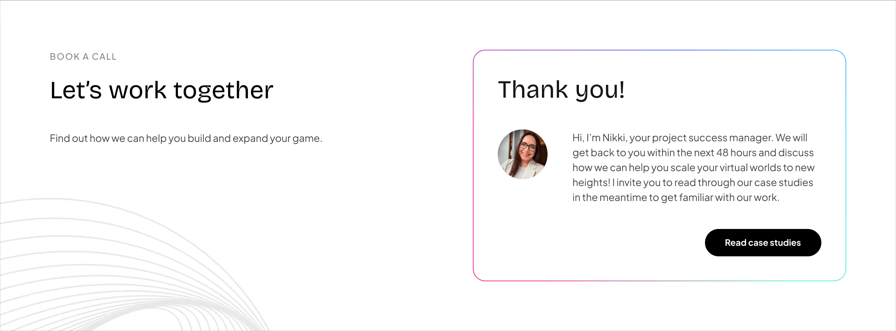
Reusable sections handled everything from dense technical explanations to events, media assets, hiring, and lead capture.

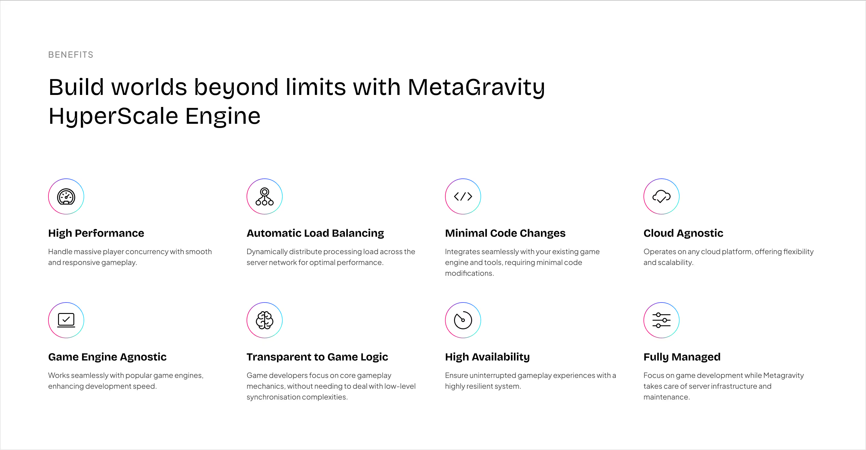
Some pages needed to explain complex infrastructure in depth.
Instead of compressing that content into dense blocks, we used hierarchy, visual recaps, icon systems, and repeated patterns to create natural stopping points.
That helped the site remain technically credible without becoming exhausting to read.


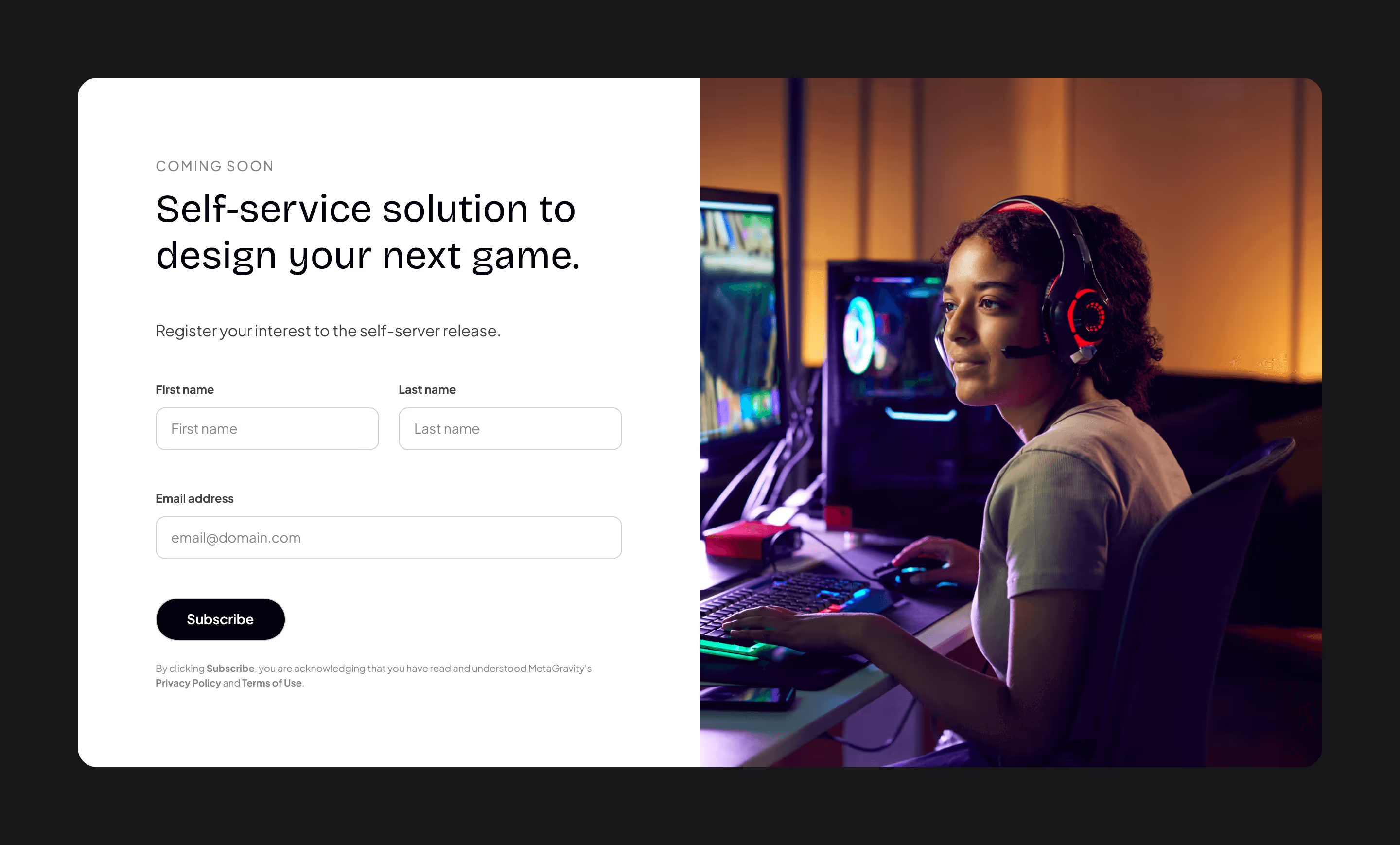
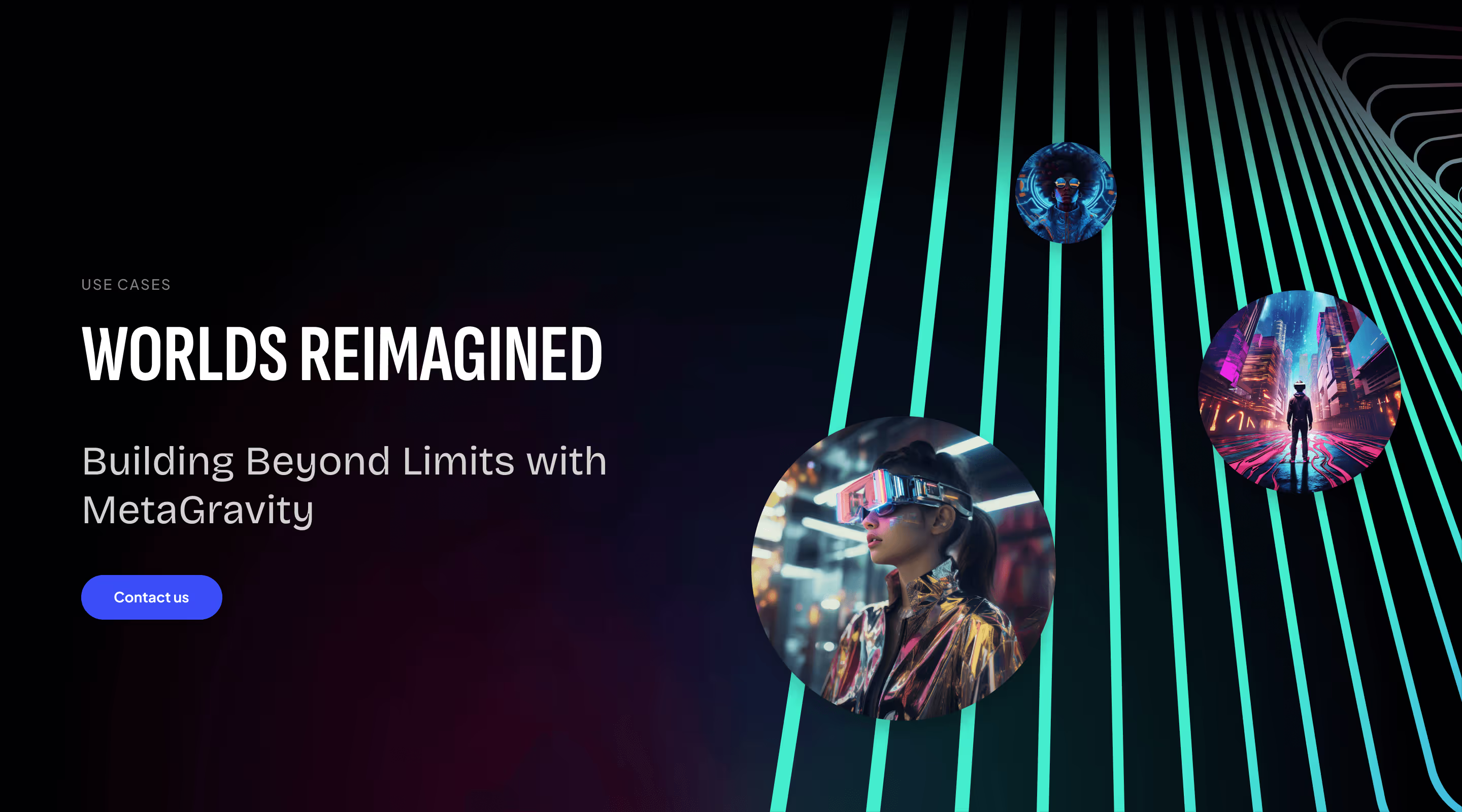
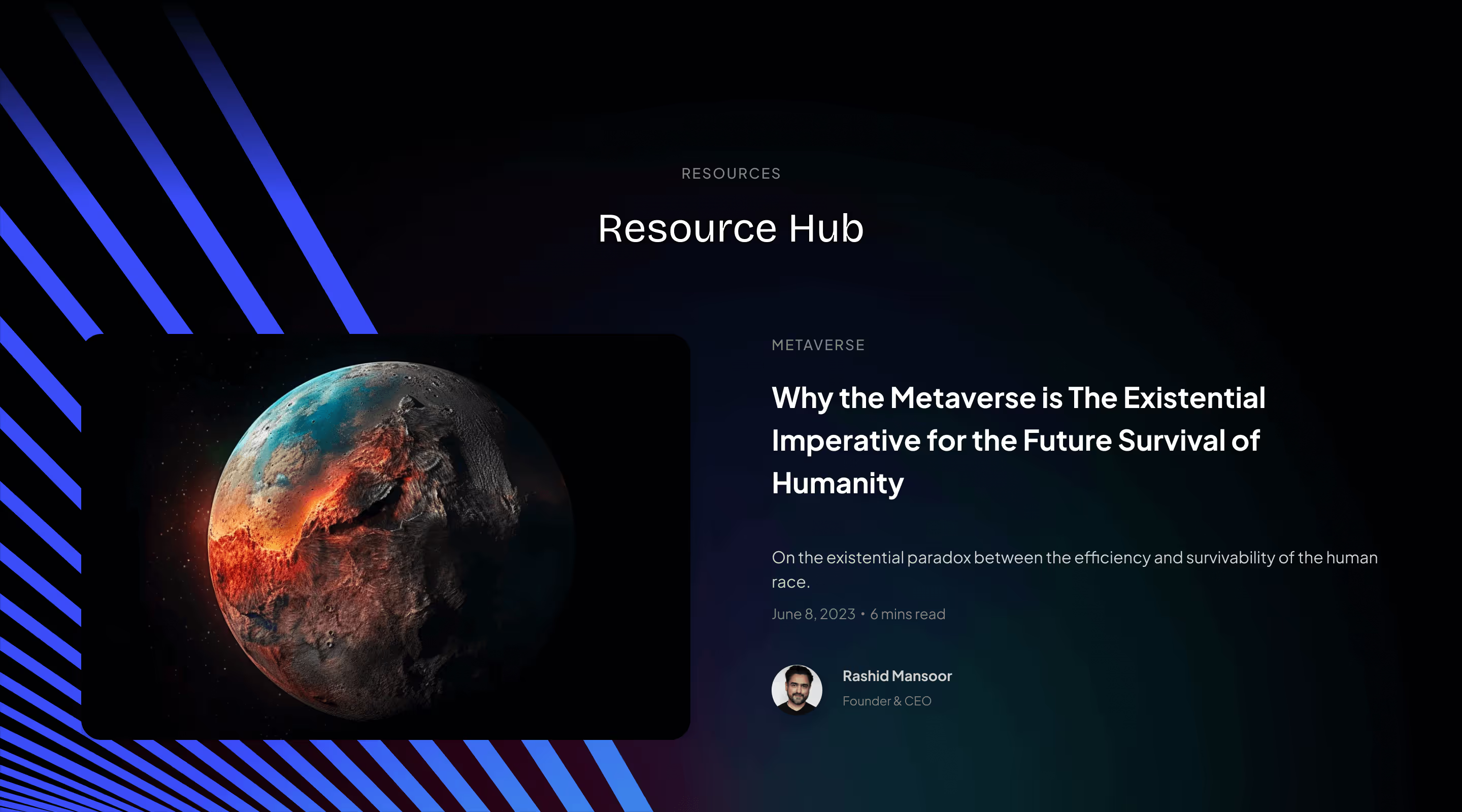
The website also needed to support an active content operation.
Resources, blog posts, events, case studies, media assets, company information, careers, and contact all used the same underlying system while adjusting to different jobs.
That gave MetaGravity one consistent digital identity across marketing, thought leadership, recruiting, and sales.




Once the desktop direction was established, the website was built in Webflow.
That kept design and implementation close enough to refine responsive behavior, content, and interactions while the deadline continued moving.
The existing CMS could also migrate cleanly, reducing unnecessary implementation risk.
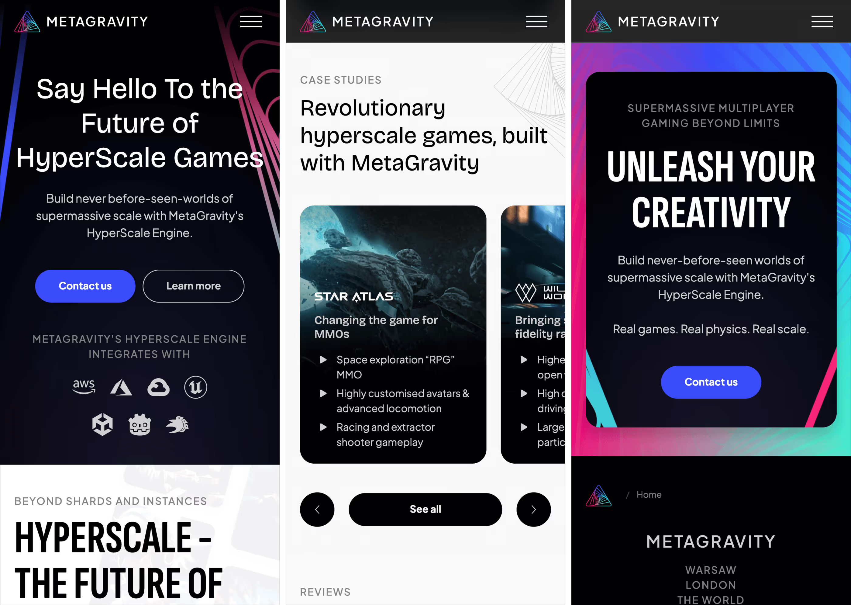
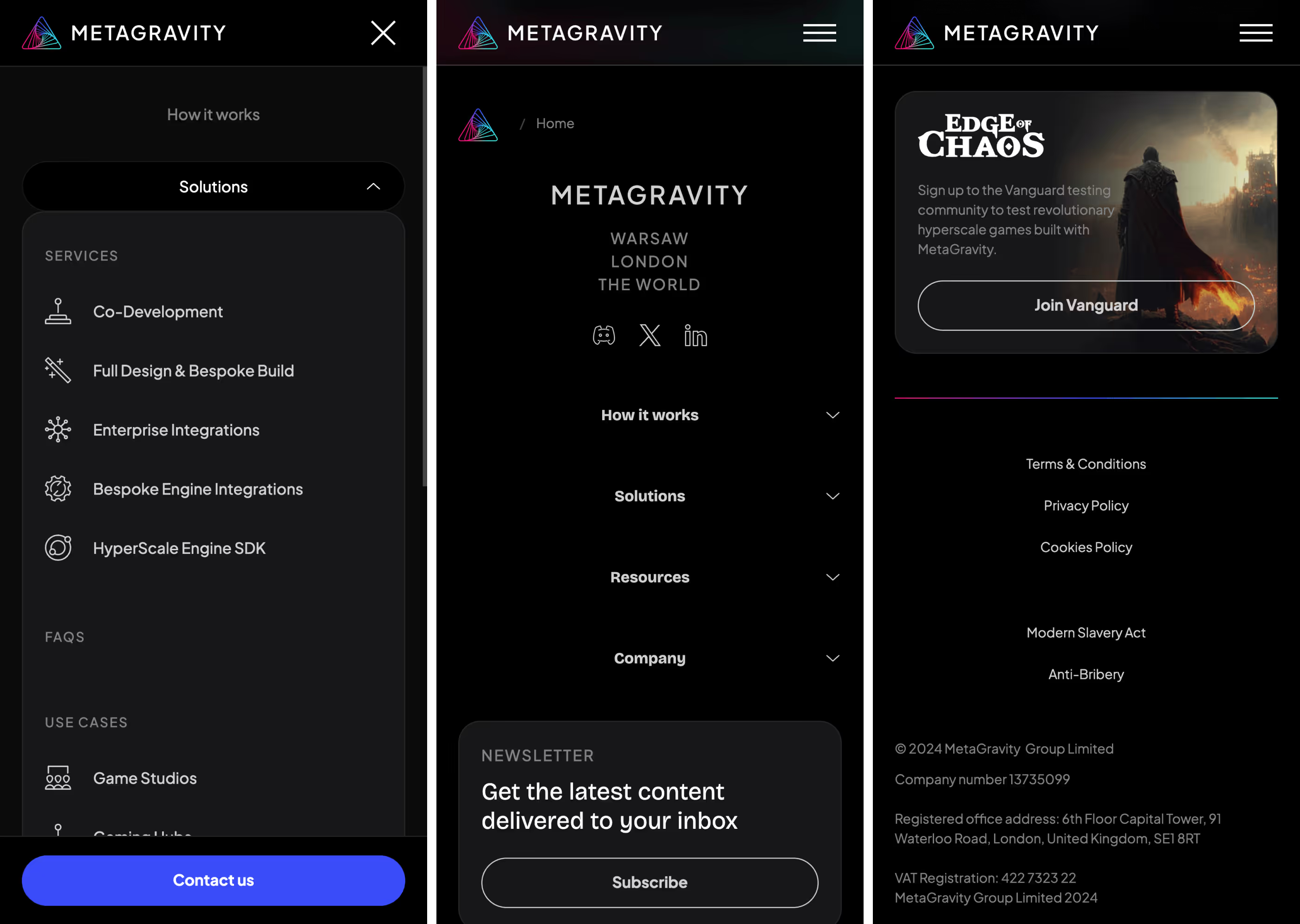
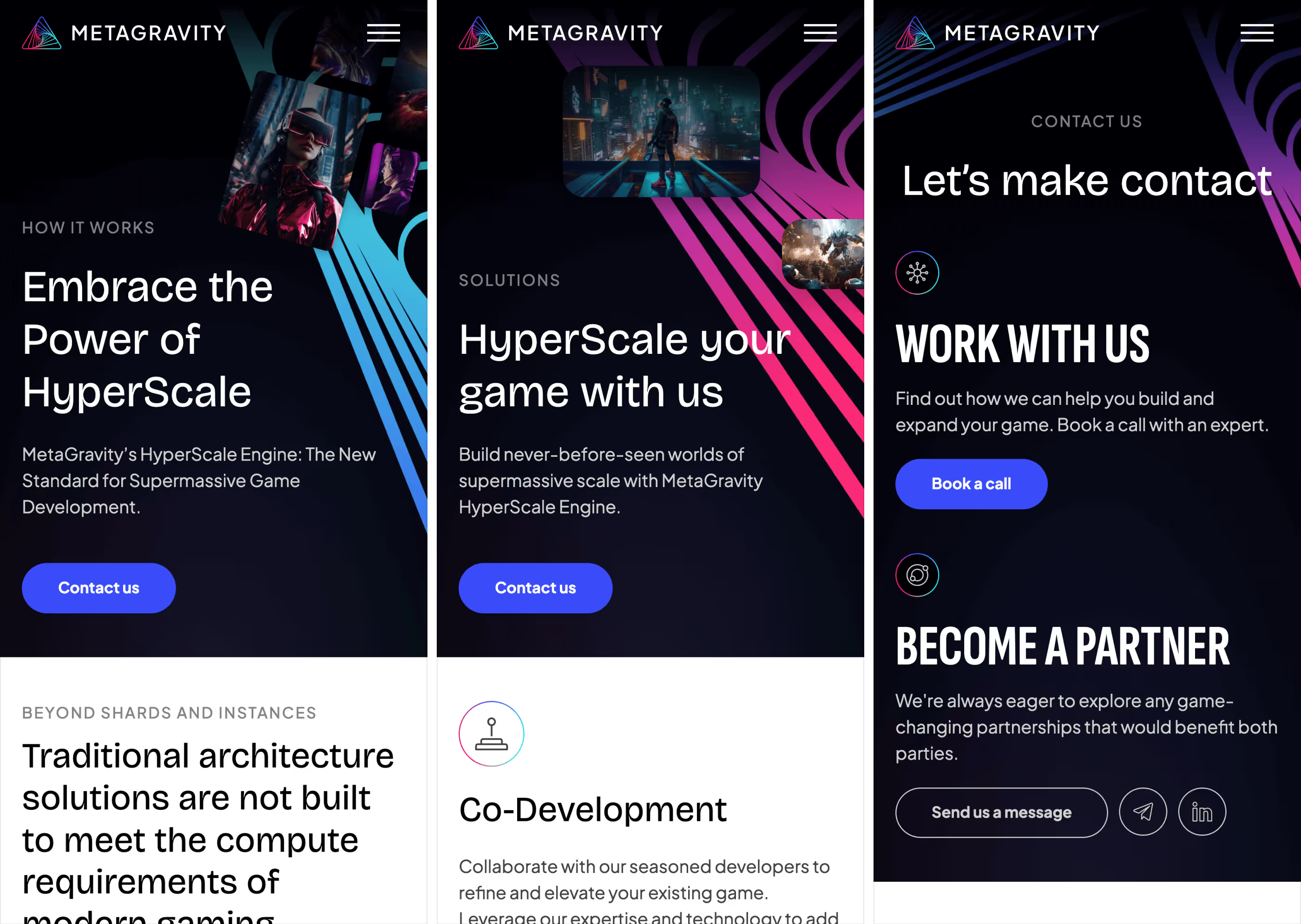

The website went live just before GDC, with the final refinements happening while the team was traveling to San Francisco.
MetaGravity arrived at the conference with a refreshed brand and a digital presence capable of communicating the scale of its technology to a much broader audience.
The deadline was compressed.
The system did not have to feel that way.
Max helped build a new website in record time for a major gaming conference, meeting requirements from stakeholders across the business and delivering a great website to a high standard.

The work translated a complex infrastructure product into a more confident digital experience without losing the energy of the gaming world it was built for.
