Risk Ledger

Media by Yuri Arcurs
Media by Yuri Arcurs
Risk Ledger is a collaborative platform for supplier due diligence that helps organizations simplify, visualize, and mitigate supply chain risk. It's building a global network of connected organizations working together to defend as one, detect, respond to, and ultimately prevent cyber attacks in real time.
Digital Designer — Brand Design, Visual Design, Webflow Development
Linda Wang, Head of Marketing
Tom Baker, Marketing Manager
Chris Luenen, Content Marketing
Mathew Kerber, Visual Designer
Risk Ledger's trajectory to conquer the supply chain security market was steady, attracting the attention of investors and leading organizations. With an unexpected approach within the industry, they applied a social network concept inspired by blockchain to cybersecurity by defending against risks as one unified and collaborative front. Yet, their brand identity and marketing website needed higher quality to match their robust product.
The team reached out to refresh its brand and rebuild its website for its next growth stage. They recently closed their Series A funding round and seeking to transition into a refreshed digital presence around their official announcement.

We had a few months to revisit the brand identity, implement it on their product, and build a new website.
Embarking into the project, we started a discovery session with the team to learn more about the industry, identify their concerns, and gauge their expectations.
According to the team, the primary issue was how the current styling and website could make the brand perceived as a newcomer startup foreign to the enterprise segment. On the contrary, the company had vast experience, a bulletproof reputation, and enough social proof to demonstrate otherwise. Still, the digital presence needs to accomplish that while proposing a clever approach to cybersecurity.
Gathering references from other websites is the most effective way to start our visual research. We reviewed potential visual directions from top players or aspirational brands in similar verticals, trustworthy products, or enterprise-friendly brands.
We organize these references as a collection of bookmarks on an inspiration board or inspo board for short. The bookmarks are presented as cards with elements that will help summarize their visual direction. The elements are their logo, color palette, and adjectives about the website experience.
The inspo board is particularly effective in giving us a snapshot of how the market generally approaches an offering or audience within specific industries or target audiences. It can help us to find opportunities to differentiate or improve a visual direction. Even more deeply, it uncovers gaps in serving an untapped segment. More practically, it helps to find portions from each reference that will potentially apply to elements we will create in our own way, hence why we can use this board as inspiration.
Finding cool blue tones on light themes for most references wasn't surprising for brands marketed as trustworthy and targeting the enterprise segment. On the other hand, most potential competitors leaned towards purple tones instead. We'll get inspired by these different approaches when exploring style directions.
Few references were striking yet innovative. They had big and beautiful typography with exciting pairings. Abstract dynamic shapes and components. Dark high-tech vibe with bright colors.
Most on the trustworthy side were playful and bright, with rounded shapes and softer treatments. The typography and illustrations are modern and conceptual, making them easier to differentiate on corporate.
As for the status quo, the brand and website were clean, appropriate, friendly, and minimalistic. The illustrations use a line art style but feel like clipart. Photography is not present. Spacing and readability are fair but too simplistic. It feels empty and incomplete. Accent teal is used effectively to promote critical elements and engage the audience.
After the discovery session, we understand what we're looking for and what success could look like. However, at this stage, everything is still being defined, and we need to start writing down the path we need to take and the external variables that could impact the outcome. Taking our research further, we perform a competitive analysis and revisit the brand story. The team already documented insights and past marketing efforts, which became very helpful and allowed us to make informed decisions.

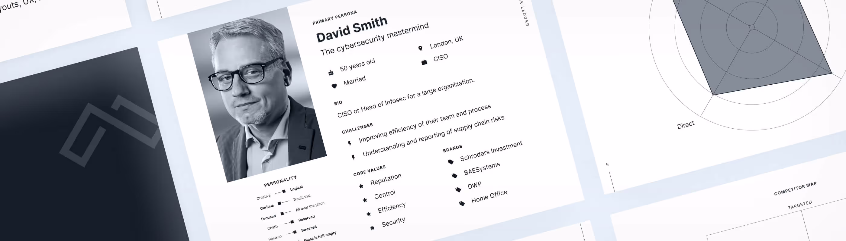
We compiled all our findings, in brief, outlining the brand strategy. It's very high-level but helpful. It comprised a brand statement, personas, positioning, voice, considerations, etc.
At a high level, we found out the name is enough for the symbolic metaphor, and the logo mark and typography could be opportunities to make it more unique to complete the offering. The key is finding the right balance between the visual identity attributes and brand values to speak to the audience with a more straightforward visual message. Different extended approaches could make these attributes more attainable: techie or high-tech to champion the modern factor, playful or intelligent to support the easy-to-use aspect, impactful or striking to sustain the fast element, etc.
It is worth noting that the team was concerned about the impact on accessibility. We understand that accessibility is essential but very technical. Only a few colors with high contrast are fully accessible, blocking creativity, forcing uniformity of visuals, and making it difficult to create a memorable brand. After forming a clear direction, the execution should follow the technical requirements to approach accessible visuals, such as typography, color palette, layouts, UX, messaging, and compositions.

Approaching the drawing board with no preconceived notions about either coming up with a new mark or only refreshing the current one will give us creative freedom and generate more ideas to compare.
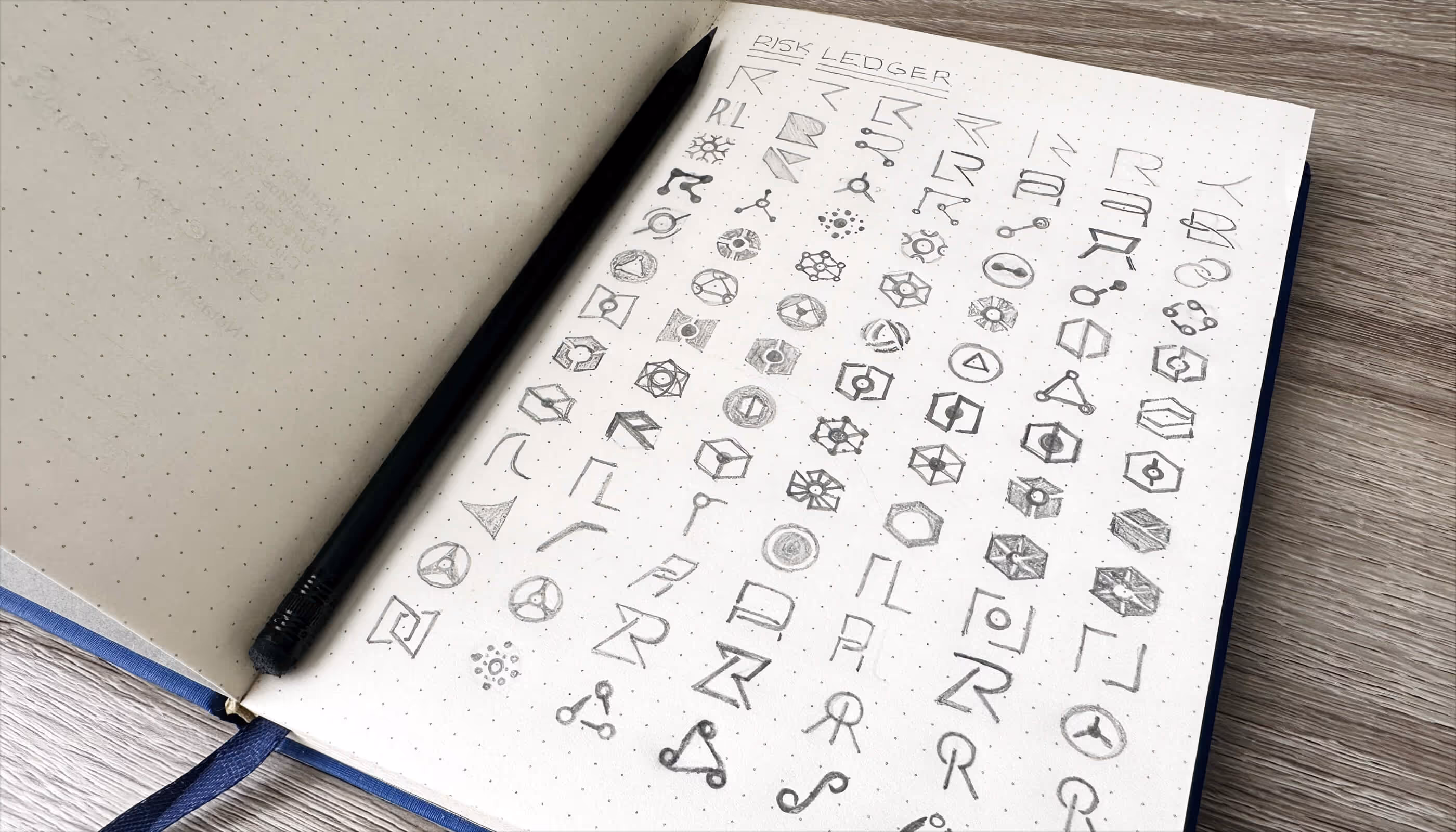
The existing brand mark is memorable and straightforward, the most critical attributes a fantastic mark should have. It is an accounting metaphor inspired by blockchain with an open-book pictogram resembling a chain. Even bypassing the brand equity, the current mark will take much work to beat.

The most productive approaches we took while sketching included the network concept, connection metaphor, node linking, the first letters from the name, and some combinations. Vectorizing allows us to polish and simplify them even more. The digital version of the sketches will be helpful when exploring different styles and mocking up revised brand identities.
Sketching boosts our imagination and encourages us to grow tiny ideas into ambitious visual directions. The strategy provides a framework to support design decisions, and the visual research inspires us with the possibilities.
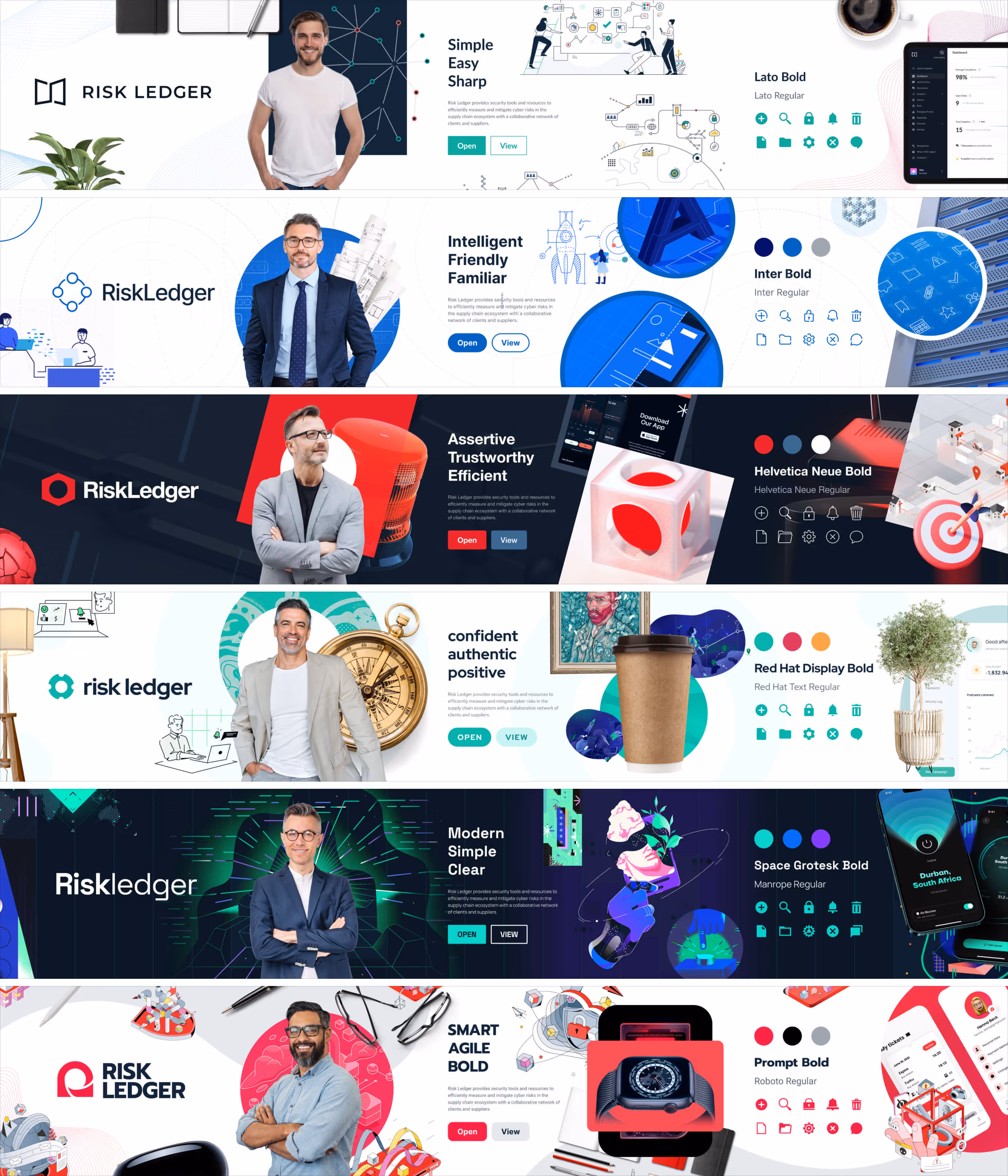
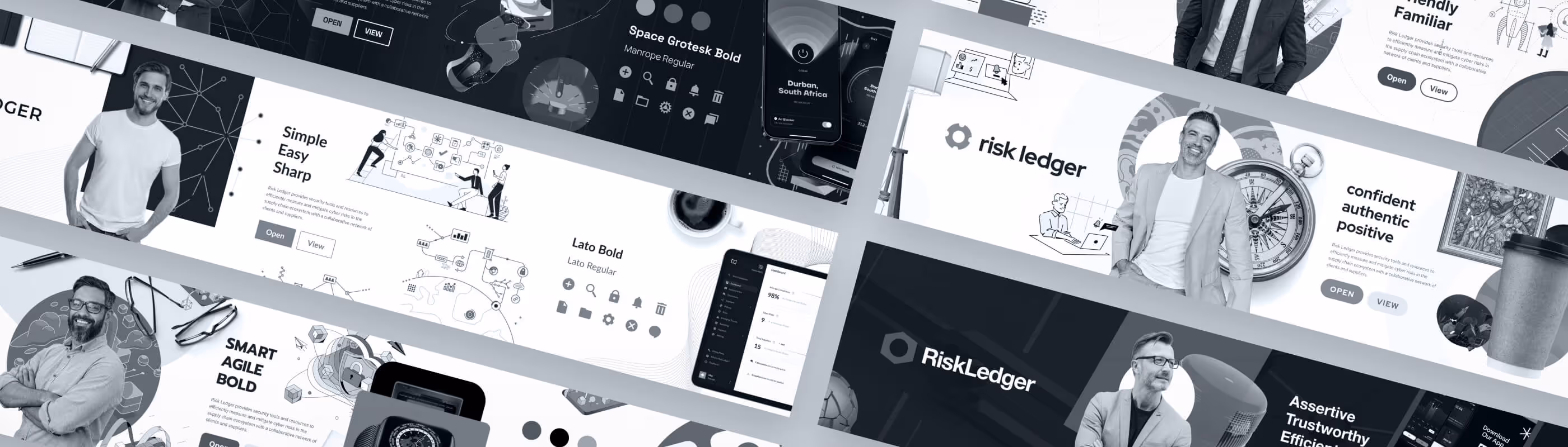
We produce different visual directions packaged as stylescapes. These are single design pieces combining standard key elements and following a style we develop. The stylescapes take one visual approach based on the values from the strategy, usually taking a more extreme approach to create contrasting directions. The elements include personification, logo, palette, typography, iconography, illustrations, photography, objects, etc.
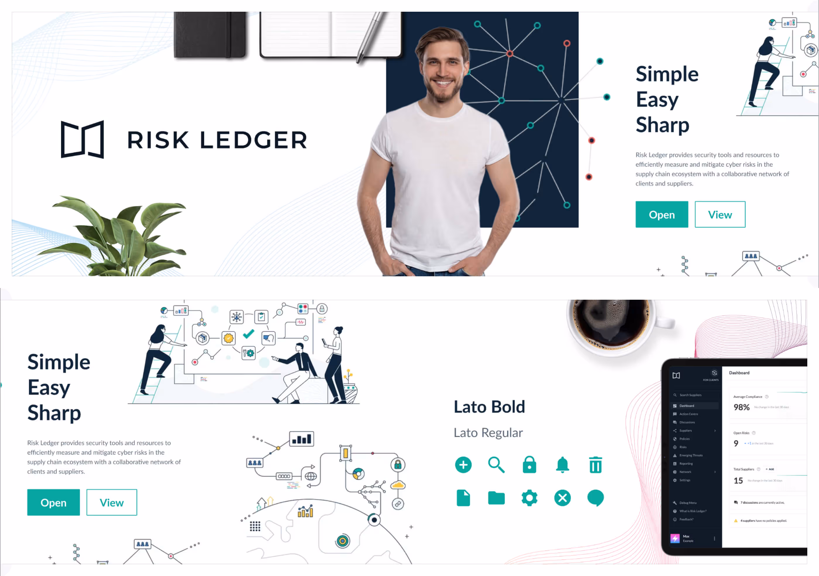
First, we created one for the current brand identity style. This helps us evaluate how much we want to incorporate from other styles, whether we should maintain the current direction, and whether we should ditch it altogether to go heavier with a more practical style.

We wanted to create a concept that played it safe with the most common elements we saw during the visual research. This will ensure the brand is easily recognized within the segment and avoids being perceived as a newcomer. With this approach, differentiation becomes a challenge. We solve it by following a more technical aesthetic style. We applied a blueprint-inspired concept to incorporate lineart, dots, strokes, subtle details, and brighter blues.

Going in the opposite direction, we wanted to try a concept that had the inverse look of what was typical in the inspo board. Differentiation here is a given by design. Using a dark theme with red accents will make it stand out in a sea of light themes with blues. In addition to the color scheme, we added more tridimensional objects, alerts, glares, masking, and legible typography for balance.
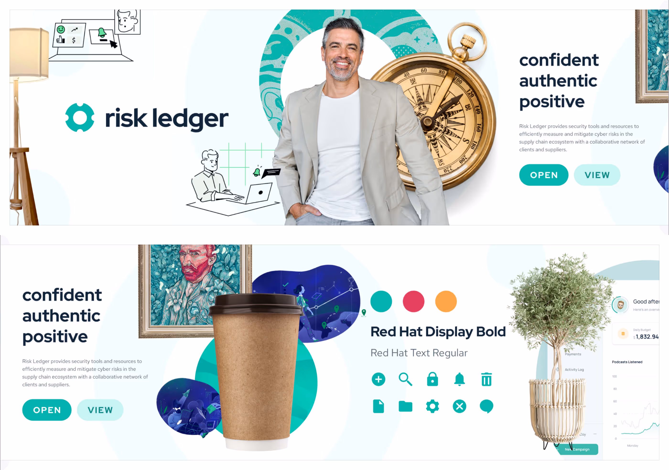
Staying on the differentiation spirit, we wanted to explore a wild approach that felt natural in some way. We kept a light theme, but unexpectedly, we went analog, far away from standard high-tech. This concept was warm and green with a matching color scheme. The vibe was more relaxed, irradiating a holistic sense of security that assured everything was controlled and okay. Based on a skeuomorphic style, we used hand-drawn illustrations, lower casing, organic patterns, and real-life objects.
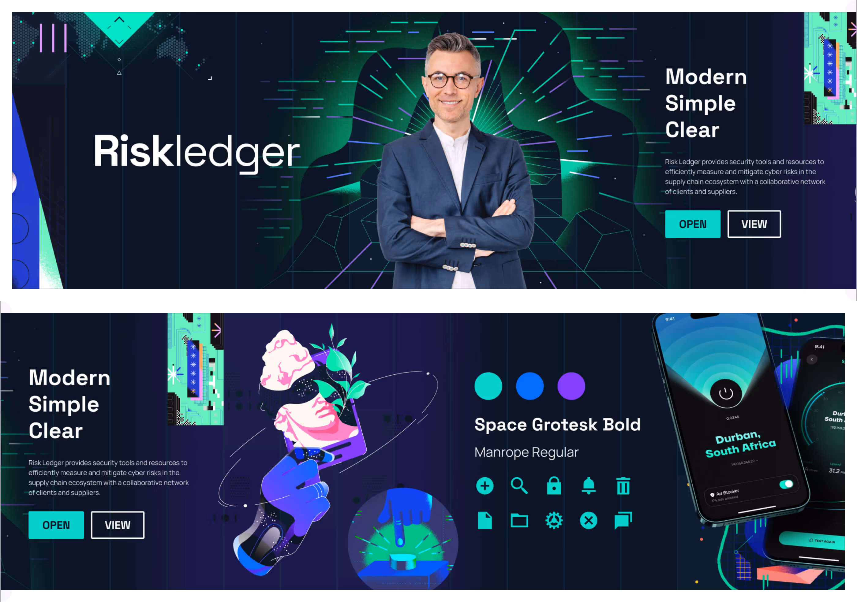
Cybersecurity has such a vibe from a geeky perspective. Inspired by retro and futuristic looks passing by hacky empowerment, we were excited to explore this concept.

The last direction is a combination of all the other styles. We wanted a flexible concept that accommodated the most remarkable elements and had significant creative possibilities. The only stacked logo for a more balanced aspect ratio. We used organic waves to create movement. Layouts were minimalist, but compositions were maximalistic. The illustration style was lineart-based but with a tridimensional depth. We had real-life objects, but mainly about tech. Incorporated subtle patterns but from illustrations. We also applied masking and picked red as our accent color. The result was a more diverse and playful direction.
After reviewing all the stylescapes with the team and revising the strategy, we concluded that we should keep the core of our brand identity. The focus shifted to polishing and refreshing everything rather than exploring more directions. This meant we would seize our existing brand equity but inspect carefully all the visual elements to make the upgrade it deserves.
Exploring styling options with stylescapes comes from a place of creativity, producing wildly different directions. However, navigating the options with pairings is about pragmatism, generating tons of iterations with minimal differences. Both are helpful, but pairings are necessary when searching for the right combination.
Going back and forth between the different factors of a visual direction is a part of the creative process that needs to be registered. Still, as designers, we regularly tend to be kept captive by comparing one with another. To ease this process, make their disparity more noticeable, and support our design decisions, we create a layout with all the essential ingredients and generate versions with their variables. Grouping is helpful when some options don't require too granular variations.
We refined the logo mark and type within the subtleties by providing balance and consistency within their geometric space. These slightly new versions are included as attributes in the comparison.
With a clear direction after working on the stylescapes, the pairings stage is valuable for refining the subtleties. However, we need to start picturing the refined styling direction and where we can create new visual elements for the brand.
Similarly to pairings, we level up our templates to iterate with higher complexity and fidelity. We still need more time to work with color and generate more iterations for different schemes.
As we compare palettes on visualizations, we revisit strategy and research to narrow down the options as we progress.
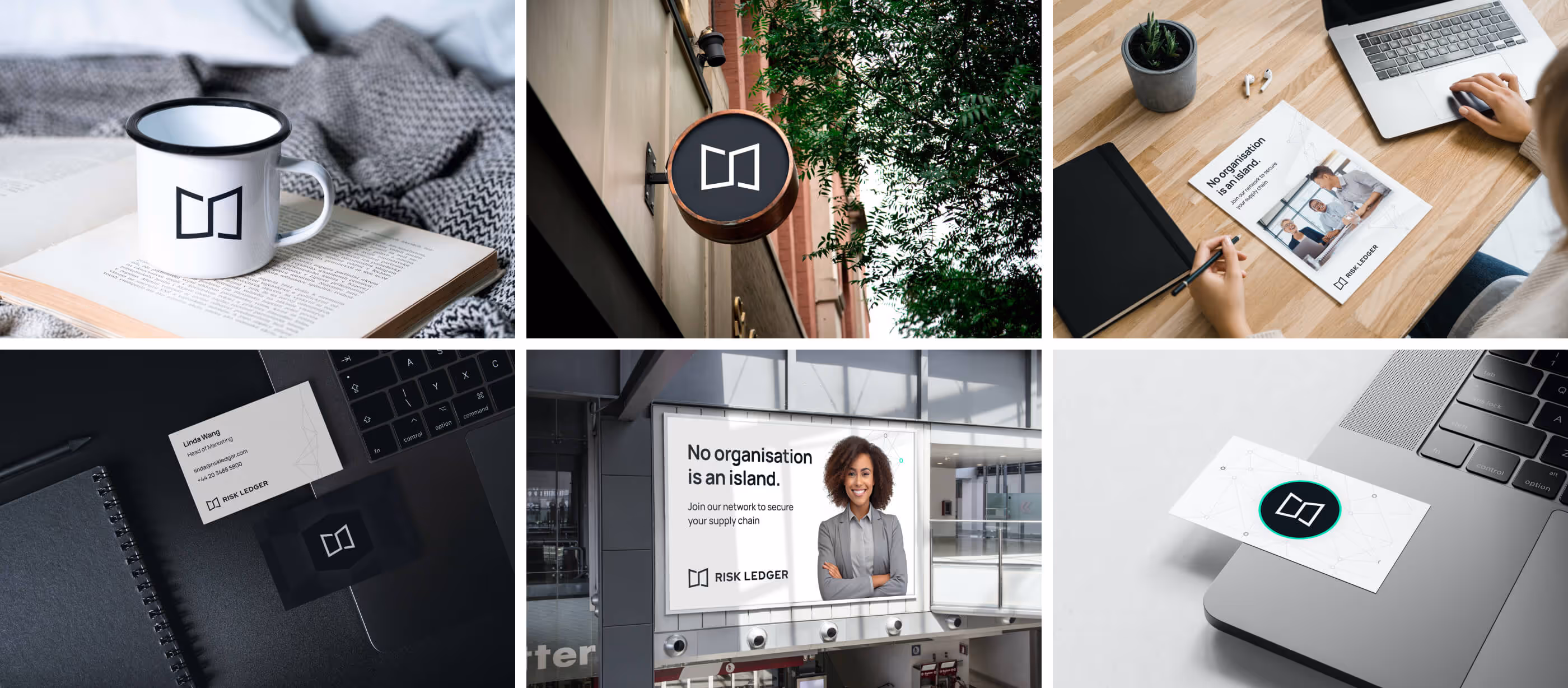
The refined brand identity is used across all visualizations, and for the first time, we start imagining how it looks in real life when implemented by making mockups.
While visualizing digital brands, exploring compositions and discovering visual elements that could be developed further is critical. We must investigate how photography is used in layouts, which patterns or shapes could be added to the canvas, and what colorways or lockups will be required.
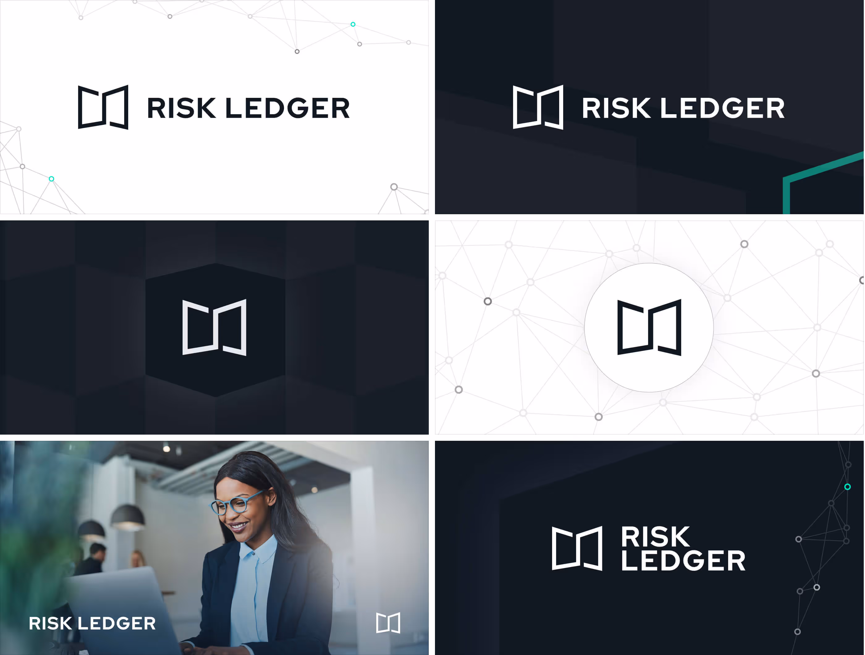
Iterative by design translates into a progressive evolution until we find the final combo. Inherit from the core of the existing brand identity, neutral colors enable us to maintain the trustworthy look we saw during the visual research without the unmistakable blue used elsewhere. Still, the accent color was our chance for differentiation by adopting a bright turquoise similar to the neon style we tried on our cyber styling concept. As for the typography, we needed a versatile sans-serif font that was somewhat geometric and clean. The typeface had to look balanced in all caps and should be widely supported online to ensure consistency. Manrope was all that and more, a fantastic companion to the refined logo.
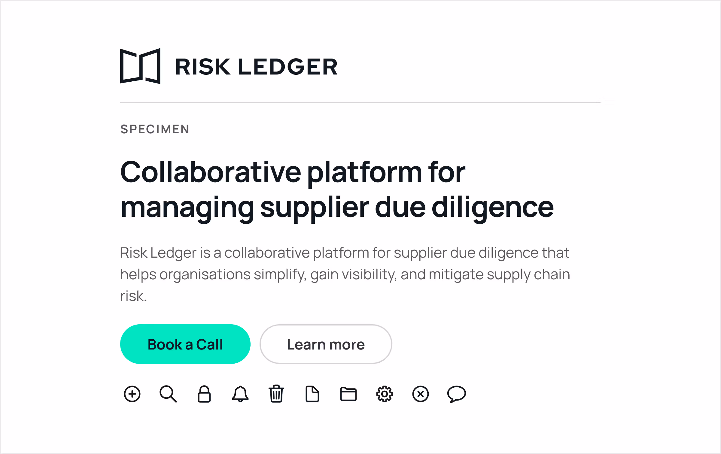
Ultimately, we had our final specimen with a killer pairing combo. This enclosed the more geometric logo, Manrope font for all text styles, turquoise as our accent color, clean neutral colors elsewhere, and line-based icons.

With clarity on our final styling and new elements, we need to precisely outline the refreshed brand identity to make it repeatable and consistent. Writing down the brand guidelines is critical to officially implementing all the changes.
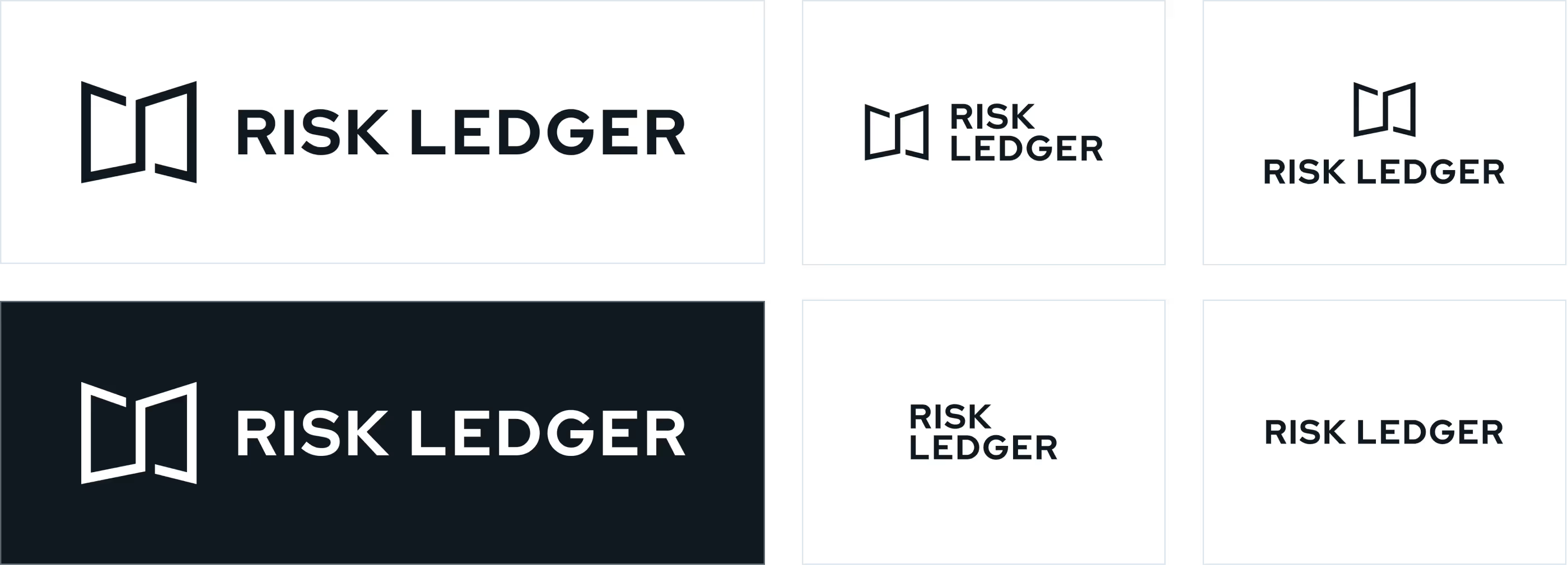
The logomark is the shorthand for our brand. It's easy to recognize and works perfectly as a simple sign-off—where the audience might be familiar with the context of the Risk Ledger brand.
The logotype is generally only used with the logomark. However, it has been optically adjusted to ensure an even rhythm between the letters.
The lockup is the structured relationship between the logomark and logotype. It is the most common use of the logo and should be used for external-facing applications, as using the logomark with the logotype helps provide context and establish brand recognition.
The area around the logo should always provide ample space so that the logo's balance and wholeness are not crowded or constrained by external elements.
The trapezoid shows the correct amount of space surrounding the logo. No accompanying text or logos should appear in this area.
The logo should appear on the primary black or white backgrounds whenever possible.
These applications reflect the core brand values and are suitable for instances when a quieter brand presence is necessary, such as a header on a website or letterhead and business card.
The primary version is the horizontal lockup, the logomark, and the logotype in one line.
However, depending on the context and best use of the real state, we have alternative versions to combine these two elements more efficiently.
The same clearspace and colorways apply to these versions.
The primary color palette is black and white. Black and white are preferred for most scenarios and sufficiently communicate the brand value about how Risk Ledger is a blank canvas that adapts to its content.
The stark contrast of black and white expresses the organization's boldness and precision. The interplay of black and white can also be creatively expressed using different blend modes when setting text over photography.
Secondary colors are mainly used as accent colors.
Tertiary colors are used sparingly. They are typically used when additional values are needed for data visualization or when a page's asset works well with a pre-determined color theme.
Neutral colors are applied to text and icons on the website to create balance within a predominantly neutral system.
The colors can also be expanded to create a broader palette of tints and shades.
They give us flexibility, especially in our digital product, and add depth to illustrations. However, while our tints and shades are valuable tools, they should be used sparingly.
The chart above approximates how much each color should appear in the Risk Ledger visual identity.
The neutral palette should be heavily favored. White and Black will do most of the work, while grays should be used sparingly.
Overusing other colors is discouraged. They should act only as an accent to the neutral palette.
The primary brand typeface is Manrope, an open-source modern sans-serif font family designed by Mikhail Sharanda in 2018. Mirko Velimirovic worked with him a year later to convert Manrope into a variable font.
Manrope is a versatile sans serif used for all Risk Ledger branded communications. No other typeface should ever be used in its place.
The shared library is based on San Francisco Symbols by Apple and the extended weight set for SF Regular by Icons8.
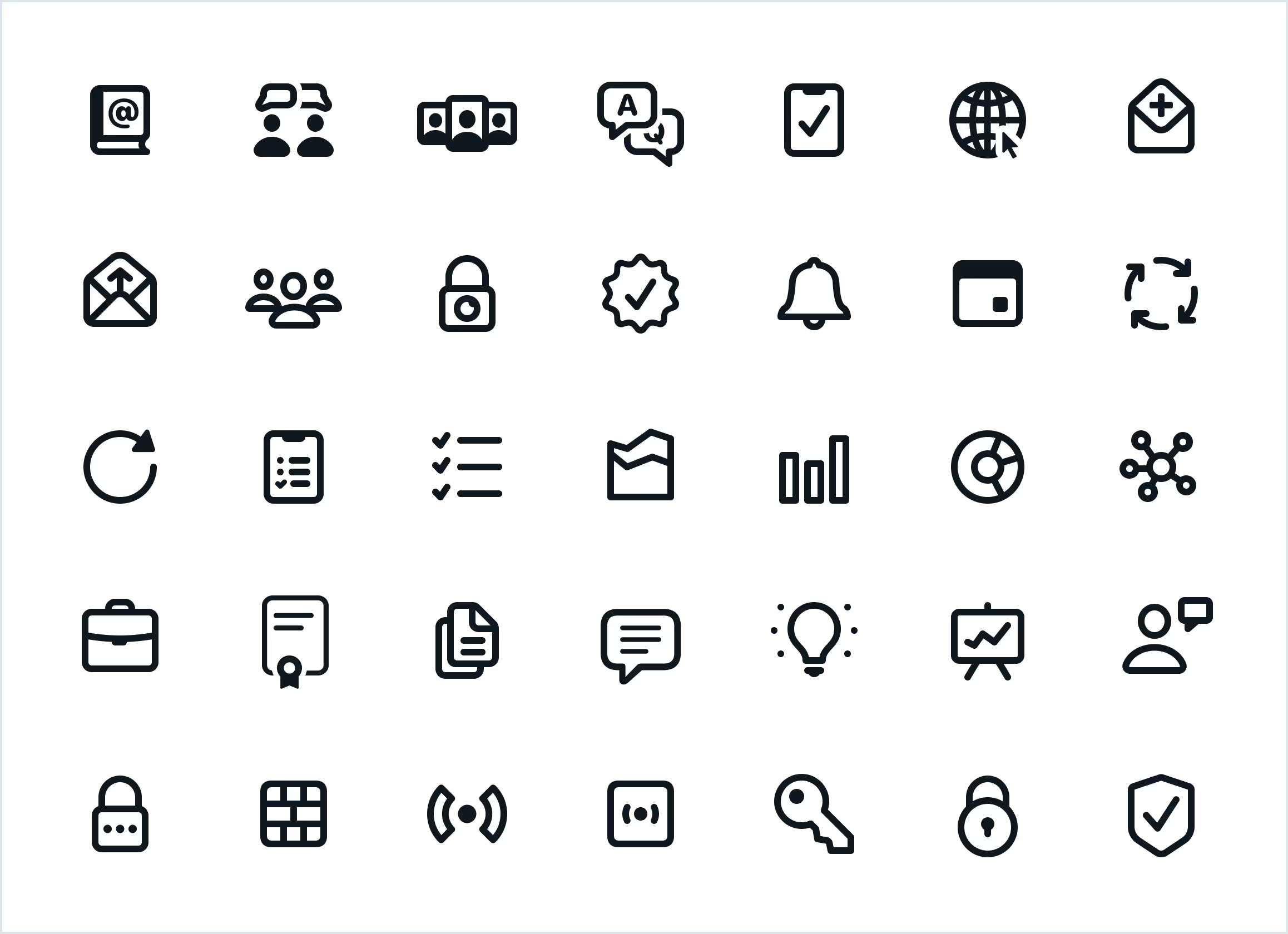
The consistent SF Regular icon pack covers diverse theme categories. These icons are pixel-perfect at 50×50 pixels. The style is outlined, with the base stroke being 2px.
Purposeful imagery communicates an idea to illustrate the story you're making.
Our goal is to create an appropriate style of photography that embodies the brand attributes and presents a distinct image, avoiding generic, inconsistent, stock-like visuals.
We aim to capture diverse, genuine moments that speak to infosec managers, CISOs, business leaders, and company employees.
The overall tone should be candid, genuine, honest, and approachable. The photography should depict a range of real-life emotions.

The style has the following attributes:
Real people in real moments or artifacts that communicate a product message, if applicable. Images of people usually include all or part of their faces, but never look directly into the camera.

The photos in the grid above, arranged from left to right and top to bottom, are examples of the subject in the photography style:
Candid, genuine, authentic, honest, and approachable. Personal, humanizing details that add unique personality.

The photos in the grid above, arranged from left to right and top to bottom, are examples of the feel of the photography style:
Full-color, slightly desaturated, cooler palette.

The photos in the grid above, arranged from left to right and top to bottom, are examples of the color in the photography style:
Bright, natural lighting; high-key, even exposure.

The photos in the grid above, arranged from left to right and top to bottom, are examples of the lighting in the photography style:
Ample white space—1/4 to 3/4 of frame. Simple forms, low detail, not busy.
The composition has the following attributes:

The photos in the grid above, arranged from left to right and top to bottom, are examples of the composition in the photography style:
Additionally, to define the attributes of the photography style, it is helpful to provide guidance on what is considered off-brand. When choosing imagery of people, we need to look for realistic interpretations of situations rather than posed or staged images. We need to be conscious of the overall tone and the composition of elements.

The photos in the grid above, arranged from left to right and top to bottom, are examples of misuse in the photography style:
There are additional elements that help us to create on-brand compositions.
Illustrations are used to express an idea or message engagingly. They help tell the Risk Ledger story, especially themes that are difficult to express with words.
Illustrations can communicate without singling out a specific time, place, or person, unlike photography.
Illustrations allow us to be more conceptual and abstract within a consistent style. They also allow us to add subtle decorations and enrich content when convenient.

The product's key differentiator is a network model approach. To convey this abstract idea, using an illustration is practical. While keeping it subtle, it is used in backgrounds and decorators to enrich the layout and content.
The style is line art-based with superficial circle nodes. The colors are neutrals and one accent color.
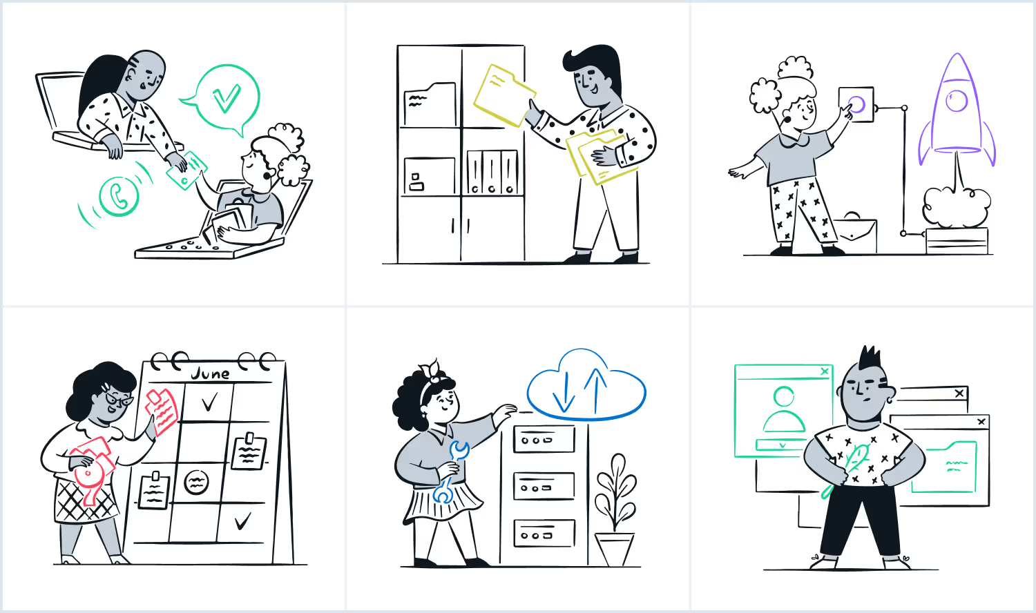
Free-form illustration can convey or talk about a conceptual or complex idea.
The style is also line art, with organic and simple compositions, such as sketches. The hand-drawn brush should be clean, like a marker. The colors are black and white with one accent color. The characters are natural, with expressions that feel approachable and add personality.
There are two patterns inspired by our logomark to primarily assist in backgrounds: Beehive and Pages.
All patterns are designed modular, allowing for application across all sizes.
This modularity also allows the patterns to be used partially for compositions with clean whitespace.
The main component used to make these patterns is the same as the one taken from the logomark to calculate clear space. It's the imaginary trapezoid made by the logomark lines, the page sheets of the ledger book symbol.

The beehive pattern is a way of tiling the trapezoid into seamless and repeatable hexagonal shapes, which creates a beehive-like effect.
The beehive is a nod to the product's network and community components. Everything is connected, and we defend as one.

The page's pattern is made of trapezoids in a more organic setting. They're arranged in different sizes, orientations, shadows, and opacities.
The trapezoids should be placed close to the edges to create cropped shapes. The line art version of the trapezoid is helpful for accents.
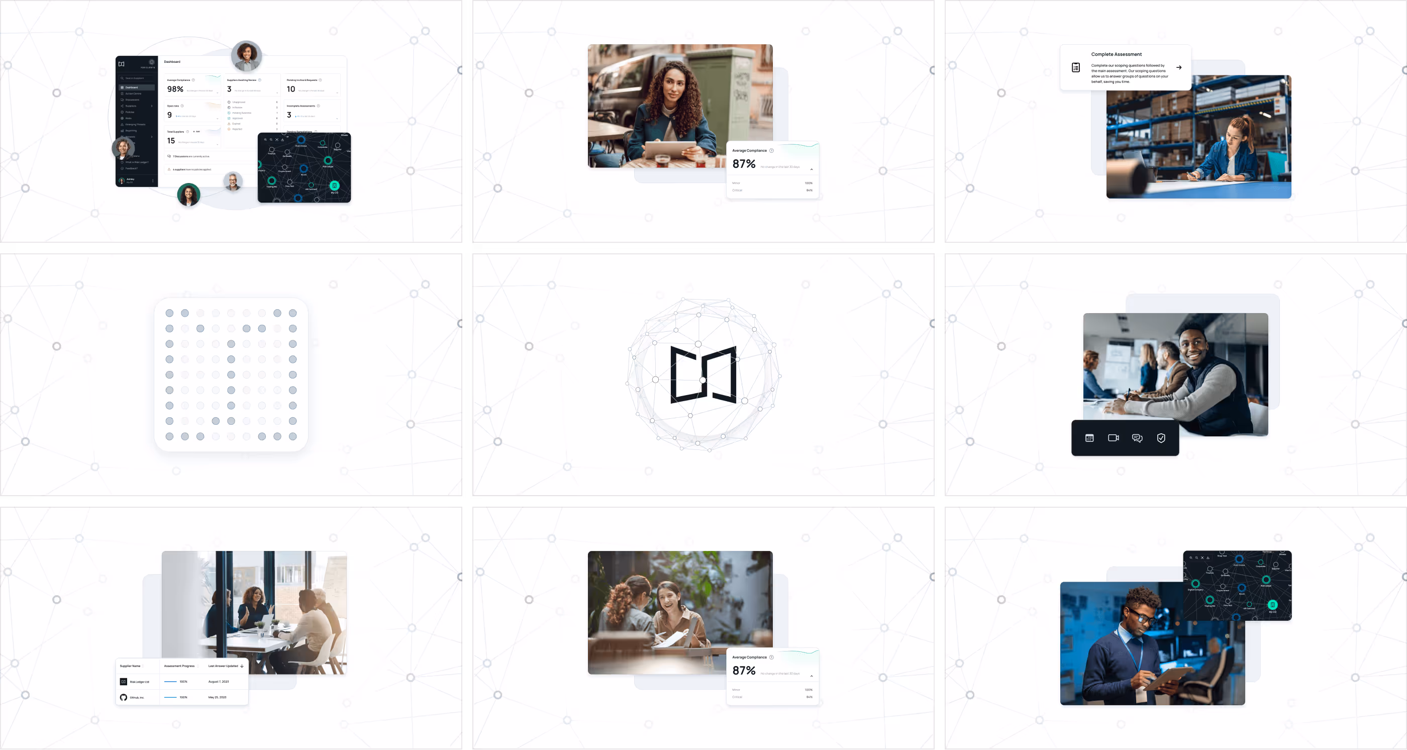
The Risk Ledger's platform is compelling and illustrative of the value proposition's top benefits.
It can range from being descriptive, with a high-fidelity representation of a given screen related to a feature, to more complex stories where UI elements can create rich compositions.

The images in the grid above, arranged from left to right and top to bottom, are examples of UI mockups:
The digital product, a platform with unique features we need to showcase correctly, is at the center of the value offering. The interface was created directly during development, lacking the required assets to represent the elements individually when applicable. Screenshots won't be enough and won't tell of the product's actual value. Also, with the brand refresh, we have refined elements for the color palette, typography, iconography, etc.

We worked diligently to take fresh screenshots and recreate mockups following the brand guidelines with minimal impact on the interface. In short, it's like adding a new skin to the existing interface with no UX or functional modifications. Shoutout to Mathew Kerber, who worked hard to complete this laborious transformation.
After defining all the aspects of the identity, we outline the new brand assets and how to use them to create consistent and cohesive branded materials. We compile them into one document that will serve as a practical guide about the essential elements of the Risk Ledger's evolving identity.
The purpose of brand guidelines isto help ensure your brand is communicated correctly internally and presented consistently to the audience. Yet, in the end, guidelines are just that— a guide. The document should be used with best judgment as a reference point.
The user experience and journey are independent of the brand refresh styling. While working on the brand identity design, in parallel, we also worked on defining the layout and flow. Styling is not critical in the website design process, and we can focus on the experience.
We follow a minimalistic and consistent visual language for the wireframes, which are low-fidelity mockups. These are black-and-white with imagery placeholders and are mainly borderline-based. The negative color on buttons is reserved for the primary call-to-action.
All elements, such as sections, components, fields, buttons, and cards, are outlined with solid or dashed borders depending on weight and hierarchy. Typography and iconography are essential in providing structure and early visuals. These modular elements allow us to reuse them and create consistency and familiarity across the website's user experience. They will become the building blocks for the website during development.
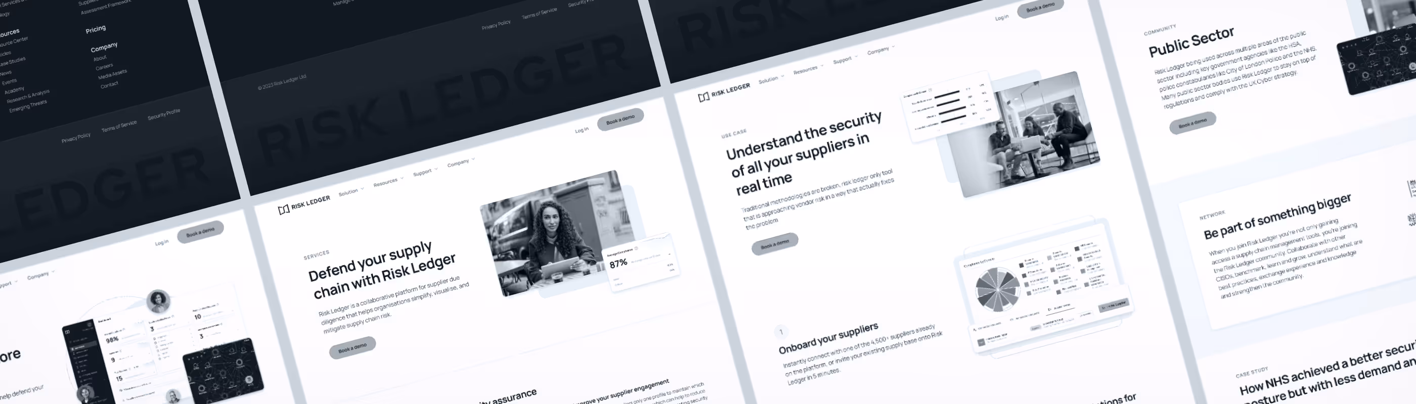
With the guidelines ready and the wireframes completed, we started implementing the styling on the structure. It's a fantastic opportunity to challenge our refreshed brand identity and user journey.

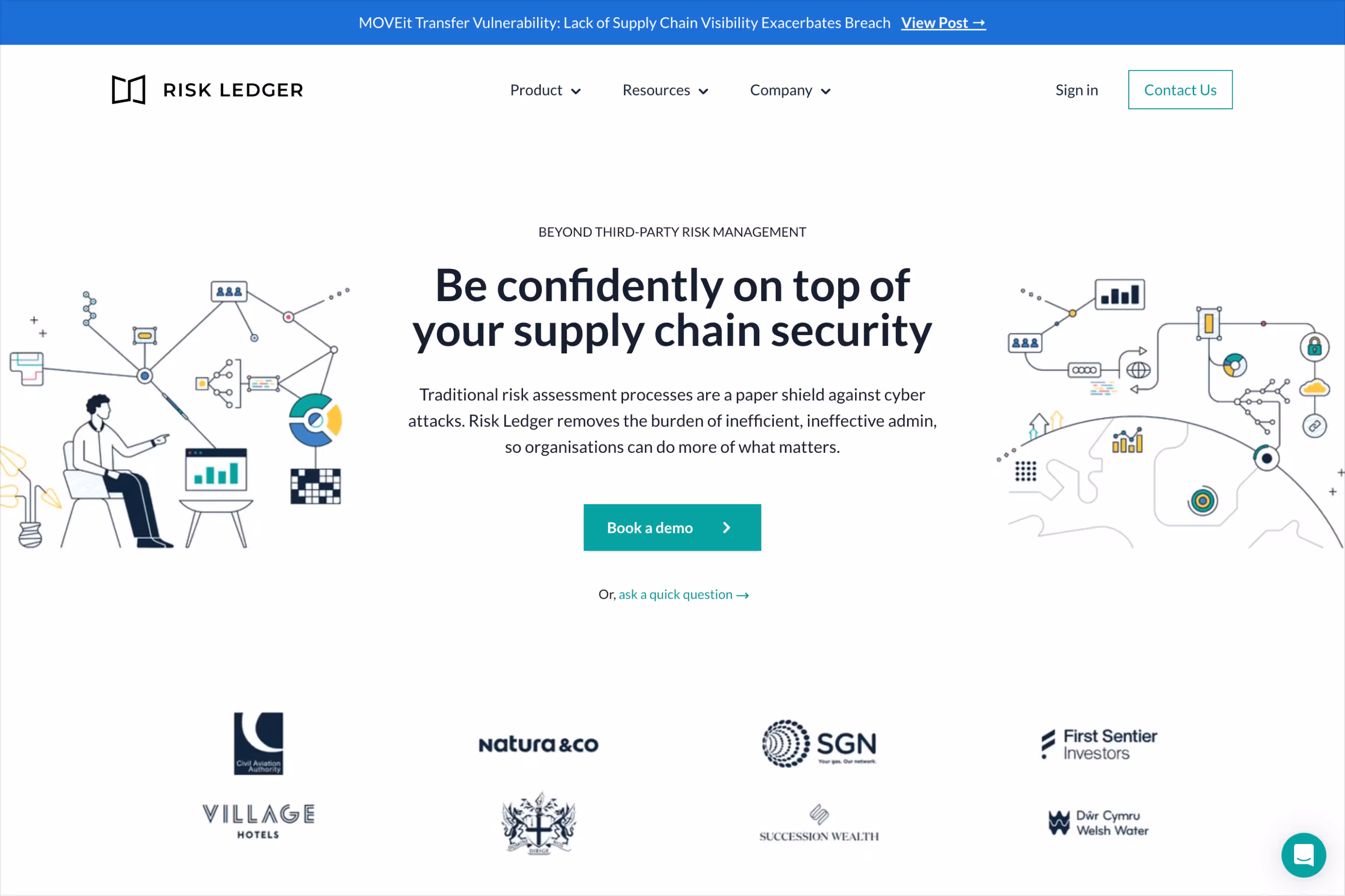
The content above the fold on the home page is the first impression of a website, which is the visible part at first glance without having to scroll. Introducing the brand, value proposition, and call to action is essential. This becomes the primary hero of the website.
Leading with the product is an honest and powerful way to make the offering more compelling. We'll use the UI mockups outlined in the guidelines to compose a piece containing the platform's home base and its major differentiator, the network view. Avatars of people on top of the screens will represent its collaborative component. Behind all these elements, we have a filled and outlined shape, providing balance and depth. Using the platform UI, this composition anatomy will be reused across the site to portray features and scenarios.
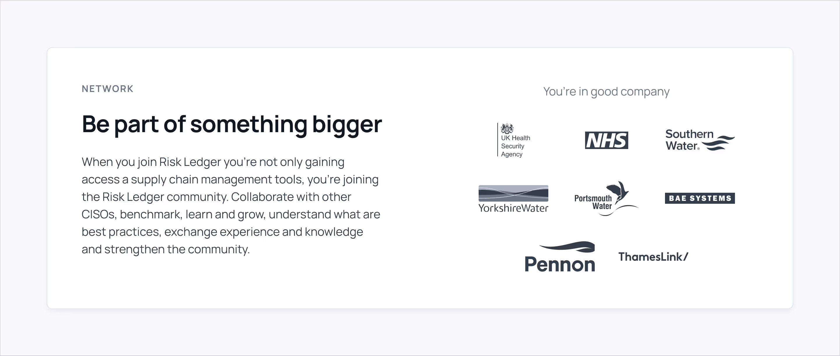
The most effective primary hero sections include social proof and detours to allow visitors to consume more content before taking action. The network component is the killer feature, and the vast list of well-respected organizations using the platform is crucial to showcase. From the public sector to infrastructure, the organizations become a seal of proof where joining won't feel like going into a ghost town; instead, a real FOMO is how it should feel. These will create trust and validate the offering by relating to accountable organizations. They're presented as trust logos on a marquee banner.
Our website's primary action is to Book a demo. The primary button will remain turquoise-colored across the website exclusively for this action and will be promoted within the global navigation, hero, and outro sections.

We introduce the product after covering the basics about the brand and website in the primary hero. First, we go with an arc graph to visualize the industries using the platform. The arc is a convenient way to arrange the data and visually invite you to keep scrolling.

Following the chart, we go into the solution pillars with UI mockups, and a list of icon badges to provide more details.
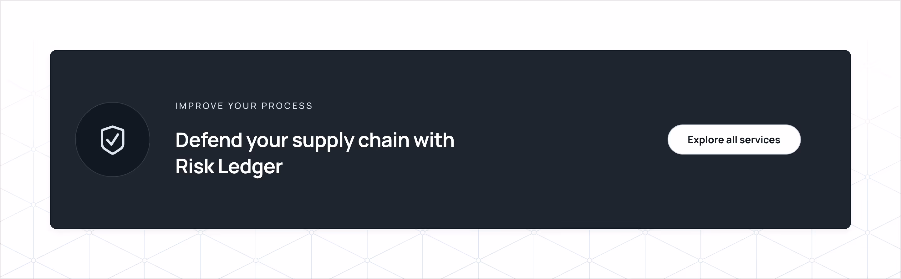
Wrapping up the solutions section and after listing the platform's top benefits, we reassure the main value proposition and provide an action to explore all the options. Visually, we opt for a black card to create contrast and place it above a subtle beehive network pattern transitioned as a gradient from the standard white. The beehive network pattern combines the beehive style pattern made of the network style illustration on the same border width for smooth transitions.
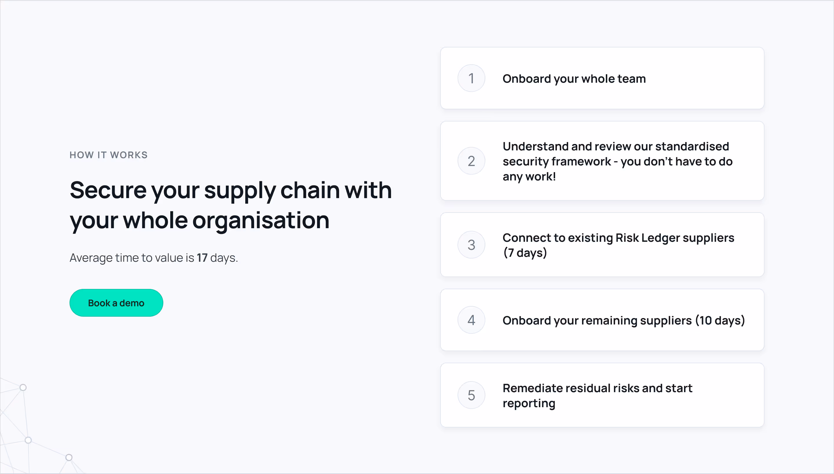
Adopting a new tool could be daunting, especially in the cybersecurity space. Setting expectations is essential to make the process less intimidating. The How it Works section helps us to showcase the steps to get onboarded and start seeing the value.
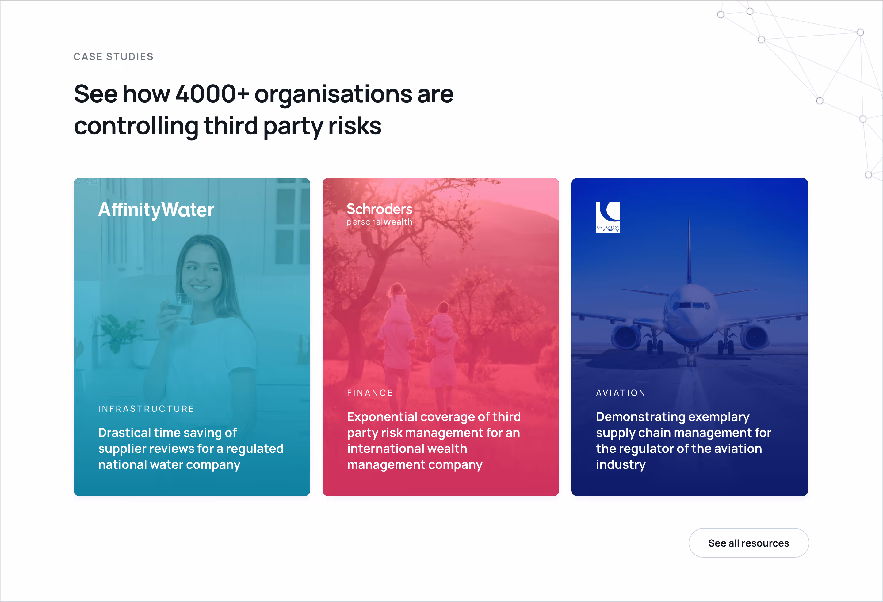
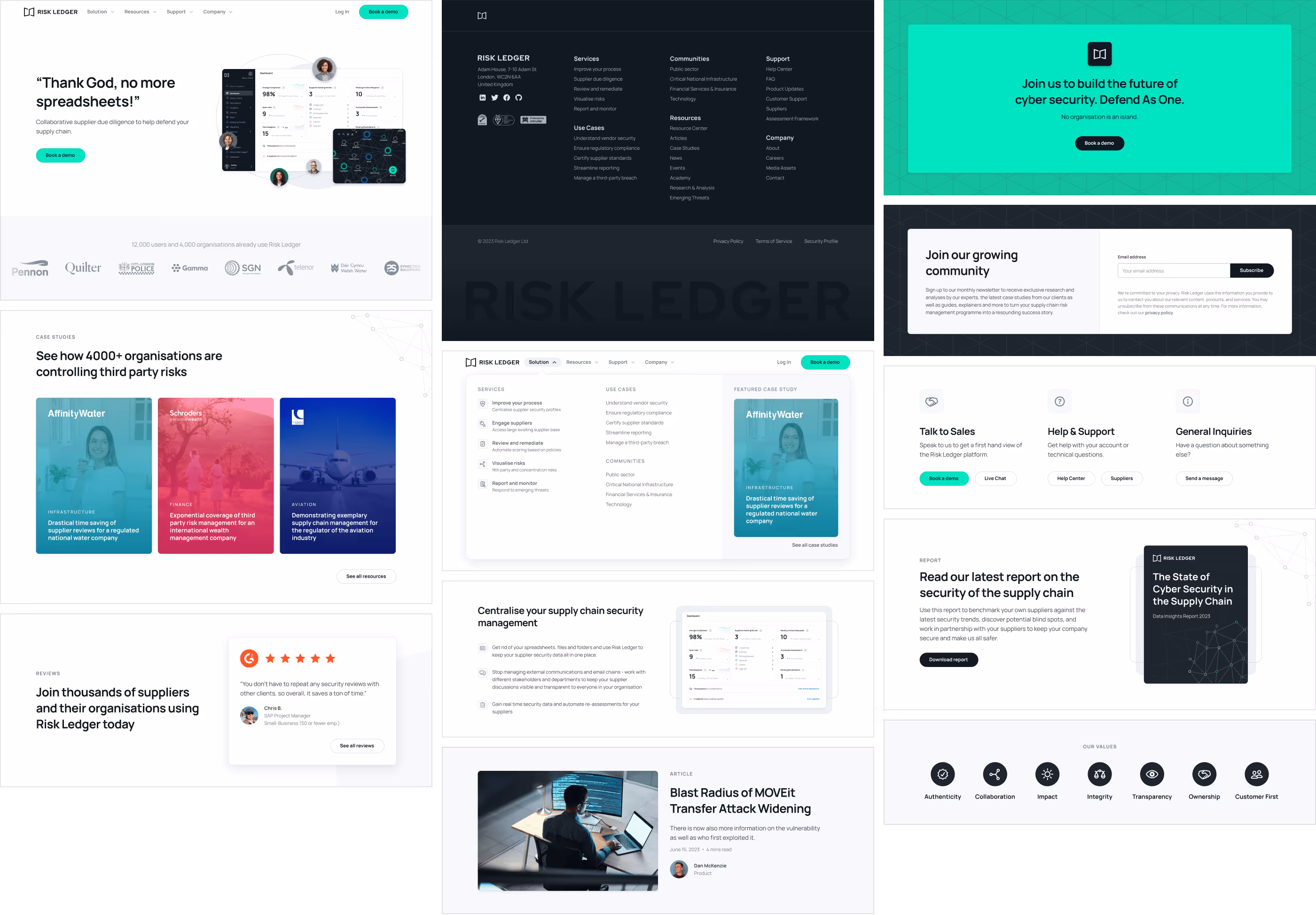
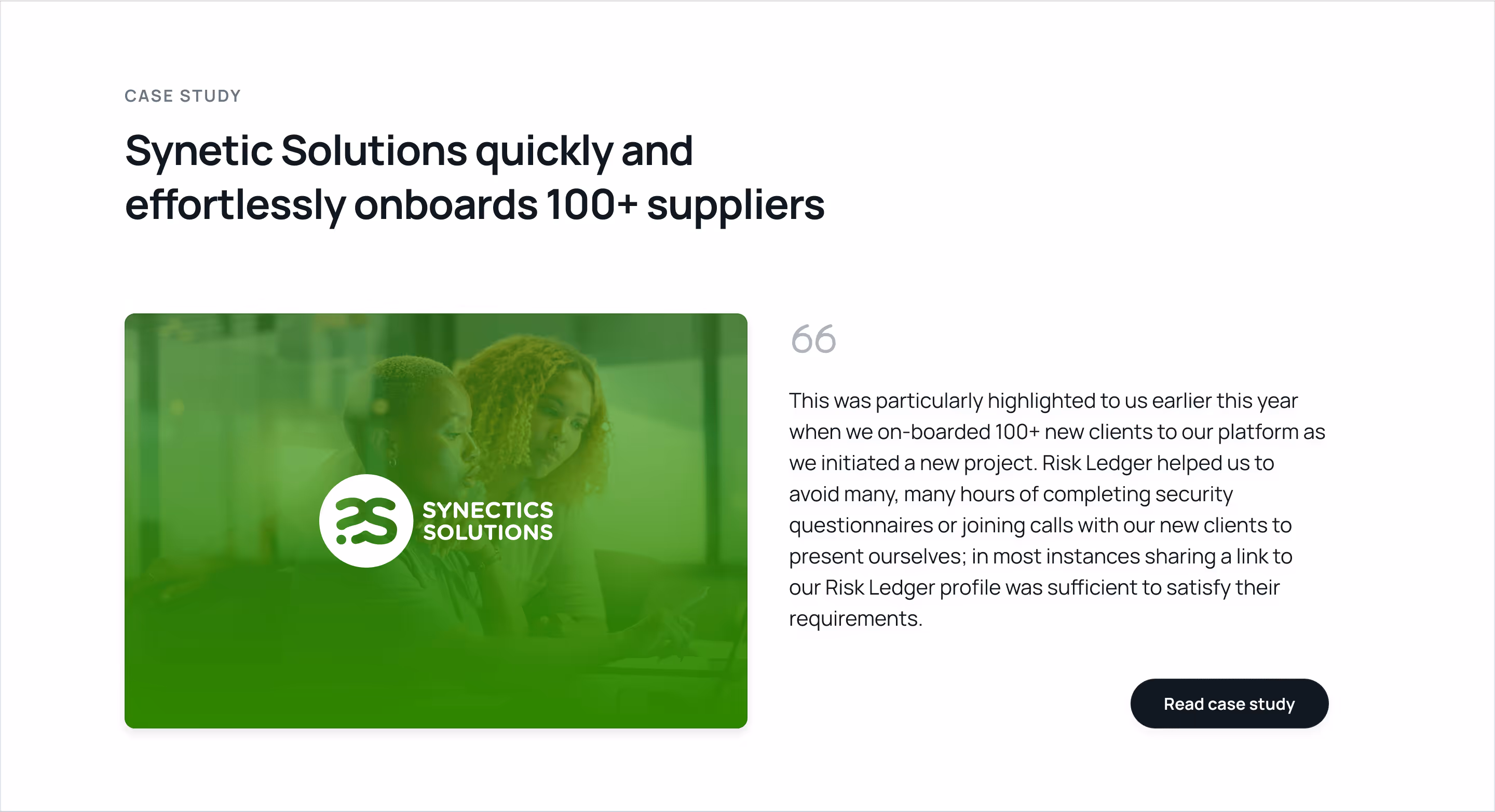
Telling stories about the success of other organizations using the product makes the value proposition more attainable and tangible. We feature them in a collection of case studies with an option to explore more. They are organized in a row that turns into a horizontal slider on smaller screens with one card partially visible on the right edge to show the user there is more by scrolling in that direction.
The case studies have headlines like stories, including their logo, imagery, and primary brand color. These become the ultimate seal of trust.
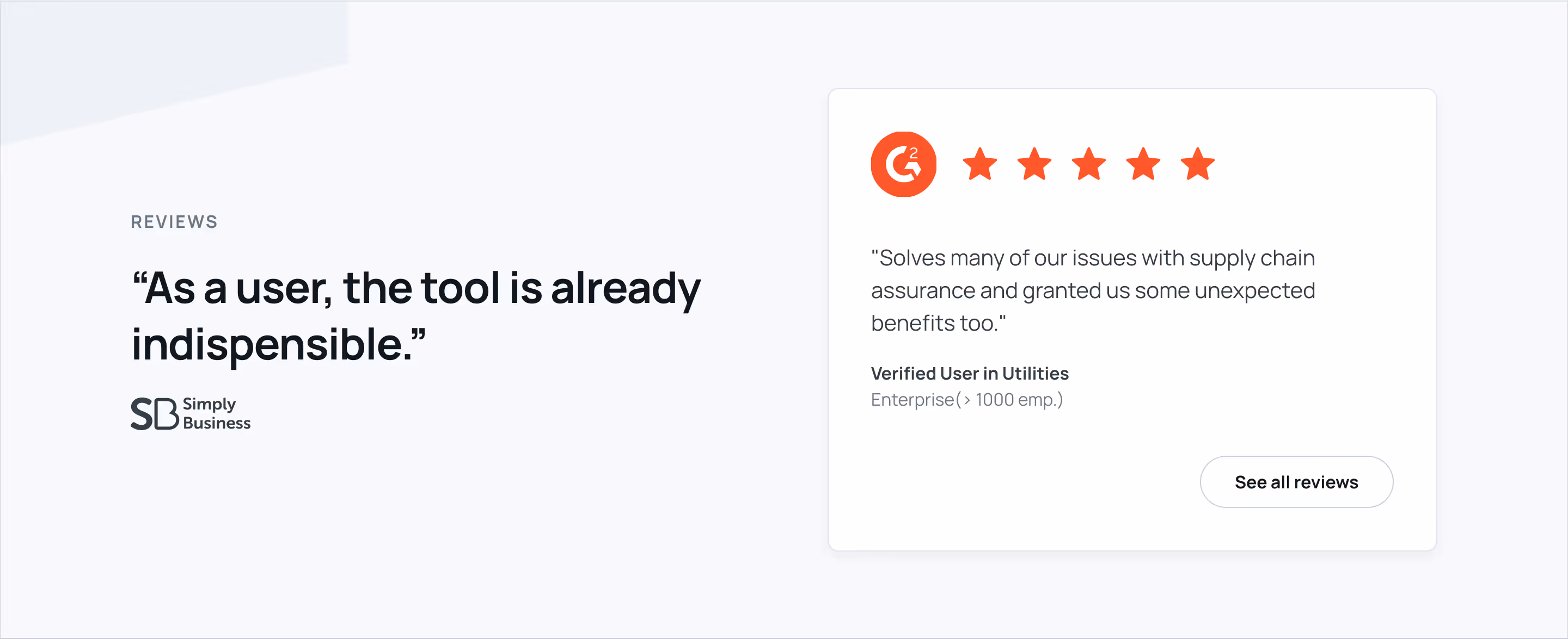
To continue building trust, we cite testimonials as more social proof. The quotes are taken from reviews. To provide more authenticity to the reviews, we link them to the direct source in G2, a specialized third-party review platform.
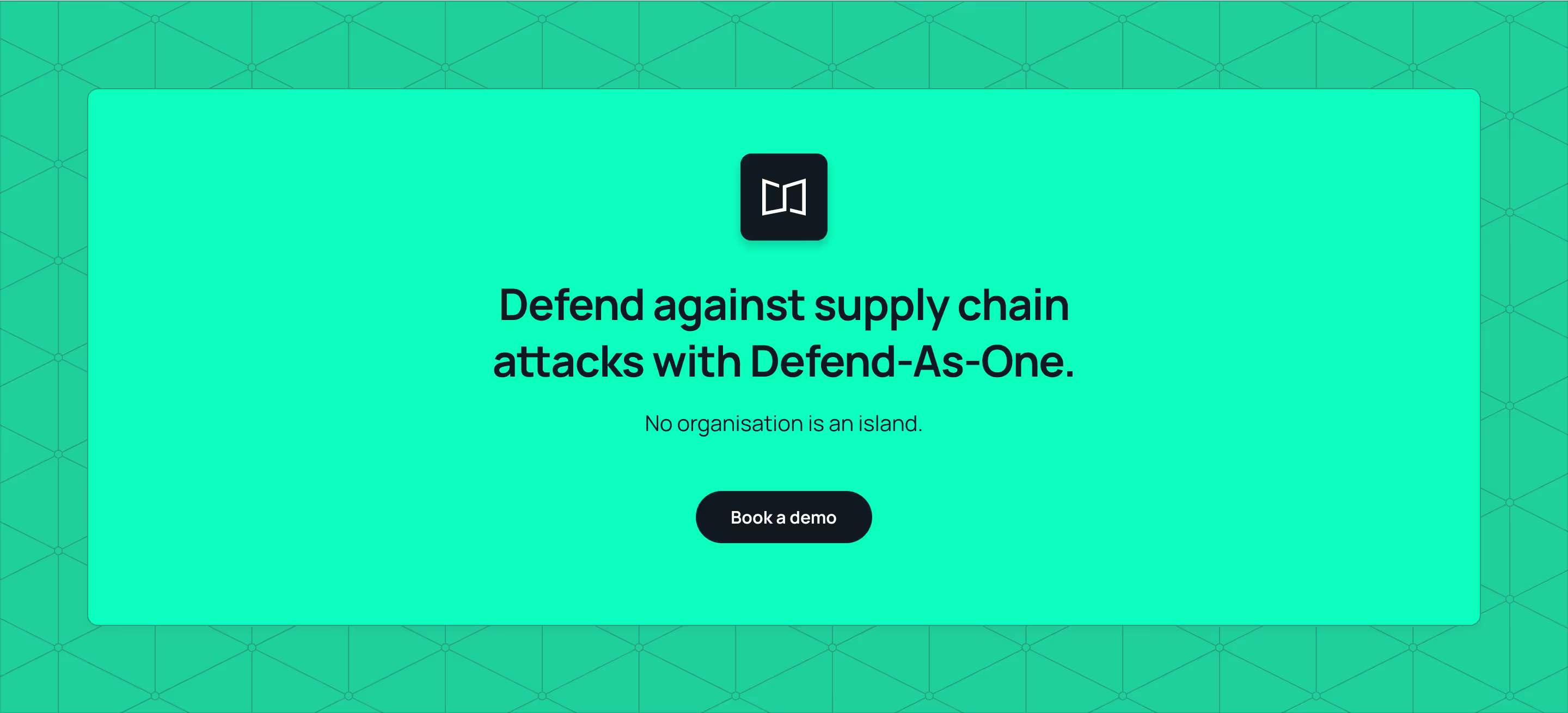
We should keep promoting the primary call to action while wrapping up each page. This is an opportunity to reinforce the value proposition in its simplest form and strengthen the brand visuals in an impactful way that makes it hard to miss out. So far, the interface is based on cool gray tones from the neutrals and primary colors. We use the turquoise accent from the primary call-to-action as the background in opposition to the regular white-and-smoke transitions. The background has the beehive network style pattern on a slightly darker turquoise from the tints and shades palette. To make this outro section stand out, we center the content on an enclosed pure turquoise box with the button now in black. Everything should drive the attention to our call-to-action button. This whole section is like a colossal call-to-action button.

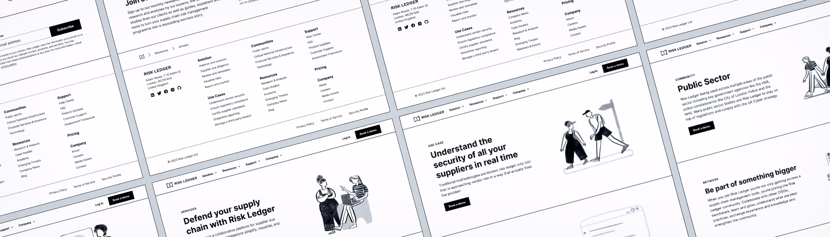
Finally, the end of a page has the usual closing footer. As a utility component, the mandatory elements include legal info and links and usually mirror the top menu navigation. We take it further with more trust seals. In addition to the global navigation, contact info, and social media links, we add a breadcrumbs bar, callouts for secondary call-to-actions, and an ending watermark of the logotype.
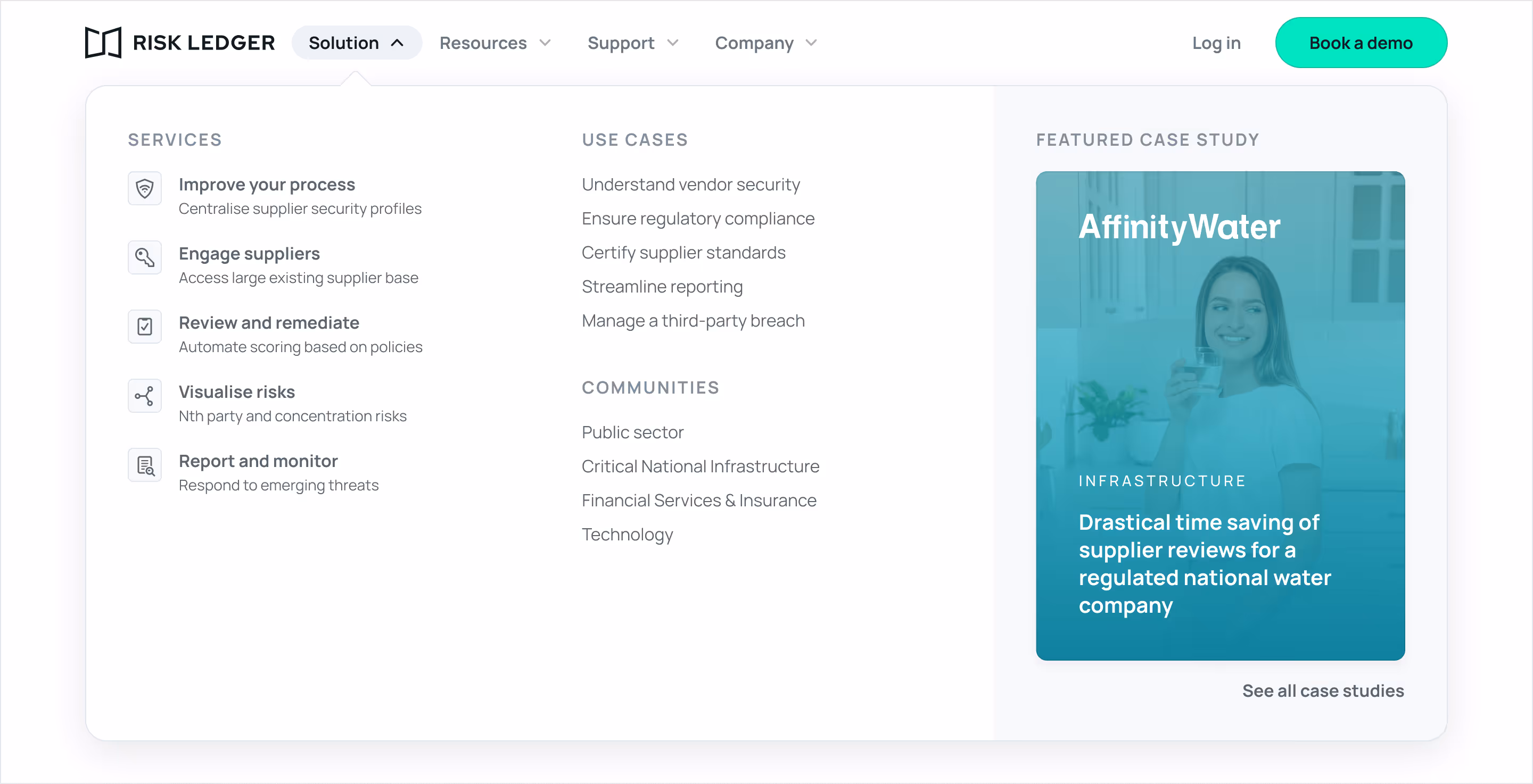
The top menu features global navigation with multiple depth levels. We use a mega menu to accommodate the different nodes in a digestible way. The hierarchy of the dropdown, eyebrow headlines, and link badges also introduce a link anatomy that becomes familiar across the navigation nodes.

Like the primary hero section, the others across the website share a similar structure. The eyebrow headline mirrors the navigation node, semantically matching the single primary headline (H1) on a page. Visually, it provides a nice framing and balance to the following extended headline, which is more editorial and reiterates the value proposition. Then, a short paragraph serves as a brief summary of a more detailed headline version. And, of course, the call to action couldn't be left behind.
In some cases, the eyebrow headline is the parent page for deeper pages to maintain the integrity of the hero section and its self-position within the navigation hierarchy. We create differentiation through typography styling while keeping the primary headline (H1) present.
Visually, the UI mockup is featured along with photography. It's made of a critical UI element on top of the photography that is getting more real-state.
Like the home page, additional sections are implemented for other pages. The subscribe to newsletter form section is a typical section on all resource-related pages, which will be featured in that newsletter for subscribers. Other forms, other icon badge grids, and so on.
Let's review some noteworthy components and sections by going through the pages in the same order as the navigation.

The Services page starts with a standard hero section and is the only page with an icon badges list; no additional UI mockups will appear after the hero section.
For the use cases, we created a section that's the ultimate trust seal combo. It features a case study with a quote, followed by the trust logo marquee banner and some highlights of the benefits.
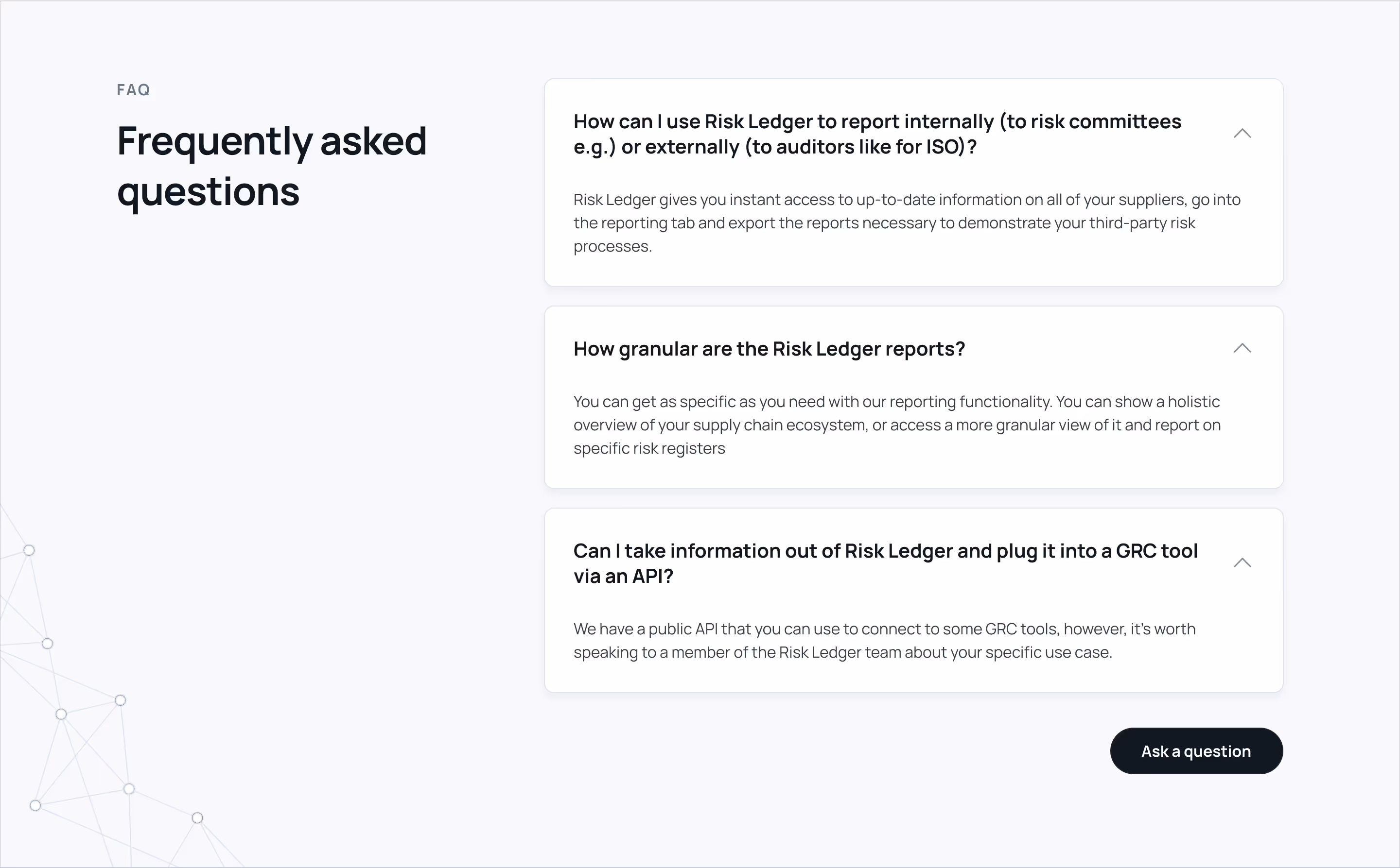
Each page covers the content in a structured way with a strong narrative. However, sometimes, it's faster to get straight answers to common questions on these topics. A section shows the top relevant questions with their answers in an accordion.
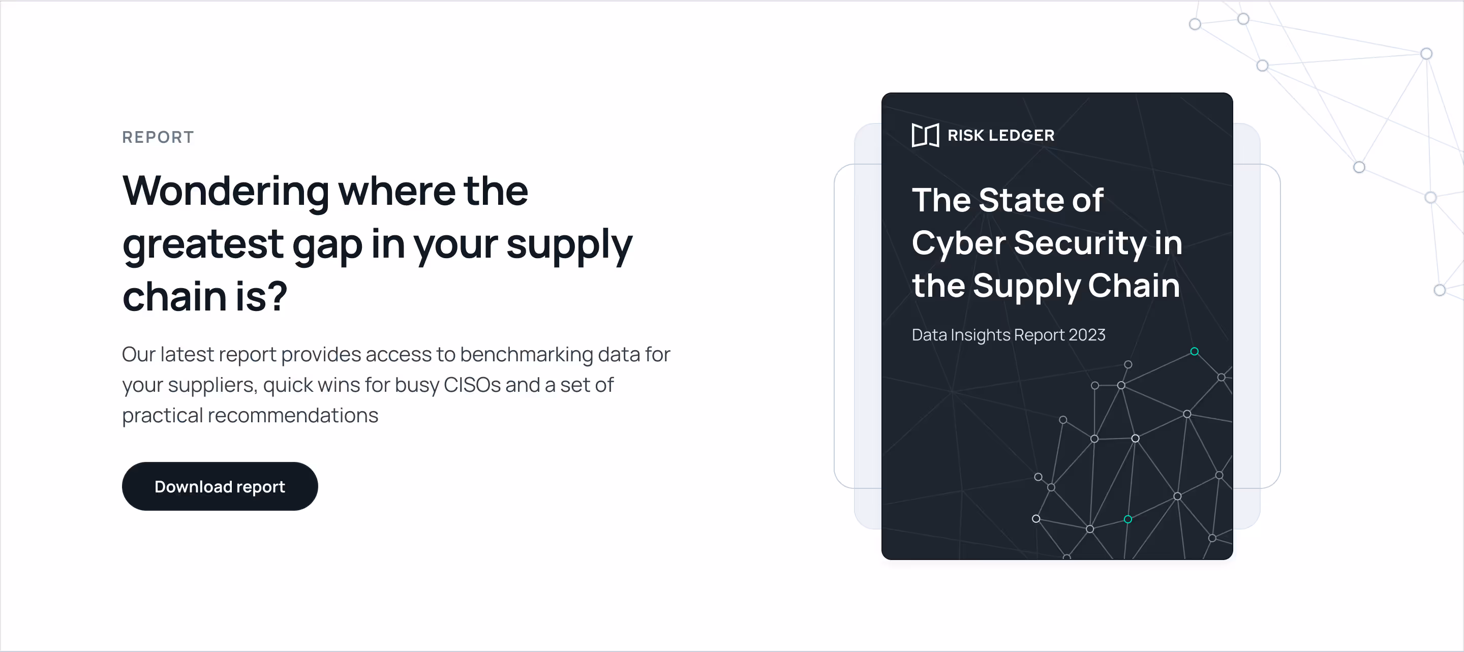
Another helpful callout is the report spotlight, which features the latest report with a quick preview of its cover and a link to download a copy. The link leads to a post with a form for the gated report, and the download will be unlocked after providing basic contact details.
So many outstanding organizations use the product across different industries, known as communities within the network. We needed an alternative section to the marque banner showcasing those related to a specific community. This section will appear on each community page and provide more relevant trust logos.
Likewise, another alternative section was a simpler version of the featured case study. This one had a quote taken from the case study. This one will be helpful for the community pages where the marquee banner won't be used, like on the combo section from the use case pages.
Unlike dense content pages, the resource center is the most dynamic, with content rotating more frequently. It introduces a new bar with more navigation items. The sub-nav lists the type of resources, key topics, and call-to-action. This last one is also specific to this family of pages. Subscribing to the newsletter is the promoted action; however, it doesn't get the turquoise accent because it is reserved for our primary action. This hero doesn't feature a UI mockup because it is not applicable.
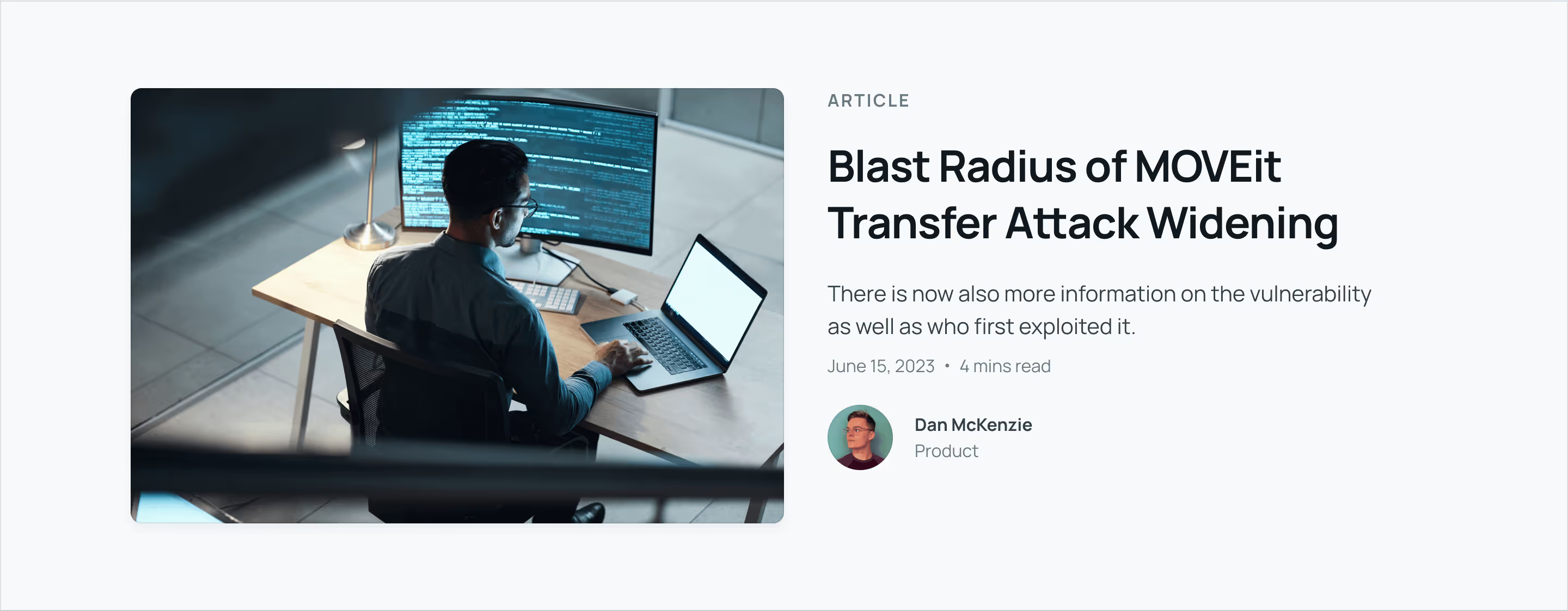
Within the resources center home and the articles page, a section spotlights one article below the hero section. This callout is full-width and splits the cover with the details of the article, including category, title, summary, author, date, and reading time.
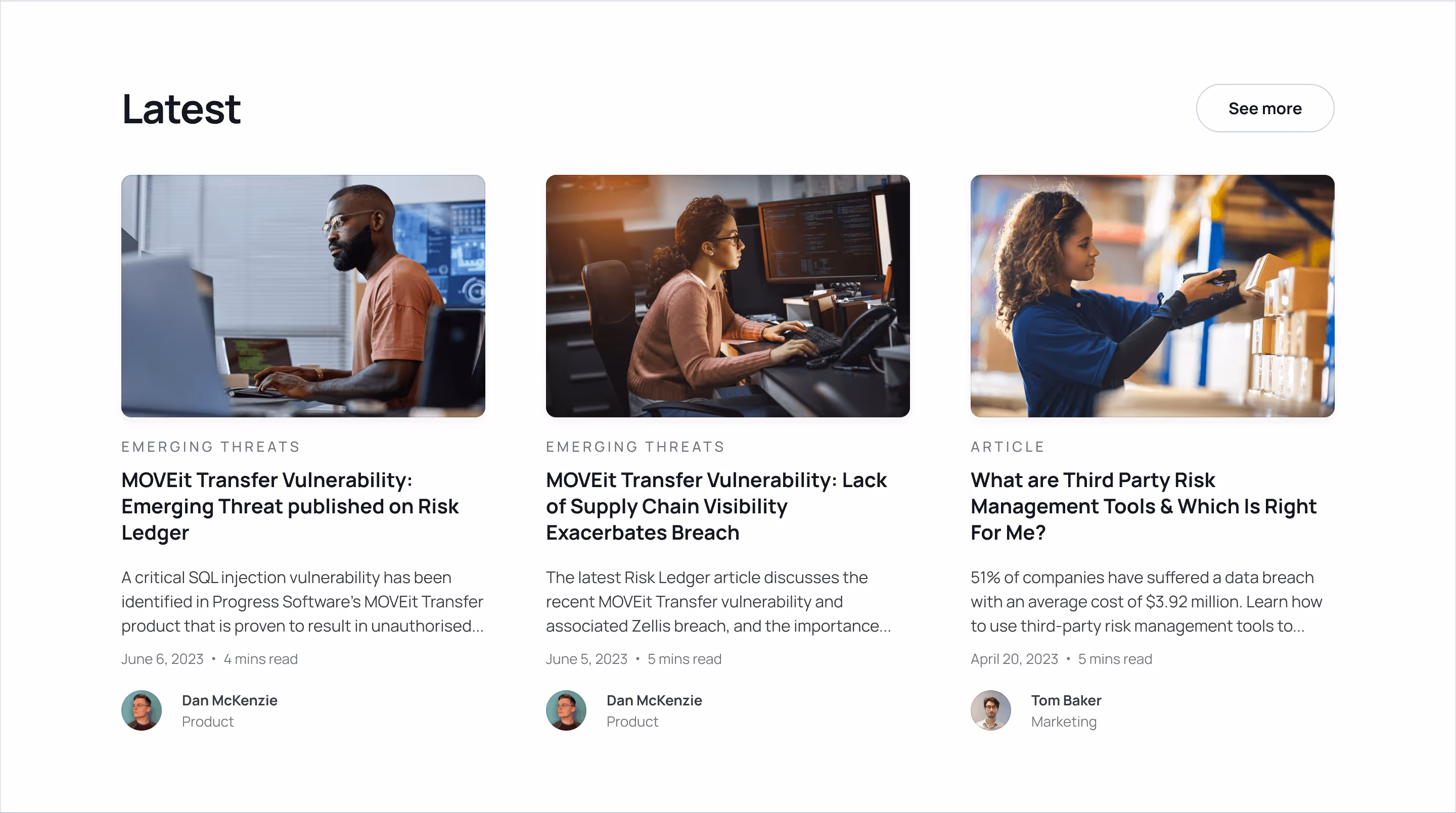
The resources center features the articles in a section with the option to explore the blog. The resources center also features case studies and other categories or topics.

New content is constantly added to the resources. Subscribing to the newsletter is the secondary call to action for these pages. The promoted section with the form to subscribe appears before going into the primary outro.
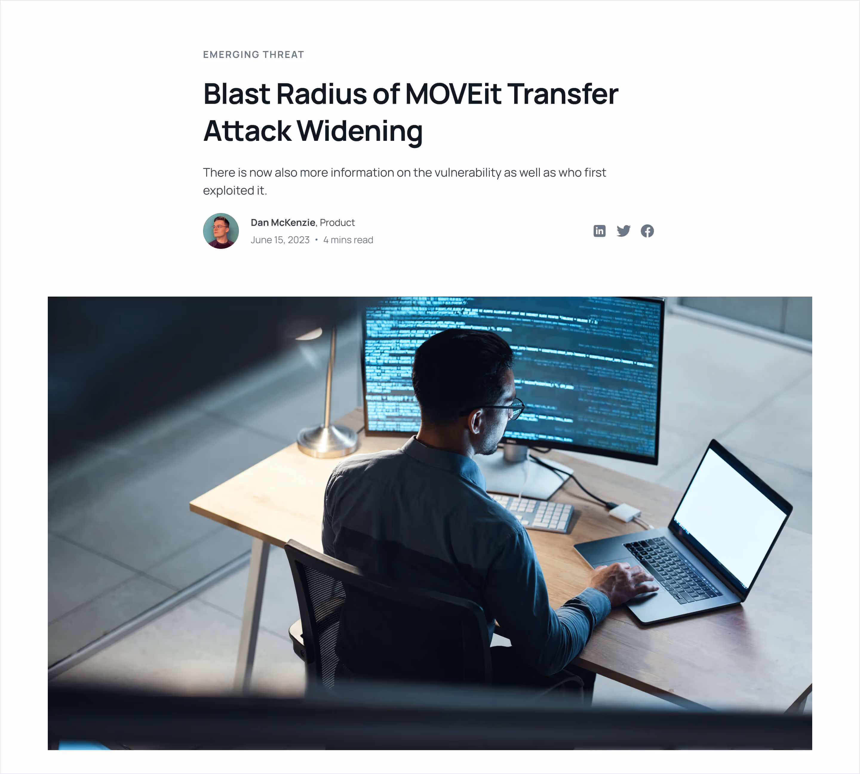
Going into an article page, the hero becomes more seamless with the content, with only the cover being a natural transition between the heading and the body. The cover is full-width and spacious. Social media links become available for sharing, and the author is linked to its page containing all their specific contributions.

Similarly to the resources center and blog pages, the hero section for case studies highlights a story. The cover is not the only element on the card; the logo and longer headline are also included. The hero gets an enclosed box treatment showcasing the client's brand color. The photography gets more subtle and fades into the box background to ensure proper contrast. Two new data elements become visible: the industry or community and the territory or location.
Like on articles, there are options to share on social media and more content to keep reading.
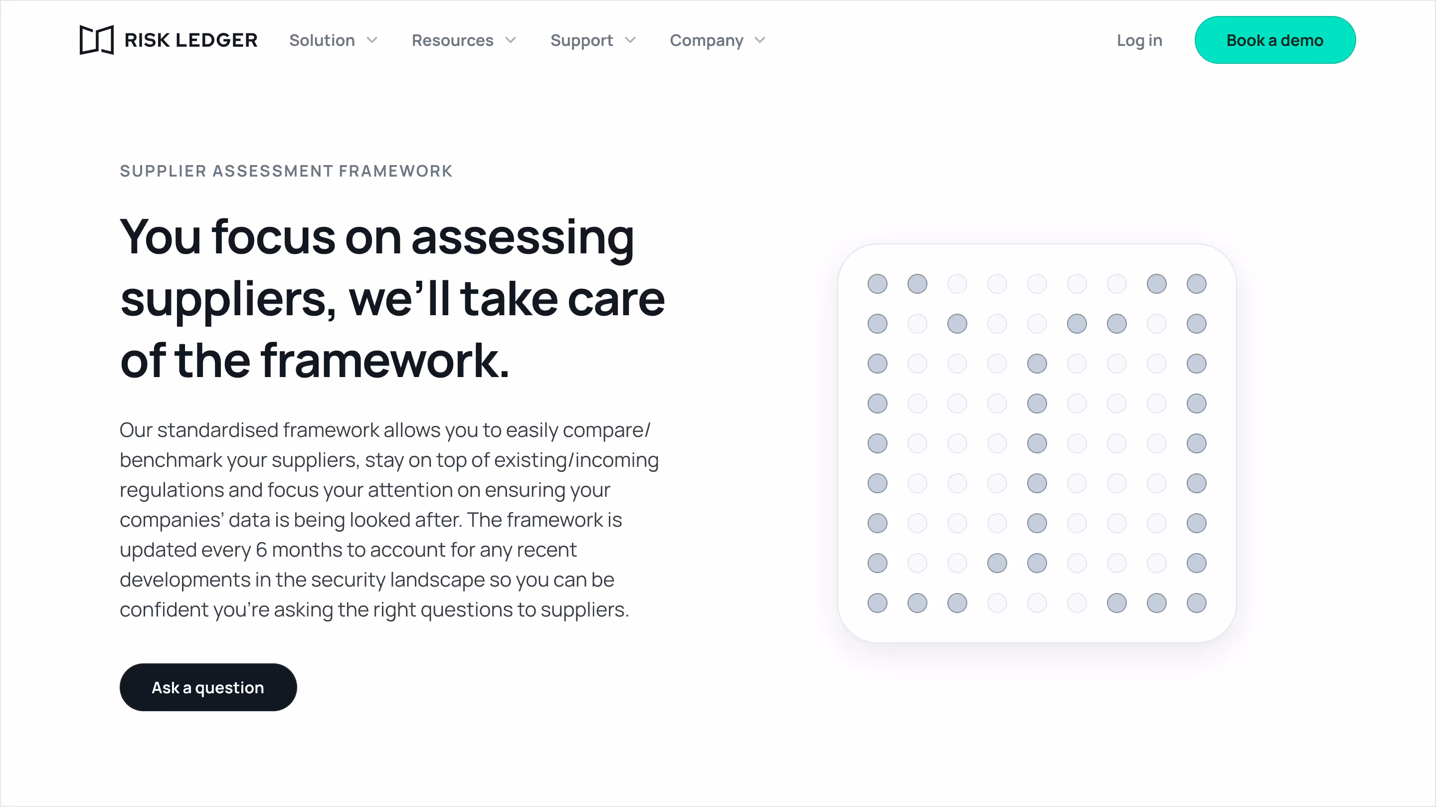
A new page tailored specifically for the product and value offering covers the framework in which the platform works and assesses risks. It documents the different components that provide a complete snapshot of an organization's cybersecurity state of the supply chain.

The About page portrays a hero with a more tridimensional version of the mark on a globe surrounded by a mesh of nodes making a network. The sections outline the story, investors, recognitions, and values. The investors and recognitions section uses third-party logos to create more social proof.

In addition to the website's primary target audience, the company page's visitors could be interested in learning more about the culture and joining the team. For them, a more appropriate outro drives traffic to the careers page. The outro structure is similar; however, the colors contrast less than the primary version. The background is black, and the box is white, which makes the content blend smoothly with the footer.

On the careers page, the hero features floating photos of the team in relaxed situations, portraying authenticity and camaraderie. Unlike the standard composition of other hero sections, this one is centered and longer. The floating photos are well-balanced, keeping the middle the center of gravity. The promoted action here is to view open positions.
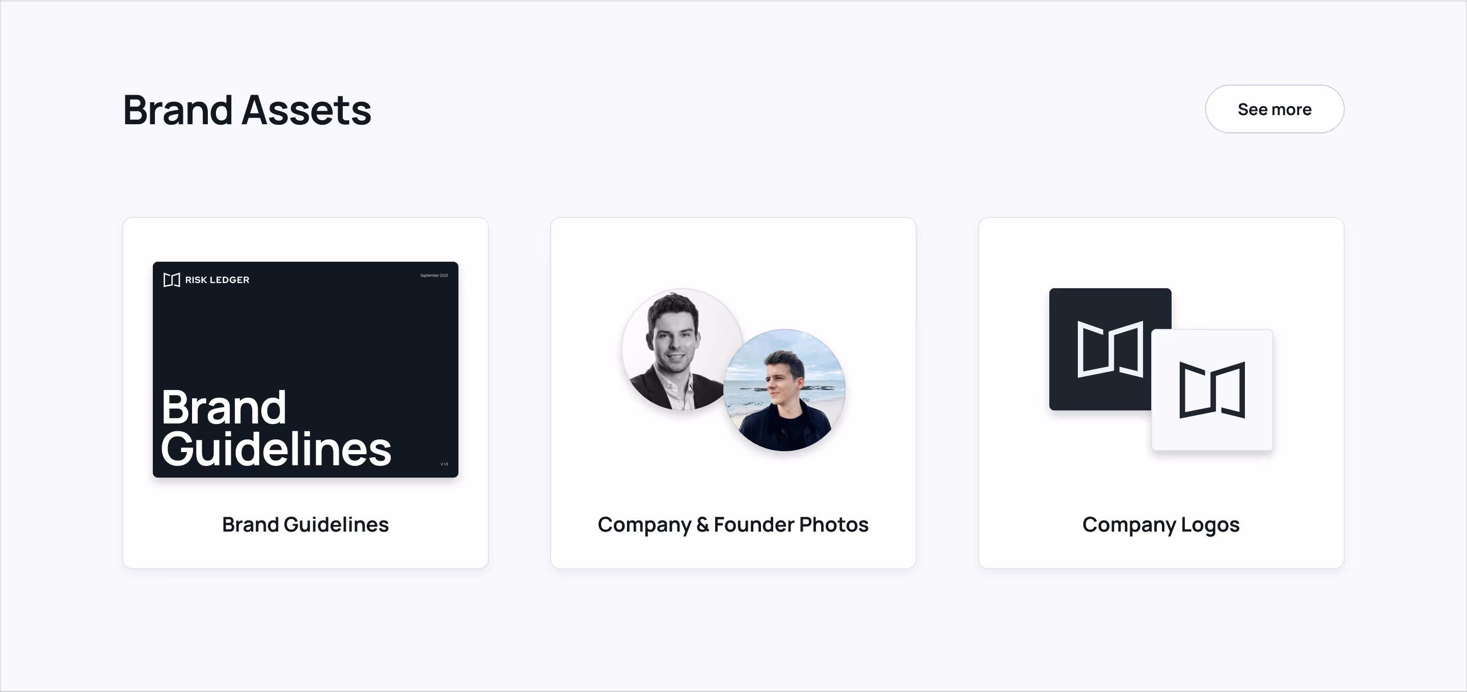
The press or media center page is under the company but includes other resources, such as press releases or news. The call to action on this page is to submit a media inquiry.
The media assets, including brand guidelines, company photos, and identity logos, are downloadable in a section.

On the Contact page, we have multiple options for different types of engagement. The preferred option is a more automated path, while the others are more manual and organic. The automation concerns booking a call, which stays exclusively in our turquoise accent color. At the same time, the manual options are associated with sending a message via different channels or getting contact information.

Ultimately, we arrived at the promoted destination, the Book a Demo page. This is where the call to action is driving traffic. After filling out this form, the scheduling function will become available.

The high-fidelity mockups for desktop view are ready, and the user journey has been clearly defined. We can leverage the power of nocode to speed up development. We'll use Webflow to build the website, a visual web builder with custom database capabilities under their CMS.
The open graph images or page covers on social media will resemble the hero section on the pages created.

While designing the high-fidelity mockups, we had an idea of how the sections and components would transform. However, Webflow is a visual development tool that makes it faster. The flexible layout on mobile allows minimal adjustments that feel natural.

The navigation on the top menu is collapsed by default under the top-level nodes. Expanding these will reveal the links within only one level deep; no extra expandable panels are present. These panels allow touch-friendly buttons for toggles and links, making the menu scannable.
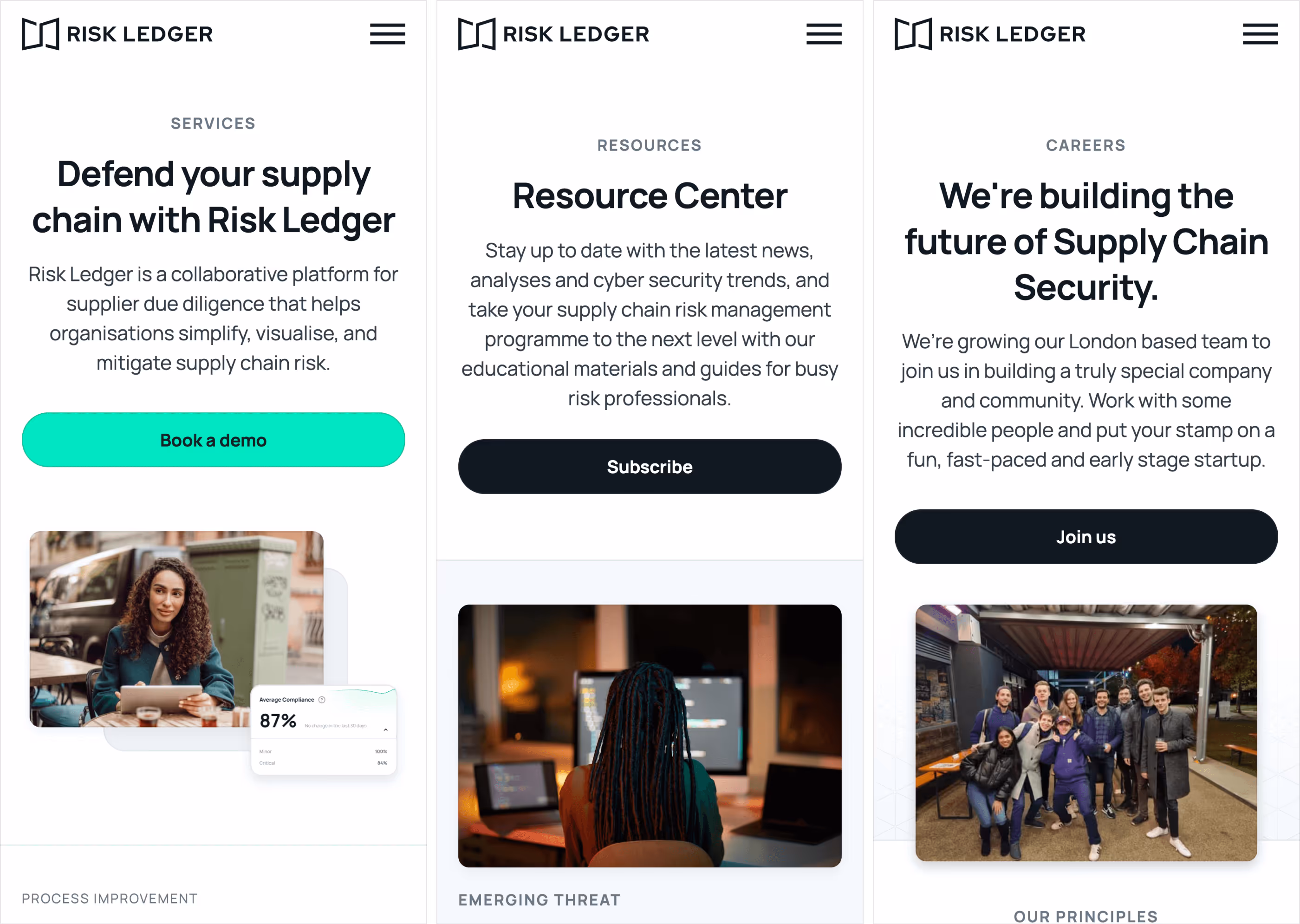
With the less real-state on mobile, the hero sections decrease the imagery decorations significantly. With the side-by-side, standard layout in the hero sections, they just go on top of each other on mobile and are centered for a better balance.
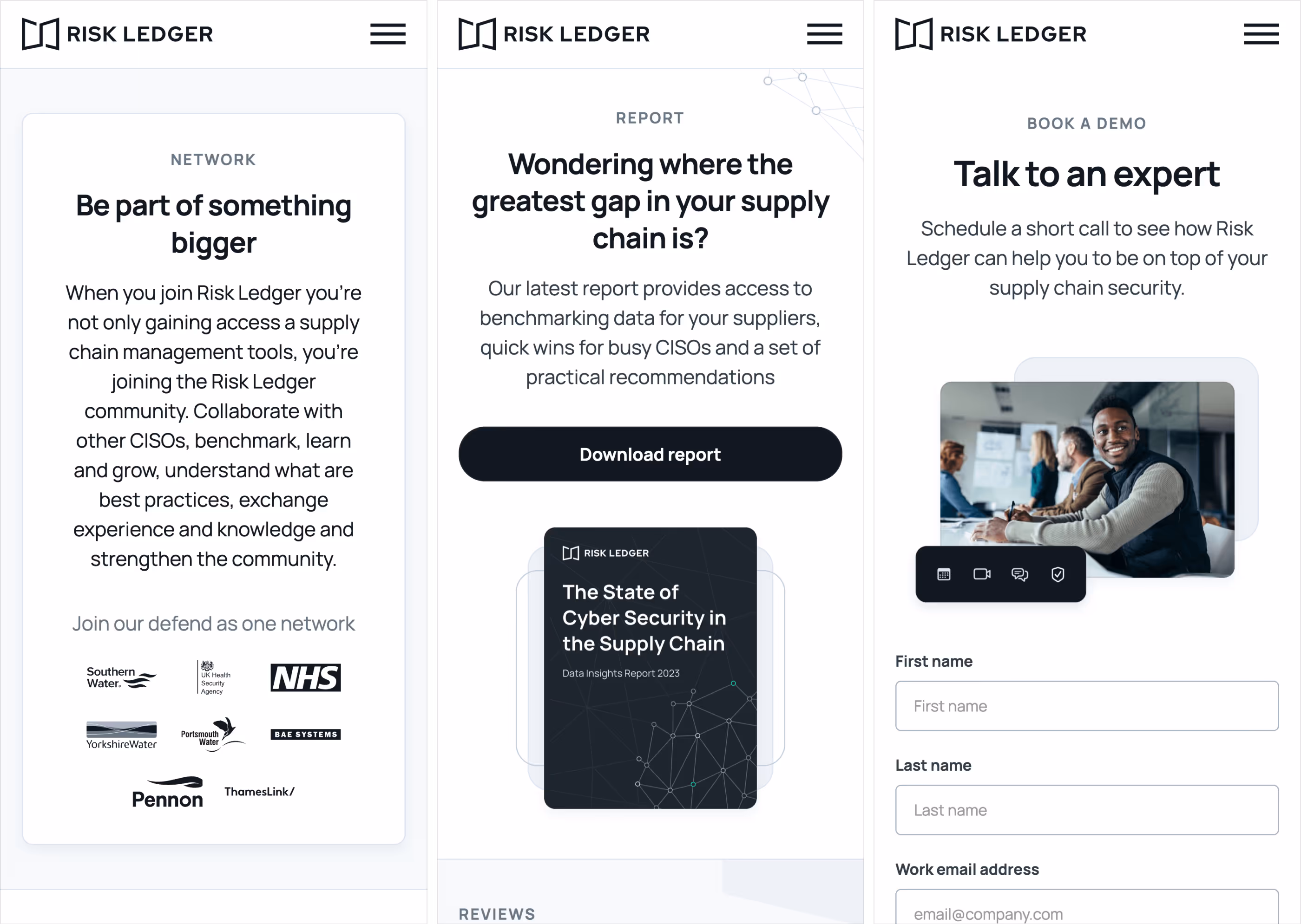
For the more dynamic hero sections featuring rich content, the elements are stacked to allow the text part to grow freely.
In addition to building the website visually with Webflow, we follow the standard best practices for SEO, including performance, speed, semantics, and asset production.

The brand refresh and revamped website are ready just a few weeks after the Series A funding round announcement goes live. In addition to a robust product, the refresh celebrates this sign of investors' trust. With the same care the company treats security, the updates are safely made with multiple soft launches. The brand materials will start updating in upcoming events and talks, and the website will be pushed forward.
Max worked with me to do a brand refresh over a very short period of time and was able to execute a new website with new brand and product positioning in record time enabling the company to communicate to their clients and prospects more clearly than ever before.

One things I really loved about working with Max was that his skillset is so all-encompassing. From the initial brainstorming and brand building all the way to the wireframing and actual website building - he was able to do it all. This made the entire process 10x smoother than I could have possibly imagined.