Superduper

Superduper turns the flood of school and family emails into one clear, personalized place to manage schedules, tasks, and everything families need to remember.
The challenge was to make a product built around administrative complexity feel calm, helpful, and immediately understandable.
Digital Designer
Creative Direction, Brand Design, Product Design, UI/UX Design, Website Design
Family logistics rarely live in one place.
School emails, activities, reminders, forms, appointments, and household responsibilities arrive across different channels and pile up quickly.
Superduper was built around a simple idea: the product should absorb that complexity instead of asking parents to manage another system.
That became the core design principle.
The experience needed to feel less like productivity software and more like relief.
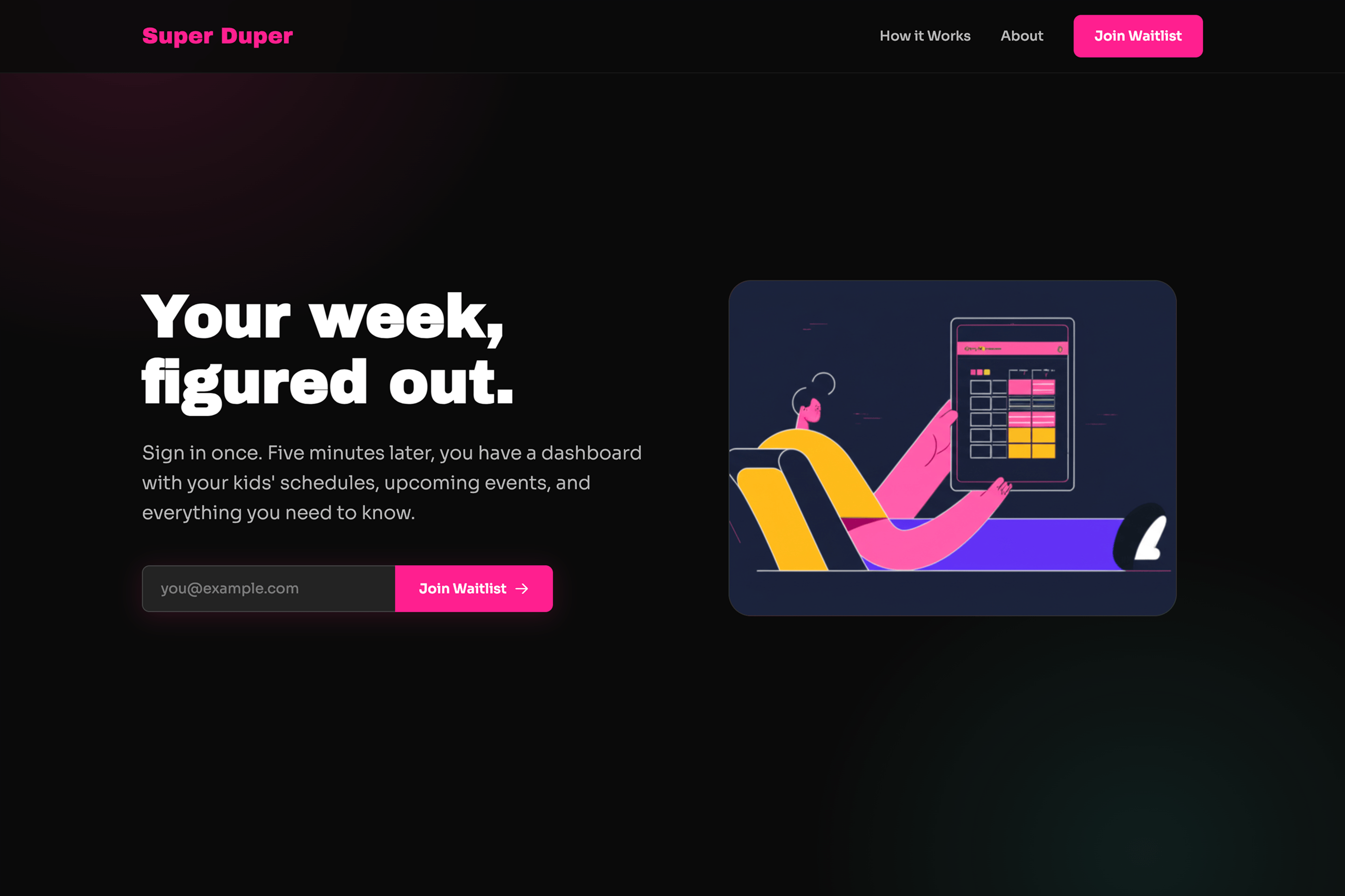
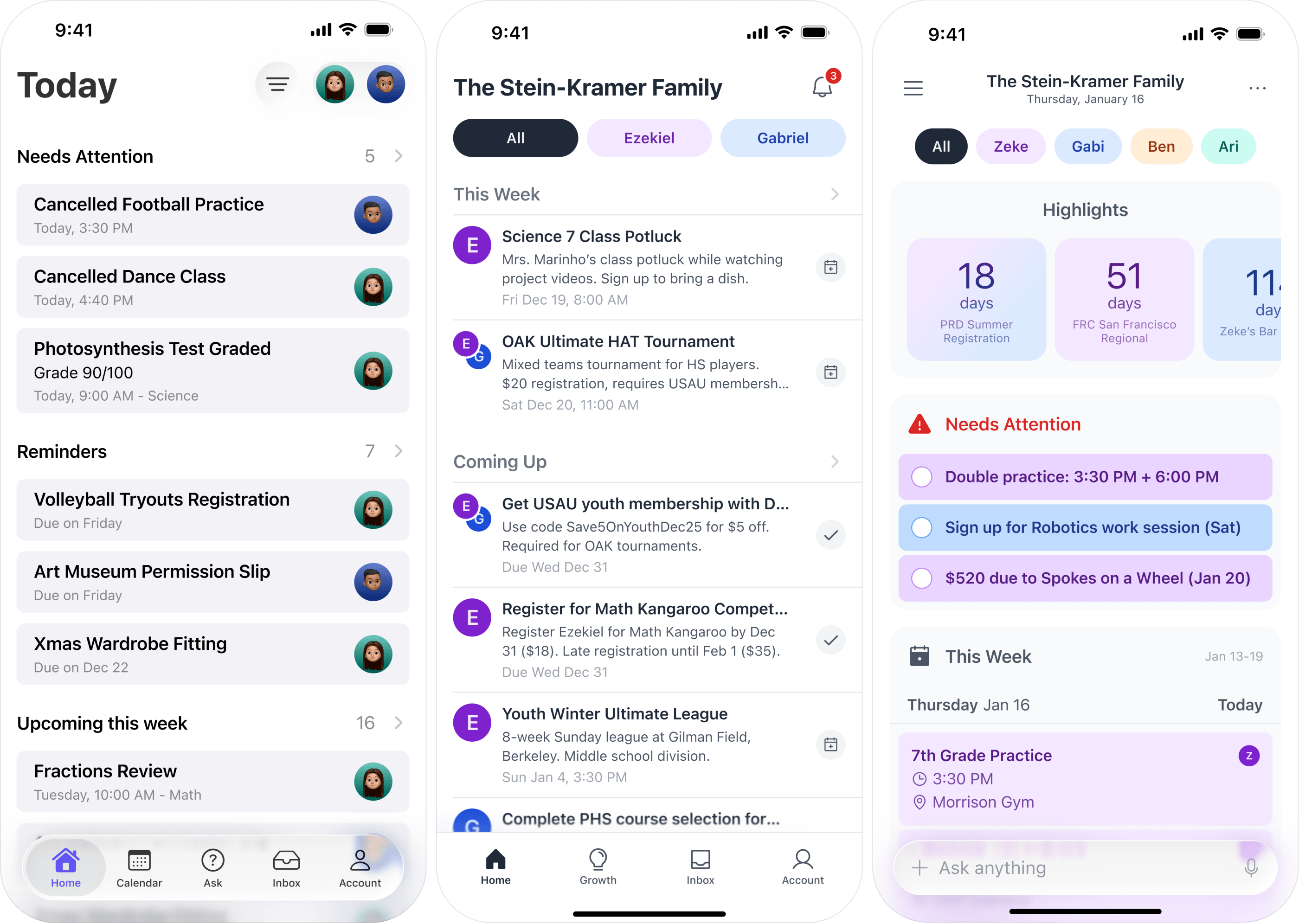
A family-management product could easily drift toward either corporate productivity software or overly playful parenting imagery.
We wanted something in between.
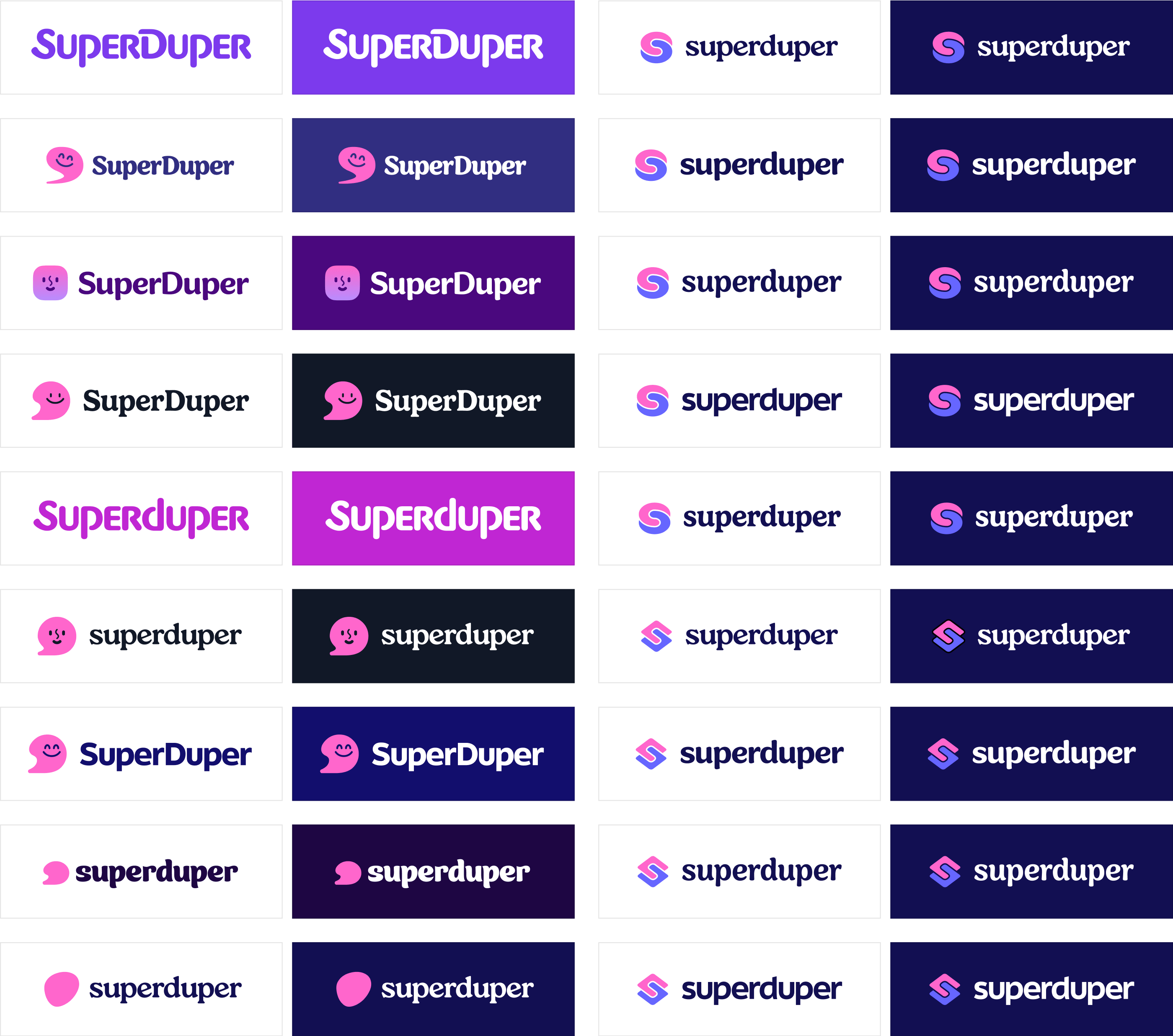
The brand needed enough personality to feel warm and approachable, while staying clear and structured enough to support a product handling real schedules, tasks, and responsibilities.
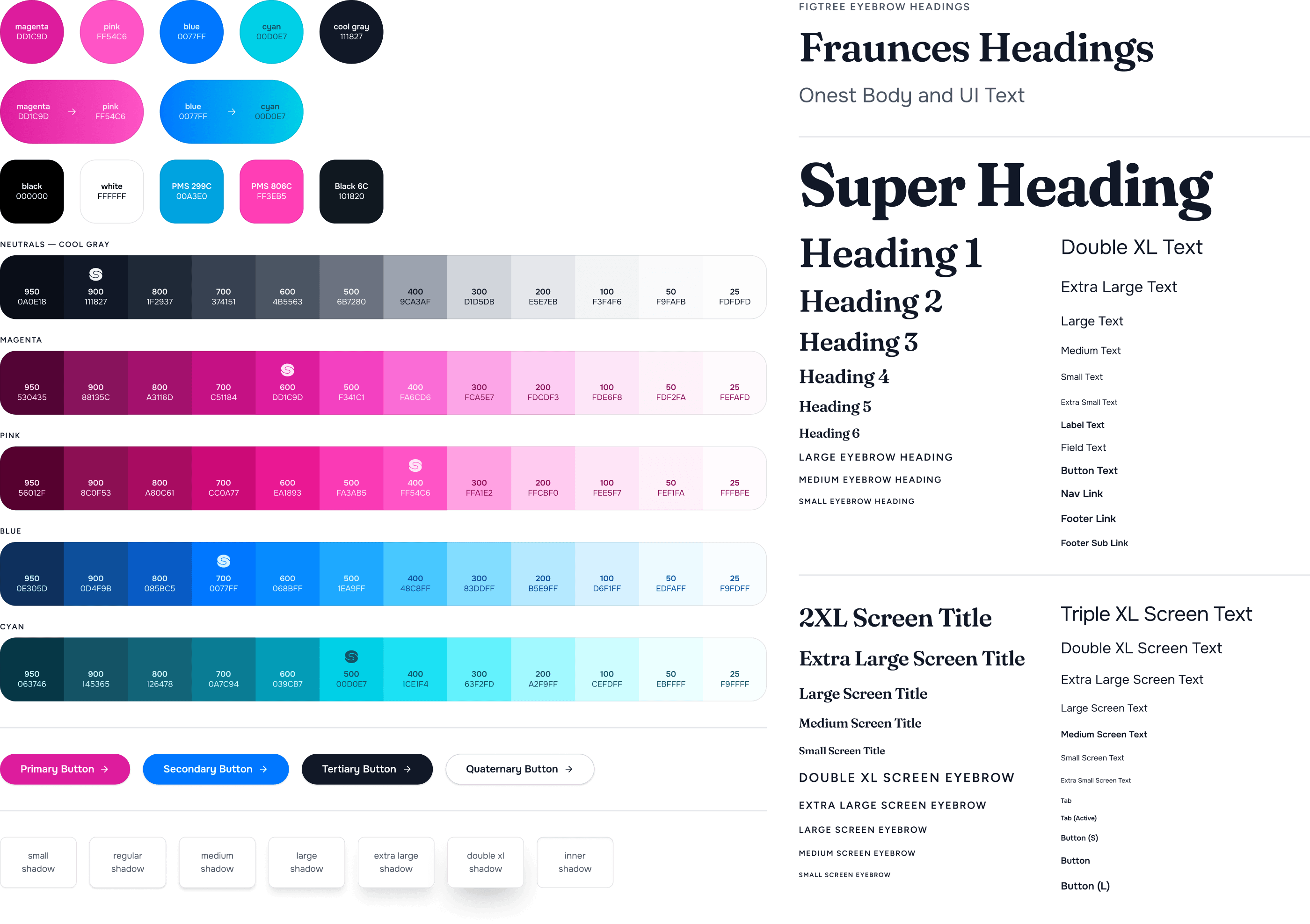
That balance shaped the identity, typography, color, illustration, and overall visual language.
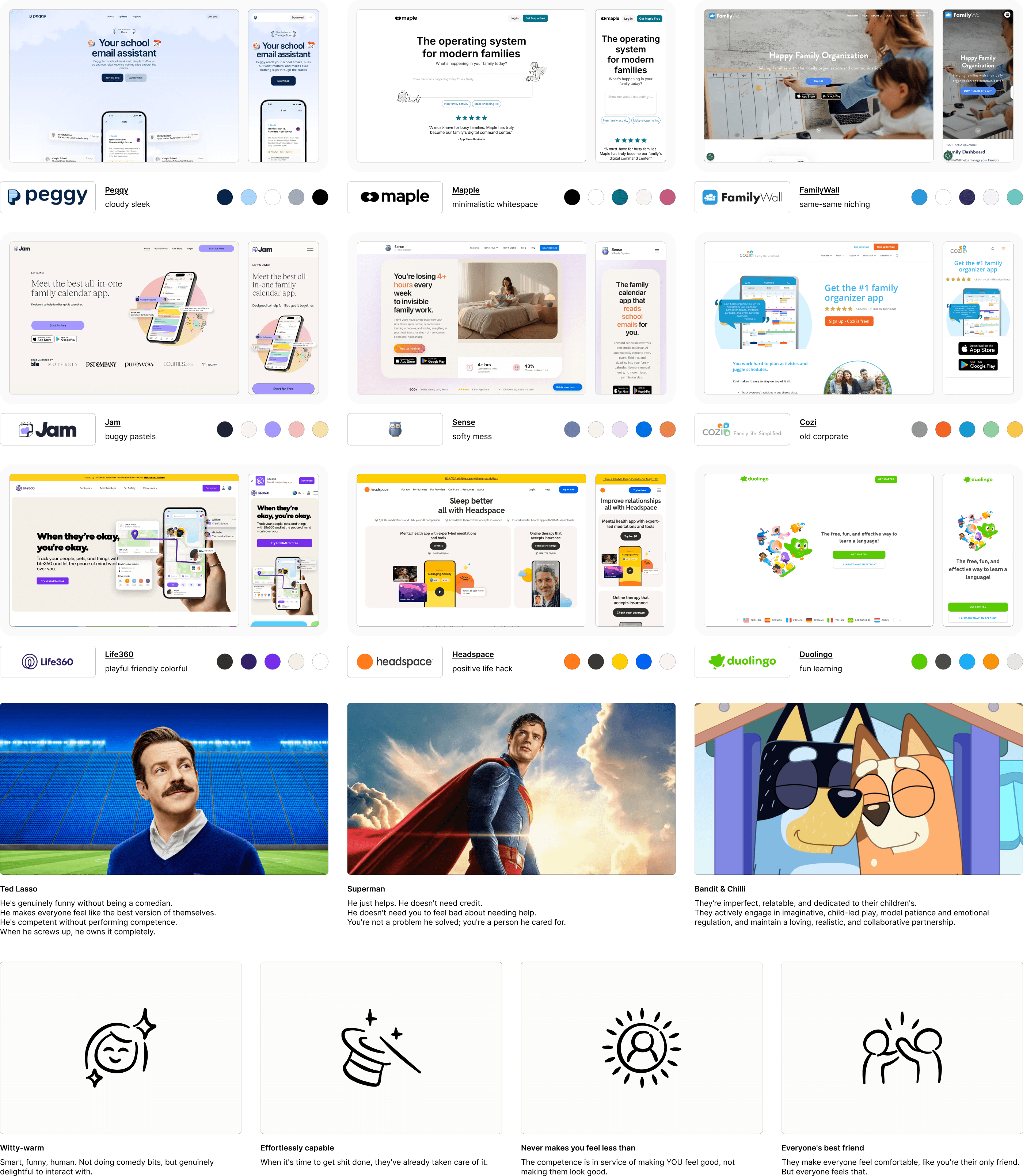



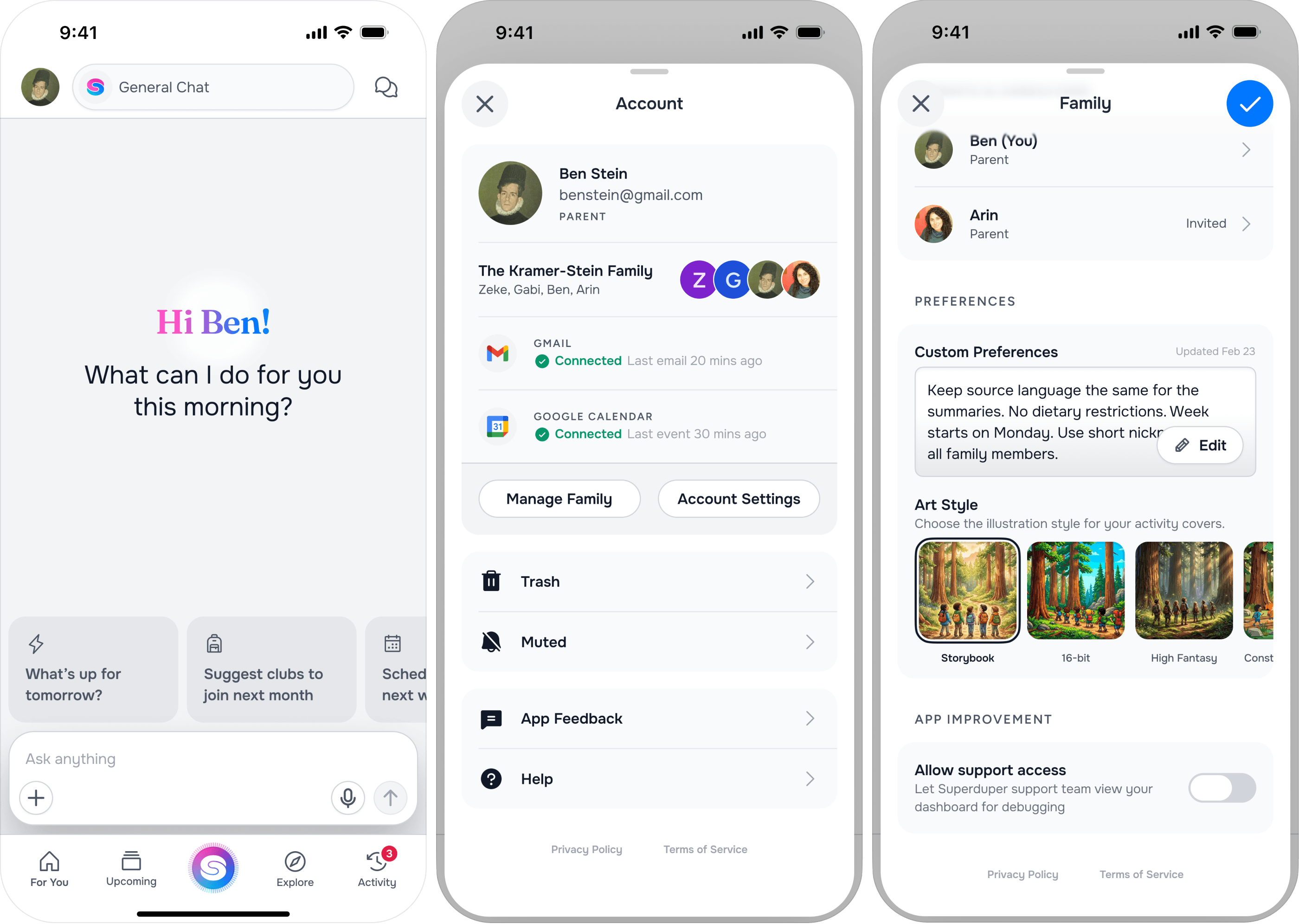
The product starts by doing work in the background.
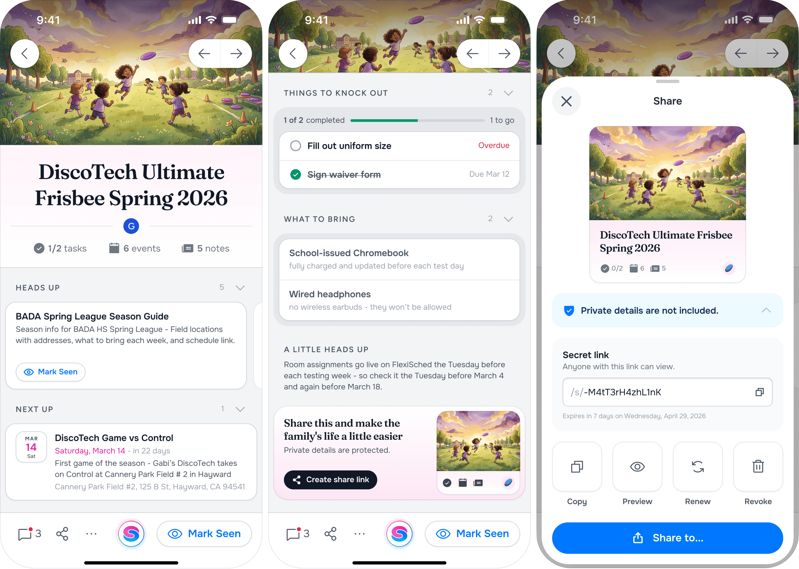
Superduper reads incoming school and family emails, identifies what matters, and turns that information into structured actions and events.
The interface then has a much simpler job:
Show families what needs attention without making them process the source material themselves.
That meant prioritizing hierarchy, summaries, clear actions, and confidence over dense productivity controls.

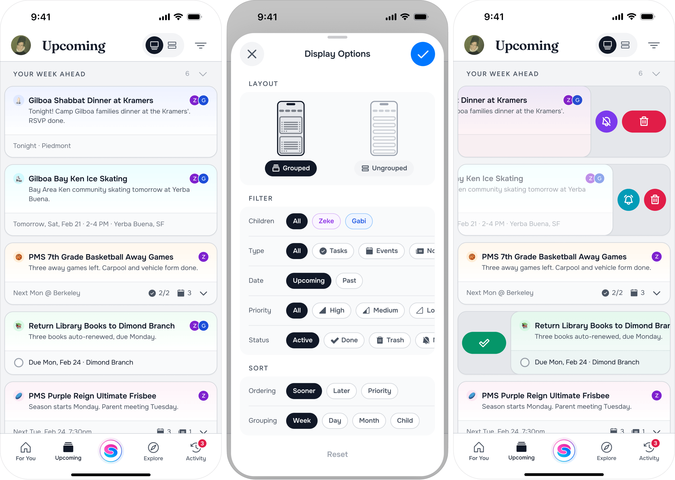
Parents usually open the product because something needs an answer.
What’s happening today? What did I miss? What needs to be signed? Where does someone need to be?
The UX was organized around those questions rather than around the mechanics of email parsing or data management.
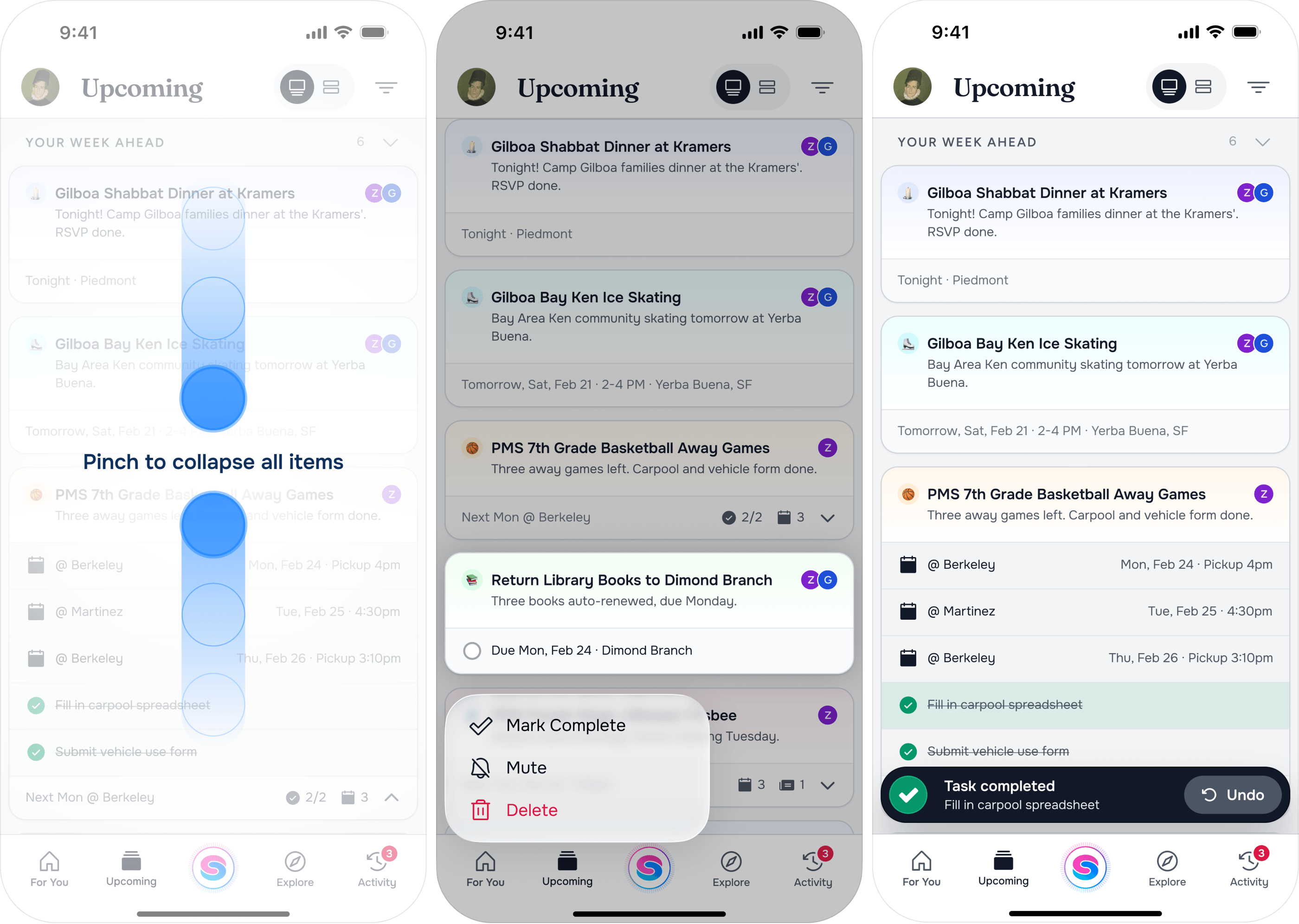
Important information rises to the surface.
Secondary details remain available without competing for attention.
And recurring family logistics become easier to scan and act on over time.
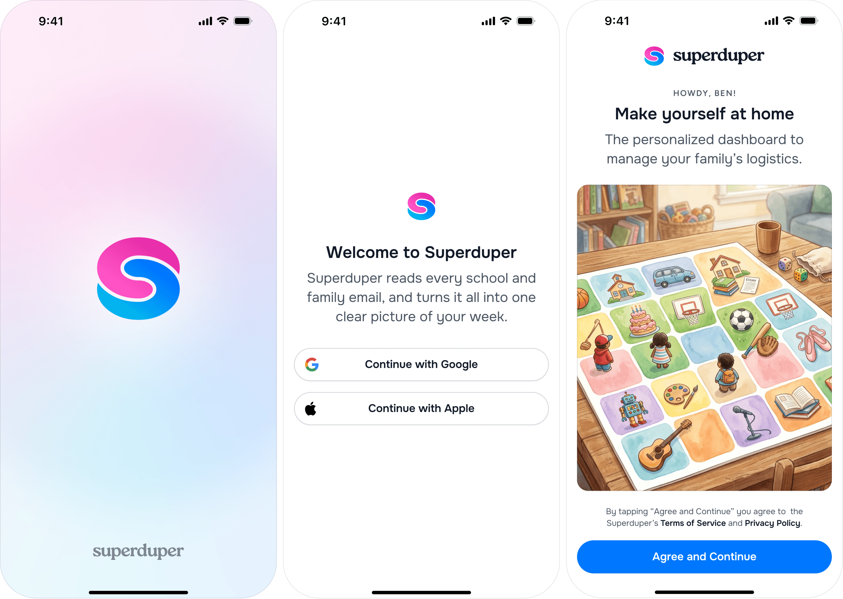
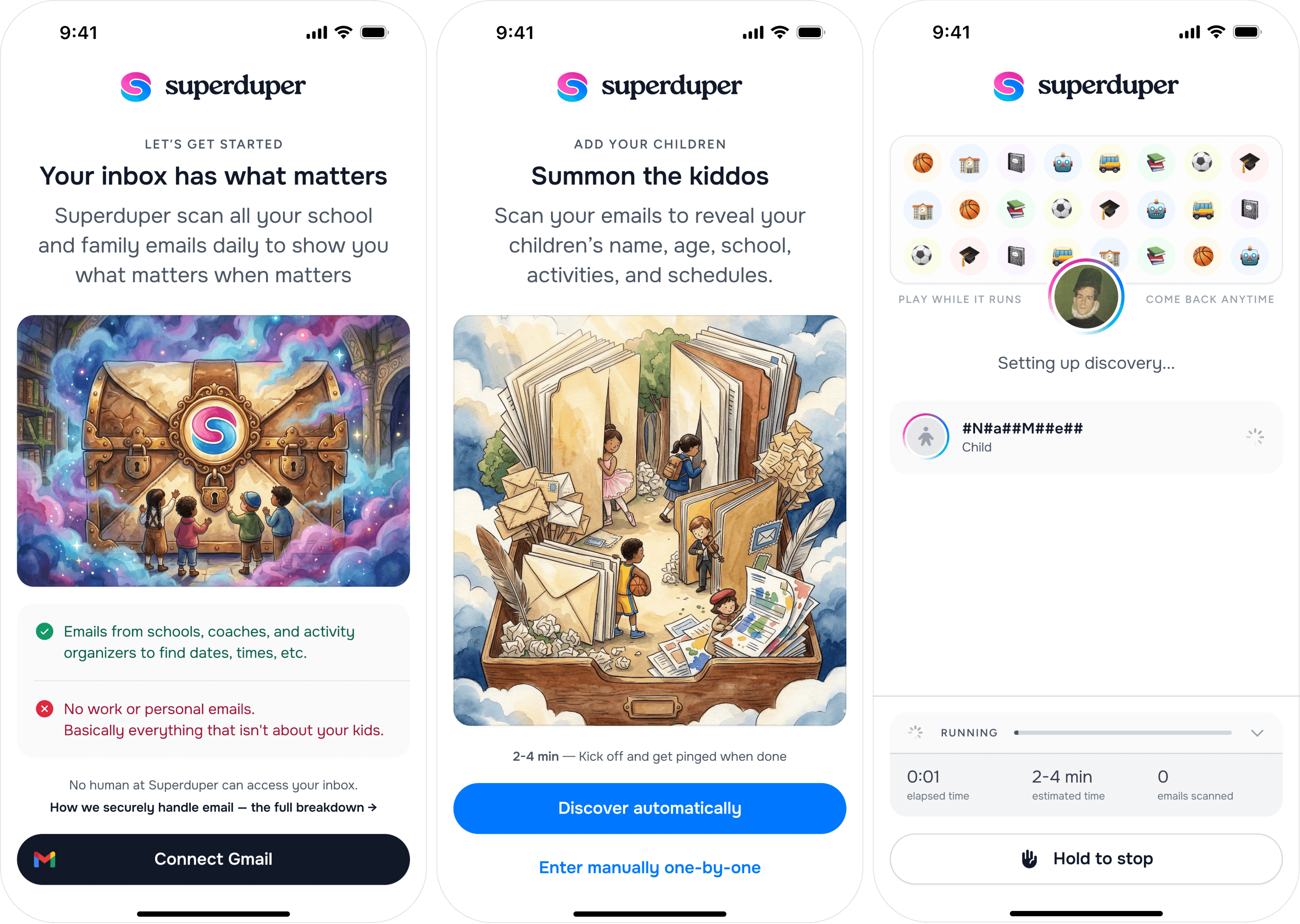
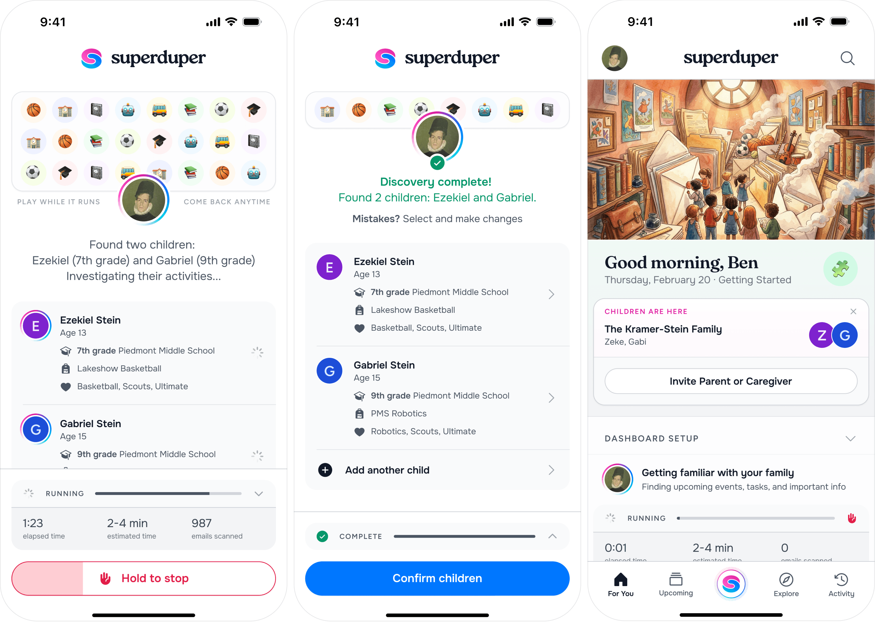
The onboarding experience needed to establish trust quickly.
Connecting an inbox is a meaningful permission, especially when that inbox contains school and family information.
So the experience focuses on what Superduper does with that access, why it is useful, and what the family gets in return.
The goal is to make the first useful moment arrive as quickly as possible.
The marketing site follows the same principle as the product.
Families do not need to understand how every email is parsed or categorized.
They need to understand the outcome:
Less time staying on top of everything. More time actually enjoying family life.
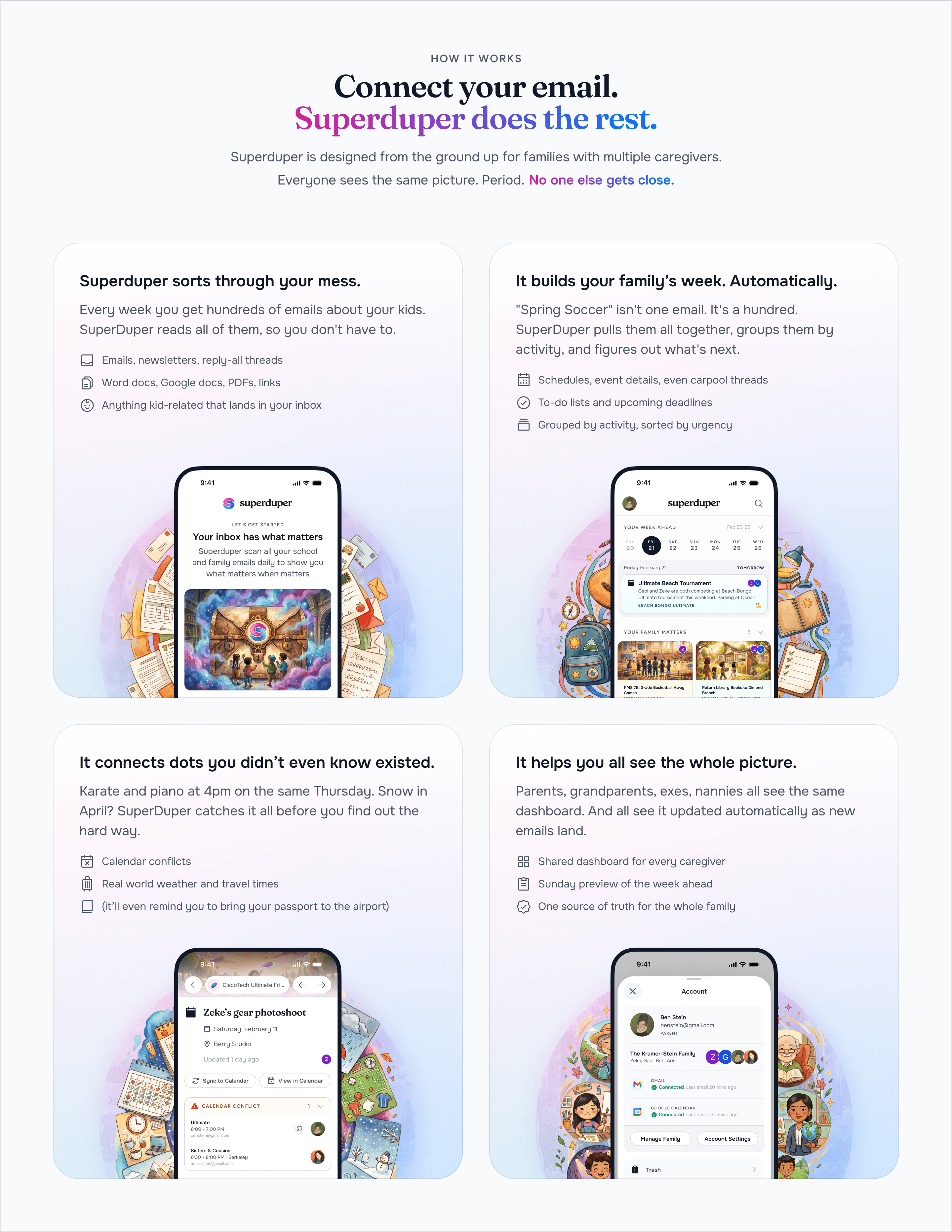
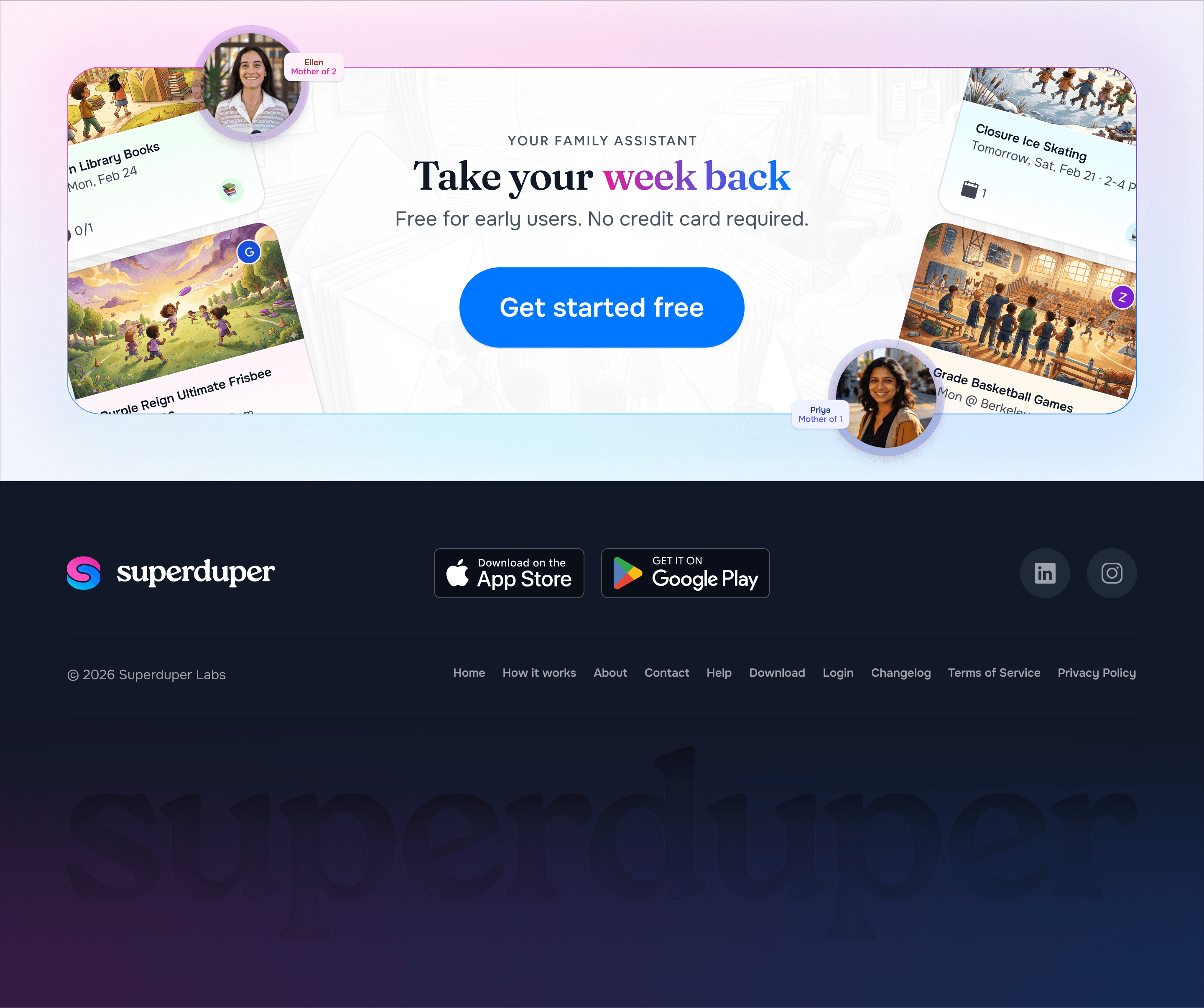
The website uses real product moments and simple family scenarios to make that benefit tangible without turning the page into a technical explanation.
The strongest part of the work is not any individual screen or brand element.
It is the consistency between them.
The brand feels calm.
The product reduces noise.
The website explains the value simply.
And each touchpoint reinforces the same promise: Superduper handles more of the coordination so families have less of it occupying their attention.
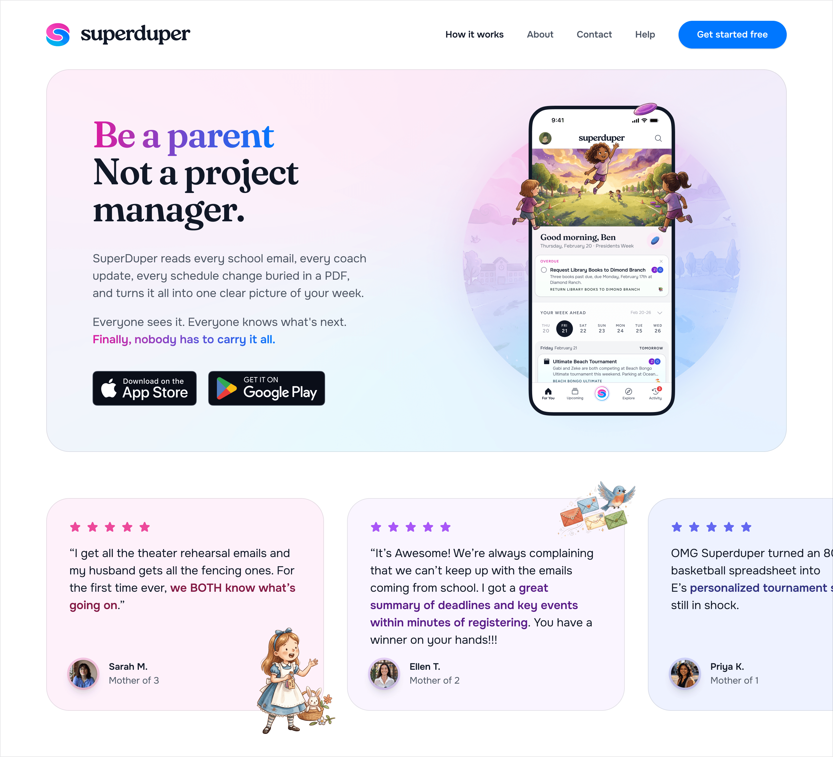
Superduper evolved into a cohesive experience across brand, product, onboarding, and marketing.
The work gave a technically complex product a much simpler surface—one centered on the family rather than the machinery working underneath.
The company was later acquired by Life360.
Max is the full design package: brand, product design, UI, UX, and can develop too! He was our lead designer for 2 product companies, one B2B and one B2C, and knocked it out of the park on both. He designed and built our marketing website, user onboarding experiences, and our brand. In addition to design chops, he's flexible in his working style and a pleasure to joke around with!

The product does the organizing in the background so families can spend less time managing life and more time living it.