X Co
Media by X Life
Media by X Life
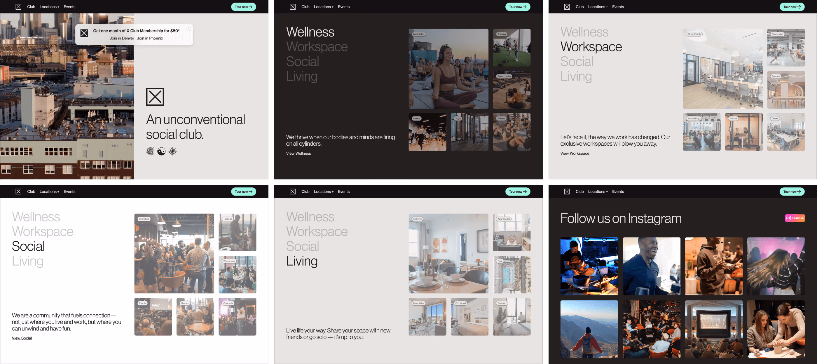
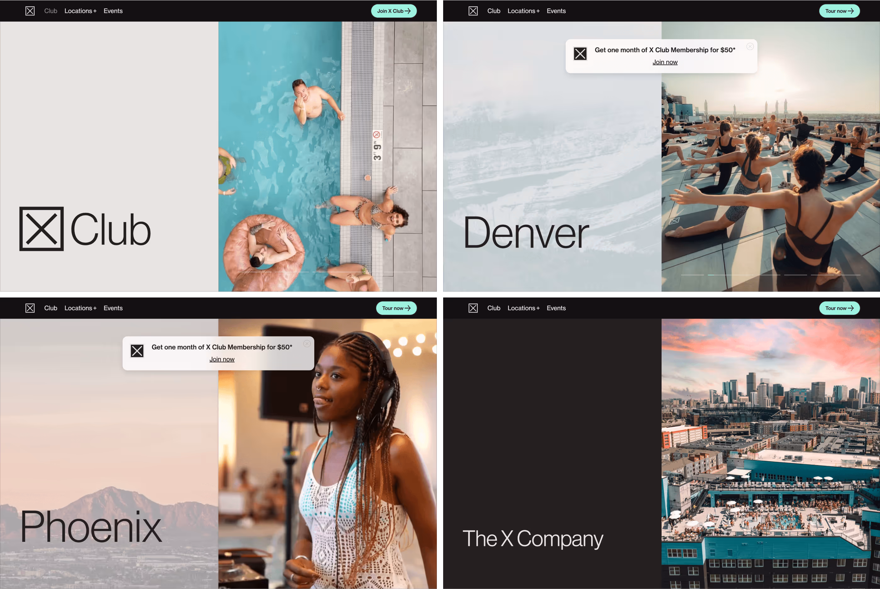
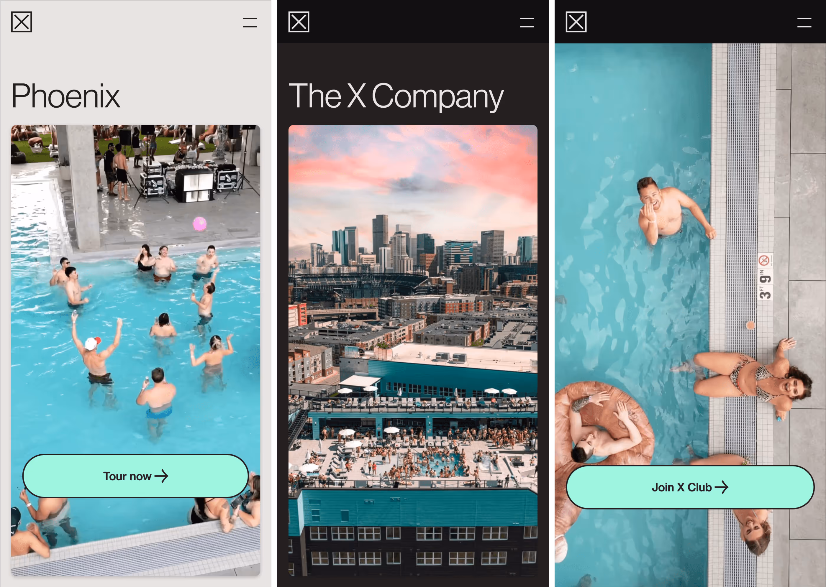
X is an unconventional social club. It offers its members professional-quality workspace to rival any coworking space. It supports the growing work-from-home segment, a state-of-the-art gym and fitness studio designed around class-based fitness activation, and attainable apartments, including private residences and coliving suites.
Digital Designer — Visual Design, Webflow Development
The X Company is the real estate development and operations team behind X — the first and largest branded network of member clubs and private residences in the United States. The X Co. is unique because it is fully integrated — able to acquire, design, build, and operate its real estate assets and manage its growing member network and brand.
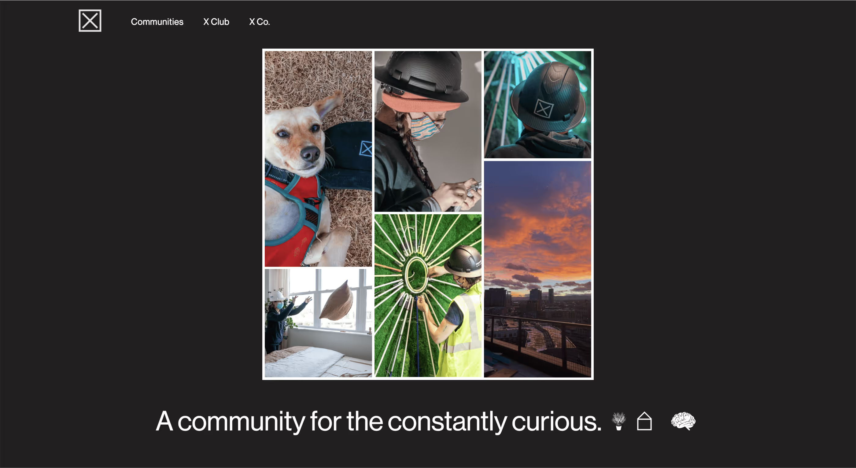
X offers its members a professional-quality workspace to rival any coworking space and support the growing work-from-home segment. It also has a state-of-the-art gym and fitness studio designed around class-based fitness activation and attainable apartments, including private residences and coliving suites.
In short, X Co. exists to improve the way we interact. Such an uncommon brand in real estate demanded an equally remarkable experience in the digital space.
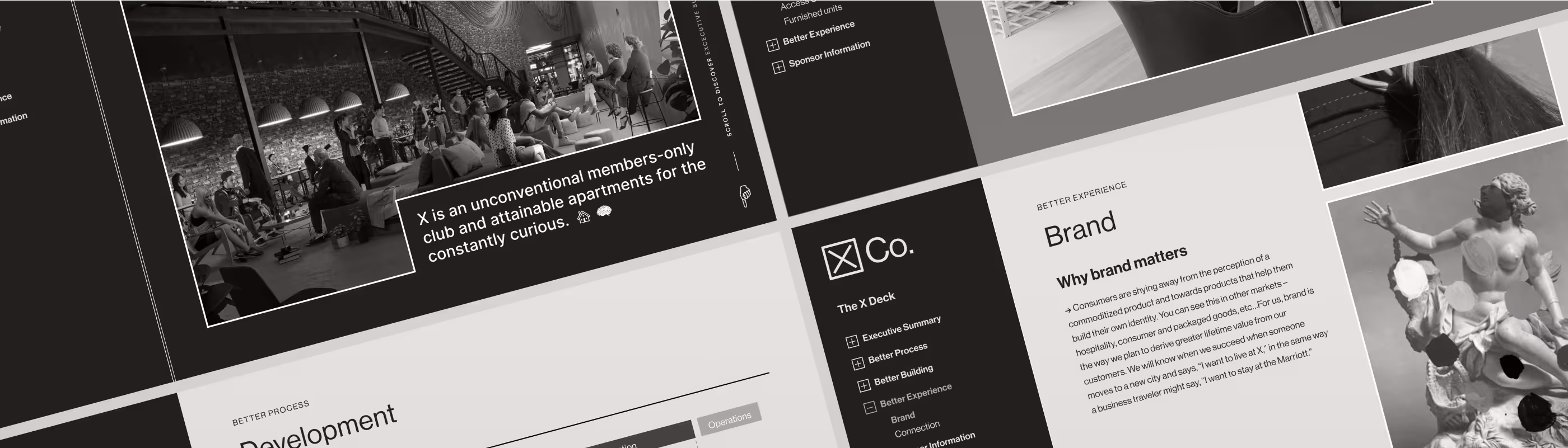
The first contact with the X Co brand was through its executive leadership. They had a quirky vision of what usually would be a predictable project, just like themselves. Building the largest branded network of member clubs and private residences in the United States requires an exceptional medium to present the business opportunity in its whole dimension. They wanted to upgrade the standard pitch deck to an interactive microsite with custom navigation and gestures while staying true to their brand.
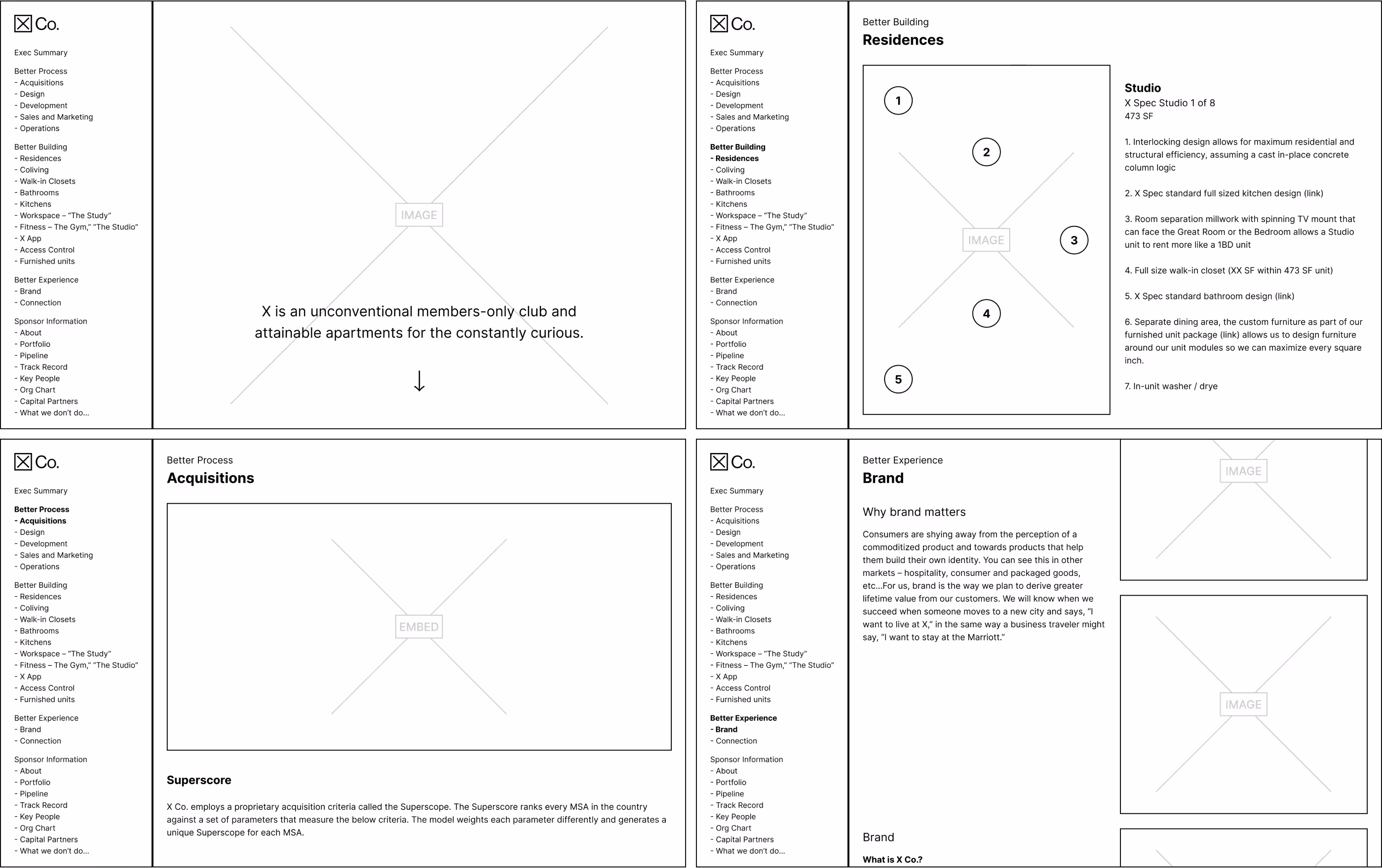
As expected, the research could have brought more helpful references to get inspiration. Plenty of pitch decks are out there, but interactive experiences are needed. We immediately jumped to UX Design by creating the wireframes on Figma and worked closely with leadership to explore the user journey on key screens and navigation. The global navigation was based on a sidebar with a tree view to keep it constantly visible, accessible to jump to any chapter and maintain an active state at all times. Another critical element was the floating pins we'll use to attach content to a specific position on media.
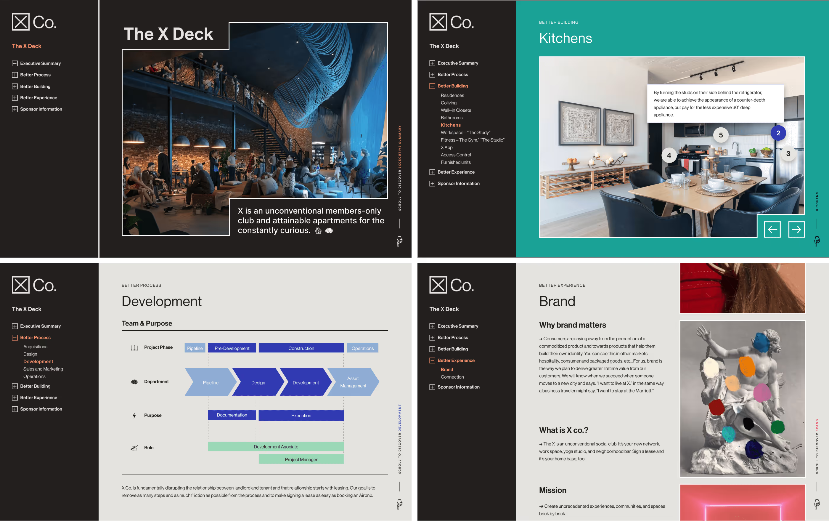
Moving into visual design was a breeze, as we had a straightforward brand identity, clear guidelines, and comprehensive assets. The high-fidelity mockups were based on the wireframes with minimal change other than styling supplied by the brand. The floating pins now had a gesture to be revealed instead of just being referenced.
The design direction was crystal clear, and we needed to bring it to life. We used Webflow, a visual web development tool, to build the microsite on time before an upcoming intro and empower the executive team to easily update the content in the future.
As a single-page microsite, the navigation relied on anchor links. The active state was a given, but the tree-view collapsible behaviors and smooth scrolling to the position were challenges we solved with low-code solutions. The page container was full-width, requiring relative positioning of the floating pins. In addition to the stunning photography, the microsite included a virtual tour, media gallery sliders, and plenty of custom imagery, such as infographics.
The executive leadership had the right vision and enabled us to bring this creative idea to life. This unusual interactive deck was the best approach for the X brand.
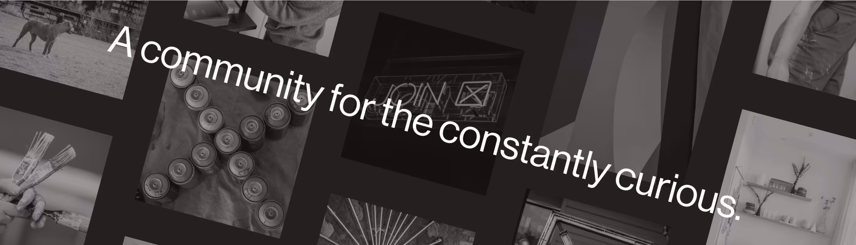
The first impression of the marketing website for X Co. needed more of the energy portrayed by the brand on social media and in real life at the clubs. The design team wanted to rethink the hero currently in place.
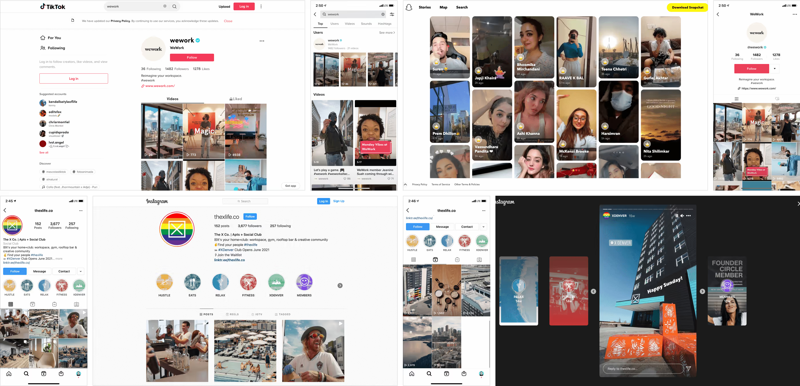
We started the process with visual research, first focusing on social media. The team wanted to curate remarkable moments while replicating the serendipity of consuming rich media content on visually-driven social networks like Instagram and TikTok. We noticed the diversity in photography with polished lighting while capturing authentic moments, usually framed on grid-based layouts with muted dark overlays.
Continuing our visual research, we explored creative ways to showcase media galleries with motion and the art direction of combining them with typography. Without hesitation, my go-to place to find inspiration for imaginative, high-end, and dynamic experiences is Codrops. It's hands down the best, flooding with ideas.

All hyped up, we entered UX Design with wildly different ideas on how the layout and interactions could work. The wireframes we made on Figma had utterly different layouts and even impacted navigation. The first had an organic composition of irregular frames moving based on gestures. The second direction was a more straightforward composition with regular frames on a trail moving as a rotating banner. The third one was closer to the full-screen playback of stories but on a split wrapper that would present media like a slide show. The final fourth option had a grid-based layout with tiles that would rotate automatically in random order and also with gestures as a more interactive alternative.
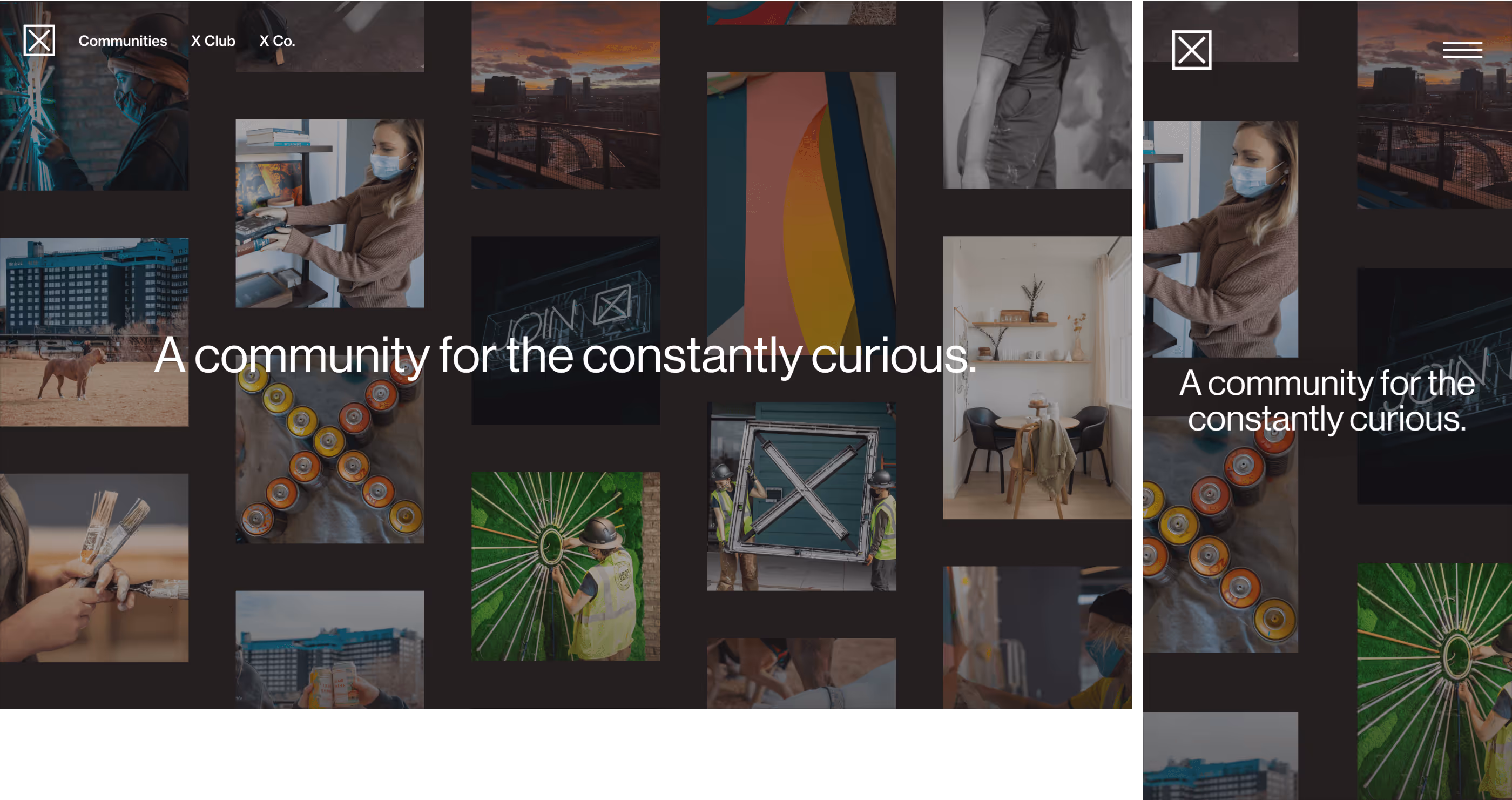
All options were valid, and we saw value in each direction. During the visual design, we combined elements that were better aligned with the brand identity and current marketing website. The high-fidelity mockups took the grid-based layout with a breathing room as a nod to the brand mark frame, the uniformity of the rotating banners taken to a larger scale, and the density of the organic composition.
The result was a grid that would automatically move in opposite directions for each column at a different pace, everything very smoothly. Hence, it's subtle and lets the audience absorb each still of the moments. We built it on Webflow, sourced from a CMS collection fed by automation that gathers live posts from official social media accounts.
After the X Deck success and X Hero exploration, the website was completely revamped with the help of an agency. The compositions, layouts, and interactions we have been digging inspired the next phase of the brand's digital presence.
Split wrappers, grid compositions, and vibrant imagery were predominant in the new elements of the mockups created on Figma.
On top of these components, video will be used more frequently and follow the novel design pattern of video story or reel playback now familiar from social media apps.
The split wrappers will be the default layout for hero sections, and they will alternate between a single massive heading and the story playback. Each story will have a progress bar inside a more extensive progress bar for the whole slide show, as expected from social media apps using this content format.
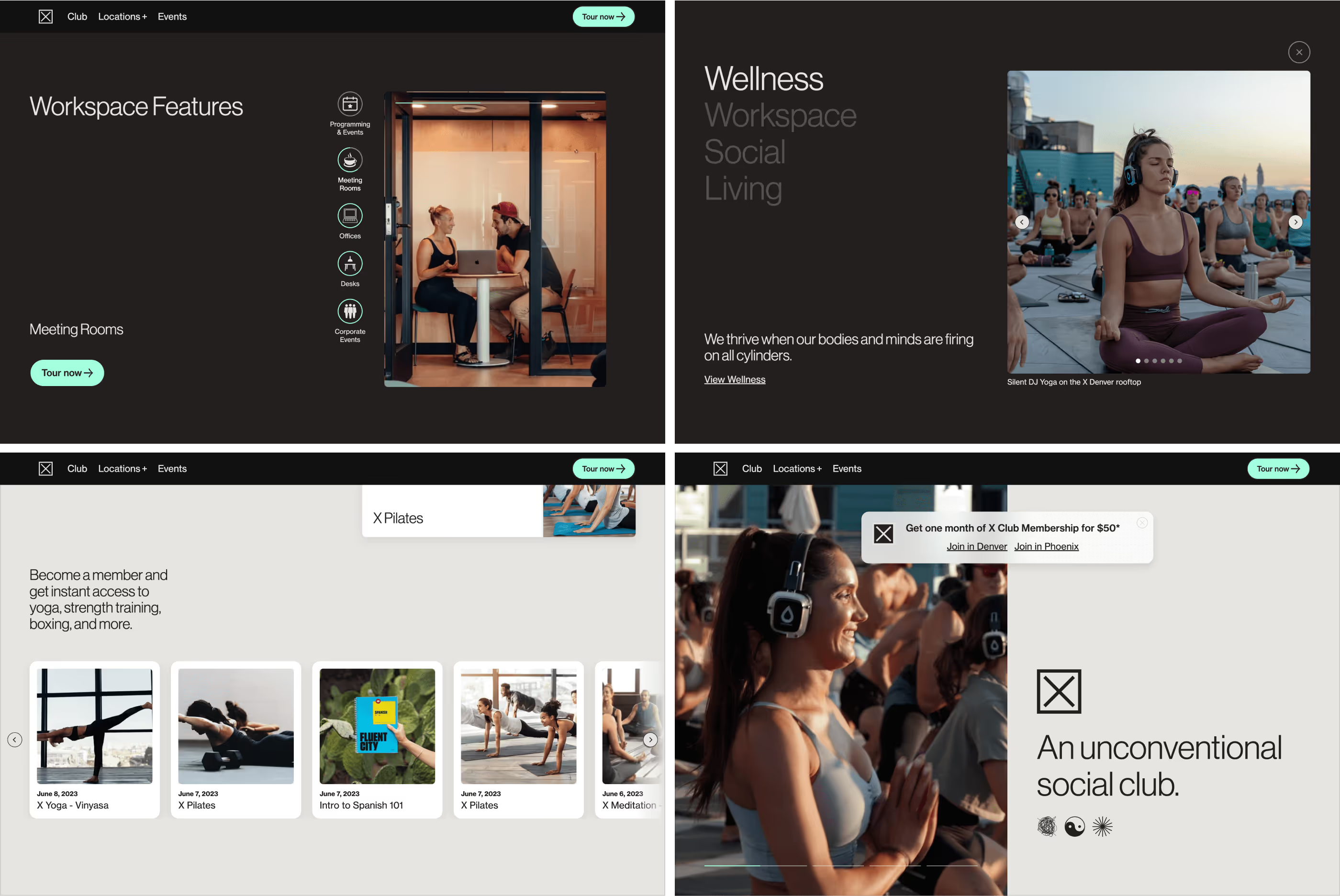
Once again, we developed the website on Webflow. The project comprised widgets following these new patterns, from polaroids to story rotators. These widgets were created as components that allow for speedy development and consistency.
The functional widgets had different layout options and color schemes but shared joint anatomy and scalable interactions.
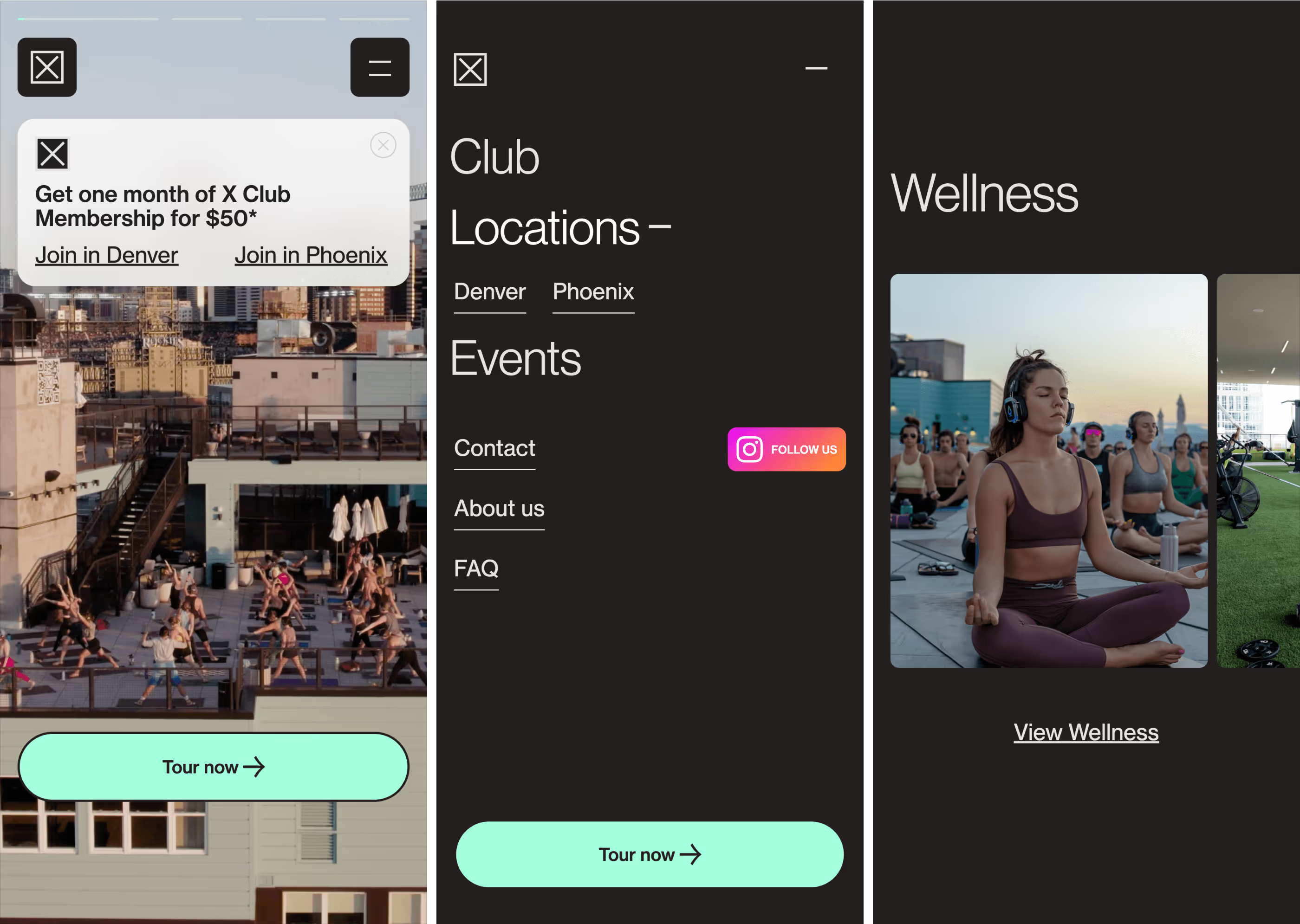
The mobile version of the website has always been a top priority. The vast majority of visitors will be using a mobile device. After all, most of the inspiration and interactions have been based on what is familiar and friendly on the daily apps users love to spend time on. Widgets like the X Mosaic will transform its grid layout into a swiping slider to ensure the best experience.
The split wrapper layout for the hero sections on the desktop will shift the focus to the media on mobile for an optimized experience.
Bringing a familiar mobile app experience to the web could be perceived as straightforward but was challenging in terms of performance and gesture responsiveness. The X Co. culture always has high esteem for the broader vision of its brand story, the impact of the art direction, and the experience quality of the touchpoints across the whole customer journey. This mindset allowed the digital team to fine-tune the experience and overcome the challenges we faced in developing these widgets and putting them all together in the website the brand deserved.
Very insightful! Max was integral in helping us design our website to fit our unique needs. We needed a lot of custom features and he went above and beyond to get us there.